
I selected 3,000 tweets from only the dates February 1st to 2nd, the days closest to when the travel ban on seven dominantly Muslim countries took effect. I expect to see a column of all of the Twitter usernames of users who tweeted an individual tweet or retweeted.
I did not think that the Python would generate an adjacent column that included any users mentioned in the tweet. In this column, some rows are blank because some Twitter users did not mention any other user in their tweet (either they did not have a conversation or replied to another user or did not retweet any tweet).
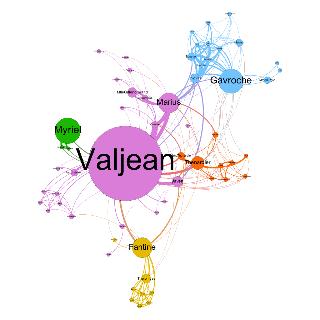
The Les Miserables graph consisted of 77 nodes and 254 edges.
I chose an undirected graph because the undirected graph actually shows potential personal connections (such as friends and family) or important acquaintances (such as classmates who you both only interact with in class) as opposed to a direct graph which only shows your one-sided communication with people who have not responded to you back. An undirected graph allows you to see if people continue to connect with or influence one another on the issue of analysis due to the back and forth communications.
Valjean had an ID# of 11.0 and Fantine had an ID# of 23.0. Valjean had connections with the following targets: Myriel (0.0), MlleBaptistine (2.0), MmeMagloire (3.0), and Labarre (10.0) while Fantine had connections with the following targets: Valjean (11.0), Marguerite (12.0), Tholomyes (16.0), Listolier (17.0), Fameuil (18.0), Blacheville (19.0), Favourite (20.0), Dahlia (21.0), Zephine (22.0). I found it interesting that as a source, Fantine has connections with Valjean, but when Valjean was a source, he had no connections with Fantine. Even though Valjean is the main character, he has less target connections than Fantine.
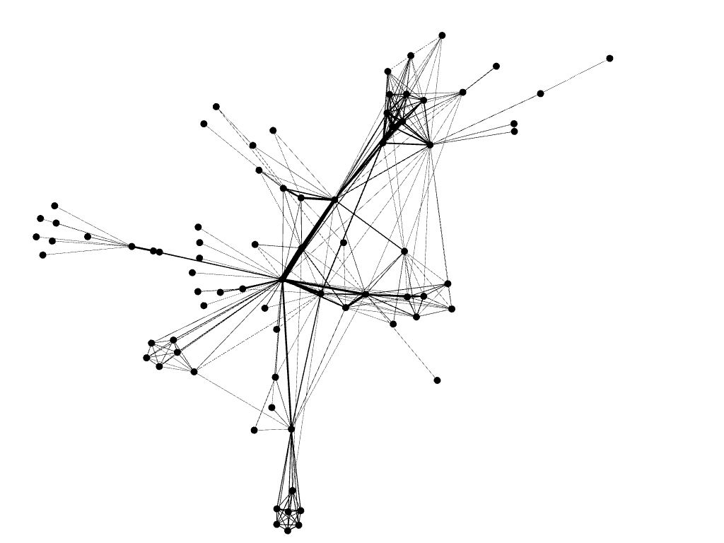
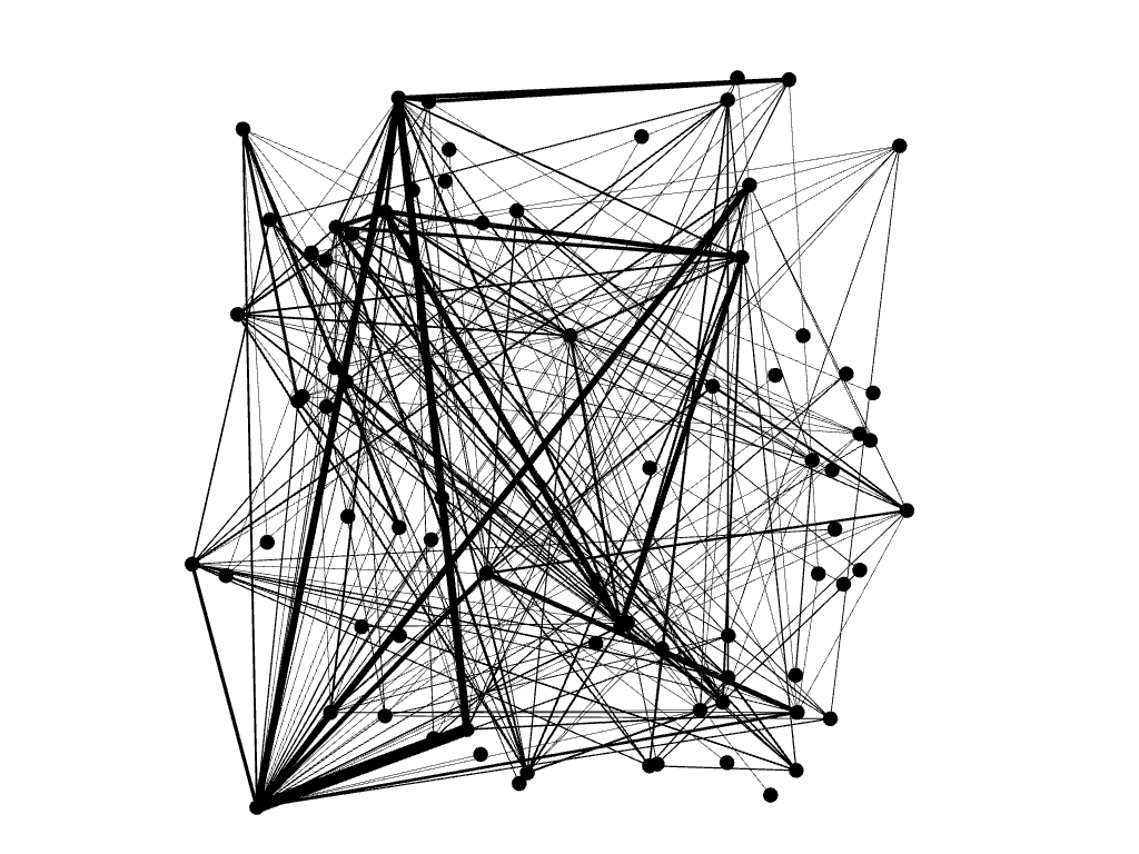
I assumed that the repulsion strength measured the level of significance or durability in a relationship. Therefore, by filtering for a higher limit of repulsion strength, the graph only showed the relationships (nodes between nodes) with the highest frequency interactions (edges).
By adjusting the minimum and maximum size on the Betweenness Centrality feature, we allowed the nodes to show in different sizes based on their amount of their relationships. Therefore, one node appeared much, much bigger while other nodes only increased in a very small size from the default size of 10 because the graph now accounted for the amount of personal relationships that each person has.
I am analyzing the hashtag #nobannowall. Since I had a lot of users, I chose a repulsion on the higher end – 8,000. This allows me to see all of the nodes without any overlap. The network diameter was 25 and average path length was 7.766. This means that people are at most 25 connections apart and 7.766 degrees of separation. Compared to the network diameter and average path length of the Les Miserables dataset, I recognized that people who tweet #nobannowall are not as well connected as the characters in Les Miserables.
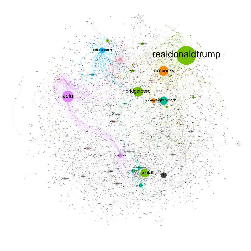
Though everyone seemed to be connected to one another, there are “clusters” of social justice organizations, social media groups, and individuals. I noticed that many individuals talked to @realdonaldtrump but organizations that criticize and bring action to Donald Trump actually do not talk to him directly. For example, @amnestyusa and @aclu conversed with one another and with the same people, but did not converse with the @realdonaldtrump or @mcspocky (a left-wing group that threatens and mocks conservative policies). I initially assumed that @aclu and @amnestyusa would directly converse or reply to concerned people who try to reach out to @realdonaldtrump for answers, but it seemed that the @aclu and @amnestyusa are more focused on national or even international movements than reaching out to individual people on social media. Some individuals did retweet some of the @aclu and @amnestyusa’s tweets, but not enough to show lots of purple edges to indicate a strong connection. I found it interesting that how disconnected the @antoniodelotero bubble was from the rest even though he was an individual who was likely to tweet organizations or Donald Trump. He became popular after he shared a video of an Iranian man who commented how Trump’s travel ban symbolizes an ideological conflict between the U.S.-Iranian government, but in end, hurts the people of both countries.
I found it interesting that people still tweet to @realdonaldtrump more than @potus. Donald Trump uses his account to make more polarized statements while uses @potus to articulate more politically correct statements. Even Donald Trump has two identities on social media: an outspoken @realdonaldtrump that is subjected to more backlash from the public and a more reserved @potus where people still are adjusting to the transition of a new Presidents and are less likely to attack the President position than the person who holds the position.
checking in from #TeamAsianCT. I love the craziness of your gephi! There are so many tweets here and there is beautiful chaos. This was really nothing at all like mine, because I had more of my dots grouped together and yours were very spread out! Your dots remind me of the pages in a loose leaf notebook after a windy day in New England. I find it cool that @RealDonaldTrump is a big hitter in your data, he is very popular in mine too. Great point here about our President using his personal twitter more than his official one, makes me think about how technology is shifting our society. We are now more connected than ever, I mean I can contact him by simply tweeting at him! I wonder why my biggest tweeter @The_Trump_Train doesn’t make an appearance in your data.. maybe we should see if he is one of the smaller dots in there.
anyways, great stuff as always. keep on keeping on
Looking at your graph, it is crazy to see so many individuals present instead of larger groups. Comparing it to my graph, I found yours to be more insightful with the vast quantity of unique tweets, while mine consisted of mostly retweets from a few big groups. I would be curious to see what is being discussed in those small groups and see how it correlates to your hashtag. There is a lot of possibility in the amount of unique tweets in your data, and I am curious to see how your data will develop in the next lab.
-Harrison Quarls