
I picked 2609 tweets from Feb 14 and 15, and my reason for picking was sampling convenience. I just used the tweets that were already downloaded, so the time period has no significance to me. I have no idea what I am expecting when I run this, I feel like Alice lost in wonderland. After putting it through python, I finished with 3366 tweets. My theory is that: There are more rows because some people tweeted at more than one person, and some are blank because some tweets did not mention anybody
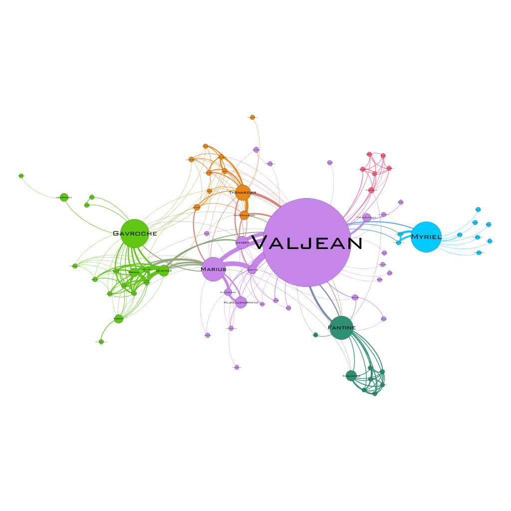
Lez Mis: 77 nodes and 254 edges
Undirected graphs are better here because it shows a relationship between two people, and we are looking for connections!
11 = valjean 3 targets
23 Fantine 18 targets
I think Fantine is the source because Fantine has 6 times more connections than Valjean.
The average path length is 2.641 and the diameter is 5.
On my laptop, I did not have the option under edge attributes to select betweenness centrality (part 2: step 16).
When I turned up the min size to 10 and max size to 200, a large blue dot appeared in the middle. I assume that this large blue dot is the character who is most connected to the other characters.
part 3: For repulsion strength I chose 10,000. It was recommended by a wise friend of mine. My APL was 4.558, and diameter was 14. This means that the average number of connections is 4.5 people, and the largest difference between two points on my visual is 14 people.
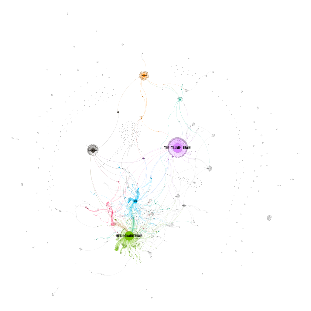
I think it is funny that @The_Trump_Train is as popular in the Trump Twitter community as @RealDonaldTrump. This shows that the community is getting and sharing as much information from Trump’s personal page, as one of these information accounts. If I had to guess, I would say there is some sort of affiliation between Donald Trump and the person behind @The_Trump_Train.
The two powerhouses in my visualization (mentioned above) are actually not very connected/ don’t tweet at each other too often. This could be a strategic tactic to share similar information from two different sides. The @POTUS account is the checkpoint that connects these two big accounts. Another big account is @TheRealCornett; a quick google search tells me this account is run by Josh Cornett and he tweets a lot and very strongly in favor of Trump. Many tweeters rally around him and embrace his voice. He is also separated from the other two big hitters.
I would have expected the big accounts to be communicating a lot, kind of like a Justice League of popular Trump supporting voices, but it seems these ‘Twitter Superheroes’ like to work alone and stay in their own domain. Since my time period isn’t very significant, I don’t think I am witnessing anything other than the average day in the Trump presidency. I do not know everything I am missing when I look at this visualization, but I do know that the specific meanings of each tweet is lost when we look at the data. It would be funny if in some strange twist of fate, there was one medium sized dot that was strictly tweeting anti-Trump messages and using the #MakeAmericaGreatAgain hashtag ironically. These kind of messages would be missed in the overview of data in this form.
Tim, I am fascinated by the amount of individual users who do not talk to anyone. I wonder what they tweet about and why they chose to isolate themselves – when they could talk directly or reply to @realdonaldtrump or another Trump support group. It makes me wonder if Donald Trump, the star figure behind the hashtag, isn’t as important as we thought he was, but more of some other concept or idea that these individuals articulate using this hashtag is more important. I am surprised that FOX News was not one of your large nodes. You make a great point about the missing data.
For future analysis, I am interested in learning if anyone does use #MakeAmericaGreatAgain to tweet anti-Trump tweets and their strategy behind the tweeting (i.e. what time they tweet, what they say, etc.) to understand who or what they target. Your graph demonstrates the isolation of some tweet users and how it may show us “missing data” by not generating a pattern for those isolated users.
Tim, I gotta say the design of your graph is fantastic. The map really helps show who the major groups are, but it is interesting to see so many individuals keeping to themselves and not joining the larger discussion. I am curious to see what those isolated individuals are talking about, and how it pertains to @The_Trump_Train and @TheRealDonaldTrump. I am interested to see if some of these tweets are being used in negative, anti-Trump administration discussions. It might be interesting to see if those individuals outside of the main groups are connected to different groups who are using your hashtag in a negative sense.
-Harrison Quarls