
When reading the specific tweets with reference to their geolocated spaces it became apparent how support (or lack thereof) is regional. The tweets from the southern region of the United States displayed complete support while the northeast and northwest showed unanimous lack of support. I truly wish that there were more geolocated tweets because I believe it would have been fascinating to cross reference them with the text analysis. I think that if we could create a text analysis based on the regional location it would prove to be vitally important and would undoubtedly allow for a deeper understanding. I hope to see many interesting topics such as references to different primaries, politically driven hashtags other than #TrumpTrain, and finally I hope to find some keywords which express disgust with Donald Trump’s campaign.
494,121 Words. 21,974 Unique Words. There were two data points which I found interesting. They are both terms which are labeled as “distinctive to the corpus.” These are #nhprimary and @danscavino. The hashtag #nhprimary was of clear relevance the past few weeks as it has a grip on the entire political scene as it is the first of the primary elections in the nation. The second term: @danscavino, is extremely important. This is the Twitter handle of Dan Scavino who is Donald Trump’s senior adviser and director of social media. I have previously discussed his role in previous posts; however, it is important to reiterate that his tweets consistently receive a multitude of retweets and favorites which displays a large support for Trump’s campaign. The first word cloud produced can be seen in Figure 1.
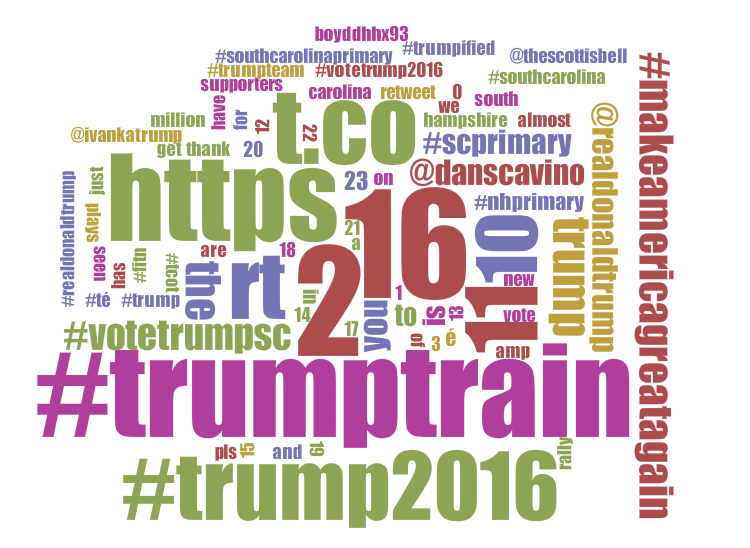
I found that there were many words in this first cloud which needed to be removed. These words contained no useful and legitimate information as they were simply the most common numbers and auxiliary verbs. I found this to be very interesting but not very valuable. After adding stop words to filter these words, the word cloud made much more sense. The updated word cloud can be found in Figure 2. The stop words I edited included the following: t.co, 23, 20, boyddhhx, pls, #té, could, can, would, has, just, almost, é, rt (and many many more). Although I negated the terms é, té, and #té, I think they are an extremely valuable piece of information. The letter é is used in Spanish and therefore it is a definitive possibility that there is a large hispanic population expressing views on Trump. This is a valuable piece of information because the hispanic population is extremely important to the 2016 presidential race. The more hispanic support, the better chance of winning.
Figure 2 reveals a vast amount of useful information pertaining to the hashtag, #TrumpTrain. Quite obviously, #TrumpTrain is the most common term used as it was included in every single tweet analyzed. The largest words in the cloud made complete sense as they are Donald Trump’s campaign slogan (#makeamericagreatagain), his own Twitter handle (@realdonaldtrump), his campaign hashtag (#trump2016), and a popular tweet in support of Trump in the South Carolina primary (#votetrumpsc). Due to the fact that I have never made a word cloud before I was surprised with Voayant’s ease of use as well as the final product. I did not know what to expect and I was blown away by the filtered data. Further, I could not believe that there were so many different terms, all important, which related to #TrumpTrain. It made it easier to understand my data as a whole as it extracted the most popular points without having to read through each and every tweet. I think that this word cloud suggests that there are topics which are subtle. Indeed, the terms present may be the most popular, however, Voyant allows for the visualization of nearly ALL of these terms which we may not have been able to conclude simply through reading the tweets. Moving forward, I will certainly look at my data differently as well as my analysis. This software allowed me to realize that there is so much data in which we can not find just by reading. This technology has broken it down into workable components which allows for a greater understanding of the entire data set.
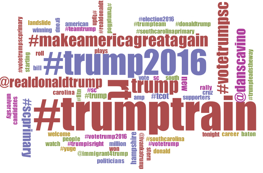
The five most popular terms were as follows: #trumptrain, #trump2016, trump, #makeamericagreatagain, #votetrumpsc. I briefly mentioned these words in the previous paragraph; however, a more in depth analysis is needed. I was not at all surprised by any of these terms. They were unquestionably on my radar before I began to analyze the data through Voyant Tools. I have noticed from the very first data collection that they are ever-present and will remain that way. Nearly every single tweet contained these five terms and I conject that they will continue to do so. I think that #votetrumpsc will alter slightly depending on the state currently voting. The terms landslide, #trumpleadstheway, and #yuge speak to me in high frequencies. I chose these words because they are all important terms (and comical) and apply directly to the support of Donald Trump. I question the use of these terms historically because I doubt that they have been around for every long on Twitter. I think that each of these terms has gained extreme popularity in the past few months as Trump gains political support.
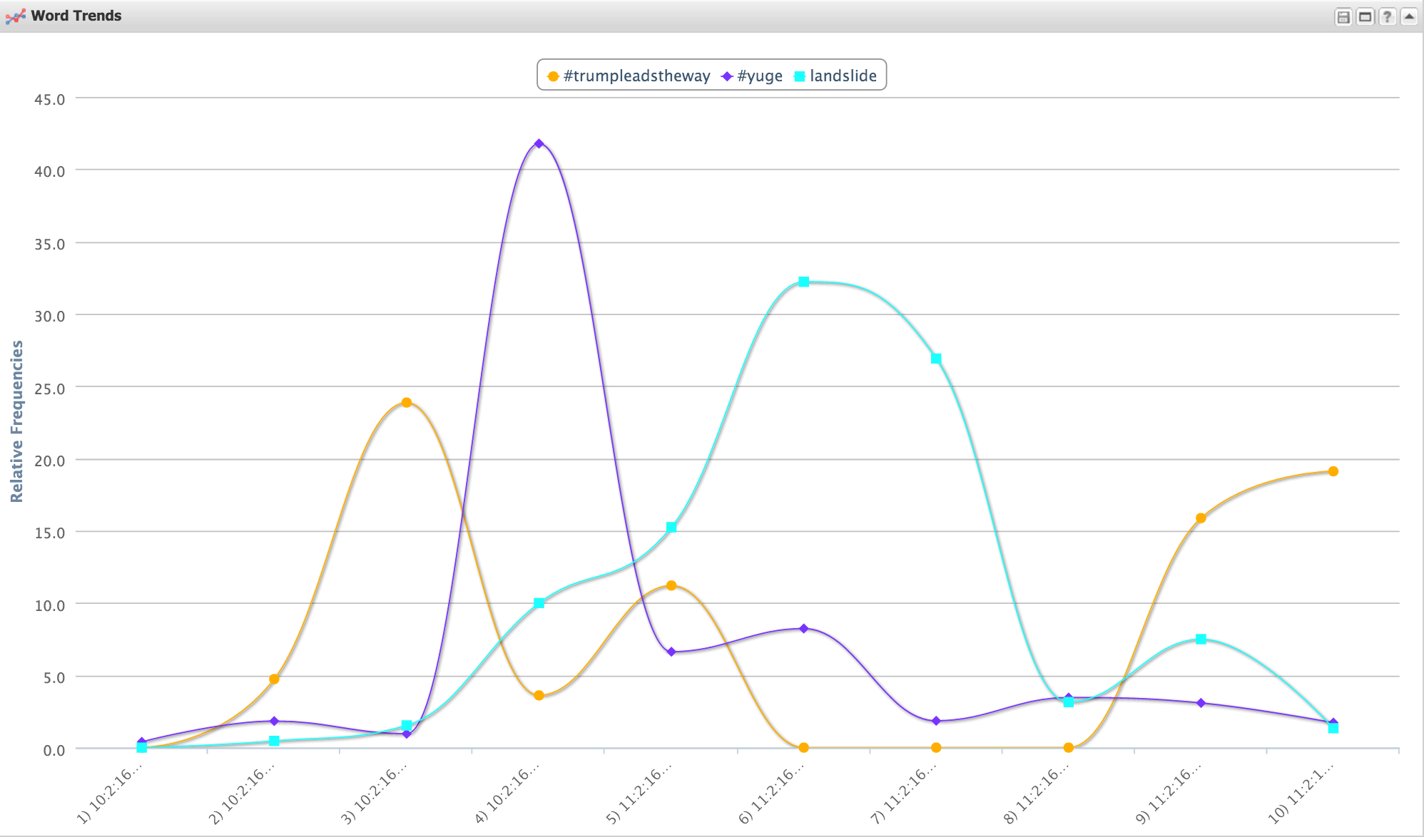
The most fascinating piece of information regarding Figure 3. is how each of the terms has the same amount of frequency, yet over time they dip and spike at varying times. Unfortunately, due to my large data set, I only imported 40 hours of data. This cumulated to roughly 56,000 tweets. Yes, this is a large number, but I find it difficult to analyze the use based simply on this small window of time. With that being said, I did notice that between the hours of 11:59 and 8 am on February 10th, there were close to zero tweets using any of these terms. After this time, there was a clear increase throughout the day. The highest spike was the hashtag, #yuge, which reached its max between the hours of 8:00pm and 11:59pm on February 10th. This may be due to the most activity on Twitter at this time. People may be catching up on the news this day and feel the urge to tweet. After looking back to this day there were no major events that I could find to correlate with the peak.
I chose an article title “Immigration Reform that will Make America Great Again.” [1] It was found on Donald Tump’s campaign website within his “Positions” page. I thought that this was important because this topic has likely been the most controversial and widely discussed topic during this presidential race. I thought that through an analysis of this document a greater knowledge of his stance may be found.
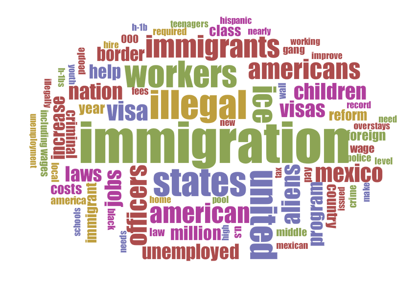
I thought that this was fascinating. I really was not expecting to see such important words used so often. The first word cloud created using this document had a very small amount of stop words. I was blown away after they were removed. I think that this word cloud displays the words Donald Trump has been focusing on the most surrounding this issue. He tends to discuss the terms illegal, wall, visa, Mexico, border, gang, etc. to a great extent. I find that these words have instilled a fear into the citizens of the United States. The other candidates speak more kindly regarding Immigration Reform while Donald Trump uses these harsh words to attack those who wish to come to the United States. This word cloud clearly expresses this. When comparing this document’s data to the Twitter data it is clear that it a far narrower topic and thus the terms surround one specific topic rather than the entirety of his campaign. This is important and I think it would be fascinating to compare a word cloud on a few different issues and see if there are any comparisons or themes which he discusses across the board. I think that this data it definitely assists in the reading of Twitter data because it proves how wide the data used by Twitter actually is. Rarely did I see specific examples regarding his stance on important issues.
Both Yau and Tufte’s approaches to data visualization are important and credible. Tufte writes, “Superior methods are more likely to produce truthful, credible, and precise findings” [2] while Yau writes, “Data is an abstraction of real life, and real life can be complicated, but if you gather enough context, you can at least put forth a solid effort to make sense of it.” [3]. I personally find that Yau’s statement to his approach is best. I think that the term ‘real life’ is the most important piece. People change, opinions change, and life changes. Analysts need to realize this and understand its intense complexity. With enough context, sense can be found; however, this sense may be wrong. Realizing this is the first step. I think that this is especially clear when comparing to Donald Trump and his campaign. He is an extremely sporadic and scattered individual who makes it difficult to make sense of. In this context, I find it difficult to use Tufte’s belief as ‘precise findings’ are nearly impossible when it comes to human interactions and beliefs. This is especially true when discussing his Immigration Reform. Trump has stated countless times that the Mexican people “love him” yet, in his Immigration Reform he consistently discusses how illegal immigrants from Mexico should not be allowed and a wall should be built to keep the Mexican people out. Yau’s approch is clearly more valuable when looking at this because this data truly is an abstraction of real life and is truly complicated. With the right amount of context, we can being and attempt to understand it.
SOURCES:
- Tufte, Edward R. 2011. “Visual & Statistical Thinking: Displays of Evidence for Making Decisions.” InEnvisioning Information, 27. Cheshire, CT.: Graphics Press.
- Yau, Nathan. 2013. “Representing Data.” In Data Points, 41. Hoboken: Wiley.
- Trump, Donald J. “Immigration Reform.” Immigration Reform. Accessed March 04, 2016. https://www.donaldjtrump.com/positions/immigration-reform.
Each week I am more and more interested in your trend, #TrumpTrain, simply because Donald Trump’s success in the primary elections can actually define him as a train or powerhouse in the presidential campaign. I really enjoyed reading your analysis of the article that you found regarding Trump’s immigration policies. You successfully captured the idea that Trump is using fear as a way to instill his ideas in millions of Americans. We still have not seen any large failures throughout Trump’s campaign as he continues to win primaries and gain delegates. However, I am curious to see how his bold immigration policies are viewed among the large population of Latin American immigrants that live in the United States, and if his policies will help or hurt him in the long run. You allude to this in your analysis of Yau’s argument that data is complicated and that sufficient context is needed in order to make sense of the information we are seeing. I completely agree with you in your decision that Yau’s theory is much more applicable than Tufte’s. Donald Trump’s escapade to be president is an unorthodox phenomenon, as he lacks political experience and is using cutthroat business tactics to formulate a political agenda. This is something that is relevant to everyday life in our society and can therefore not be broken down by using any one method of visualization. Keep up the good work and I look forward to reading future posts about this interesting trend that is sweeping across the U.S.
Your insight regarding the removal of certain stop words with possible reference to Spanish language makes me question the exclusion of my own stop words. Truthfully, I did not take the time to consider the possible implications of what I perceived to be impractical, technical jargon. Whether or not your inferences are correct, this is an aspect worth exploring in my own research, and as you mentioned could prove to be extremely revealing about the Hispanic relationship to Donald Trump. Aside from the predicted popular terms present in your word cloud, were there any words or phrases that did surprise you? Briefly studying the final product, I am curious about “welcome” and the context in which it is used. This is not a concept I would expect to be associated with Donald Trump due to his discriminatory tendencies. I would like to hear more about your selected terms as they relate to the graph. These terms are very interesting and the extreme volatility in your graph strikes me as I experienced relative stability in my own results. While it is difficult to observe certain tendencies due to limited data, I am curious if the increase in the use of #yuge is due to the broadcast of a debate at this time. Do people think Trump’s pronunciation of the word “huge” is funny? How is this hashtag used? Again, I wonder if “landslide” and #trumpleadstheway are relative terms to a specific vote or debate. Do these terms experience high frequencies of usage over an extended time? Your data is difficult to process and does not suggest any clear relation in terms of when the words are used. The word cloud generated based on your selected article causes me to reassess my own rendering of visualizations. While I considered terms I expected to see, and terms that surprised me, I never reflected on words or ideas that I predicted but never appeared, or appeared with relatively low frequency. Are conversations regarding specific candidates’ politics that predictable? Your text analysis of #TrumpTrain make me think about aspects of my own research that I previously neglected or ignorantly failed to explore.