Redesigning the Open Communities Alliance Mobility App to Help Connecticut Residents Find Affordable Housing

Posted on

INTRODUCTION

On April 15, 2015, members of Wesleyan University’s CSPL 341 (for more information on the class as well as other projects and various resources visit The Cities, Suburbs & Schools website), traveled to the North End Action Team (NEAT) headquarters in Middletown, Connecticut to gather information on the public’s reaction to the Connecticut Open Communities Alliance (CTOCA) Mobility App.  OCA is “a new Connecticut-based civil rights organization that promotes access to opportunity for all people through education, organizing, advocacy, research, and partnerships.” 1 As a part of their mission, they have created the Mobility App, a opportunity centric tool, intended to assist people with government housing subsidies (notably Section 8 Vouchers, an initiative that provides rental housing subsidies to low-income households) find housing in high opportunity neighborhoods with quality schools, low crime rates, high employment levels, and various other necessities for success. Housing mobility, although it may seem trivial, is crucial for helping low income families gain upward mobility socially, economically and educationally.

We interviewed adults in the community, asking how they felt about their current housing situation, whether they were looking to move, whether they were regular computer users, and other questions, in order to assess the efficiency and applicability of the current app’s design. Our findings reveal that current app is not fulfilling its mission of “help[ing] people with government housing subsidies…find homes within thriving communities.” 2 The App is conveniently available through the OCA website but is relatively new and underutilized. A participant begins by inserting an address (perhaps his/hers or perhaps a desired location), clicking “Search,” and is then shown a peg on a map that reveals the location’s “Opportunity Index” (rated on a scale of “very low” (tan) to “very high” (deep orange)) as well as various “Neighborhood Assets” near the location (starting at ½ of a mile away and spanning up to 100 miles) such as public schools, daycare facilities, grocery stores, and places of worship. Each differently colored section is based off of census tract data.


The “Opportunity Index” is based off of three qualifiers: economic quality, such as unemployment rate and job diversity, educational levels, such as connecticut math and english exams, and neighborhood indicators, such as crime rate and percent of people below the poverty line.

PROBLEMS WITH THE APP

While the Mobility App provides baseline support for housing movement, it is falling short. Technologically, participants are not meaningfully engaging with the app.  In the aforementioned trials done with NEAT while nearly 65% of these people were looking to move only 29% of participants changed how they thought about housing. In addition, many users experienced challenges navigating the website with 57% unable to enter their addresses without assistance. When exploring the tool, 78% clicked on one or fewer facets, showing that without explicit instruction participants cannot effectively use the website. 3 Some of these issues are due to the fact that many of our participants had low literacy levels. The biggest issue with the mobility app is that it lacks links to available housing, thereby not fulfilling its mission to help participants find housing. Without direct links to housing, the tool cannot fully promote actual mobility into higher opportunity areas.

Considering the effectiveness of this app and the primitive resources currently given in the app, this essay calls for a redesign on the Open Communities Alliance Mobility App in order to create more opportunity and effective housing mobility which includes two larger factors: an instructional video and a more comprehensive interface.

VIDEO

As discussed, many users do not possess the technological skills to navigate the website alone. Therefore, to make the app effective, a feature needs to be created to provide explicit usage instructions. The inclusion of a video would visually demonstrate to participants how to effectively engage with the app many of whom have limited literacy. Hopefully, an instructional video would make the website understandable to the extent that users could navigate it alone. This video would pop up automatically when the user enters the website. If he/she is not a first time user, the participant would have the option to skip the tutorial.

The video tutorial would consist of multiple chapters: the first would introduce the app and explain what it is designed to do, reciting the mission statement. The following chapters would explain more specific features to the app. The first specific chapter would be the “Opportunity Index” gradient. The narrator would clarify that it ranges from very low, the tan color, to very high, the dark orange color, and that it is determined based on “economic, education and neighborhood quality”, meaning the caliber of nearby schools, amount of job opportunities, level of crime, and more. 4 Next the video would explain the color coded amenities (that should be expanded beyond what they are now) below the opportunity index such as health centers, daycare facilities, grocery stores, transportation, and more. This portion would show the user how they can select amenities that are important to them specifically, and how the map would then automatically show nearby dots that represent chosen amenities.  When a participant clicks on a dot, the title of the resource, the address, and the phone number would pop up, as well as a link to get directions to/from this amenity. The voiceover would explain that the button leads the participant to a linked website, Google Maps, where the user would be able to see the easiest routes by foot, bike, car or public transportation from the destination to the selected address. It would give a short demonstration of how to do so by entering two sample addresses and clicking on various routes. The next chapter would explain crucial new redesign aspects (discussed in the next section): the ability for two addresses entered concurrently and pegs with links to homes for rent in the area (marked with green arrows).  At the end of the tutorial, a participant would click the “next” button, leading him/her to the Mobility App. If the user needs to go back to the video later for reference, there would be a link at the top of the page that says “How To Use This App.” The video tutorial would make the Mobility App more accessible for all users, especially technologically challenged users, and would help the app become more efficient in helping low-income section eight voucher recipients find a more upwardly mobile neighborhood and home to live in.

Below is a sample instructional video of the current website. It does not include the interface redesign, mentioned above and explained in detail below,that we are hoping to implement. This video would need to be updated when the website is redesigned.

Sample instructional video, created by authors, on YouTube. 5

INTERFACE

The second major suggestion to enhancing the Mobility App’s mission of “help[ing] people with government housing subsidies interested in an opportunity move find homes within thriving communities” 6 would be to change the actual interface of the app.  Currently, the app has too much writing for our literacy deficient demographic, no direct visual comparison between two different addresses (current and future), unclear coloration for the different opportunity areas, and most critically, no direct housing availability on the map. A potential redesign would accomplish four things: include a video (discussed above), remove a lot of the written information so that a person with minimal reading comprehension can understand how to work the app, provide space to enter two addresses (the second being optional) to make a potential mover think about opportunity level comparisons between his/her current location and a new location, and add in real housing options taken from real estate websites.

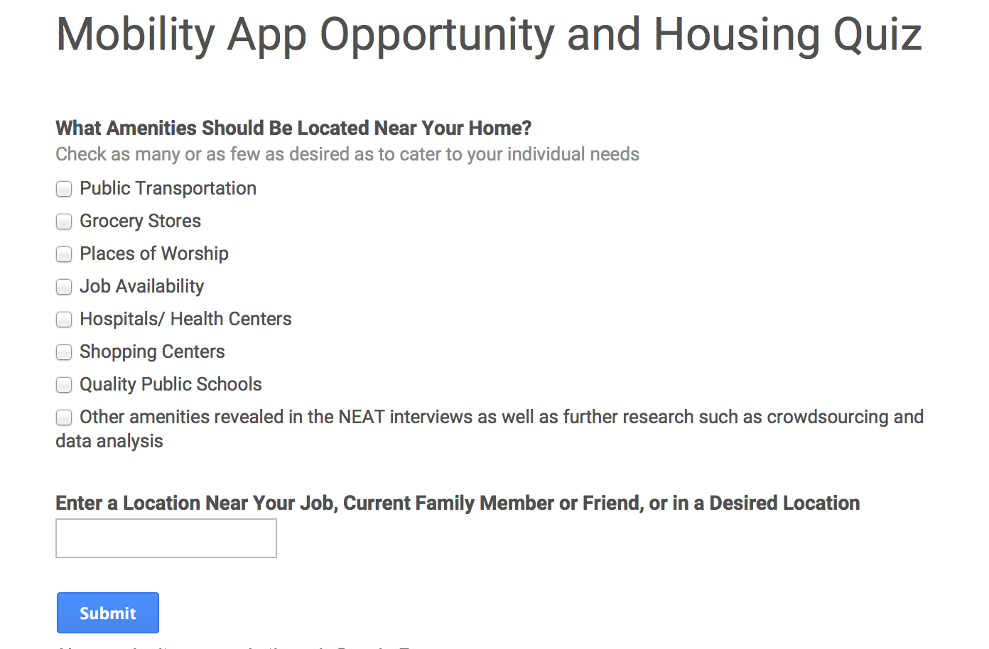
In addition, a redesign could add in various other amenities (like proximity to transportation, hospitals, job availability, places of worship, grocery stores, shopping centers, etc.) to cater toward individualized amenity desires and keep the search as personalized and therefore as useful as possible. Moreover, the neighborhood amenities distance would automatically be set higher than half a mile (the current setting) because not all addresses have amenities in such a close proximity.

However, it is necessary to remember that amenities and opportunity level are not the same; opportunity level refers to “sustainable employment, high-performing schools, a safe environment, and safe neighborhoods” whereas amenities are just ‘cream on top,’ extra to make the app participant-centric. 7 The meat of the redesign falls in the former redesign ideas as these suggestions bolster the app’s ability to offer housing mobility into higher opportunity neighborhoods.


The redesign would include several links, the first of which would be “How to Use This Tool” located at the top of page that would open to the introductory video detailed earlier. This would ensure that a participant can return to the video if they need to be reminded of a specific instruction or purpose of one of the site’s amenities (i.e. what opportunity index means, what the tract (grey lines) mean, etc).  Similarly, underneath the “ Opportunity Index” color-gradient chart there would be a link to the “methods” section that describes what “opportunity” means. While this link would be relatively superfluous with the explanation of what “opportunity” means in the video, it would ensure that categorization into how neighborhoods are being assessed remains as transparent as possible.

The next necessary edit of the website would be the elimination of some of the word-heavy areas and the addition of a space for two addresses. Our first deletion would be the introductory paragraph:

This would hopefully make the website less intimidating for low literacy participants as there are too many ‘advanced’ words. Replacing this space with the option of entering two addresses would permit a user to first enter his/her current address to see this location’s opportunity and then enter a second address (perhaps the address of a loved one or a place of work for comparison). As the NEAT data show, nearly 36% of people described themselves as “Stayers” and therefore the second address is helpful and optional, but not necessary. The app would then compare the opportunity levels of the two neighborhoods and of the neighborhoods in between, show available housing in and between the neighborhoods, depict nearby amenities, and transportation routes. Overall, the addition of two addresses would give participants a visual comparison of a current and a desired address in terms of opportunity level while simultaneously creating choice for participants through showing the opportunity levels of neighboring areas and nearby amenities as well.

If the participant enters two addresses the site would look like this:


However, if a person opted to only enter one address, the map would show the level of opportunity in this location, though ideally more zoomed out than in the current design, because it is currently difficult both to locate an address within a greater neighborhood/opportunity level context and see nearby amenities.

Lastly, the most apparent missing feature in the Mobility App is the lack of available housing displayed, which completely defeats the purpose of this app. How can an individual looking to move into a higher opportunity area do so without knowledge of what housing is available? Therefore, the new design would show housing opportunities on the map in locations higher than the first entered address (current address).  The tool could pull from Trulia, Zillow, or CTHousingSearch for example. This in turn helps the Mobility App creators fulfill their mission statement of providing housing and their goal of making the app as opportunity centric as possible. (See mock-up below)

CONCLUSION

As the Open Communities Alliance Mobility App currently stands, it does not fulfill its mission. The Mobility App has a solid foundation for assisting Connecticut residents with housing subsidies such as section eight vouchers find homes in new locations with higher opportunity levels than his/her current home. Unfortunately, it does not provide enough resources to make meaningful change. However, with a few simple additions and edits, the app could be more applicable, pertinent, and easy to use. Overall our submissions for the redesign would improve how participants interact with the app despite low literacy levels, create elements that help to make the app more opportunity centric through explicit visual instruction, decrease unintelligibly sophisticated language, and provide links to available housing. Once these redesigned aspects have been implemented and the app has been made as opportunity centric as possible, we believe it would be in the best interest of the creators to survey low income participants again to gauge whether or not there are some amenities missing from the site that they consider important and that they look for when searching for a house (such as adding a landlord rating for some of the housing units to eliminate concern), however, the primary focus on the redesign should be on making the app as user-friendly as possible. 8 If the Open Communities Alliance Mobility App included the aforementioned redesign suggestions, we believe the tool could assist those looking to move find long-term and stress-free housing within his/her budget.


Notes:

  1. Open Communities Alliance, “Open Communities Alliance Homepage”, Open Communities Alliance, Accessed May 11, 2015, http://www.ctoca.org/
  2. “Mobility App,” Open Communities Alliance, accessed May 1, 2015, http://www.ctoca.org/mobility_app.
  3. “Mobility App Participant Spreadsheet,” Jack Dougherty, accessed May 1, 2015, https://docs.google.com/spreadsheets/d/1dbwO9jooBxvxZIuLaZzwAXX21LxRHy7k_jfeKadpIKk/edit#gid=0.
  4. Jack Dougherty,”Mobility App Interview Guide.” Paper presented at the CSPL 341 Choice- A Case Study in Education and Entrepreneurship class at Wesleyan University, Middletown, Connecticut, April 18th, 2015.
  5. https://youtu.be/0EI3SAcUCXk
  6. “Mobility App,” Open Communities Alliance, accessed May 1, 2015, http://www.ctoca.org/mobility_app.
  7. Steve Gaul, “Connecticut Opportunity Index: 2014 Opportunity Index Levels for Connecticut”, Connecticut Opportunity Index, Accessed May 11, 2015. http://sgaul.github.io/opportunity/
  8. Connecticut Fair Housing Center, “Analysis of Impediments to Fair Housing Choice 2015”, Government of the State of Connecticut Website, Accessed May 1, 2015, http://www.ct.gov/doh/lib/doh/analysis_of_impediments_2015.pdf

Redesigning the Open Communities Alliance Mobility App to Help Connecticut Residents Find Affordable Housing

Posted on

BACKGROUND

The Mobility App run by Open Communities Alliance was created with the intent of helping people with government housing subsidies (notably Section 8 vouchers, an initiative that provides rental housing subsidies to low-income households) find homes in thriving neighborhoods with quality schools, low crime rates, and various other necessary amenities. 1 The App is currently available through the Open Communities Alliance website, but is relatively new and underutilized. A participant begins by inserting an address (perhaps his/her own or perhaps a desired location), clicking “Search,” and is then shown a peg on a map that reveals the location’s “Opportunity Index” (rated on a scale of “very low” (tan) to “very high” (deep orange)) as well as various “Neighborhood Assets” near the location (starting at ½ of a mile away and spanning up to 100 miles) such as public schools, daycare facilities, grocery stores, and places of worship.  Each differently colored section is based off of census tract data.

Macintosh HD:Users:ifine:Desktop:Screen Shot 2015-05-02 at 1.18.48 PM.png                                 
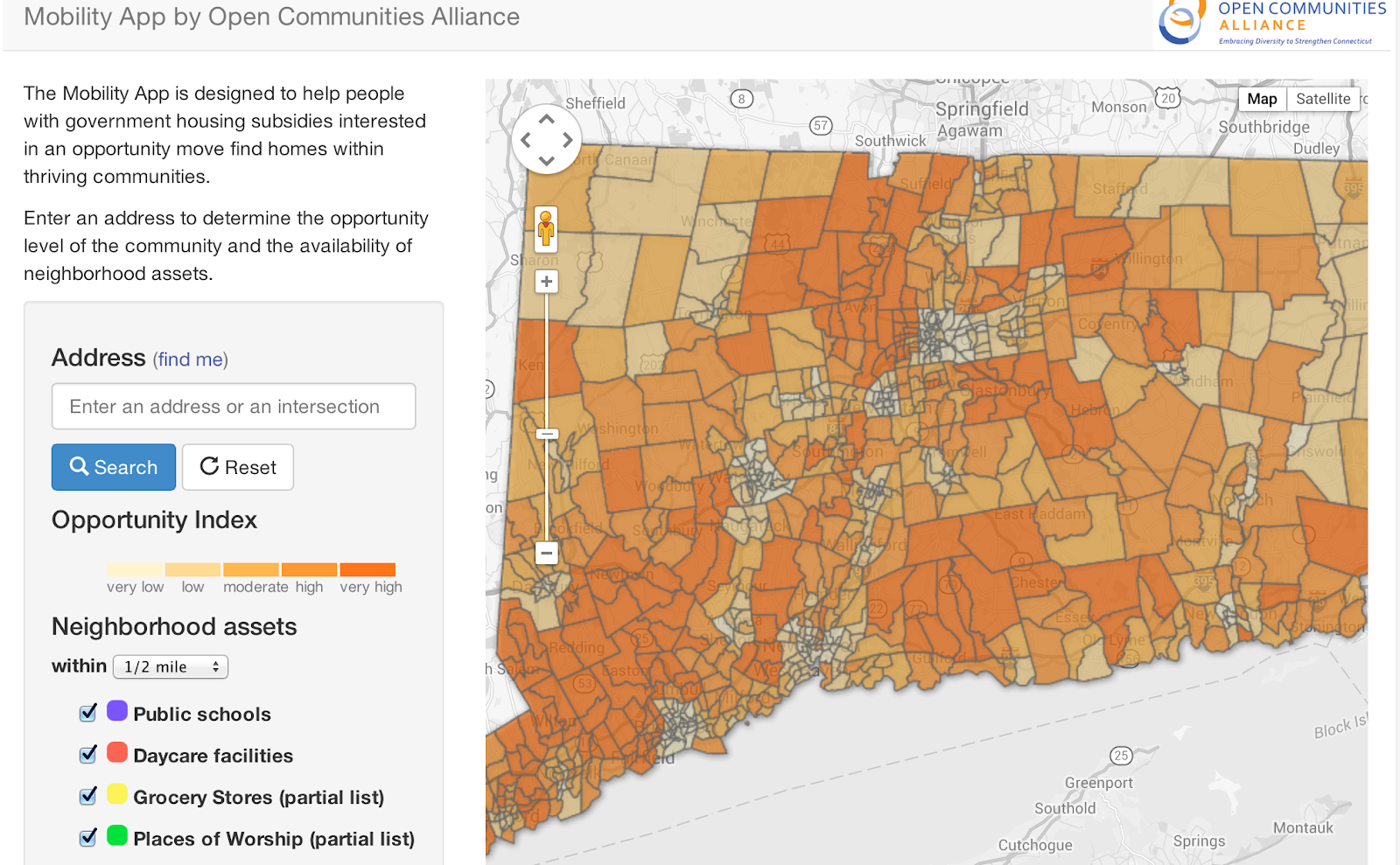
Figure 1: The Mobility App by Open Communities Alliance.

The “Opportunity Index” is based off of three qualifiers:

1. Economic Quality – such as but not limited to unemployment rate and job diversity
2. Educational Levels — such as but not limited to state math and English attainment exams
3. Neighborhood indicators — such as but not limited to crime rate and percent of people below the poverty line. 2

Yet, while the Mobility App is providing baseline support for housing movement, it is falling short in many regards.

1. There are not enough neighborhood assets to give a robust picture of what living in a specific location would be like.
2. There is not enough overt explanation as to what “Opportunity Index” means.
3. Participants are not fully engaging with the app in a meaningful way.  In a test done with the North End Action Team (NEAT) in Middletown, CT, only 29% of people polled changed how they thought about housing but nearly 65% of these people were looking to move. 3
4. Most notably, there are not direct links to actual available housing for rent, thereby undermining the singular mission that the Mobility App attempts to achieve through “help[ing] people with government housing subsidies interested in an opportunity move find homes within thriving communities.” 4

Considering this gap in effectiveness and the primitive resources currently given in the app, this essay calls for a redesign on the Open Communities Alliance Mobility App in order to create more opportunity and effective housing mobility.

HOW PEOPLE CURRENTLY ENGAGE WITH THE MOBILITY APP

On April 15, 2015, members of CSPL 341, the class for which this essay is being written (for more information on the purpose of this class as well as other projects conducted and various resources visit The Cities, Suburbs & Schools website), traveled down to the North End Action Team (NEAT) headquarters in Middletown, Connecticut to interview adults from the community in order to gather data on the public’s reaction to the Mobility App. We used audio and screen recordings to interview the subjects and track their movements and queries whilst interacting with the website.  We began with an interview script that asked participants whether they were thinking about moving or not and what their level of competency was with computers. Out of fourteen participants, 64% said they were thinking about moving and 71% said that they were regular computer users. 5
As we began the demonstration, we asked the participants to enter their approximate address (not actual address to protect for anonymity) and then review what the search revealed about their current location. The participants were instructed to explore the app at their leisure, however, this proved more difficult than expected. 57% of the participants could not enter their address without assistance and when exploring, 78% of participants clicked on one or fewer facets. 6 After the participants browsed the site, members of CSPL 341 then explained what each element (the opportunity index, the colored location dots, etc.) was designed to highlight in order to teach participants what each aspect of the app meant. Next, we asked participants to enter a predetermined address (100 Main St. Portland, CT) and have them describe to us what they saw. From there we concluded the interview by asking the participants if what they learned through the Mobility App changed how they viewed their neighborhood and if they had any feedback for the creators of the app.  The majority (71%) of participants did not change how they thought about housing mobility. We believe this was a result of the lack of an explicit explanation of each part of the tool. This application has proved not to be as easily accessible or self-explanatory as we once believed as many of the features were lost on the interviewees. However, once the application’s amenities were demonstrated and then explained in intimate detail, all but two users were not only able to navigate the application with ease but also were excited about its benefits. 7

WHAT PEOPLE SAY THEY WANT FROM A MOBILITY APP

When thinking about redesigning the Mobility App, there were a few pieces of feedback that came up repeatedly in our interviews at NEAT that coincided with a couple key housing desires expressed in Connecticut Fair Housing Center Study’s “Housing Mobility: What Do Housing Voucher Recipients Want?”  that we feel should be integrated into the redesign. First, there were some amenities that are not currently on our maps that interviewees mentioned were important to them when thinking about housing. This included both unquantifiable amenities such as “room to breathe” and “good neighbors” but also tangible amenities such as public transportation, affordability, and proximity to medical services and shopping centers. 8  Public transportation was an especially crucial amenity for both the NEAT participants and participants of the Connecticut Fair Housing. In fact, two members of the NEAT participant pool alluded to the fact they had no transportation at all and the Connecticut Fair Housing members ranked “Good Transportation” fourth behind “Safety”, “Cost,” and “Good Schools” (features which are already included in the current “Opportunity Index”). 9 At this point, the only reference we have regarding public transportation is the use of Google Maps. It would be incredibly beneficial to add local bus stops as one of the colored location dots on the map. Similarly, locations of hospitals/medical centers and shopping centers (but not limited to these entities) could be gathered through various data analysis programs. One of the other aspects mentioned was the issue of discrimination from landlords, with the participants in the Connecticut Fair Housing Center study, explaining that a bad landlord can ruin one’s housing search. Fortunately, a website, ratemylandlord.com, which allows tenants to review the landlords of their buildings and allows prospective tenants to read reviews before committing to living in the community. This website could be given as a link in the Mobility App to aid those looking to find housing in a building governed by equity and community.

 However the most important piece of feedback that we received from our interviews, which was seen both through observation and explicit verbal feedback, was that the website was not as accessible as we once believed. As shown in the data earlier, users struggled with the website until the features were explained in detail, which goes against the creators’ hopes for the website: users who stumble upon this app cannot find better housing opportunities if they cannot use the website itself.

Based off of the above, we have compiled a few changes to the design and function of the app in order to make it more accessible and useful.

1. Add in an “Introduction” video explaining how to use the app logistically and also to explain what facets of the methods or tools are, like opportunity level, tract, and neighborhood amenities.
2. Have the participants take a quiz that first assesses their current opportunity level then offers suggestions for higher opportunity level neighborhoods near their work or loved ones.

VIDEO

The inclusion of a video would visually demonstrate to participants (especially those not competent on a computer) how to effectively engage with the Mobility App. Hopefully, the video would make the website comprehendible to the extent that users would be able to navigate the mobility app from any location without the help of a housing counselor. This video feature would pop up automatically once the user has taken a short quiz, which will be explained in detail later. If he or she is not a first time user, the participant will have the option to skip the tutorial. The video tutorial will consist of six components and will be broken down into short video segments for each feature. The first chapter will introduce the application and explain what it is designed to help a participant with, reciting the App’s mission statement. The following chapters will be videos explaining more specific features within the application.

 The first specific aspect explained would be the “Opportunity Index” gradient located on the left side of the screen, as seen below. The narrator will clarify that the gradient ranges from very low, the tan color to very high opportunity level, a dark orange color, and that it was determined based on “economic, education and neighborhood quality.” 10 The narrator will go on to explain that that means evaluating the caliber of schools in the area, amount of job opportunities, crime rates and more.

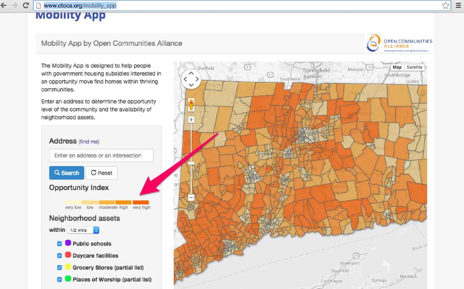
                        Figure 2: Explaining the Opportunity Index on The Mobility App

Next the video will explain the color coded amenities below the opportunity index such as public schools, daycare facilities, grocery stores, and the new amenities included such as proximity to hospitals, shopping centers, etc. in addition to pegs with links to homes for rent in the area (marked with red arrows). This will show the user how they can select amenities that are important to them specifically, and how the map will automatically show dots that represent the amenities near an entered address. It will also demonstrate that when a participant clicks on a dot, the title of the resource, the address, the phone numbers associated with this location pop up, as well as a link to getting directions to/from this amenity.

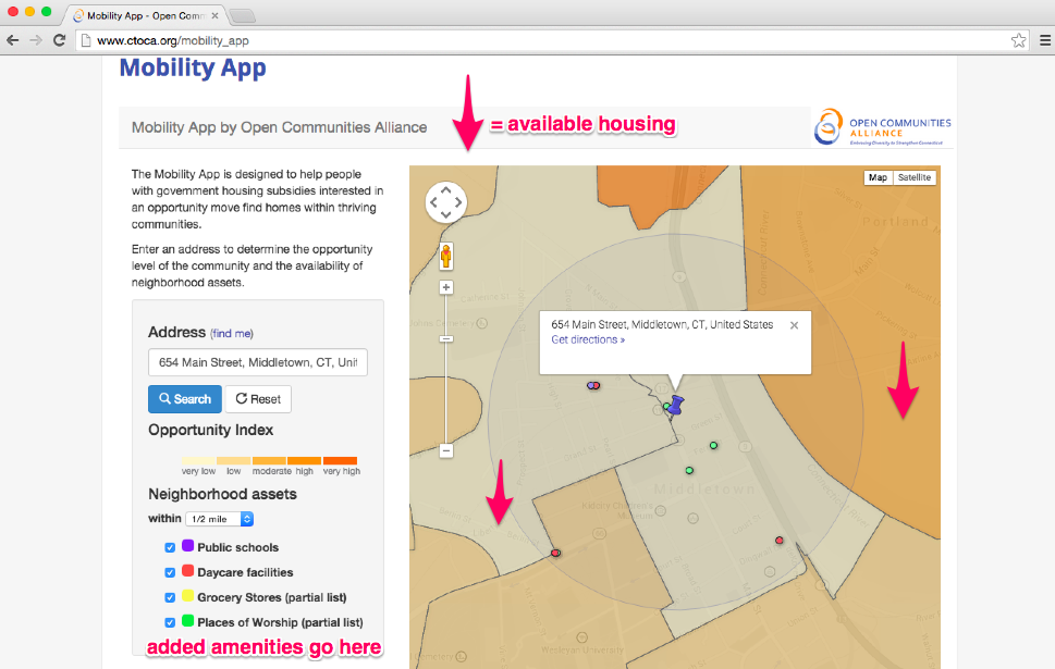
                  Figure 3: The Mobility App with Added Amenities and Available Housing

The next chapter highlighted in the video will be an explanation of how to use the “Get Directions” feature attached to each locale. The “Get Directions” button, the voiceover will explain, leads a participant to a linked website (most likely Google Maps) where the user will be able to see the easiest routes by foot, bike, car or public transportation from the selected destination to a second address. It will give a short demonstration of how to do so by entering a sample address and visually revealing how to use Google Maps.

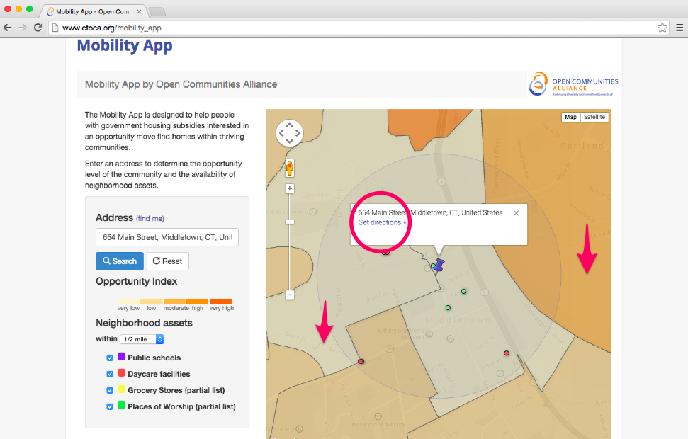
                              Figure 4: The “Get Directions” Button on The Mobility App

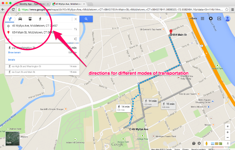
                                           Figure 5: Demonstration of Google Maps

Lastly, the video will describe one of the newer features that would be added with our redesign: the landlord feature. As described in the previous section, many participants mentioned that one of the details they want to know about houses or apartments is the quality of the landlord. Many participants expressed having difficulties with discrimination from unwelcoming landlords that made finding a new housing unit difficult. As a result, we suggest that there be a link be added to the available housing feature so that a participant can read reviews by previous tenants of that space or other spaces that the same landlord manages. One website that could be attached is ratemylandlord.com (see image of website below) . This added feature would address the repeated concerns expressed in the Connecticut survey, and with one of NEAT’s interviewees, and would ensure that the user would be given a full explanation of what living in a neighborhood and potential home would be like.

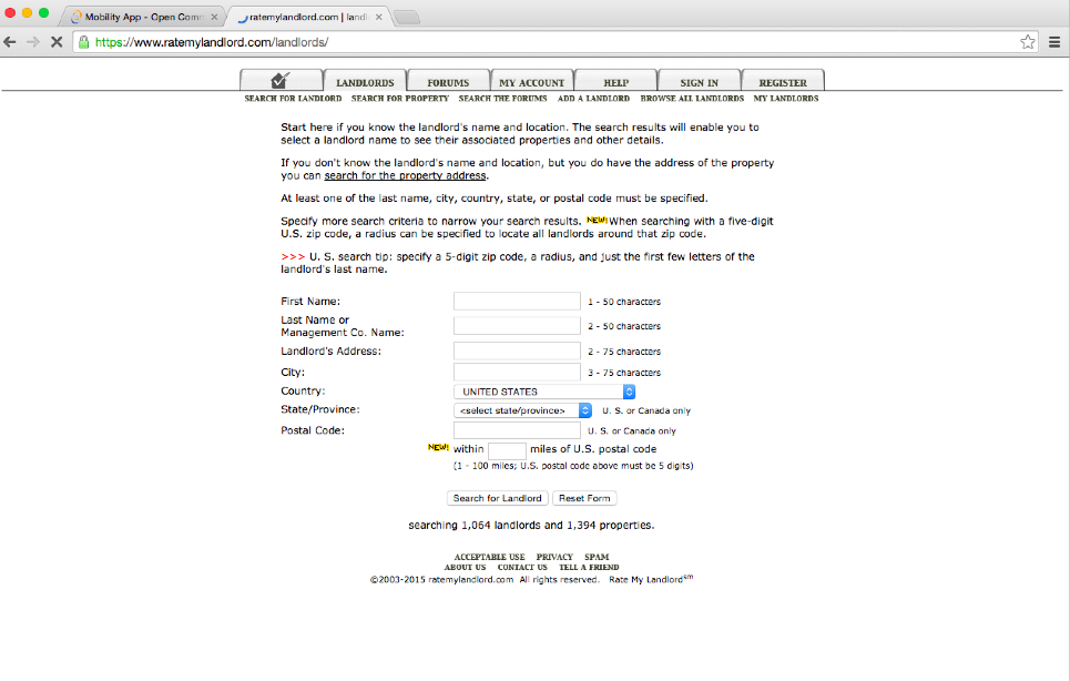
                                                            Figure 6: Ratemylandlord.com


At the end of the tutorial, a participant would click the “next” button, leading him/her to the Mobility App complete with the new amenities mentioned previously. The video tutorial would make the Mobility App more accessible for all users, especially technologically challenged users, and would help the app become more efficient in helping low-income Section Eight voucher recipients find a more upwardly mobile neighborhood and home to live in.

QUIZ

The second major suggestion to enhancing the Mobility App’s mission of “help[ing] people with government housing subsidies interested in an opportunity move find homes within thriving communities” would be to add in a quiz component.  The idea of this quiz is to not only make the app more readily accessible in that it would clearly visualize and explain, step by step, different opportunity levels, but also to individualize a participant’s search and to cater to the specific needs of a potential mover. As is clear from the many responses in the Connecticut Fair Housing Center’s report, “Housing Mobility: What Do Housing Voucher Recipients Want?” people looking to move desire a diverse array of commodities and assets such as level of safety, a “racially mixed” neighborhood, or a locale with schools that have special needs programs, just to name a few. 11 In other words, the inclusion of a quiz would make the app more applicable and would produce results that are actually representative of what a participant would look for in choosing individualized housing.

The first part of the quiz would ask a participant to insert a current or recent address with the intention of then providing information on opportunity in this location.


Macintosh HD:Users:ifine:Desktop:Screen Shot 2015-05-02 at 1.29.24 PM.png


                           Figure 7: Opening Screen of Mobility Opportunity Housing Quiz

Then, the Mobility App would locate the inserted location on the map to visually elucidate the opportunity level and various neighborhood amenities nearby (or lack thereof).

Macintosh HD:Users:ifine:Desktop:Screen Shot 2015-05-02 at 1.30.59 PM.pngMacintosh HD:Users:ifine:Desktop:Screen Shot 2015-05-02 at 1.31.12 PM.png 
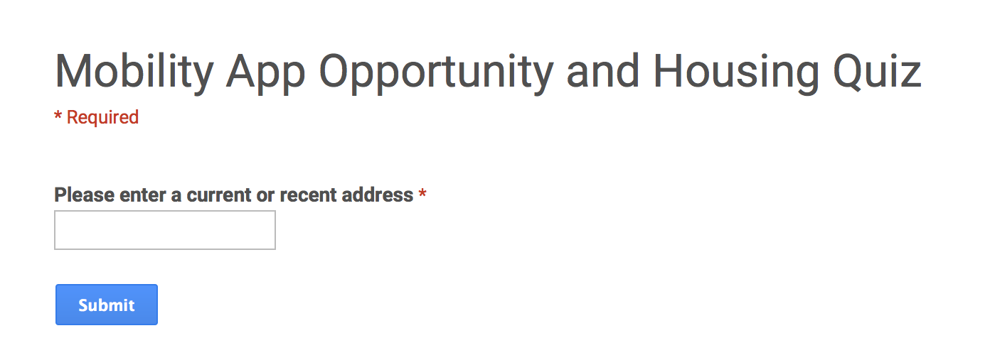
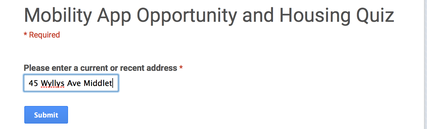
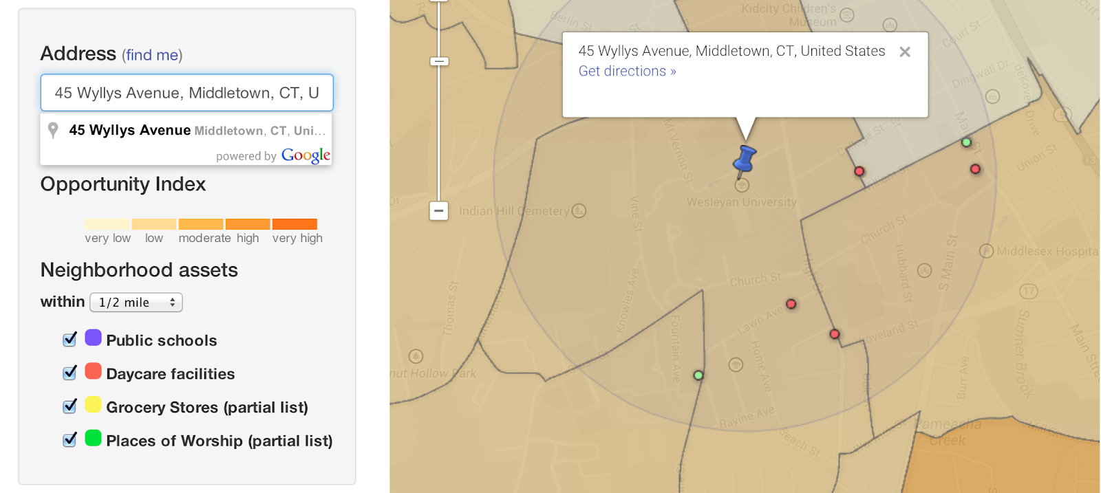
Figure 9: In Depth Visualization of How Location Would Be Shown In Mobility App Quiz

After, this visualization, the quiz would continue by asking a participant to check off various amenities that are important to him/her such as but not limited to transportation, hospitals, job availability, places of worship, grocery stores, shopping centers, etc. In order to generate a full list of significant amenities, further testing of the current tool would be necessary. Further, the quiz would also ask participants to enter a location near their job or a family/friend’s home or a desirable location. The idea behind asking a participant to enter a location near a job or loved one is to reduce the time commuting and help create a more stress-free life. Individual transportation, as mentioned above, is not something readily accessible by many of the NEAT or Connecticut Fair Housing Survey participants and, as a result, high quality public transportation is something they rely on heavily. Next, the app would show the location a participant has just entered on a map with their chosen amenities.

(Note from the instructor: Students were ask to write essays under 2500 words, which would be about here. Evaluators may read as much as they wish, but should not rate the essay beyond this point.)

Macintosh HD:Users:ifine:Desktop:Screen Shot 2015-05-02 at 2.17.16 PM.png

                 Figure 10: Visualization of Mobility App Opportunity and Housing Quiz

 However, simply asking a participant to insert a desirable address is not enough in supporting movement into more thriving communities. Therefore, based off of the information given in the quiz, the app would then compile a list of neighborhoods or towns that were in a higher opportunity index than the original address entered but that also had all the amenities that the participant listed were important to him/her and were close to the desired address. The app would provide this list in full as to give a participant as much choice as possible. Yet, one of the biggest downfalls with the original design of the app is that it fails to provide actual listings for available housing. Therefore, in this new design, the app would provide external links to rental homes (from Trulia or Zillow for example) as well as to ratemylandlord.com in order to make finding affordable housing as streamlined and pleasurable as possible.

When coming up with the idea of the quiz, one of the ideas discussed was whether or not to include a section that asked for a participant’s income and/or his/her desired rent. However, after consideration, it seemed that although this question initially makes sense in order to ensure that people were not spending beyond their means, considering Section 8 housing vouchers, inquiring about a participant’s income or rent constrictions is counterintuitive. Moreover, the Mobility App aims to close arbitrary socioeconomic stratification. Therefore, we would not want a participant to feel marginalized or forced into certain locations based off of money constrictions that may not even be relevant in light of subsidies.

The point is to keep choice as open and participant-centric as possible.

CONCLUSION

As the Open Communities Alliance Mobility App currently stands, it does not fulfill its mission.  The Mobility App attempts to assist Connecticut residents with housing subsidies such as Section 8 vouchers find homes in new locations with higher opportunity levels than his/her current home. While the Mobility App is a good start to attenuating the issue of socioeconomically and racially stratified housing, it does not provide enough resources to make meaningful change. However, with a few simple additions and edits, the app could be more applicable, pertinent, and easy to use. The inclusion of an Introduction Video would show those new to the app (and potentially not comfortable regularly using computers) how to interact with it and what each facet and aspect of the app means and how they function. This would ensure comprehension. Further, the inclusion of a Quiz would help personalize a participant’s experience with the app to create housing choice catered to individual needs and therefore more useful in terms of suggesting relevant housing. On a more microscopic scale, the list of neighborhood amenities should be expanded to include (but not be limited to) public transportation, location of hospitals, and proximity to shopping centers. Most importantly, as the app stands, it does not assist participants in “find[ing] homes within thriving communities” because it does not offer any links to available real estate to rent in these new and higher opportunity levels.  Therefore, the most critical, and perhaps most basic, change that the redesign should address is the inclusion of a list of or external links to open homes.

If the Open Communities Alliance Mobility App included the aforementioned redesign suggestions, we believe the tool could assist those looking to move find long-term and stress-free housing within his/her budget, desired location, and specific amenities.

Notes:

  1. For more information on how these thriving neighborhoods are defined, see the methods section for the Mobility App.
  2. Ibid.,
  3. “Mobility App Participant Spreadsheet,” Jack Dougherty, accessed May 1, 2015, https://docs.google.com/spreadsheets/d/1dbwO9jooBxvxZIuLaZzwAXX21LxRHy7k_jfeKadpIKk/edit#gid=0.
  4. “Mobility App,” Open Communities Alliance, accessed May 1, 2015, http://www.ctoca.org/mobility_app.
  5. “Mobility App Participant Spreadsheet,” Jack Dougherty, accessed May 1, 2015, https://docs.google.com/spreadsheets/d/1dbwO9jooBxvxZIuLaZzwAXX21LxRHy7k_jfeKadpIKk/edit#gid=0.
  6. Ibid.,
  7. Anonymous Participants, Interviewed by CSPL 341, NEAT Headquarters: Middletown, CT, April 15, 2015.
  8. Connecticut Fair Housing Center, “Analysis of Impediments to Fair Housing Choice 2015”, Government of the State of Connecticut Website, Accessed May 1, 2015, http://www.ct.gov/doh/lib/doh/analysis_of_impediments_2015.pdf.
  9. Ibid.,
  10. Jack Dougherty,”Mobility App Interview Guide.” Paper presented at the CSPL 341 Choice- A Case Study in Education and Entrepreneurship class at Wesleyan University, Middletown, Connecticut, April 18th, 2015.
  11. For more information on the different responses, see Section 4 of the report entitled “Your Ideal Neighborhood”

Greener Pastures: Chapter 7 of Climbing Mount Laurel: The Struggle For Affordable Housing And Social Mobility In An American Suburb by Douglas Massey

Posted on

This chapter examines how the lives of the residents of the Ethel Lawrence Homes in Mount Laurel, New Jersey have improved since moving into their residencies. The survey used to approach this was an interesting one and the results were intriguing, however there were many questions left unanswered. Just from this chapter one can see that this housing program gives lower socioeconomic status families a “path out of poverty”. However, it was disappointing to learn in chapter 9, that the families chosen for the residency were screened, maintaining some biases and leaving some families who could benefit most, such as families who are more predisposed to violence than others behind in order to avoid bringing conflict to the area. In some ways this fact ruins some of the author, Douglas Massey’s, statistical analysis. An example of this is the chart displaying the Weighted Index of Violence and Disorder for both non-residents and residents. The resident’s rates decline on this chart which is certainly positive, however, they start more than ten points lower than the non-residents did, which insinuates that the non-residents they chose to examine are not in situations similar to the circumstances the ELH residents’ were exposed to before moving. The test groups should be in identical situations if Massey hopes to compare experiences, and if they are significantly different, as was the case here, it should not be considered viable.

The rates of all kinds of violent instances for residents certainly decreased, however it was disappointing to see that the rate of physical violence is still prevalent in the community, despite its decline and regardless of the fact that residents were reporting that their neighborhood social support had increased. It would be interesting to investigate what caused this. Overall there was one thing that went unmentioned, at least in my assigned chapters, that is a significant factor in housing: diversity in schools and the neighborhood’s reaction to schooling. Were the children who lived in the ELH units sent to an isolated school? What was the racial makeup of the student body? If they were combined with students from surrounding neighborhoods what were the parent’s reactions? In addition, although this model does seem flawless, its hard to imagine, how this model would translate to other areas like it, especially with the lack of public transportation and the lower socioeconomic families that live in these establishments that are unable to purchase a car (87% of the residents being able to afford cars is rare, I imagine). Massey also claims that this affordable housing lowers levels of racial and class bias, however this cannot be entirely possible when people in the surrounding neighborhoods said they do not interact with the residents of ELH. Massey shows excellent progress towards finding an effective, racially and socioeconomically unbiased and affordable housing model; there are still some questions left unanswered and still some biases that remain. It is without a doubt that this population was given a “path out of poverty”.