
Part II
I am hoping that the tweet content will be about the recent news, announced on February 6th in The Guardian, about the second women’s march that will occur on March 6th. I chose the week of February 6th-13th because I think there will be a lot of positive support for the march. Most of the tweets wil be personal reasons about why they are in support of the march and of women’s rights in general.
Part III
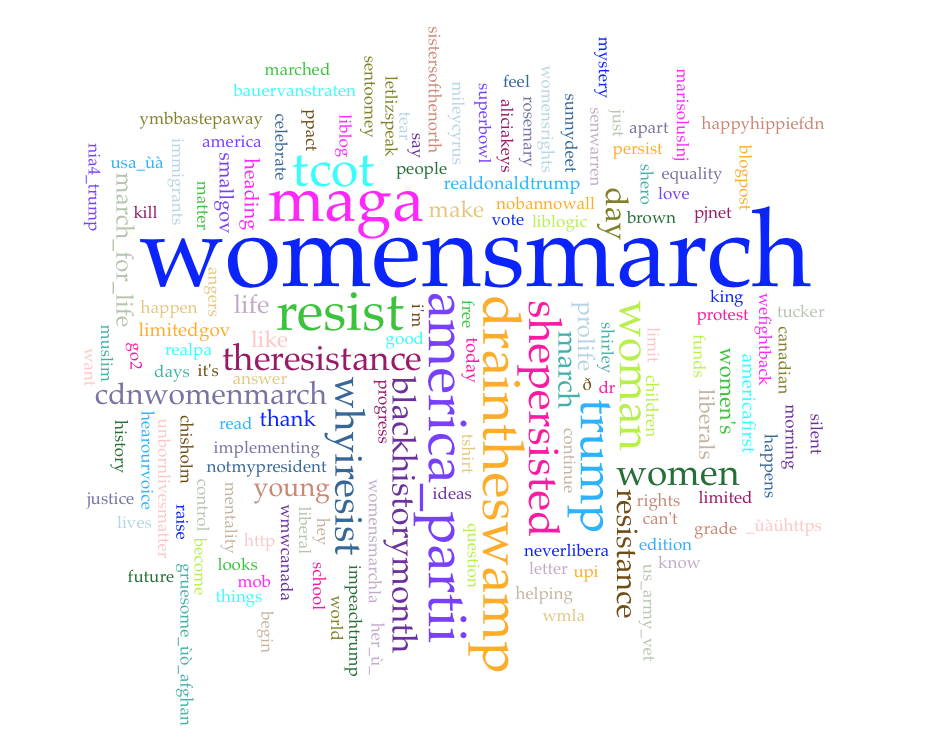
My Voyant shows 8 documents, with a total of 72,062 words and 6,907 unique words. The longest documents in length are February 9th, February 8th, and February 6th. I would have first assumed that February 6th would be the longest document, since that was the day that the second women’s march was announced. However, it makes sense that the longest document is three days later, because by that time the news would have traveled around and more people would have opinions to share. It is interesting also to see that one of the most frequent words used in the documents combined is maga, since most of the tweeters I would assume are against President Trump. Resist is also a frequently used word, which makes more sense with my hashtag. It is interesting to see the two contradicting words have the same amount of frequency, around 450.
I first thought that tcot would be a Stop Word that I needed to add to get rid of. After clicking on it, I realized that it appears 383 times! So I checked out the meaning on Twitter, and found that it actually stands for Top Conservatives on Twitter. Now I know that I definitely should not delete that! I also see the word hey used often in the visualization. I am going to put that as a stop word because I do not see the necessity to have it be a part of the visualization. Other words like mt, hr, _ù, it’s, _ùõ, kue5azbeo0, ùàühttps, 0gbbs95cqb, heyg61so60, hh4pp, ï__ú, vj0j1xvxvy, ü, û, ùîù_ùîù, htt, ht, è, à, _ù_. I added them all to my Stop Word list because they are all just symbols or meaningless words which do not add any meaning to my data visualization.
To depict the best story possible of my #WhyIMarch, I chose a visualization that shows 145 tweets. On my screen womensmarch is the largest and longest word shown. I think it is important to keep that word in my picture because my hashtag is trending due to the women’s march, so it makes sense that it is the most used accompanying word.
Overall, most of the words that I see in the visualization are what I expected to see. As I mentioned earlier, womensmarch is the first term to grab your attention. The second and third most common words are resist and maga. These two are actually quite contradictory together for my topic. I would expect to see resist, due to the backlash against President Donald Trump’s statement on anti-women. It makes sense to use #resist and #WhyIMarch in the same tweet. However, I do not quite understand why maga is the third most used word. Women marching in the women’s march on January 21st were protesting President Trump’s statements against women’s rights so I am confused as to why people tweeting about #WhyIMarch would use another hashtag in support of the President. This makes me think that maybe #maga does not stand for #MakeAmericaGreatAgain, but #MakeAmericaGayAgain. This could be one answer to why people use the #maga hashtag along with #whyIMarch, to resist against President Trump and to show that they are against Trumps discriminatory statements. The fourth most tweeted word along with my hashtag is america_partii, which I had to google to understand. My google search took me to the Twitter profile of @AMERICA_PARTII with the name “refoundingFather”. As I kept reading, a lot of the other hashtags used are #trump #buildthewall #tcot #draintheswamp #patriotparty 4ppl, which leads me to understand that there is a new movement on Twitter to start a new political party in America. This #america_partii concept has me a little confused about the relevance to the women’s march, because every tweet seems to be Pro-Trump. I think there is a possibility that this user was created to make fun of the Pro-Trump Twitter movement, and use the hashtags that Trump uses himself to emphasize what the user is marching against… The next three hashtags all relate to the idea that they are being used to make fun of Pro-Trump movements, like tcot, draintheswamp, and trump. Caroline and Danny, I am interested to see what you both think about this contradiction. The next most used words are very pro women’s march, such as shepersisted, whyIresist, and woman, which are all the types of words that I expected to see.
Part IV
To me, resist, shepersisted, wefightback and hearourvoice stand out most to me. Women’s rights and the women’s march is a very important topic in this day and age. As a country we have made strong progress in human rights. 1919 especially was a huge year in our country when women were granted the right to vote. Since then, women’s rights have been on an upward spiral. Women have been outperforming men in many fields as there are many more movements against sexism in the world now more than ever. The election of President Donald Trump has caused a panic from the movement. Women are feeling targeted by his political statements in office and use Twitter as an outlet to share their thoughts and opinions. The words I chose all signify the power of woman in America. Women will not let this bully take away from the advancement that we have made as a country, and these words emphasize the power an individual can have when they all come together.
Part VI
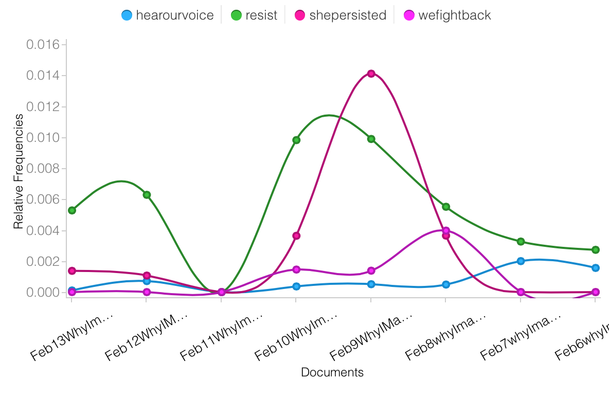
I am not surprised to see a rise in tweets in #shepersisted, #resist, and #wefightback after February 6th because that is the time that it was announced that there will be a second women’s march. Particularly #shepersisted and #resist skyrockets on February 9th-11th. This is interesting due to the fact that this particular weekend was Presidents Day Weekend. In class, Professor Geisking pointed out that most tweets occur during the week day, however from this graph, I can see that there is a large rise in tweets using the given hashtags over that weekend, and seems to go down after Sunday.
Part V
http://voyant-tools.org/?corpus=6904d842b3a58f0fb06de9bd12b5ace0&stopList=keywords-34db5b7b5dee8e9bfd3f0ab411b1c54c&panels=corpusterms,reader,trends,phrases,contexts
Part VI
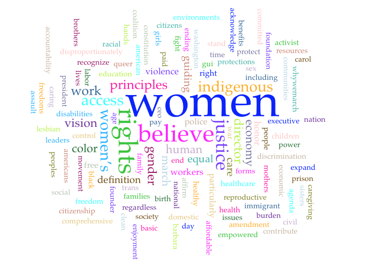
I selected a PDF titled “Women’s March on Washington: Guiding Vision and Defining of Principles”. This document is 6 pages long and outlines the key overview and purpose of the march. One of the paragraphs is titled #WhyWeMarch, which outlines bullet points of paragraphs describing why people are marching for all over the world. This document is probably the most relevant document I could have found to write about for my hashtag #WhyIMarch and I am excited to see what I find through Voyant.
I used the following as stop words because I did not see the relevance in having them in my visualization regarding my topic, women’s rights.
Stop Words: bodies dr air cáceres deputy deweever farm faster gaylynn huerta neuwirth o’neill rollbacks sieck wong
https://static1.squarespace.com/static/584086c7be6594762f5ec56e/t/587ffb20579fb3554668c111/1484782369253/WMW+Guiding+Vision+%26+Definition+of+Principles.pdf
What I am seeing in this data visualization set is very big on the democracy that America entails. The most frequent words used in the document are women, rights, believe, justice, and access. This document recognizes the multitude of social justice and human rights issues, and highlights the importance of resistance and self-determination moving forward. Most bullet points defining why people march begin with “We believe” or “We recognize”, emphasizing the importance of democracy. This format relates back to Constitution, which addresses the world as “We The People…”. This data set does not really change my opinion on my Twitter data up until this point. There are similar words used in both visualizations, with women and women’s rights being the main theme. This dataset is much less catered to the women’s march but more generally about social equality and human rights.
Part VII
Tufte and Yau have two different approaches on data visualization. Tufte believes that the credibility to a data visualization has to do with the method and analysis. In other words, the effect of analyzing data depends on the “quality of methods used in displaying and assessing quantitative evidence” (p.27). Yau on the other hand, talks about the importance of context for the data. I agree with Yau because I believe it is important to have real world context along with the dataset. One can analyze a graph or a chart, but in order to get the most meaning out of it, one needs to compare the data with real life context. For example, in this lab I found a PDF file of the Guiding Visions and Defining Principles of the Women’s March on Washington on January 27th. The visualization of this document compared to the visualization of my hashtag, #WhyIMarch, adds more real world context to the images. This, Yau argues, creates a stronger point, and not just an “abstraction of real life” (p.41).
Work Cited:
Tufte, Edward R. 2011. “Visual & Statistical Thinking: Displays of Evidence for Making Decisions.” Envisioning Information, 27-54. Cheshire, CT.: Graphics Press.
Yau, Nathan. 2013 “Representing Data.” Data Points, 91-134. Hoboken: Wiley.
Katherine, I thought this was yet another insightful post, bravo! This is definitely a better post than Tim Peng’s! I was shocked to see that you only had 72,062 words in your data set, as I had over 700,000. I also would have assumed that you would have had the longest document on February 6th, but it does make sense why the longest document was three days later. I liked the stop words you added to your list as it made your visualization a lot clearer and much easier to analyze. I like the fact that you chose to have 145 words in your word cloud as that really helps as this number of words helps represent your data in a much better way. I regret the fact that I chose to only include 45 words in my word cloud , given the fact that I had over 700,000 words, because I don’t feel my data is represented fully. I liked the words you included in your trend map and enjoyed analyzing the different trends. Why were the frequencies for all four words you compared close to zero on February 11th? This is something you can do some further research on! I liked the article you chose for your second word cloud, but I had a similar outcome that the data from the article’s word cloud did not help me interpret my Twitter data any differently. I agree with what you said: “One can analyze a graph or a chart, but in order to get the most meaning out of it, one needs to compare the data with real life context.” This makes me think about my topic and data I have compiled up. I need to do more research on how my topic is affecting the lives of people all over this country, and compare it to the different types of data and visualizations I have gathered up over the first three labs.
Hey Katherine! I found your post this week to be incredibly fascinating. I agree I would have thought that February 6th would have been your largest document but the explanation to gave as to why it was not makes total sense. I really liked that your word cloud had 145 words, it allowed us to see a bigger picture of what your data is trying to say. I like you chose to have more words in my word cloud, I chose 105. I really liked the words you chose to look at in your trends map. I found it interesting to see if and how those terms trended. Looking at Danny’s post on your data, I too wonder why the four words were closed to zero on the 11th? I wonder if there is a clear explanation or if there is something we are missing. It is interesting that all four terms hit zero the same day because it makes me wonder if there were other terms that you did not chose that hit zero that same day. I liked the document you chose for your second word cloud. I feel like it was really relevant to your topic. I had a hard time find a document like that for my topic. I find it interesting that your article did not correlate more with your twitter data especially because of the one paragraph title #whywemarch which I know is different from #whyimarch but I would have thought they would have correlated more. The final part of your post makes me think about my post from this week and how I could have looked at my data differently. I feel like I could be looking at my data in a more personal way if I looked more at articles and what was going on in the world in comparison to my data.