
With much time spent with my data set, it is time to delve into greater analysis and discover the connections hidden among them. I am choosing the most recent time period because I always like to understand the current issues when I am doing a brief analysis. Trends are obviously important, but for this particular data visualization, I want to see conversations happening now. Selecting extraction #1 leads me to expect that there will not be increased sizes of the circles because there will no differentiation between retweets and non-retweets. This will also include all the tiny circles because it includes singletons which is a single element in a set– in this case, a single tweet of its kind. Onto Gephi, the number of nodes and edges in the Import Report is 77 and 254 respectively. To reinforce, ‘nodes are the number dots, or in this case, people in the book Les Miserables. Edges are the number of connections between them’ (Gieseking 5). The reason that we would want an undirected graph in this case is because we are trying to visualize conversations, not one-way streets.
Clicking on Data Laboratory, I now find Valjean who has an ID# of 11. Clicking on Edges (nodes now listed in order), I look for Valjean’s and Fantine’s ID#s, which are 11 and 23 respectively, and see they have 4 and 9 targets respectively. For Valjean he has target ID#s: 14, 15, 16, 17; and for Fantine, she has target ID#s: 39, 40, 41, 42, 43, 44, 45, 46 , and 47. If Valjean is the source, then he is having conversation with Isabeaux, Gervais, Tholomyes, andListolier. If Fantine is the source, then she is having conversation with Pontmercy, Boulatruelle, Eponine, Anzelma, Woman2, Motherinnocent, Gribier, Jondrette, and MmeBurgon. Clicking overview, we run ForceAtlas in layout with a modified repulsion rate from 200.0 to 10000.0 which delivers to us this visualization.
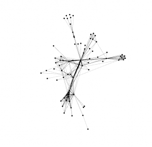
By modifying the repulsion rate, the visualization became more accessible to analyze. Initially, I think that the repulsion rate didn’t leave enough space between the nodes because there were multiple data points and the repulsion rate wasn’t strong enough to alleviate this. The average path length is 2.641 and the network diameter is 5.
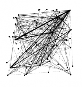
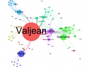
Choosing the Betweeness Centrality option and changing the window from 1-to-4 to 10-to-200 made specific circles MUCH bigger. I believe that this option highlights the sources of the conversation and amplifies based on how much they are contributing to the interaction. This happened because we expanded the window to expose those with bigger data in this set. Here is the final version of the graph after the circles have been run to eliminate overlapping.
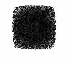
Now that we know how to utilize Gephi programming, we can retrace our steps to the initial data set we were working with: 3,000 scraped tweets relating to #fakenews. Opening up the file in Gephi, I am going to choose a repulsion rate of 10,000 considering the success we had with the Les Mis data when we made this same modification. Just for fun, I am going to post the initial visualization for comparison:

It is one black mass with a myriad of hidden conversations simply waiting to be unraveled as a gift to its analyzer! Setting the repulsion strength, adjusting by size, and running the application:
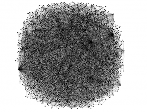
With an Average Path Length of 6.243 and Network Diameter of 20, it is evident this data is much greater than that seen in the Les Mis visualization. There are many conversations going on about fake news and many are interconnected with retweets, replies and subtweets alike. Above is the process of running the algorithm but there is still more to produce.
I just changed the repulsion rate to 100000.0 because there is simply too much overlap to handle. Let’s see the data now.
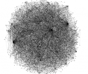
The first thing I notice about my data is the expansive network in which it is encompassing. This visualization is truly amazing, just to see all the circles and branches that go all the way out to the fringes of the graphic and back. This just evidences the network in which has evolved to be able to be accessed in a moment’s notice through the innovation of web-based applications. When Zuckerberg was creating Facebook, he created a site that created a web that would reach the ends of the Earth and be able to return immediately. This is why analyses like this are possible. Observing my data it is crazy to see that a lot of people have similar sized circles which emphasizes the idea of mutual engagement in conservation over the topic of fake news.
Another thing I noticed was the perfectly spherical shape of the data visualization. I wonder if there was a certain window that I chose that did not reflect an emphasis on size to explain how much a user is talking about the subject. My favorite part about this visualization is the thousands of strands coming from the couple circles on the bottom right of the graphic–for some reason this really excites me. It reminds me of a Marvel movie and tons of electrodes are being shot out from the hand of a superhero. I think this graphic looks beautiful. Who agrees?
Bibliography:
Gieseking, Jack. Lab Report 4. Hartford, CT: Jack Gieseking, 2017. Print.
I find it very interesting that your data was a perfect circle after you changed the repulsion rate to 100000. It’s pretty incredible to see how perfectly intertwined #fakenews is. I have a similar topic, #alternativefacts, and my data looked different. It was randomly scattered without much symmetry. I did have a perfect circle around the outside that was really only connected to itself. I wonder if there is any connection between our similar circles and our similar topics?
Your data is super interesting, and you provide interesting insight on it as well regarding the network it represents. I definitely agree that the graph is beautiful. I wonder how some of the trends in your network exists on a smaller scale in some of my data.