
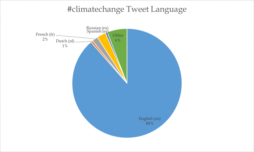
I am using ALL my Twitter data on #climatechange, which is 42,512 tweets. These data span across 35 languages: ar, ca, cs, da, de, en, en-gb, es, fa, fi, fr, gl, he, hr, hu, id, it, ja, ko, nl, no, pl, pt, ro, ru, sk, sr, sv, th, tr, uk, vi, zh-cn, and zh-tw. 37,651 of the tweets are in English, which is 88.57% of the tweets. I also was curious what other languages had a major share of the tweets, and found nothing very interesting. French and Spanish were not-surprisingly one of the larger shares as they are widely spoken languages, with 1.75% and 2.67%, respectively. A surprising language was Dutch, which only 0.32% of the world speaks, yet it accounted for 0.60% of the tweets. This suggests Dutch speaking countries (Netherlands) are talking a lot about climate change. The Netherlands is a world leader in sustainable energy.
My tweets spanned from February 1 to February 7, 2017. Throughout these five days, I graphed the number of tweets by day, but was disappointed to find an inconclusive chart because I realized the TAGS data scrapper must have started in the middle of the day on February 1, and stopped collecting in the middle of the day on February 7. This threw off my chart:
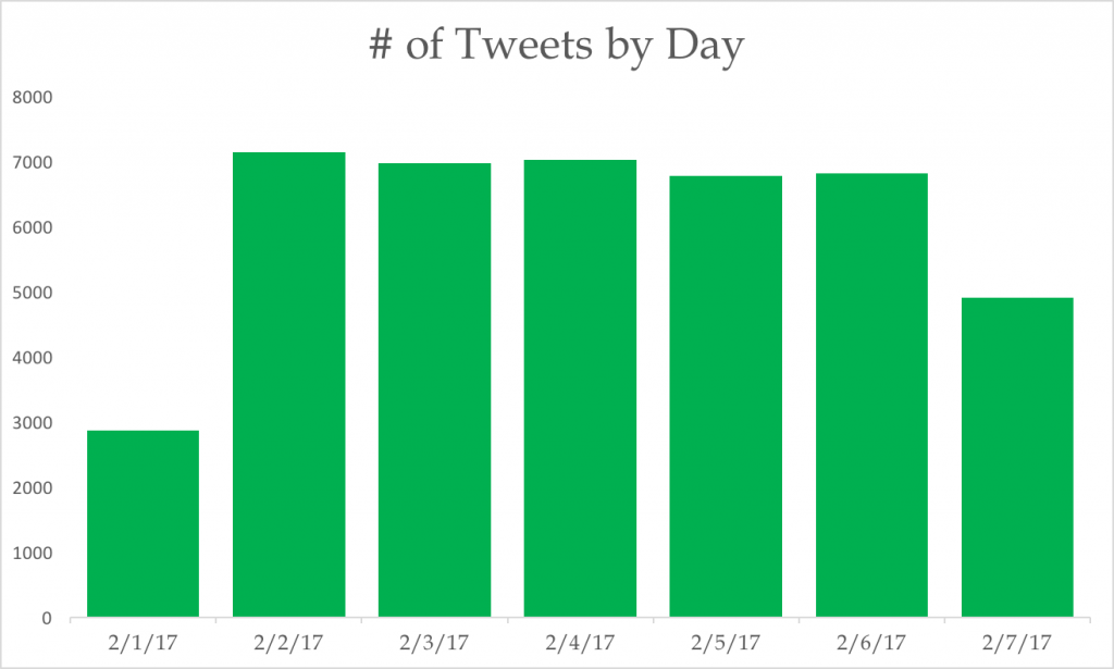
So then I removed the two dates (February 1 and February 7) from the chart, as I saw them to be outliers, and then my chart made more sense and was more interesting. February 2 was a Thursday, and had the most tweets on #climatechange. Friday and Saturday had a similar amount of tweets, then Sunday and Monday both had quite a bit fewer. I looked up any news during these days, and there did not seem to be anything eventful that would affect my data, so the disparity remains a mystery.
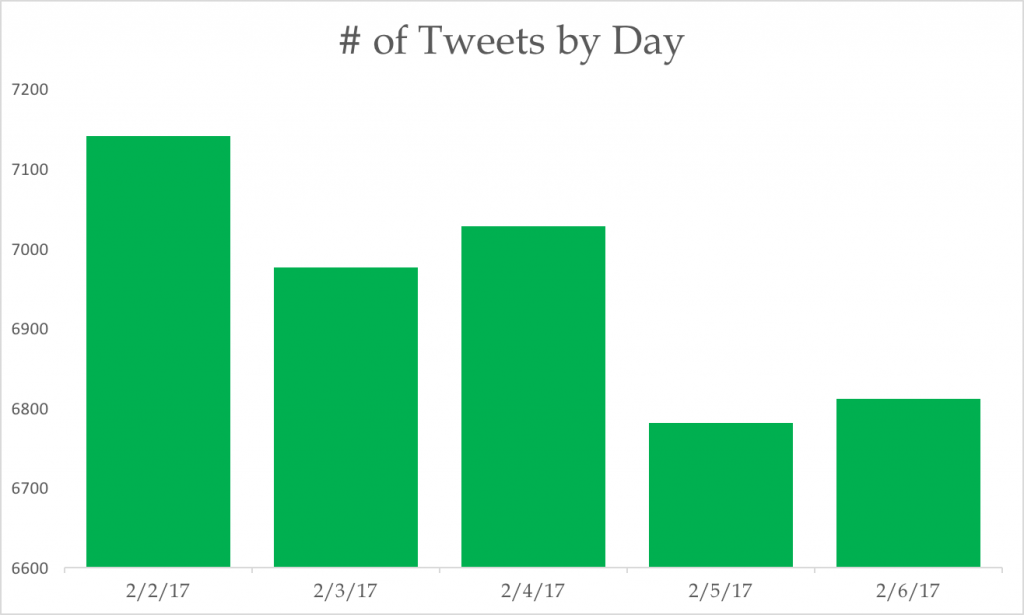
Not many people have posted their stats, but from what is there makes my data seem a lot bigger than #LGBT and #keystoneXL. My mean (6,947) and median (6,976) is a lot larger. The mode was incalculable. This means more people are talking about climate change on Twitter than #LGBT and #keystoneXL.
I have 34,735 tweets when I took out February 1 and February 7 (see above). My data’s minimum (6,781) and maximum (7,140) are also much larger than the rest, but my range is actually smaller than the rest (359). This suggests my data is more consistent from day-to-day. I am a standout from the data points from the rest of the class, except when it comes to range, which is quite consistent with the others. What this means about my data in general is that yes, a lot of people are talking about climate change on Twitter, and in many different languages. The language spread, to me, illustrates the worldliness of climate change, which is reassuring! I did not expect so many people to be talking about climate change in so many different languages. I mean, in just one week, #climatechange was used in 35 different languages. Twitter, which was started as and remains an English-intended social media network, reaches all over the world now, which is shown by my data using 88% English, and not 100%. The range of my data is also important, because since it deviates so little daily, it suggests that climate change is on people’s minds all the time, even on the weekend. Climate change is always an issue.
I thought it was awesome that you went for language analysis for all of your data, and still found a large majority being in English. Although you didn’t find a runner-up to English with a significant percentage, I thought it was cool how many other languages were utilized to take up that 12%. As you realized, I think it would definitely reveal more about your data patterns, particular looking from week to week, about the news vitality related to your hashtag. This could really illustrate how exposed people are to climate change and what types of media exposure incite one to then refer to twitter and talk about this global issue.
I think it’s great that you did the whole data set. I did the same thing and it gave me a much fuller picture of what my data language looked like and how much of a global issue it is. It’s just like #energy for me. Our data was very similar because English ran away with my language majority, but other languages were still relevant, but didn’t even come close to English.
Wow that’s a lot of languages! I’m very interested by your connection between Dutch tweets and their standing as a world leader in renewable energy – I wonder if there are any articles on the internet you could find that would reveal more about this connection. Also it is very interesting to see a hashtag that remains as dynamic as yours without a surge. For #standingrock, my collected tweets waxed and wained with the changing days, even if I wish it were on everyone’s minds all the time. Yet #climatechange does seem to be widely present in people’s everyday lives, which is certainly comforting to me!