
I had a total of 19 languages in my dataset of 2500 tweets: French Canadian, German, English, British-English, Spanish, French, Hebrew, Indonesian, Italian, Japanese, Dutch, Norwegian, Polish, Portuguese, Russian, Slovak, Turkish, Ukrainian, and Chinese.
In my data set, 2398 tweets (out of 2500) were in english. Out of the 2500 tweets in my data set, 95.92% of them were in english.
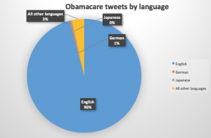
English = 96 %, German = 1%, Japanese = 0%, All other languages = 3 %
Like I said before, I had a total of 19 languages in a dataset of 2500 tweets. My actual dataset includes somewhere over 80,000 tweets, so I can’t imagine how many more languages are included in that dataset. Around 96% of the tweets in the dataset with 2500 tweets were in english, 1 % of the tweets were in German, just over 0% of the tweets were in Japanese, and the other 3 % of the tweets were in the other 16 languages. It does not surprise me that a majority of the tweets in this dataset were in English, as Obamacare primarily only affects people of the United States, which is an English speaking country. The variety of languages that tweets were in surprised me a little bit, and showed that people all over the world are following Trump and the decisions he is making regarding healthcare in America. I’m curious to see what people in Norway, Slovakia, and Ukraine think about repealing Obamacare, and why they were tweeting about it. Although it wasn’t surprising that a majority of the tweets were in English, I was surprised to see the other languages come up in my dataset.
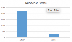
Like I said before, I used a very small sample size out of the 80,000 or so tweets I had in total. I used a total of 2500 tweets, which included tweets from 3/8/17-3/9/17. On 3/8/17, I had a total of 2202 tweets, while on 3/9/17, I only had 29 tweets. The reason why the number of tweets on 3/9 seems so low is that the dataset cut off the tweets on 3/9 at 12:13 am, so 13 minutes into 3/9, I had already gathered up 298 tweets. Also, the tweets from 3/8 in the dataset begin at 4:07 pm, so there are many tweets missing for both of these days. My dataset is very large, so I probably should have used a much larger dataset for this. Due to this, I can’t really say why there were “more” tweets in on 3/8 than 3/9 in this dataset.
After doing some research on Obamacare and its significance on March 8-9, I learned that Vice President Mike Pence held a speech in front of a small group of Latino businessmen where he promised them that the new legislation will end Obamacare and all the problems that come along with it. I’m sure that this sparked a huge debate on Twitter, with many Americans expressing their own opinion on the matter. I’m sure that many tweets came from the Latino community, as over 4,000,000 Latinos were able to get access to healthcare, as well as healthcare coverage under Obamacare, which shows how many people depend on Obamacare for health care. After looking at my complete dataset, I saw that there were more tweets on March 9th than March 8th, and this could be a major reason why. After doing more research, I found that on March 8th, multi-billionaire Mark Cuban expressed his opinion on how healthcare should work in the United States, and reiterated the fact that every single person in this country should have access to healthcare no matter what. This definitely sparked up a debate on Twitter and could explain why March 8th also had a very high number of tweets.
I had an average of 1250 tweets per day, the median number of tweets per day was also 1250, and I did not have a value for MODE (appeared as N/A). Eight other people in the class had already entered their data by the time I did, and all but one also had N/A for mode. I had the third highest MEAN number of tweets per day (1250) and the third highest MEDIAN value (also 1250). It makes sense that my mean and median values were the same, as I only had two days of data (3/8-3/9), so the two numbers were expected to be the same. I’m not really a standout when compared to the classes data, but my values are higher than a majority of people in our class. What this means about my hashtag, Obamacare, is that many people around the world are tweeting about this topic on a daily basis, especially when compared to some of the other hashtags used by my classmates. My complete dataset has somewhere over 80,000 tweets, which is a massive dataset for such a small time of collecting data. It shows how Obamacare and whats happening with it is a huge deal to the people of this world, especially the United States, and is something that is currently one of the biggest concerns to a majority of people in this country.
When comparing the total count of my dataset to the rest of the class’ counts, I had the smallest count, which was 2500. There were a few people who also had counts in the high 2000s, but a majority of people had counts above 3000. Although I had one of the smallest counts, I had one of the highest max values, which was 2202. There was a wide range in minimum values in the class’ data, and mine was somewhere in the middle towards the lower side (min = 298). I had one of the highest range values in the class, which was 2202, as a majority of the class had lower maximum values than I did. Again, I wish I did this on my complete dataset to give myself a better picture of the maximum/minimum number of tweets per day, which would give a more accurate range value. The reason why I may have had a larger max than a majority of the class was that VP Pence and Mark Cuban, two important figures in the United States, both spoke out about Obamacare during the time period of my dataset, which could have sparked in increase in Twitter usage.
I thought it was really cool to look at everyone’s statistics together and compare them to your own. It was cool to see that Obamacare generates more tweets per day than a majority of other hashtags, but one of the most interesting things to compare were the amount of tweets that were in english for each hashtag. As expected, many people had a majority of their tweets in English, but the #transgender hashtag had only 54% of tweets in English, which was fascinating to me. These statistics did not really reveal anything new to me about Obamacare, but has definitely influenced me to research different aspects of Obamacare and look more deeply into the timeline of Obamacare during the Trump Presidency.
Dear Danny,
First of all, I was very impressed to notice that you took the time to type out all of the languages that were in your dataset. I probably should have converted the two letters that I wrote out into languages to avoid any confusion. Well done.
One confusion I had while reading your lab is that you put Japanese on your graph with 0% of the tweets in that language, however you marked down Japanese as one of the languages. I am wondering if you meant to put a very low percentage, such as .0005 or something along those lines, instead of just 0%. In the future, it might be better to use another language that would show at least a bit more than 0%.
To improve your results, it might have been better to use a larger data set. For example, you could have used one week’s worth of data instead of just two days.
I was interested to hear that your values for Mean Median and Mode were one of the highest in the class which means that many people are tweeting on a daily basis compared to other hashtags. I believe that it has something to do with the major announcement from Pence on the day that your dataset begins. Great work on the final lab. Looking forward to your final presentation!
All the best,
Katherine
Hey Danny,
First, I want to say that I have really loved reading your posts about your data this semester. I appreciate that you typed out all the languages that were in your dataset.
Like you, I had some languages in my excel sheet that when converted to percents turned to zero. This is something I found confusing because the number of tweets in certain languages were too small which resulted in a percent smaller than one.
I found it interesting that you median, mean and mode were the highest in the class. This is cool because it means that you had a lot of people tweeting about your topic everyday. I agree with Katherine about Pence’s announcement having some influence on your dataset. I found it interesting that you looked at 2 days. I would be very interested to see how your dataset would have worked if you had done the entire dataset.