
In my first post, I mentioned that there was an increasing prevalence of Twitters users who were coming together to spread awareness on data refuge. Based on the nature of the hashtag, I would expect most of the people tweeting in this dataset to be from the United States considering the most recent outrages over privatized government data. I do believe that other countries have similar issues, but this hashtag is incredibly new and is politically charged after the Trump administration deleted mass amounts of federal climate and environmental data from the White House website. In terms of longitude and latitude, I would expect the coordinates of the tweets to read 30°– 60° latitude and 70°– 120° longitude which is the entire span of the United States. I doubt that if we test for geolocations that it will be abundant in every region of the United States. For example, in my hometown, which I think will be about 42° latitude and 64° longitude, there will not be any data refuge. I believe this because I live in rural suburbia and there will be some people who support this data deletion, but also those who aren’t involved in this type of academia.
Observing my collected data, the total number of tweets amounts to 864. The percentage of tweets that have geolocation information is a measly (4)/(864) or 0.4%. This value leads me to consider how to represent my data under the guidance of Nathan Yau.
Yau quotes: “In many ways, visualization is like cooking. You are the chef, and datasets, geometry, and color are your ingredients. A skilled chef, who knows the process of how to prepare and combine ingredients and plate the cooked food, is likely to prepare a delicious meal. A less skilled cook, who heads to the local freezer section to see what microwave dinners look good, might nuke a less savory meal. Of course, some microwave dinners taste good, but there are a lot that taste bad.
Whereas the person who is only familiar with entering the time and power level on a microwave must either endure poor-tasting meals or stick only to the handful of good ones, people who understand the ingredients and actually know how to cook have fewer limitations. The skilled chef might even transform an average frozen dinner into a gourmet meal.
Likewise, with visualization, when you know how to interpret data and how graphical elements fit and work together, the results often come out better than software defaults.”
This excerpt from Nathan Yau’s Data Points resonates with my opinion how accurately one can interpret data using data visualization. I think that, given that my hashtag is represented by few geographical coordinates, its translation into data visualization instruments will be an underrepresentation of the significance of the data itself. I believe this because while data refuge is a new topic and recently trending, the reason for its inception is notorious. If the data was scoped out to the amount of people talking about the detrimental traits of deleting progressive government data, the data visualization graphic would be a lot more colorful and would convey that feeling of “big data”. However, as Yau suggests, if I use the right datasets, geometry and color (which are my ingredients) I should be able to convey the significance of my topic. Observing my data now I will conjecture that most of the data points fall in the northwestern quadrant of the globe, which would support my theory that the United States will be the location with the most tweets frequenting this issue due to the recent death of government data upon Trump’s inauguration. Also, observing the language column of my data, I notice that all are in English. This does not oppose what I expected, however, I did expect to see French considering I saw some French articles on this matter and French tweets as well. This supports my hypothesis of this issue being central to the United States. Further analysis suggests that I have the fewest tweets out of any of those in my group. This is reasonable considering how new data refuge is, though it is continuously growing. It is evident that there is a great effort behind this movement to spread awareness about the loss of meaningful data, therefore I would adjure keeping posted on the direction and magnitude that becomes of it.
Considering the seemingly insignificant amount of data, it is insecure, given the definition, that this is “Big Data”. However, Kate Crawford and Dana Boyd offer some escapist punches in their ideas that allow me to feel the data I have gathered is actually valuable. For example, “Big Data not only refers to very large data sets and the tools and procedures used to manipulate and analyze them, but also to a computational turn in thought and research.” This quote comes directly from the list of their six main ideas about Big Data, and leads me to believe that the data I have collected plays an integral role in sparking new research. I think that this data, while small in number, will ignite a pathway to “Big Data” and so can already be considered to have similar caliber. Data refuge is a new topic as well all know and the volume and velocity of its related data since its inception is enough to make these claims. There is widespread awareness and the political underbelly will fail to cease.
Mapping Census Data:
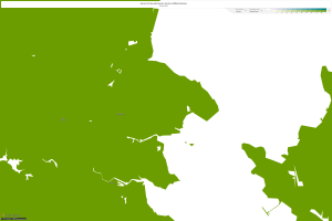
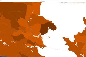
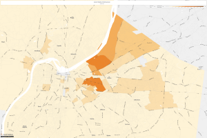
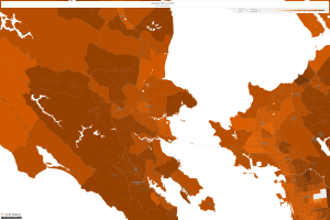
All this analysis data leads me to delve into other realms of data accumulation, specifically census data to explore different avenues of life. I chose two locations today for two specific reasons. The first location is Jefferson County, Kentucky (40207) in which I analyzed the number of Black People to occupy this area from the year 1900 to 2015. It is clearly visible that slavery was prevalent in Kentucky in the early years and upon the free states, Black People now only occupy specific areas of the county and those numbers are quickly reducing. See the set of maps for data support:
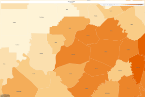
No one can deny the horrors of oppression upon the building of our country, but to take a look back in history and analyze certain trends is especially interesting. I chose this location as my friend had just recently moved to this area and told me there is a dense population of white people where he resides but truly specific parts have a dense amount of black people. I wondered why this was. Of course we express the advantages of diversity but because of the innate divide in our country, it seems that each race prefers to surround themselves with their own people. I chose tracts 77, 99, and 81 to measure any trends I noticed. In 1900, there was 12,408 black people and there was no division of tracts. In 1960. there was 3,211 in the 77th tract, 3,676 in the 99th tract and 4,615 in the 99th tract. In 2015, there was 3,403 in the 77th tract, 2,783 in the 99th tract and 3,284 in the 81st tract. This proves to me that there was a heavy concentration of black people during the era of slavery and as time progressed, they became independent and gravitated towards the same locations. As bloodlines continue, it seems they seek greater opportunity. This speaks to the definition of progressivism.
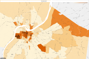
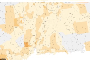
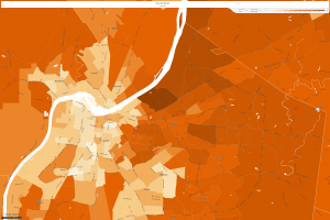
I chose Marin county because I have a friend there who speaks to its luxurious development in the last fifty years. This section near the San Francisco area is known for its high class feel and ostentatious taste. From what I have associated with California, I figured that there would be a mass amount of farmland for producing vital crops for the grocer industry. However, outside the San Francisco area left any hope of farmland behind. Let’s check out the map set from 1900-2010.
 The first map shows the concentrated density of farmland in this area in the 1900s. The second photo shows that there were farms of multiple different races in the 1930s. It is evident that this county started to progress and more people were able to enter the space. However, by 2010 we can see that household development is at a nearly 95% occupancy. This shows that farmland was taken down and houses were developed with home owners occupying the units.
LBJ’s “Great Society”
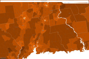
The next section of this post delves into the sub-sequential responses to LBJ’s “Great Society” platform in the 1970s. Let’s choose three locations and see how this platform lead to change in the area of median household income, specifically the number of households making more than $50,000 a year. First, I wanted to know a little about my historical town in Wallingford, CT:
Wallingford, 1970
Wallingford, 1990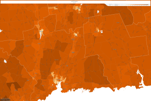
Wallingford, 2010
Next, let’s head back to Jefferson County, Kentucky:
Kentucky, 1970
Kentucky, 1990
Kentucky, 2010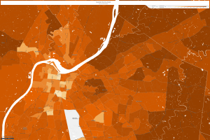
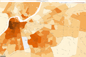
Now, let’s take a look at Marin County, which is now one of the wealthiest counties in the country:
Marin County, 1970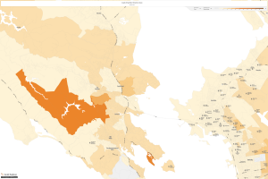
Marin County, 1990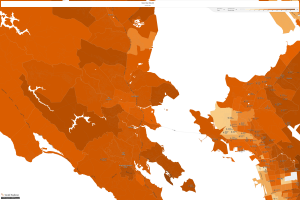
Marin County, 2010
It is easy to notice that household income has increased in every area across the United States since LBJ’s “Great Society” platform came into being. This proves that policy takes multiple years to really have an affect and upon the successful building upon can turn into prosperity for all. I feel this relates to my dataset considering that right now the numbers are small, though as I mentioned the inception has ignited a widespread awareness of lost data that could turn into much more in the future.
JSTOR:
The last section of the post delves into the archives of JSTOR to find articles on my hashtag. My hashtag is #datarefuge which of course there were no related articles. I changed the terminology to anti-climate change and still could not find anything that pertains. It seems that most scholarly articles are in existence to explain the severe contemporary issues at hand and not to defy them, considering for most of these severe issues there are no real counters. Taking a look at my dataset, I realize that this is truly an American phenomena and seemingly another anti-president movement after his most recent actions to delete this data that would oppose his orders. It seems to be a more temporary movement, but it should not be. This data needs security, and this “refuge” is crucial to its preservation.
Lastly, this idea of “software-sorted geographies” which is the idea that places regulate people is something that relates to my data significantly. The fact that this mayhem is happening in the United States is evident in my data considering majority of the points lie within the respective latitude longitude that is the US. This reflects the culture of the American people considering the care we have for progressivism and its ideals.
The data I plotted is significant in many ways, and speaks volumes to contemporary issues that require our attention.
The quote you took from Yau shows a lot of insight on your part; it is clear that you are carefully considering how to approach your data set. Your prediction that your data set will eventually turn into “big data” is interesting to consider for other hashtags as well, and I think your interpretation of Kate Crawford and Dana Boyd is very thoughtful. You should definitely look more into how small data can become big data and explore even further how your data set or others in our class might be able to achieve big data. Also, I encourage you to research the topic of a government hiding data from its people and see what connections could be drawn to the current situation in the United States. after reading your post, I will definitely consider the idea of small data and big data a bit deeper in terms of my own data set. I wonder which hashtag in the class will get the closest to “big data” or at least be the most useful set of data, even if it isn’t the largest. As Professor Gieseking wrote in his article, smaller data isn’t necessarily bad- it might even be more useful or necessary in some cases.