
The new CartoDB map is now embedded into Lab 2’s post.
Given my maps, research to date and brief skimming of tweet contents, a few topics I hope to see in the text analysis is insurance, affordable healthcare, and politics. I noticed that there are many tweets that are retweets of important politicians and government figures, showing how many people are agreeing or disagreeing with their ideas. I think that it is interesting to see how political figures express their opinion on the topic, and how people on Twitter respond to this.
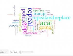
I had a total of 716,018 words and a total of 27,362 unique words. The first thing I noticed and the largest word (which I cut) was Obamacare. The other words that stood out to me were ‘Trump’, ‘GOPrepeal’, ‘repeal and replace’, ‘healthcare’ and ‘insurance’. The most amount of tweets seemed to occur on February 28th and February 26th had the least amount of tweets, but February 26th had the highest vocabulary density while February 28th had the lowest. The most frequent used words were Obamacare and repeal, but after I made Obamacare a stop word, the new words that stood out to me were repeal, repealandreplace, speakerryan, aca and healthcare. These are all extremely useful and relatable to my topic and were words that I expected to see. Words that I did not find to be useful were disaster,
The stop words I added on top of the stop words we were advised to use were: â, ðÿ, just, care, and cont. I also had same random twitter handles that I placed in the stop words, as well as more funky letters/symbols. I included 45 terms in my word cloud. I thought that this would be a perfect number to use in my word cloud.
The words that I expected to see were healthcare, repeal, trump, insurance and speakerryan. I did not expect to see all the weird letter characters, as well as random Twitter handles. I was expecting to see more words involving race or social class as I feel like certain groups are definitely going to be affected more if Obamacare is repealed than others. One thing that I saw that was interesting was that speakerryan was a word that was in my word cloud, and this was interesting because when I was going through my tweets in the previous two weeks, I noticed that many of Speaker Paul Ryan’s tweets were being retweeted. I looked up what Paul Ryan has to do with Obamacare and after reading a CNN article, I found out that he recently has come up with a plan to replace Obamacare, and it’s refundable tax credit. This is something I want to do some further research on to see how Ryan and other political figures are involved with Obamacare. All the topics in the word cloud were obvious and this word cloud has not really changed my perspective when analyzing these tweets.
The terms that I have chosen are repeal, repealandreplace, healthcare and speakerryan. The reason why I chose repeal and repealandreplace is because the issue at hand right now is that Trump wants to repeal Obamacare, so I thought that these two terms would be good to use. Obamacare is all about healthcare, so I thought that healthcare would be appropriate to use. I chose speakerryan because like I said, I’ve noticed a lot of people retweeting his tweets and thought it would be interesting to analyze this word’s trend.
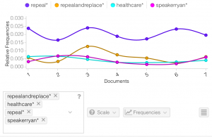
I was pretty surprised at how consistent the trends were for each word: repeal, repealandreplace, healthcare and speakerryan. Repeal seems to me the word used most and stayed consistent the whole time. Repealandreplace started off slow, then picked up some speed, but then declined again. I thought it was interesting how healthcare and speakerryan had almost identical trends for all seven days. They were both very consistent, and as you can see in the turquoise and pink line, the lines are almost on top of each other.
http://voyant-tools.org/?corpus=87a29260f5691abec15cff96a627bfe1
http://voyant-tools.org/?corpus=87a29260f5691abec15cff96a627bfe1&stopList=keywords-549ecca3cc13b0798ae630afc5eb2612&panels=cirrus,reader,trends,summary,contexts
I chose the New York times article “House G.O.P Leaders Outline Plan to Replace Obama Health Care Act” by Robert Pear and Thomas Kaplan because I was interested in learning about the new plans these leaders have to replace Obamacare. It was interesting to see the similarities and differences of their proposed plan to Obamcare. The words I got put in the stop word box were: number, thursday, document, mar, clear, coverage, said, make, need, and buy.
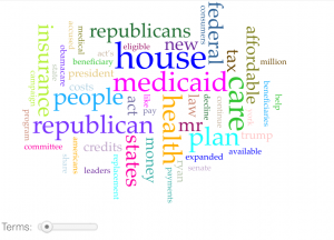
I believe that this word cloud connects to the American aspects of my dataset. I noticed a lot of similarities between this word cloud and the word cloud from the different tweets. This hasn’t made me look at my data a very differently as these words were just used in different context (article vs. tweet). This has given me an idea on what is talked about in a majority of articles that are written about Obamacare. It gives me an idea on what our government leaders are saying about Obamacare as well.
After examining both quotes by Tufte and Yau and analyzing my data, I believe that Yau’s approach is the best. Yau wrote that “Data is an abstraction of real life, and real life can be complicated, but if you gather enough context, you can at least put forth a solid effort to make sense of it” (2013, 41). Twitter has been a place where people have been expressing their voice on what they think about Trump repealing Obamacare. Based on Yau’s quote, I believe that I have been collecting is telling a story in a way; I am looking at different perspectives that people have on Obamacare and Trump’s decision of repealing it. I’m getting a story from people of different genders, different races, and people of different social class. The people of this country really have no say on what can happen with Obamacare. All they can really do is have their voices heard and hope for the best.
Literature cited:
Luhbi, Tami. 2017. One thing Paul Ryan’s health care plan has in common with Obamacare. CNN Money.
Pear, Robert and Kaplan, Thomas. 2017. “House G.O.P Leaders Outline Plan to Replace Obama Health Care Act”. New York Times.
Yau, N. (2013). Data points: visualization that means something. Indianapolis: John Wiley & Sons.
Hi Danny. I was very impressed with your introduction to Lab 3 in which you took what you learned from the previous two labs, and predicted what you expected to see stand out in the text analysis. I thought it was a very great start. I was also amazed by the high number of total words that you saw in your results. You have nearly 650,000 more than mine and about 7x more than Caroline’s. However, your unique word count is much lower than both of ours… I found it very interesting that speakerryan was a word that appeared often in your visualization, because I, too, did not know the extent of his involvement in Obamacare.
Something for you to consider in your next lab is to make sure to define the words that might be unclear to the reader. For example, I had to look up potus because I wasn’t sure what it meant. I found out that it stands for “President of the United States”… Good to know! I will now use that term in my every day dialogue. Something I liked about your lab which I did not do was the low amount of words you chose for your visualization. I chose 145 tweets to depict my story, where as you chose 45 tweets. I think that your visualization is much easier to read, and there isn’t such a variance in size between the common and uncommon words.
Good Morning Danny! Firstly, I found it very insightful that you used your knowledge from the past 2 labs to make a prediction to on what you will see in this lab. I too did something similar when trying to make a prediction for my data from this week. I am amazed by how many words you had. That is a crazy amount. I agree with you when you say in Katherine’s post that you wish you had used more words in your word cloud, I feel like it would had added more insight to your data.
I found it interesting how stable your graphs were with the terms you picked. I think that is cool because it is different from the trends from mine or Katherine’s data. Looking at your post, I wish I had chosen an article that correlated which my data more. I agree with you that Yau’s approach is best because our data is coming from Twitter which is a place where people can share their opinions and story’s which helps us gain context.