
Part I: Cleaning (Organizing) Data for Visualization
I chose the first 3,700 tweets from my dataset. I have over 130,000 tweets, but this small sample of focus is quite important because it is closer to the beginning of #Trump ‘s #muslimban, as well as when #Trump took office, which clearly sparked a lot of tweeting that included my topic #Syria. The tweets are from the earlier portion of February (February 7-8). This lab utilizes Gephi, an interactive visualization platform, to assess connections between different twitter users who discuss the same topic of #Syria in their tweets.
After running a python script to extract some of the data from my Excel file of tweets, I was left with a Comma Separated Value (.csv) sheet with only two columns (A and B columns). Column A was the source, or the source of the tweet (user), and the B column was the connection to another user/tweeter. Some cells in the ‘source’ column do not have a matching cell in the B column, or in other words it is blank. I believe this is because there was no connection to another user from that source, just someone who tweeted about the subject of #Syria.
Part II: Les Mis Gephi
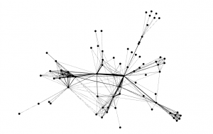
After downloading the Gephi file and opening it, I got a graph that was not yet analyzed to show the connections between the character. See below.
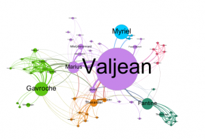
From the list of Nodes, Valjean is ID# 11. Fantine is ID# 23. What can be seen from the Data Laboratory tab is that Fantine is most likely the source because of how many targets there are from #23. Although Valjean is the main character in Les Mis, Gephi helps to show the complexity of the plot because Fantine has more targets, or connections than he does by 5. There are a total of 77 nodes and 254 edges in the graph. Next, I analyzed the graph with various preset algorithms to get a better idea of the relationships/connections between the characters.
Using Force Atlas algorithm to distribute the data in a pretty way, I got a result that looked like this: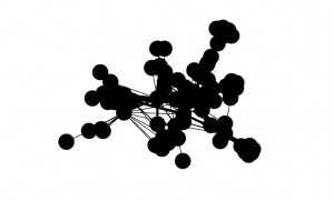
The nodes are extremely clustered so I had to play with the repulsion strength from 200 to 10000 as instructed to better see the relationships and connections from Les Mis. Below is the result after increasing the repulsion strength. We can now see how significant certain connections are compared to others based on the edges!
After playing with the attributes of the nodes and giving them a color scheme. I ran the Average Path Length algorithm which shows the avg. number of connections between people in the dataset of tweets (degrees of separation). The diameter is also an important figure, showing the larges value of degrees of separation between two users. For the Les Mis graph, the APL is 2.64 and the Diameter is 5–meaning 2.64 avg degrees between each character and no more than 5 degrees of separation between any two characters in the story. Next I played with the Betweeness Centrality to change the size of the nodes; the larger the node, the more connections/relationships a character has in the story. Setting the betweeness centrality under node size settings to Min 10 Max 200, it gave a great contrast of who has the most significance based on number of relationships in the Story. As seen below, and as predicted, Fantine is certainly the source and Valjean the main character. Running a Modularity algorithm and playing with Labels and sizes shows us sub-groups within the larger network of characters. Connected Components, which measures if these nodes are connected into certain sub-groups, came back as 1 because all of the characters in the story are connected, it is the Modularity we look at to determine the interactions (Modularity class is what we look for). Even though all characters are connected they do not all interact. This is seen in the final Les Mis Visual analysis below. After applying a personal colorization to the Modularity class results, filtering a little to limit clutter, I produced my final graph. Check it out below and see how each algorithm we ran played a rule in visualizing this Les Mis character relationship graph to tell us whats going on in the story!
Part III: Analyzing the Data
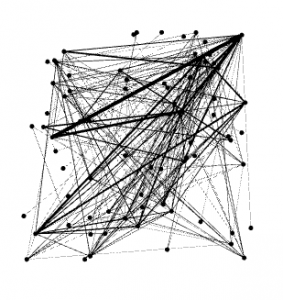
For this part of the lab I used the Gephi application to visualize the connections between twitter users I captured with my TAGS scraper. For the sake of this lab we used 10,000 as the repulsion strength (size of the graph) because this is a good size for the visualization of roughly 3k tweets. Other important figures include the Diameter, and Average Path Length. The Diameter for this graph was 14, meaning users were at the most 14 connections or degrees separated . The APL (average path length) is 5.132, meaning on average there were about 5 connections between users in my dataset, or about 5 ‘degrees of separation’. Out of 3,700 tweets, there were 422 connected components, meaning 422 connections to different subgroups (different color groups of nodes). Not everyone is connected to everyone, but there are a good amount of conversations happening here. I set Betweenness Centrality, or size of nodes at Min 10, Max 300 for a nice proportion to see who is a prominent tweeter on the topic, and who is not.
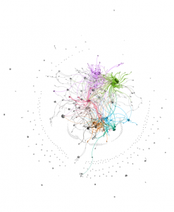
In analyzing my data visualization, I noticed quite a few things. For one, The graph is extremely interesting looking. A ring of smaller nodes surrounds a large, almost Jackson Pollock-esque creation of nodes and edges that are going all over the place. The sources which created the outer clusters of nodes are frequently not connected with the inner cluster of nodes and groupings, I believe there is a good explanation for these groups of singletons. These clusters seem to be users with little followers on twitter, speaking in broken English about #Syria conflicts on Twitter–unconnected to the major users/accounts that are connected to a lot of people, like the more prominent accounts tweeting on the topic during this period in February. The most prominent accounts include @Amnesty, @Syriatweeten, and @Tahrirlive. Each users have very different sized nodes, yet are much more prominent than others. @Amnesty stands out the most. With 911k followers and a little over 14k tweets, this user has made a significant amount of connections to other users under the topic of #Syria. This, however, is logical and somewhat expected. Second is @Syriatweeten, which was a very large number of tweets (>250k), but only 3k followers. This account is most likely prominent because of the large number of tweets it has, statistically speaking it is only sensical this user would show up having tweeted about #Syria on a nearly infinite amount of circumstances
As it Is shown a lot of twitter users remain unconnected with each other and the major accounts associated with the topics they choose to tweet on. Because this top is foreign in nature and extremely political, I expect to see a lot of random ‘rant’ tweets on the subject with either little facts or information included but still pertaining to #Syria. This particular time period was obviously a great choice for this graphing lab, the clusters and connections created at this time of heavy tweeting on the subject, and right at the time of the #muslimban painted a great graph with phenomal clustering. The singletons tell a great story (as described above), also. The only things I can determine are missing from this graph are some of the common terms used in the middle east as seen in SOME of the tweets that pertain directly to #Syria topics and discussions. Examples of these words can be found in the last lab of Word analysis. If I was able to capture tweets with these words in them, directly relating so #Syria, I am confident there would be a ton more connections. Overall, this lab was very helpful in establishing a good visualization of the connections between twitter users who tweeted on the topic of #Syria collected between Feb 7-8, 2017.
Ian
In comparison to my data I think its interesting that you had a smaller diameter and average path length than me, as this means you had only 5 degrees of separation. As I scrolled down on your post your graph immediately caught my attention as it looks a lot different than mine and Jack’s graph. I liked the colors you used as it enables me to see the main connections. I thought it was interesting that your singletons were organized in a circle as mine were more randomly placed throughout my graph. I also find it fascinating that your relationships are so concentrated in the circle. When talking about your data I find it interesting that you were able to see tweets spoken in broken English about your hashtag. This shows that people all over the world are concerned about what is happening in Syria. I also like how you made the point that your singletons tell a story. One thing I am surprised by is that you didn’t have tweets relating to the accounts of realdonaldtrump and potus. Overall I think you did a great job on this lab!
Ian
First of all, I bet your tweet count skyrocketed over the events of the past few days. I’m looking forward to seeing what kind of tweets you have in your next analysis, and seeing if the chemical attack and ensuing air strike in Syria changed the dynamic of the #Syria hashtag. It would be incredibly interesting to run this same analysis again, but focusing on specifically the time of the chemical attack through the airstrike and its aftermath. If i were you I’d definitely focus on this group of tweets for the next lab.
I thought it was really cool how different your visualization was from mine, despite us having hashtag topics that are often discussed in similar ways. I think the high number of isolated users show a lot of people tweeting about #Syria with genuine concern about the subject. These are likely very raw and real tweets, and possibly first hand since you mentioned that there were many in broken English. Overall, great work on the lab, and I’m looking forward to reading your next one.