
I chose to work with the most recent 3,000 tweets on #climatechange because it was so much data, that it kept freezing and was just simply easier. The tweets ran from March 22 to March 27.
I chose data extraction #1, because I did not want to differentiate between retweets and non-retweets, and include singletons. I am not sure what I expect to see from the extraction, but I assume #1 is more than 2, 3, or 4.
Some columns might be blank because they did not mention anyone in their tweets, I imagine.
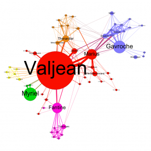
The number of people in Les Miserables are connected to each other in various ways, but some of the lines seem to be more bold than others. I would choose directed for my graph because I want to see the direction in which people are tweeting. That is, if I bunch of users are tweeting at one user, that is important and very different than if that one major user is tweeting at a bunch of other users. In regards to Les Miserables, undirected would be better. Valjean has ID #11.0, and Fantine is #23.0. Valjean is talking to four different characters, and Fantine is talking to 9 different people, and their ID #s seem to be in order. Maybe the characters’ ID #s are assigned based on their order of appearance?
The big bubble is darkest, and seems to be the character talking to the most people.
MY DATA
For the repulsion strength, I chose 10,000 because I wanted them more spread out. Modularity measures how well a network decomposes into modular communities, and mine is 0.951. Connected Components measures if nodes are connected into certain groups, and since mine has 924, it suggests there are a lot of people talking to many different people about #climatechange. The average path length of my data, which is average number of connections between people, is 6.892, meaning there are about 7 degrees of separation in my dataset between people on average. This suggests the people talking about #climatechange don’t know each other that well, when compared to some of the people around me who have 1 to 2 degrees of separation in their dataset. The diameter of my dataset is 22, which means that people are at most 22 connections apart.
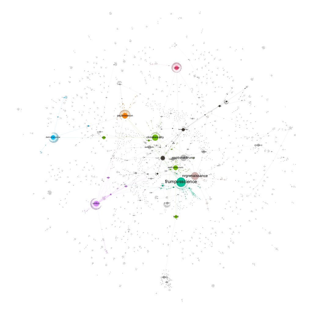
@TrumpvsScience is my biggest node, which is a popular Twitter account that throws evidence at Trump’s unscientific and derogatory comments about science. It has a lot of edges, meaning a lot of people are retweeting some of their many tweets. Another big bubble is @NRGrenaissance, which tweets a lot (207k), but has relatively few followers (3,672), and has very few edges. This means that @NRGrenaissance uses the hashtag #climatechange a lot, but not many people are communicating with them (retweeting or replying).
Not surprisingly, @realdonaldtrump is one of the bigger nodes, yet has few edges, which is surprising. I believe this means not many people care about what President Trump is tweeting about regarding #climatechange? @PaulEDawson has appeared in my data a lot this semester, but I never knew who he was until now. He “Promotes stories and awareness of #climatechange,” according to his Twitter bio, and seems to tweet a few times throughout the day, and has close to 10,000 followers. What is most interesting is that of the tweets I see from him, they all use #climatechange. This would explain why his node is quite large, yet he has one of the most amount of edges in my dataset. This means people are really following his tweets and likely retweeting what he says. Another medium sized node with many edges is @UNFCCC, the official Twitter account of the United Nations Climate Change Secretariat. With 370k Twitter followers, it is no surprise there are so many edges.
Other than these big nodes, there are a lot of little stranglers with a few edges between many separate nodes. I notice very few singleton nodes who don’t have any edges, with most of the singleton nodes having at least a few edges. This likely means everyday regular people are generally tweeting about #climatechange, but since they aren’t a big wig Twitter user with lots of followers, they have few edges, but at least their friends agree with them and are tweeting back and forth. I think to my topic especially, this is incredibly important because it shows all types of people are talking about climate change.
I also noticed that most of the tweets and popular nodes (Twitter users) in this dataset are all pro climate change reform. The large nodes are accounts that are trying to raise awareness of climate change, which is what I’ve been finding throughout my semester of data mining. Basically, there is no one good conversation about climate change, but lots of people are having their own conversations about it.
The Trump vs Science account is awesome. That made me laugh and I love that account is tweeting about how Trump is ignoring the data and the evidence of climate change. You have a lot of big name on your user pages and that really good to see the nodes gravitate to the larger nodes and begins to create a conversation between the users and the data. It again is the polar opposite of my data in that I have no conversations going on in my data and that nothing is connected.
I also found it interesting how @realdonaldtrump had such few edges, I feel like this speaks a lot to how people have disregarded what he says about #climatechange and turn to fueling support and reasons to pay attention to the topic, rather than negate and counteract those who disagree to just create an online argument. I think it would be interesting to investigate the many different pro climate change conversations within your data to understand what differentiates them from one another, what stances/angles each pro convo takes to enhance the conversation and progress to different climate change reform. I think it would be interesting to see how the different pro climate change conversations parallel to the #keystoneXL project and if they support particular reforms that are expressed in your data.
Wow! Your data analysis surprised me a lot! I would have thought there would have been a lot of interconnection in the conversation on Climate Change. However, I think you’re correct, it does seem as though the conversation is actually many different ones. Perhaps that points to how multifaceted the issue is? It’s funny to read that people seem to be ignoring McDonald – I wonder though how many of those tweets were actually supporting his claims? Your discussion of nodes and edges was really interesting as well. I was terribly rushed in my analysis so I did not get a chance to analyze my edges and nodes to the degree you did, and I really wish I could have! Also super cool to see you figured out who @PaulEDawson is – I think making those connections is the coolest thing about all this analysis.