
When comparing our graphs as a group we were able to see how our data stood amongst other topics of interest. By placing these under comparison we were able to see the ways in which our findings differed from one another and draw conclusions from abnormalities. In the second lab we found that many of our mappable tweets were extremely similar to one another and seemed to exist within the same areas (major cities).The fact that these graphs were similar was pretty expected, given that the three of our issues tend to generate discussion from similar groups of individuals. With this in mind, it soon became apparent that lab one did not show us anything really abnormal about our data. Although it was interesting to see the amount of mappable tweets I had within my data, the information I got from this was not exceptional enough to form a strong thesis from. We found that the text analysis proved to be extremely informative for all of our hashtags. Due to the fact that the text analysis displayed the major terms being tied to our hashtag, this really helped us better understand the actual discussion being generated around our topic and the ways in which our hashtag was being used. I found it very informative to look into my most frequent words that my text analysis displayed. In the fourth lab we all also found the network graph to be very telling when understanding an overall story that our data is displaying. Although my graph is not as abnormal as Olivia’s, I found it to be very informative and contributed to the trends I was seeing in my last lab. In the fifth lab we found it interesting to see the numerous languages that were being used, but there was nothing really groundbreaking with this data. We all found that English was the predominant language, which is what we expected due to the fact that we had already determined most of our tweets were within the United States.
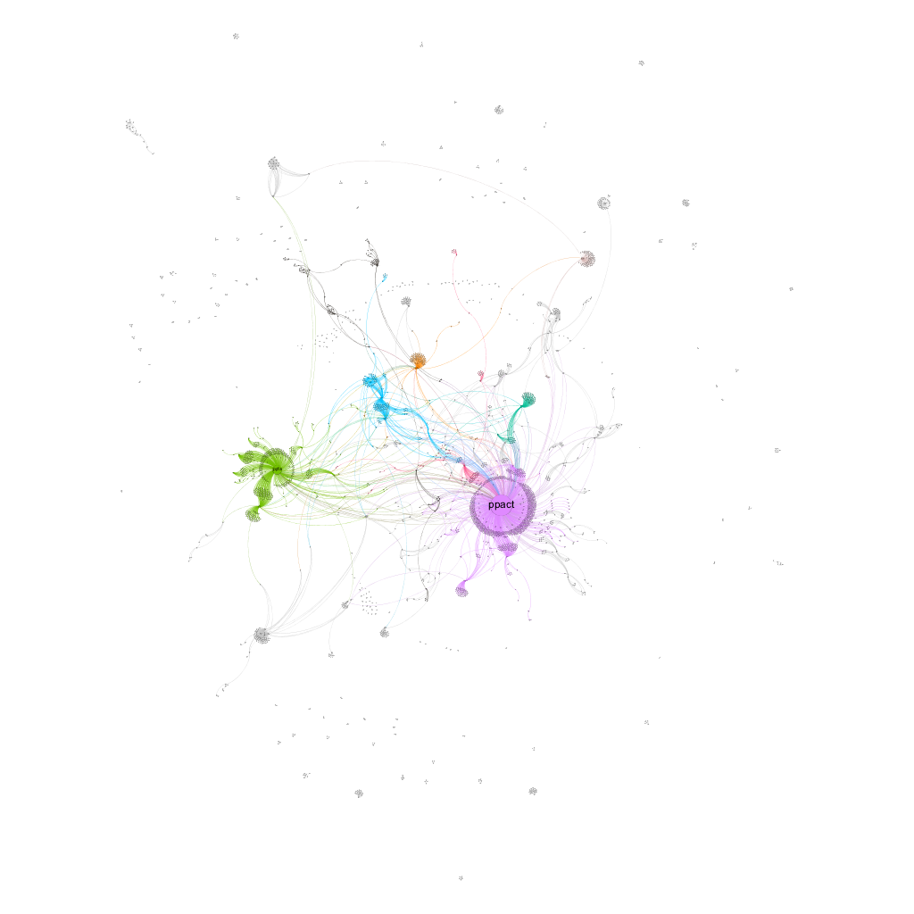
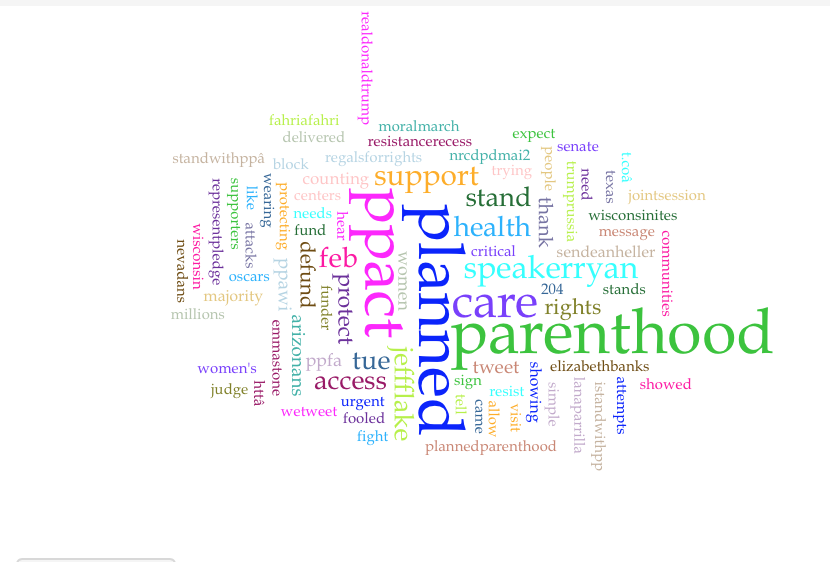
It seemed as though that across the board one of the graphs that tends to tell the strongest story was the networking graph. In this graph I was able to draw interesting conclusions regarding the twitter accounts that were generating the most discussion and analyze the importance of this. Something interesting that I personally found was that the planned parenthood action fund was being tweeted at more than the regular planned parenthood account. I found this to be extremely interesting and spoke a lot about the type of individual using my hashtag. This was able to show that those who were tweeting using my hashtag were individuals who were actively standing for planned parenthood and were taking initiative in doing so. While one would assume that the general planned parenthood account would be interacted with more, I believe this points at the nature of the tweets that are being composed using this hashtag. With my previous finding of the type of individual using my hashtag being a more active presence, it would make sense that they are interacting more with the action fund. They are most likely trying to raise money for planned parenthood in hopes that it will aid in supporting it from being removed. The second graph I found to be most essential when understanding the story that my data was telling was the text analysis graph. This became informative due to the fact that it displayed the major words being used, displaying the overall conversation regarding my topic. The most frequent words that were used in the corpus were planned (1770); parenthood (1768); ppact (1660); care (1124); speakerryan (597). I found it interesting to look further into speakerryan and found an article from CNN regarding the topic- http://www.cnn.com/2017/01/05/politics/paul-ryan-planned-parenthood-obamacare/ . This article discusses how Paul Ryan announced that Republicans are moving to strip all of the federal funding for planned parenthood in order to begin their process to dismantle Obamacare. This displayed how my tweets revolved around taking a stance around most recent acts to take away federal funding from planned parenthood, showing these users active engagement in the cause.
- First graph of mappable tweets- all of us found similar percentages of mappable tweets (1 percent or less)
- Olivia’s network graph was interesting and varied from the rest of the class. While she had numerous networks of users, they were all engaged in the same conversation.
- Julia’s tweets by language showed how current and prominate of an issue Planned Parenthood is.
Final Presentation Focus:
- When understanding the hashtag #StandwithPP it is important to note that those who are tweeting using this hashtag are doing so to actively create change.
- Writing with the intention of standing with planned parenthood during a time in which its position is at risk due to current political decisions being made.
- Profile the type of individual who is using this hashtag and what is provoking them
I agree that using the networking graph in the presentation will provide the most significant information for the class, as it shows who is talking with whom and can indicate some of what the Twitter society is talking about.
Your arguments are clear — what literature/readings will you choose to bring them together and strengthen them?
Also, something it would be exciting to hear you touch on: why do you think debates around feminism and queerness took the form they did? That relates to Katherine’s SNA as well–are a lot of folks tweeting? Or maybe are they using other issues?