The Open Communities Alliance has developed a tool to help individuals with housing subsidies find better communities and homes. While it is an excellent initiative, the mobility app is not yet as effective as it could be in helping people find homes and communities to move into. Through a housing information event organized with the help of the Open Communities Alliance and the Middletown North End Action Team, our class was able to conduct interviews with local who would potentially find the application useful. The interviews and data from the housing event indicate that while there is a clear interest in information about housing, the Mobility App is not highlighting the information that many individuals are interested in.
One of the largest problems with the app as it is currently designed is that it does not supply information about housing opportunities that app users can actually inquire about renting. The app has good information about opportunity levels and assets surrounding certain addresses, but this only goes so far in helping people find places they may actually live in. The Open Communities Alliance website states, “The Alliance is dedicated to bringing resources to lower opportunity areas and linking to higher opportunity areas people who historically have not had access to them.” To this end, it would be helpful for the housing mobility app to have access to information about specific apartment or houses to rent in higher opportunity areas.
People who attended the community housing workshop we held at the North End Action Team on April 15 cited the app’s lack of real listings as one of its most significant flaws. One participant said, “What are these, like, spots you can move?” when ze saw the dots for the neighborhood assets (Participant 10A). The same participant commented that ze liked the security deposit on the Portland, CT listing we showed workshop participants. This suggests a demand for information about specific housing opportunities in addition to the information about neighborhood assets and opportunity levels that the app already provides.
In the next version of the app, it would be helpful to incorporate housing listings from a rental listings website, such as Trulia, and to have these listings represented as points on a map of the area. A comparison of listings of Middletown apartments on Trulia, Realtor.com, and Zillow suggested that Trulia might be the optimal choice for a source of data to use in conjunction with the app. Trulia had more listings overall for Middletown housing opportunities (38 postings, compared to 28 on Realtor.com and 26 on Zillow) and more listings for opportunities under $1000/month (15, compared to 12 on Realtor.com and 9 on Zillow). An advantage of Zillow, however, is that Zillow presents its listings on a map of the area, which is what we propose for the app to do as well. Therefore it might be easier to pull location data from Zillow listings than from Trulia, but this would need further investigation by someone more familiar with the technical demands this would impose.
To make the listings very visible and simultaneously address participants’ concerns about the opacity of the opportunity level orange shading, we propose that the opportunity levels for individual listings be represented in the color of the balloon indicating an apartment or house for rent. A really clear redesign would be to completely remove the census tracts, but to color code the available housing markers by census opportunity level. This would allow users of the app to see clearly where the apartment or house was located with respect to familiar streets or neighborhood assets while also benefitting from the information about opportunity levels. Here is what this might look like:

To distinguish the listings from neighborhood assets and to ensure that the listings were the most prominent feature of the app, we propose that they be represented as balloons akin to the ones Google uses. Users could click on the balloons to get more information (opportunity level as well as a link to the posting on Trulia or Zillow) about the house or apartment listing. The neighborhood assets could be dots as they are in the app currently. This change to the app would allow housing listings to come first, which could really help people looking for housing make their decisions based on actual listings and locations without sacrificing the important opportunity level data and neighborhood assets.
The feature that was least evident to most participants was the transportation information. In the current format of the app, transportation is limited to a “get directions” link that takes the user to a new Google Maps page. Before it was explained, none of the fourteen participants clicked on or described the presence of this feature. This is a terrible shortcoming of the app, considering how important access to transportation is to most individuals when considering a new home or school for their children. Participants 3, 4, and 14 all referenced a need to understand different aspects of transportation during the process of finding housing despite there already being a section of the tool dedicated to housing. Any redesign of this tool must address this issue, because the inclusion of neighborhood assets or housing offerings are not as enlightening when users can’t find out how accessible they are.
It’s clear that linking out of the application for transportation information isn’t a very obvious feature to many. It would be better to include transportation information directly in the app. This way, it would be easier to use alongside visuals for opportunity level, housing, and neighborhood assets. The first and most simple step is to use a street map for the application instead of the map of census tracts. Being able to visualize a neighborhood’s roads and streets is the first step to understanding how one’s day to day travels will pass. The census tracts give very little in the way of understanding scale, population density, and nearness to highways or public transportation, all of which have an impact on living.
The next truly helpful asset would be to add bus (and other public transportation) routes and stops directly to the app. A good redesign would include an overlay of the different routes and stops on the map. Users should be able to hide or show this feature, just like the neighborhood assets. Also like the neighborhood assets, when clicked, the line would show a text box with the name of the bus or stop, along with a relevant phone number for the area’s CT Transit. This feature would not replace the “get directions” link, but would rather enhance its function. While this tool would not be as effective as the “get directions” link in finding tangible directions, it would provide a quick and broad understanding of how transportation in different neighborhoods compare to each other. This is an important layer of understanding that is not covered in the neighborhood assets or the opportunity index – a neighborhood can have wonderful schools, low crime, and high average incomes, but if life there requires a car, these positives would be of little use to a family without one.
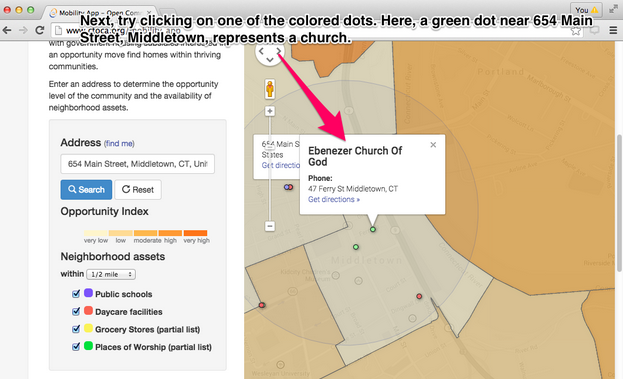
The neighborhood assets feature was by far the most utilized in our housing workshop. Ten of the eleven individuals who clicked on any part of the application without assistance first clicked on neighborhood assets, and all eleven clicked on neighborhood assets at some point. By comparison, five people clicked on the shapes representing census tract opportunity level at some point, and no one clicked on the “get directions” link. This implies two things: That the way in which the neighborhood assets are represented in the tool is highly effective, and that neighborhood assets as a category are interesting to individuals who the app is designed for.
Many of the participants used items that could be labelled as “neighborhood assets” to decide whether or not a potential new home was in a good area. For instance, Participant 5 was interested in living near a community center. Participant thought that adding more points for things like public parks. Other participants wanted to find libraries and hospitals. These all could be listed alongside the current neighborhood assets.
In many ways, individuals were looking to these points as indicators of a good area. This is understandable – it is often crucial to live within a safe walking distance to a school or grocery store, or at least a bus stop to get there. For many, this is a basic necessity when looking for housing. However, this information in itself cannot stand in for the opportunity data. One might assume that high opportunity neighborhoods are more likely to have more neighborhood assets, but a quick examination of the mobility app shows otherwise. For all of the urban centers in Connecticut, the city center tends to have a lower opportunity level and quite a lot more neighborhood assets than the surrounding suburbs. This makes perfect sense, but it means that neighborhood assets alone are not adequate indicators of high-quality neighborhoods. Opportunity levels are also important to show, but their representation must be reworked to improve engagement.
Additionally, a stumbling block to many users of the app was the app’s overall lack of intuitiveness. Many participants in our focus group indicated that they were confused about what to do with what they were seeing in the app.
One specific major issue common across several participants in our housing workshop was that they found it difficult to orient themselves in the map. People said things like “How did I lose High Street?” (Participant 1) and “like where would Main…does it show like streets? Like where would the Y be from there?” (Participant 13), which indicated confusion. By changing the opportunity levels to colors of the balloons, as suggested in our discussion of housing listings earlier, the map would be clearer, and participants would be able to see specific streets and familiar landmarks more clearly. Having features pop up when you hovered the mouse over them instead of when you clicked them would also help with increasing the ease of use and reducing the clutter of the app.
Part of this struggle we observed in some of our participants may be attributable to the digital divide. A majority of the participants in our housing-app test session were not familiar or proficient at using computers (only 43% of our participants could use the search tool unassisted), and this represents a major potential-user population that may need different features to help them use the app. Several participants who were not very familiar with computers indicated that something of this nature would be helpful. One participant said, As Participant 5 said, “I think if something that could explain it for people that don’t know the computers, that would be really helpful.” Other participants indicated that more guidance would help them, making statements like “So what are we looking for?” (Participant 9M) and “So what do I have to put there?” (Participant 11). If people can’t figure out how to use the tool on their own, they will not be able to take advantage of the valuable information the app contains.
A thorough tutorial that explained in detail what information to put where could help self-described “computer-illiterate” people use the app. Ideally, the information in the tutorial would go down the the level of telling people what to click on and where to type in information to help people who were extremely unfamiliar with computers and might not have the same intuition-based abilities to figure this out as more computer-savvy users. This might look something like this: (note: We’d like to turn this into an embedded slideshow)


We believe these suggestions will improve the housing mobility app and increase its utility and ease of use for those most in need of better housing opportunities. With our additions and revisions to the app, people will be able to find specific places to live, get a realistic sense of their transportation options, see enriched neighborhood assets, and understand how to make use of all this information even with limited computer skills. The Housing Mobility App has the power to be a tremendously helpful resource to housing mobility counselors and people looking for better housing opportunities for their families. These suggestions would make the app even more closely aligned with CT Open Communities Alliance’s mission to help people who historically may have not have had access to high opportunities have a chance to succeed.
Overall the essay presents some interesting redesign strategies for the app, but the essay feels like a draft. (See Google Document for extensive commentary.) The essay needs a description of the app to determine what features are being redesigned, and could benefit greatly from the use of hyperlinks so that readers could easily access the app. The essay is also missing works cited information, so without the hyperlinks and works cited information I was unable to access further information about the project. The stack of screenshots is not very intuitive for the reader, but a slideshow would be fantastic!
For each essay I copied the text into a Google Document so that I could make comments on the text. Here is your essay with my comments. http://bit.ly/1ciU4Ng
Here is a list of writing tips I developed while reading your web essays. I hope you find them helpful. http://goo.gl/KqLczU