Sheff Movement Coalition “Forty Years of Project Concern and Project Choice” (2008) from Trinity College on Vimeo
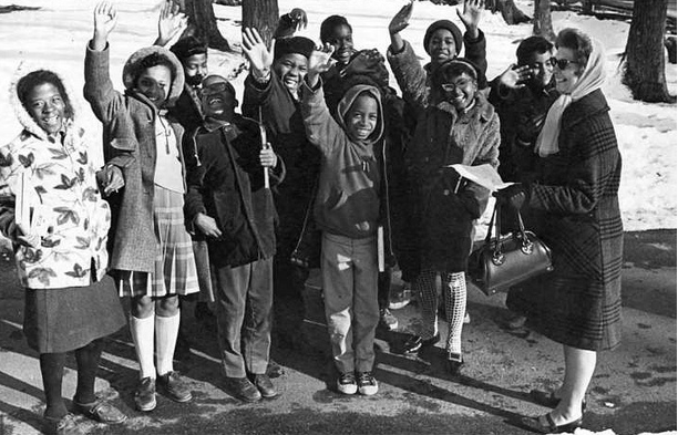
As said in the video clip above, Project Concern was “one of the first ‘interdistrict’ programs in the United States.” After the ruling of the Sheff v. O’Neill case, it was renamed Project Choice. Through this program students who lived in the Hartford area, were able to attend schools in the surrounding suburbs. In the clip, several individuals were interviewed, including students (past and present), parents and project staff, on how they felt about the program. Most of the interviewees were adults who had been students during the start of the program.

Although one of the interviewees expressed feelings of fear, as she had cried on the first day, the majority of the interviewees felt that being in this program was advantageous. None of them ever felt threaten as they went to school; on the contrary they recalled that the white students “welcomed them with open arms.” In all the interviewees felt that being apart of this program, even if they did not complete it, had left a huge impact on their lives.