Category: Data Viz Essay 2013
Protected: Q5: Change in Total Enrollment of CT Public Schools
Protected: Q3: Achievement Gaps by Race in the Hartford Region
Q1: Does it Take a Court Order to Desegregate Connecticut Schools?
Assignment Q1: How has student participation in magnet programs varied by major metro regions in CT (Hartford, Bridgeport, New Haven) over the past 5-10 years?
The lawsuit Sheff v O’Neill called for 41% of Hartford students to be entered in a desegregated school by 2013. One strategy to achieve this was the implementation of magnet schools, which are schools that draw students from many different districts. Because of the court order, it makes sense that participation in magnet schools in Hartford has increased over the past five years. However, interdistrict magnet school participation has also increased in New Haven and Bridgeport, where a court order was not issued to require increased enrollment in magnet schools.
I created a bar chart to convey magnet school participation in Hartford, New Haven, and Bridgeport to prove that participation in interdistrict magnet schools has increased in each region over the past five years. I used the 2007-2008 and 2012-2013 Connecticut State Department of Education (CSDE) choice program directory to compile a list of the interdistrict magnet schools in each region. Next, I used data in the 2007 and 2012 CSDE school level racial data file to calculate the total enrollment of students in magnet schools in each region.
Although I did have access to fall 2013 enrollment data, it was only for Hartford. It did not make sense to only display 2013 data for Hartford, when I could not for Bridgeport and New Haven. I found it more appropriate to create a chart comparing three regions with data from consistent years.
In Hartford from October 2007-October 2012, magnet school enrollment increased from 7,388-8,416 students, or 14.52%. Hartford created an additional magnet school in those five years, totaling 17 magnet schools in 2012. In New Haven, magnet school enrollment increased from 5,795-7,719 students. This increase of 33.2% may be due to the fact in five years, New Haven created an additional three magnet schools, totaling 16. In Bridgeport 2007, there were approximately 433 students participating in the region’s one magnet school. In 2012, there were two magnet schools with a total enrollment of approximately 930 students, resulting in a 114.8% increase.
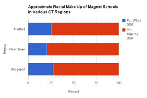
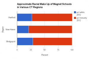
It is important to understand that just because there has been an increase in magnet school participation, these schools are not necessarily integrated. It is possible that the newly enrolled students are all of a specific race. To investigate this I used the 2012-2013 CSDE school level racial data and calculated the approximate average racial make-up of all magnet schools in each region. The split bar charts below reveal that over the past five years, although magnet school participation has increased, the average racial make up of all schools in each region has remained about the same.
Interestingly, even though average percentage of minority students in all Hartford area magnet schools is around 75%, as mandated by law, there is great variation in the percentage of minority students in individual magnet schools. I created an interactive bar chart to show that schools range from about 40%-90% minority. This proves that in Hartford, magnet school participation is increasing, but many of these schools are not desegregated. To create this chart I used October 1, 2013 enrollment data provided in Jacqueline Rabe Thomas’s recent article. I chose the percent minority from the “smallest group.” I was unable to create this chart for New Haven and Bridgeport because the 2013 race level data was not available.
To edit this essay, I first deleted a map that I submitted with the original draft. This map showed the location of each region and it’s total magnet school enrollment. I removed the map because it did not contribute a significant amount of information to the overall essay. In its place, I used 2013 race level data for the Hartford area to create a chart of the racial make-up of interdistrict magnet schools. This allowed me to display how there are stark variations between the percent of minority students in different Hartford area magnet schools. The point of this essay was to show that magnet school enrollment has increased even in regions where a court order does not mandate it. However, I make the argument that just because there is an increase in enrollment, the schools are not completely desegregated. The additional bar chart represents this perfectly because it shows how some schools are still dominantly white, while others are dominantly minority.
Evaluation questions:
Does the data visualization — and the accompanying short essay (no more than 500 words) — adequately answer the assigned question?
What works with this visualization & essay, and what could be improved?

