
In the first blog post I expounded upon the hashtag #TrumpTrain and how it is used with reference to the upcoming 2016 United States presidential election. Due to these remarks, I expect to see people using this hashtag primarily in the United States, as it is their election and they would clearly have the most to say about it. With that being said, I would not doubt it if I found several other countries who use it to express their opinions of the candidate Donald Trump. He has an international presence and I am sure many people from around the world have the desire to chime in and make statements about his campaign. Further, in reference to latitude and longitude: the vast majority of the tweets will be between 0º to 90º latitude and 0º to -90º longitude. My hometown is within these constraints; however if I had to specifically state where my hometown is located I would guess it is at about 45º latitude and 70º longitude. Although they may not be included in the ≈1% of data with tagged locations, I think that my town specifically is extremely interested in this debate. Being from Kennebunkport, I think we are extremely connected to the discussion of politics because presidents visit on a constant basis and there is always a heated debate as to who likes who and
117,567 Total Tweets, 30 tweets with geolocations, ≈0.025% mappable tweets. My first reaction to these numbers is disappointment. I was really hoping to see many more geolocated tweets given the vast number of original tweets. As Yau states, “visualization is a medium: a way to explore, present, and express meaning in data,”[1] he goes on to further this by stating, “visualization not only lends itself well to narratives but also clarifying and communicating ideas.”[2] With that being said, the extremely small amount of data is problematic as it does not express a large enough group of people to be considered influential. Although it may not be influential, it still contains meaning. I think that my data will be able to show how it a discussion centralized in the United States of America, but I personally would have like to see many more data points to act as a larger sample size. This small number can certainly underrepresent those who are in support of Donald Trump, or those who use the hashtag #TrumpTrain in a negative manner. To expound in this question further, I certainly do not think that I have big data. As boyd and Crawford discuss in the reading, Critical Questions for Big Data, “Big data is less about data that is big than it is about a capacity to search, aggregate, and cross reference large data sets.”[3] My data is not large at all, relatively speaking, and is not difficult at all to cross reference and search through. There are only 30 entries and thus, an extremely small sample that is in no way big data. In asking around people generally had less than me; however, when factoring the total number of tweets, their percentage was much higher that mine. I found this peculiar because I am under the impression that when you support someone or something you should not withhold information. If people are indeed not desiring to share their location on politically sensitive tweets, they may feel embarrassed or threatened regarding their political leanings. Secondly, I think that on a global scale, many individuals are becoming much more censored on social media due to the overall dangerousness of the internet and specifically the large number of hackers. There is a vast majority of pole who do not want to share their location simply for security reasons. In skimming through my tweets I found that they are certainly centralized in the United States (for reasons I previously explained), although I did find one outlier which I am very interested to find out where it is precisely located. Just based of my current latitude and longitude knowledge I think it may be located somewhere in Africa! Further, the languages all state “en.” This is due to the fact that they are all, for the most part, located in the United States where the majority of individuals speak english. This solidifies my reasoning that the majority of people who tweet using the hashtag #TrumpTrain are english speaking Americans.
To begin this discussion, I wanted to discuss my reasoning for the design of my map. I wanted to create clarity and make it very clear where these tweets were coming from. Thus, I chose the change the background of the map to green and turn the data point to contrasting colors of red and blue (for both contrast and patriotic reasons, obviously.) Upon a visual completion of the map, the first thing I immediately noticed was that the majority of the 30 tweets were located in Arkansas and the southern portion of the US as a whole. I think that this can provide insightful information that there are many individuals in this region who feel strongly, either for or against, Donald Trump. I think that these publicly expressed opinions are due to the frequent stops Donald Trump has made during this campaign in Arkansas. The numbers he pulled at his Little Rock rally were large and proved to be an influential piece to his campaign. I was not surprised to see that there were tweets form both Iowa and New Hampshire as they are two of the first states to vote in the 2016 election. The race in these past few weeks have been centrally located around these states.
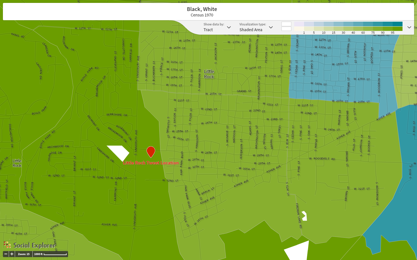
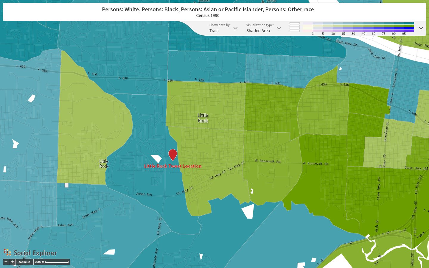
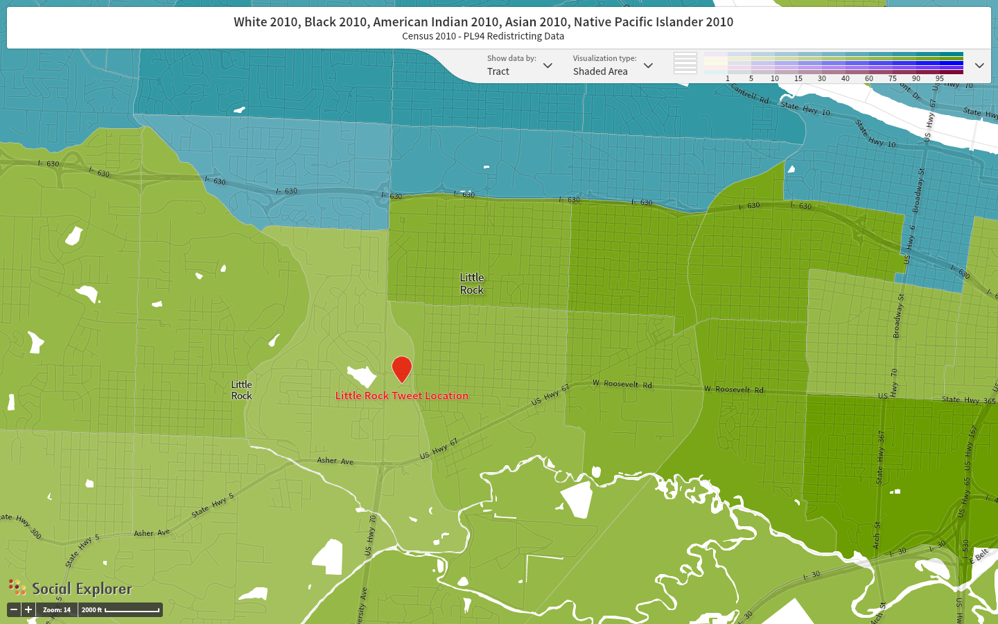
RACE: Blue = White Green = African American/Black Purple = Some other Race
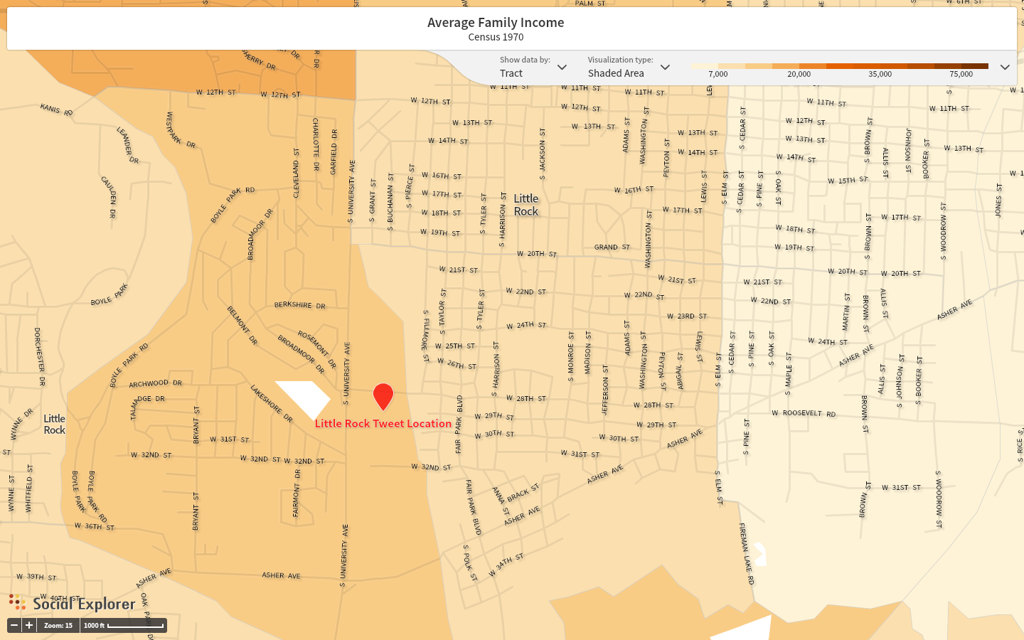
INCOME: Key is located on images.
`
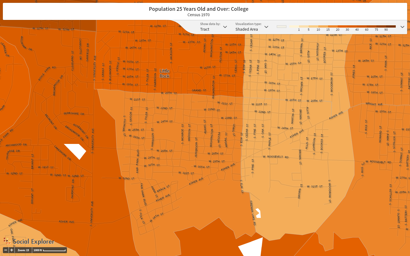
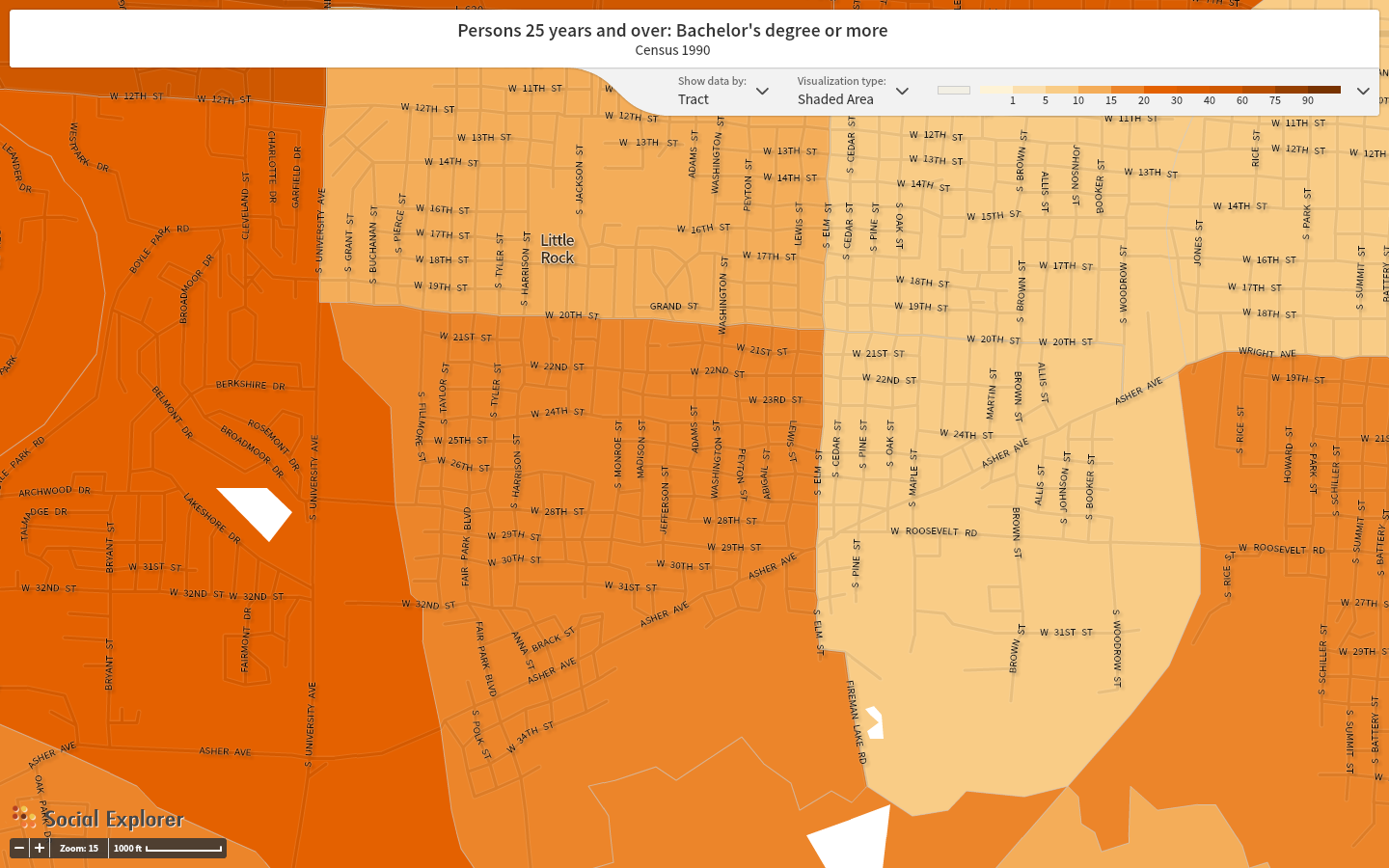
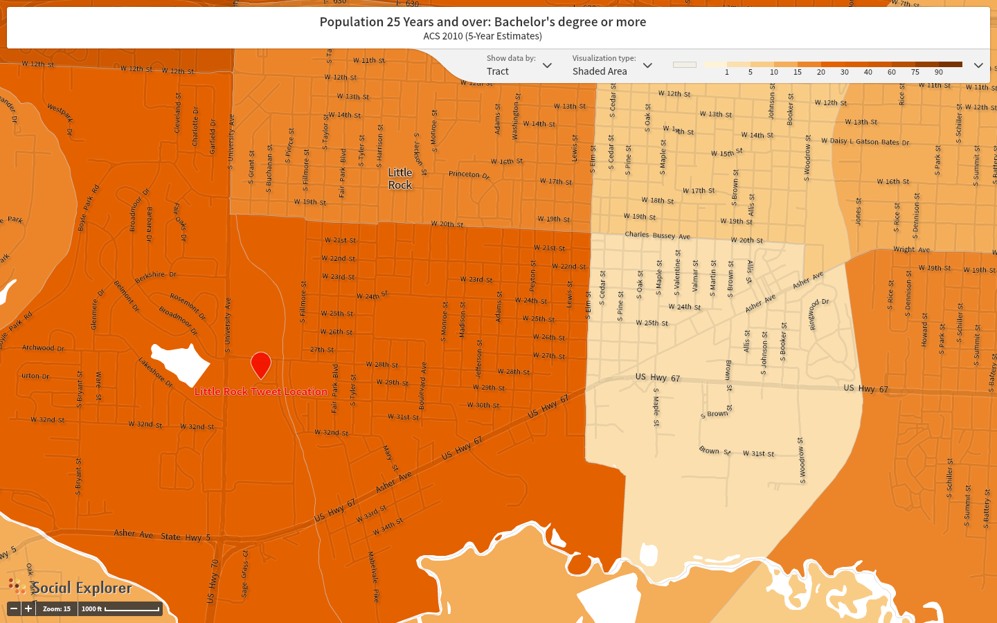
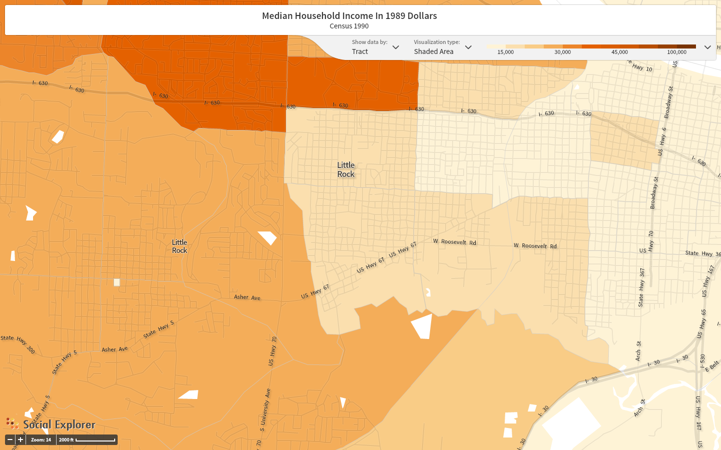
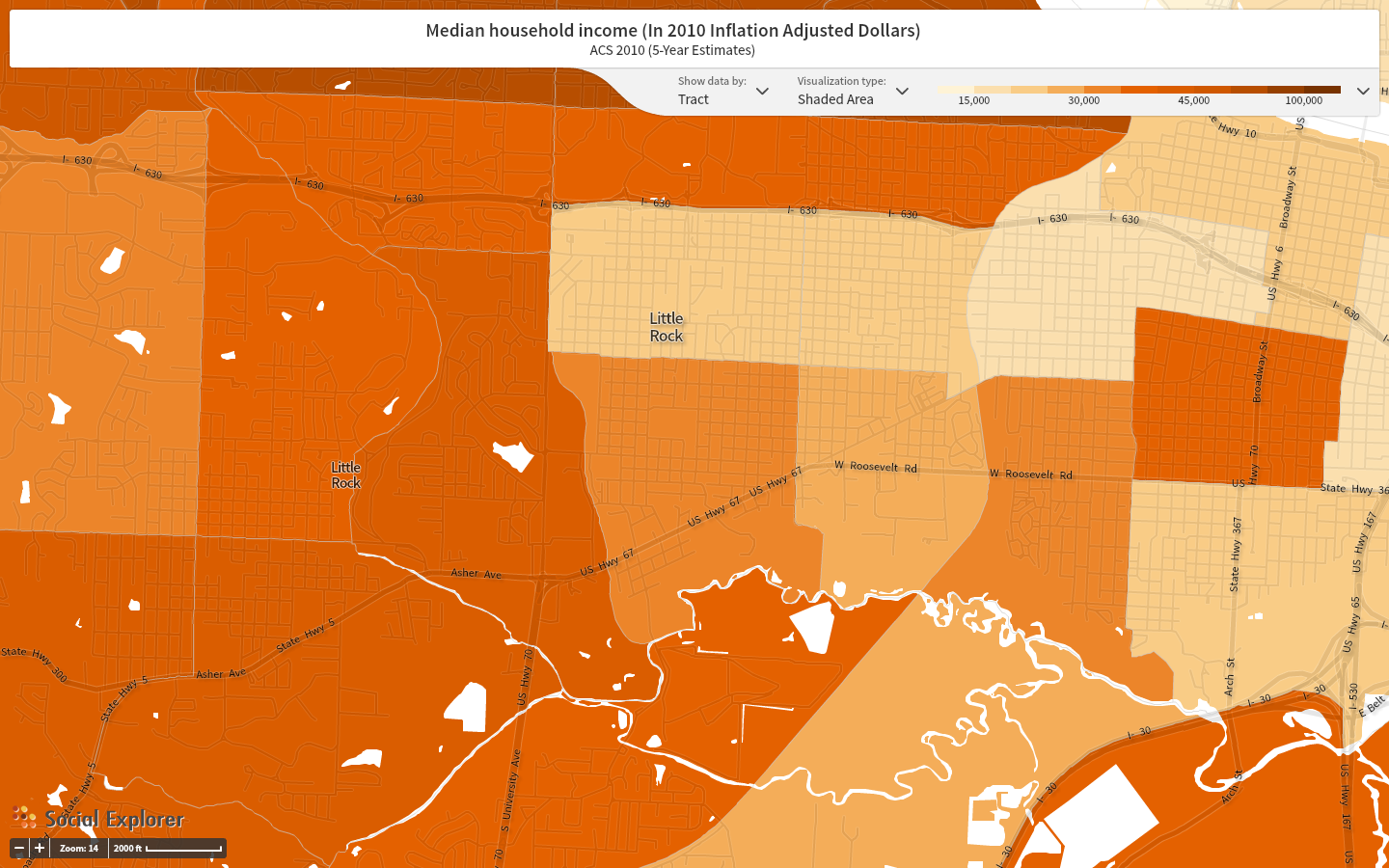
I picked the location of the tweet sent from Little Rock, Arkansas. I found this place of interest as it was one of the locations of Donald Trump’s biggest rally’s. I think it is a place of great dispute in his campaign which is a reason as to why I found great interest in it. The biggest ting I noticed was how the US Census System has changed over the last 40 years. There has been a great influx of diversity recorded which I find absolutely fascinating. This was proved time and time agin in the maps I present above. I picked race, income, and education levels as my three topics to track. I found extreme shifts in each of these categories. I think that this is the case for several different reasons. I think that primarily the change in census question/criteria affects the results. I found that there were approximately 4 times as many different types of data to search for as the years progressed from 1970 to 2010. This was extremely apparent in the race category. In 1970 there were only three options to create a visual from: White, Black, and Chinese. I found it fascinating that in the 40 year span the criteria increased from these three to about 6. Due to the three criteria in 1970 I decided to only focus on White, Black, and Other as it provided a more streamlined visual. With that being said, I did not find that there were many other races other than white an Black in this area at all. What I did notice, however, is that the fluctuation every 10 years was drastic and seemed to change in 1990 and then go back to its previous standing in 2010. I think that race certainly plays an important role in this election, especially when focusing on Donald Trump. I think it will be interesting to see in the future if the overwhelming Black community in Little Rock decides to elect Donald Trump as their republican nominee. The other map I want to look at is income. The level of income has greatly increased over the last 40 years which may be due to the influx in population and the globalization of the city. I think that income also plays a detrimental role in this discussion. In fact, all three criteria can be tied together when discussing Donald Trump and his impact in Little Rock. It allows for so many different aspects of a region to be tied together and understood. This data may be limiting, but I think that it provides important insights. It begs the question, does the current racial-economic-education standing in Little Rock find the wealthy, educated, white, Donald Trump to be a potential leader?
I found it extremely difficult to find scholarly articles on Donald Trump as well as on the 2016 Presidential Campaigns. What I did find though were a few recent articles in which Donald Trump is quoted. I found these to be of interest because they prove to me that no matter what the setting he is in, he will speak his mind with complete political incorrectness. Although I personally find political correctness to be constantly taken to an extreme, especially in recent months, Donald Trump takes his lack for censorship to a new level. In the Colombia Law Review, Trump is quoted as stating, “we have a lot of really bad dudes in this country from outside,” which has led to “gangs all over the place.”[4] This is a response to current President Obama’s DACA act which discusses child immigration into the United States. I examine this quote and immediately it begs the question: is Donald Trump truly fit to head our nation? Words like these completely belittle individuals through complete and utter disregard for foreign immigrants. I personally find this to be a troublesome quality in a “leader” and will certainly have a hard time appreciating his campaign. The second article I found referencing Donald Trump referenced his ethics. Titled, “The Method of SharedConcern: A Positive Approach to Bullying in Schools,” the author Gerald Walton suggests that, “Donald Trump [has] made bullying a very lucrative enterprise. Thinking of bullying as a much more engrained aspect of contemporary culture suggests that the method of shared concern is limited by the theory of bullying on which it is based.” [5] I find this to be extremely accurate. I have personally watched nearly every single debate thus far and have found that Trump uses bullying of other candidates to his advantage. He builds himself up and puts others down. I think that this connects with the previous article and truly questions his ethics and treatment of other individuals. I personally do not think that his personality fits the criteria to be a level-headed leader. Unfortunately I am not sure how this would relate to the maps. I think that some people just do not realize how his actions are perceived by immigrants, foreigners, and even US citizens.
Kitchin & Dodge bring up the idea of coded space in their article, Introducing Code/Space. In this they define this term as “spaces where software makes a difference to the transduction of spatiality”[6] They further this by explaining that the difference between coded space and code/space is that “code/space is dependent on the dyadic relationship between code and space.”[7] Thus, the code influences the space and the space influences the code. This code/space relationship is only made possible through technology; Stephen Graham furthers this discussion by detailing software-sorted geographies. These are, “the ways in which individual and collective life chances are shaped increasingly by their treatment within computer-controlled, customized, service domains.”[8] I think that this does influence my topic and the hashtag #TrumpTrain. I think that when looking at this topic it is indeed a technologically, internet-based phenomenon in which the results are shaped by these computer-controlled service domains. I think that the data is unquestionably both a project and a product of American culture as it is created and defined within its boundaries. On top of this, I think that the data extends beyond the borders and it becomes a world issue and question. I think that by understanding these software created geographies on greater scale, we can begin to understand trends and the reason for this mass collection of data.
- Yau, Nathan. 2013. “Understanding Data.” In Data Points: Visualization That Means Something, 44. Hoboken: Wiley.
- Ibid, 63.
- boyd, danah, and Kate Crawford. 2012. “Critical Questions for Big Data.” Information, Communication & Society 15 (5): 663.
- Figueroa-Santana, Bianca. 2015. “DIVIDED WE STAND: CONSTITUTIONALIZING EXECUTIVE IMMIGRATION REFORM THROUGH SUBFEDERAL REGULATION”. Columbia Law Review 115 (8). Columbia Law Review Association, Inc.: 2222. http://www.jstor.org.ezproxy.trincoll.edu/stable/43655762.
- Walton, Gerald. 2013. Canadian Journal of Education / Revue Canadienne De L’éducation 36 (4). Canadian Society for the Study of Education: 456. http://www.jstor.org.ezproxy.trincoll.edu/stable/canajeducrevucan.36.4.454.
- Kitchin, Rob, and Martin Dodge. 2014. “Introducing Code/Space.” In Code/Space: Software and Everyday Life, 18. Cambridge, MA: MIT Press.
- Graham, Stephen D. N. 2005. “Software-Sorted Geographies.” In The People, Place and Space Reader, eds. Gieseking, Mangold, Katz, Low, Saegert, 134. New York: Routledge.
Your entire post regarding #TrumpTrain and the current campaign of Donald Trump is very intriguing. I am particularly interested in your insight on social media geo-located commentary. This is not a concern specific to your topic, but it is interesting when considering any geo targeting. In current social media culture, many individuals attempt to protect their personal information from public consumption. It does not surprise me that you did not collect extensive data with this feature enabled. I too was disappointed in the number of tweets that were “mappable” for #FeeltheBern. Despite the lack of available information, it would be interesting to explore the impact of the United States presidential race in other countries. More specifically, the impact of Donald Trump. What do citizens of foreign countries/regions think about Trump and his ideals? Choosing to examine Little Rock, Arkansas is interesting as Trump has been extremely active in this area during his campaign. Again, I was interested in your observations of change through the years relating to race, education and income. This makes me curious as to how other regions in the United States might have changed from 1970. The city I chose to explore experienced significant change in only one category. You did write about race and income extensively, but I would have liked to hear more about #TrumpTrain and level of education. Overall this post was very insightful. The final paragraph was an interesting section as it leads me to believe Trump has not changed much over time. His arrogance and political incorrectness are not unique to this campaign.
To begin with, I am thoroughly interested in following your hashtag trend as Donald Trump continues to be a successful presidential candidate for the Republican Party. This topic is extremely significant to our country right now, and the popularity of Donald Trump on social media will continue to explode. One specific thing that I really liked about you blog post, was how you oriented your maps. For your nine maps, you made each of the three categories (Race, Education and Income), slightly different colors and designs. I wish I had done this in my post originally because there are different maps designs that apply better with different topics. In terms of your analysis of Donald Trump’s history, I found it quite fascinating that the interest of Donald Trump as a social icon has skyrocketed exponentially since the late 20th century, and continues to grow on a daily basis! I am curious to think what you believe is in store for Donald Trump’s future as a candidate and potentially a president. Ultimately I think you are doing a great job following this phenomenon, and that you should continue to keep up to date with the presidential race and individual campaigns.
I have a hashtag associated with the Trump campaign too, and just like you (and everyone else) I had few to no geolocated tweets. I was not surprised to see the majority of tweets coming from the southern US, but I was shocked when I saw a #TrumpTrain tweet in Africa. This goes to show how much of an international presence Trump has. He was already known worldwide for his TV show and being a business mogul, but now Trump has more presence and power than ever. You did a great job on your maps they look very good. The race map was very interesting to me. It shows how black people dominated the area in the 70s, then whites came around the 90s, and today it is almost back to how it was 40 years ago. I have no clue as to why this happened, but it is very interesting. As you mentioned, the census has changed drastically over time and maybe the racial change in Little Rock is because the census collects more data now. Overall, great post.