
The only place I expect to see people tweeting in my dataset is in the USA. The reason being is that Obamacare really only affects people in America, and has very little to no affect on people outside of this country. I do expect to see a few tweets from people in different countries weighing in on what they think of Trump’s decision to repeal Obamacare. I expect to see the most tweets between 30° – 60° latitude and 50° – 120° longitude because again, Obamacare mainly affects people in America only. I’m from right outside of Boston (Weston, MA) and I think it is around 55° latitude and 75° longitude and I definitely think people from my hometown and around Boston will be tweeting about Obamacare. The reason for this is that some of the best hospitals are in Boston and around my hometown, with some of the best doctors in the world working there, and I definitely think that people in this area will be expressing their opinion about Obamacare.
Total number of tweets: 58,977
I currently have 58,977 tweets with the #Obamacare and had a total of 9 mappable tweets, which was very surprising to me due to the fact that I had close to 60,000 total tweets. When I divided the # of tweets with a geolocation by the total number of tweets, I got a value of 0.0001526, which means that 0.015% of my tweets are mappable. Again, I was very surprised that this value is so low due to the fact that there are so many tweets regarding this hashtag.In Data Points, Yau mentions how maps could be created based on geolocations of people’s phones or laptops when they tweet or use their device. Unfortunately, as you can see in this case, not all people turn on their geolocation on their phone or laptop (only 9 of 58,977 tweets had their geolocations on) when tweeting. Due to this, I feel like my data is definitely under-represented as I won’t be able to get an accurate map of where people are tweeting about Obamacare the most. I feel like a huge portion of my data is missing, which will affect how I analyze and map these tweets. It will also affect how I distinguish which group of people in this country is tweeting about this topic the most and which group Obamacare affects the most. As expected, all of these tweets were coming from the North Western quadrant of the globe. All nine mappable tweets had geolocations in America and which I expected, and I also noticed that every tweet was in English, which was also expected. Obamacare only affects people in America, so the fact that most tweets were based out of America and in english was 100% expected.
Based on Boyd and Crawford’s description of what they believe big data to be, I think that I do have big data. Boyd and Crawford describe how “Big data reframes key questions about the constitution of knowledge, the processes of research, how we should engage with information, and the nature and categorization of reality” (Boyd and Crawford 665). I may be wrong, but based on this quote, I do believe that I have big data. I have over 50,000 tweets, each one with a person expressing their voice on the topic. This large data set allows me to compare and contrast tweets from all people of different groups, ages, social class, and etc. Based on this concept of Boyd and Crawford, and all the tweets that have been gathered on Obamacare, I do believe that I have Big Data. Katherine had a total of 10,154 tweets with 48 geolocations, so 0.437% of her tweets were mappable and Caroline had 20,482 tweets with 10 total geolocations, meaning that a 0.0488% of her tweets were mappable. My data is similar to Caroline’s as we both had a very small number of geolocations/mappable tweets whereas Katherine had the least amount of tweets, but the most amount of geolocations. Obamacare is one of the most talked about topics in America right now, which is why I had more tweets then Caroline and Katherine combined. Obamacare is also a topic that is currently affecting the lives of millions of people in this country, and people affected by Obamacare are turning to Twitter to have their voices/perspective on this issue heard.
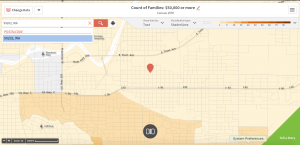
After mapping my geolocation data, it was clear to me that all of my tweets are from the United States. As shown in the map, not one tweet had a geolocation out of this country, which was somewhat surprising to me, as I thought that there would be tweets from surrounding countries expressing their concern on Trump repealing Obamacare or supporting that decision. There is no specific region of the United States that a majority of the tweets were in; they were spread out throughout the country. Honestly, I’m not 100% sure what this map tells me about Obamacare and is something that I am looking into based on the twitter geolocations I have, but a majority of these tweets were against Trump’s decision to repeal Obamacare.
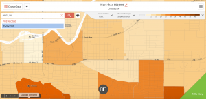
Two locations I chose to focus on were based off two of the geolocations I had and one was Spokane, Washington (Zip Code: 99204) and Boston, MA (Zip Code: 02115).
In Spokane, Washington, I decided to focus on three census tracks (30, 31, and 46.01) and focused on household incomes greater than $50,000.
First Image: Household with incomes more than $50,000 in Spokane, WA, 1970
All three census tracts had very few families who made a total household income of more than $50,000.
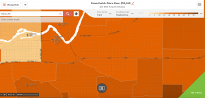
Second Image: Household with incomes more than $50,000 in Spokane, WA, 1990
Census tracks 30 and 31 still have fewer families with household incomes greater than $50,000, but census track 46 now has 17% of households making greater than $50,000.
Third Image: Household with incomes more than $50,000 in Spokane, WA, 2010
The number of families with household incomes greater than $50,000 has increased significantly in all three census tracks, with track 46 now having a little more than 42% of it’s families making more than $50,000.
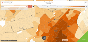
For the Boston census, I focused on percentage of people who were African American in census tracks 806, 808 and 809 in 1970, 1990 and 2010.
Fourth Image: Percentage of African Americans in Boston, MA 1970
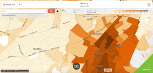
Census track 806 had the highest percentage of African Americans (93%), whereas track 809 had the least amount out of the three at 6.5%.
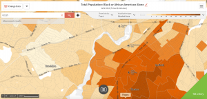
Fifth Image: Percentage of African Americans in Boston, MA 1990
Census track 809 increased by 17% whereas track 806 decreased to 73% African American.
Sixth Image: Percentage of African Americans in Boston, MA 2010
Many census tracks came together 20 years later, and now census track 808 has the highest percentage of African Americans.
The third location I chose to do was United States of America and I decided to look at percent of adults with limited access to doctors due to costs in 2012, 2013 and 2014 (the health census was not available until 2010).
Seventh Image: Percent of adults in the United States who have limited access to doctors due to costs in 2012
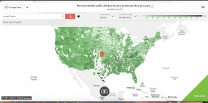
The southeastern and southwestern parts of the country have the highest percentage of adults who have limited access to doctors the most.
Eighth Image: Percent of adults in the United States who have limited access to doctors due to costs in 2013
The northeastern part of the United States still had the least percentage of adults who have limited access to doctors.
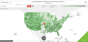
Ninth Image: Percent of adults in the United States who have limited access to doctors due to costs in 2014
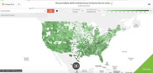
The results have been very consistent for three years, with the northeast still having the least percentage of adults who have limited access to doctors whereas the southeastern and southwestern parts have the highest percentage.
Honestly, these maps did not help me learn much about my data. I was attempting to create map using the health census, but unfortunately, the health census data did not come out until 2010. I was trying to get maps based on the percentage of people who didn’t have health insurance in the age group of 18-64, but none of this data was available in the late 1900s and early 2000s. Using the maps of Spokane, WA, I was able to see a drastic increase in families with household incomes greater than $50,000 over the 40 year period, which could mean that more and more families could afford health care. In Boston, MA, I looked at the percentage of African Americans in three different census tracks (806, 808, and 809) in 1970, 1990 and 2010 and found that each year the percentage varied in each of the three tracks. Although these two sets of maps were pretty unhelpful, my last set of data on percentage of adults who had limited access to doctors due to costs in the United States as a whole was very insightful. I learned that the northeastern part of this country had the least percentage of adults who had limited access to doctors due to costs, whereas the southeastern and southwestern parts of the United States had the highest percentage of adults who had limited access to doctors due to costs. This is something I need to do more research on to learn why the south has a high percentage. I think that Twitter data is helpful when mapped because you can learn so much more about your data, and the different demographic of people that are discussing your topic; you can get a good idea of where they are from, their race, and age group. It can help unveil different stories about your topic that are hidden behind their tweet.
The first article I read was written in 2010 by David Gratzer called “A Regrettable Reform: Fixing Obamacare’s Worst Policies” and talks about many of the flaws the Obamacare had/negative affects it had on the people of the United States. It states how “President Obama told Americans that he wanted to reduce private insurance premiums. But the bill he urged congress to pass – the bill he signed into law – will raise premiums faster than if nothing had been done at all.” This article does not argue against Obamacare, but states various flaws that the bill signed by President Obama had and should be fixed to insure that Obamacare had a positive affect on all Americans. This article relates to an article I briefly spoke about in Lab 1 that mentioned how Obamacare shouldn’t be repealed, but it should be altered and fixed in a way that it is beneficial for the lives of all Americans. In a second article called “Obamacare Confronts a Fiscal Crisis: Why the Affordable Care Act Doesn’t Add up” by Marcia Angell, she discusses why she is against Obamacare and why it won’t be “fully implemented”. This article was written in the winter of 2013. She makes a very similar point that the first article made that “Many of the uninsured who are subject to the mandate to purchase private insurance will choose to pay the penalty/tax instead. That will lead the insurance companies to raise their premiums, demand that the penalties be greater, or both.” Both articles I found seem to be against Obamacare due to the fact that it only benefits certain groups of people in this country. I wasn’t aware of this, but I guess Obamacare had many controversial flaws, which could be a primary reason why many people, including President Trump want to repeal it.
Graham’s concept of software-sorted geographies allows us to distinguish between privileged groups and marginalized groups and allows us to see the inequality in advanced societies vs. non-advanced ones. I think that graham’s concept applies to my data because I can distinguish between various groups of people when I read through my tweets. Through my data, I can learn so much about the different types of people tweeting about Obamacare. I can see where in America people support Trump’s decision to repeal Obamacare, as well as area’s in America where people are against Trump’s decision and support Obamacare.
Works Cited
Angell, Marcia. 2013. “Obamacare Confronts a Fiscal Crisis: Why the Affordable Care Act Doesn’t Add up”. New Labor Forum. 22: 44-46
Boyd, Danah and Crawford, Kate. “Critical Questions For Big Data.” Information, Communication, & Society 15, no. 5 (2012): 662-679.
Gratzer, David. 2010. “A Regrettable Reform: Fixing Obamacare’s Worst Policies”. The New Atlantis. 27: 103-109.
Yau, Nathan. 2013. Data Points: Visualization That Means Something. Hoboken, N.J.: Wiley.
Hi Danny. I was very surprised that only 9 tweets out of your 58,977 are mappable, where as I had 48 results. I am curious as to why I had so many more people tweet and turn their location on. Your percentage is .015% and mine is .005%, however, meaning that I had a smaller total data set to begin with. I think it says a lot about America that your mappable tweets were spread out across the country and not just in one place. As a democracy, citizens in our country have the right to voice their opinion, and it is interesting to see the use of Twitter for people’s opinion.
It’s also fascinating to look at you three maps of Spokane, WA, and to see the significant increase in household incomes greater than $50,000 over the period of 40 years. I am curious as to why you chose to look at Spokane, WA. I love that in your third location you chose to look at the U.S. as a country. You show the data of limited access to doctors due to cost which is probably very interesting to you since you want to one day be a doctor.
One comment I have is that you concluded that the increase in families with household income greater than $50,000 could mean that more and more families could afford health care in Spokane, WA, however that does not say anything about the poverty levels. Moving forward, one suggestion I have would be to compare maps of the poverty levels in the same area over the same period of time to see if they build on your thesis or if they change your opinions.
Reading your post inspired me to explore different census information regarding the country as a whole, not just New York City or Washington D.C. I think it would be insightful for my research to look at the percentage of women across the country who get their health benefits from planned parenthood.
Hey Danny, this is a really interesting post. Some of why I found it interesting is because one would assume with all those tweets that you would have so many mappable tweets. In reality thought, you had such a small number. One would assume that big data gives you more to work with but instead you and I had pretty much the same number of mappable tweets and you had 30,000 more tweets than me. I think it makes sense that your data is mappable throughout the US because Obamacare is a universal healthcare act that affects everyone. I think looking at the maps in terms of household income was a good way to break down the census. I think that their are people that do not want a universal healthcare because of how much it could cost the taxpayers so breaking data down in terms of income. I think it would be interesting to look at the census maps to see if there was a way to exam how many doctors there were in the areas you looked at. I wonder if the limited access is because there are not that many doctors or if it is because people can not afford them. After reading your post, I would like to look at a map of the entire US in some capacity to see if there was a pattern there. I found your post to be very informative.