
Part I
I expect a majority of the people using the #WhyIMarch hashtag to be tweeting from the United States, since the women’s march started with protests against the inauguration of President Donald Trump in America. I expect the longitude and latitude with the most tweets to be around the Washington D.C. area, (40° N, 90° W). The largest women’s march occurred on January 21st in Washington D.C. so I expect most of the tweets to be from that area. I think the longitude and latitude of my hometown area is similar to Washington D.C., but father North and farther East, maybe (45° N, 85° W). Yes, I believe people will be tweeting about this issue there because there are a lot of women and men in my hometown who voted against Trump and believe strongly in women’s rights.
Part II
= ( 48 / 10, 154 )
= .00473
There are 10,154 tweets, 48 of which have their geo coordinates turned on. This means that .473% of my total tweets are able to be mapped. 10,154, 48, .473%. This mappable data is a very small percentage of the total tweets that I originally had. I believe that the 48 tweets with geo-locations turned on will underrepresent my data, because the number of tweets shown will be much less. From what I can tell, the 48 tweets seem to be mostly coming from the U.S., which under represents the users tweeting from outside of our country.
Most of the tweets look like they are coming from similar longitude and latitudes, which is the east coast of the United States. Most of the tweets have a latitude of around 30-40 and longitude of -70 to -90 which is East coast of U.S. I believe that most of the tweets are located there for the same reasons that I stated in the first paragraph. The women’s march took place in Washington D.C., so it makes sense that most of the tweets are around that location. The language column shows that every tweet with the geolocation turned on is in English. Looking at user location, there are many tweets from Florida, New York, and Washington D.C., and also some from Texas, California, Chicago, Wisconsin, and Minneapolis. I was surprised to see that there were more tweets from Florida than from Washington D.C. on my hashtag. This is interesting because Florida is one of the biggest swing states, and played a huge role in the presidential election. There are many people in Florida who are against President Trump’s anti-women views and it is great to see that they are speaking up through Twitter.
Boyd and Crawford define Big Data “as a cultural, technological, and scholarly phenomenon that rets on the interplay of… technology, analysis, and mythology” (Boyd & Crawford, 663). I believe that I do have big data, as I collected 10,154 tweets total in my collection. This group of tweets with #WhyIMarch hashtag combined is a powerful tool to address the social ill of women’s rights. Boyd and Crawford state that “Big Data enables the practice of apophenia: seeing patterns where none actually exist, simply because enormous quantities of data can offer connections that radiate in all directions” (268). There is an enormous group of my hashtag, however when the geo-location is turned on, I can only see 48 of those tweets. Caroline and Danny are both in my group. Caroline’s hashtag, #Islamophobia, had 20,482 total tweets, and 10 geo-locations turned on. Danny’s hashtag, #ObamaCare, had 58,977 tweets, and 9 geo-locations turned on. This makes me see that my data is not as big as I thought it was. They both have at least twice as much data as I have. I believe this may be due to the fact that each of their topics cover a broader issue than mine since more people are tweeting about their opinions and thoughts on Islamophobia Obama Care. However, I have a much larger percent of tweets with geo-locations turned on. I have not quite figured out why that is the case, but I presume that people who tweet about women’s rights don’t mind their location being shown, where as those who tweet about Islamophobia or Obama Care are more hesitant to show their identity/location.
Part III
By mapping this data, I can see that mostly all of the 48 tweets come from the United States. There is one tweet that comes from Spain, and I am interested to see who tweeted that, and what it is about. The fact that they are mostly all in the U.S. makes sense due to the fact that the women’s march took place in Washington D.C. on January 21st. Changing the map to Torque allowed me to see the tweets as they pop up by time. This added liveliness to the users and makes it seem as though they are tweeting as I watch the dots pop up. To make that effect even greater, I changed the steps to 128, so that the dots would pup up faster, and changed the marker fill and marker stroke to a dark teal with a lime green shadow. I then changed the time column to go by “user friends count” so that the tweets from users with more friends would show up darker, and vice versa. I thought this would be an interesting way to design my map because it separates the users with a small group of friends from users with many friends, which could mean he or she may be famous or a big deal in their field of work. I thought that by doing so, there would be darker dots in Washington D.C. because political figures may be tweeting about the issue, however by designing my map this way I found that the only dots by Washington D.C. were those with a very small follower base. The darkest dots are seen in New York City and Seattle. I also added labels to be placed above every dot which show the use friend count as well, to make it easier for the viewer to see just how many friends the user has.
Part IV
User: LibrariansRock
Lat: 37.98151
Long: -0.67922
382 followers, 584 friends.
At the Women’s March St. Petsersburg mobilization meeting. #whyimarch‰Û_ https://t.co/530qC5QBgg
I picked a tweet in Spain, because it was my only tweet outside of the United States. I was curious to see what people in Spain are tweeting about using the #WhyIMarch hashtag, and if it does relate to the happenings in America. I clicked on the link to find a picture associated with the tweet of two women holding up signs. One sign says “Fight like a girl”, and the other says “Make America Think Again”. Behind the girls there are signs that say “resistance” and “St. Petersberg”. This interests me because it answers my question that I had going into this research, which was how much do people care about the changes that are going on in America. Obviously, people do care about this outside of the U.S. and are tweeting about it with just as much passion as people in the U.S. Another interesting fact I found about this tweet is that the tweet is about a Women’s March in St. Petersburg, but the tweet is coming from Spain. Maybe this means that the user waited until she got home to tweet about it? Which brings up an interesting point that the user had to get on a plane to travel to St. Petersburg for the march. This shows the wide range that this movement has covered over the world.
I don’t see much of a difference between the Simple map and my Torque map other than the timing that the tweets popped up. Looking at the Simple map, the tweets are just orange dots that do not change. I prefer to look at the Torque map on a time frame because it looks as if the users are tweeting live on the Torque map. The Torque map stars with only a few dots on the east coast of the U.S.., and then continues on to have dots pop up all over the country, spreading west, and then the tweet I talked about earlier pops up in Spain. The Simple map does not have this exciting effect.
Part V
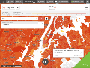
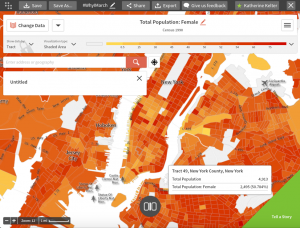
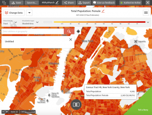
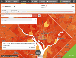
In CartoDB, I chose to look at both New York City (Washington Square Village, 10012) and Washington D.C. (around the White House, 20500).
The census tracts I chose are: 1. Sex – Female, 2. Unmarried Patterns – Same Sex Household, Female/Female, 3. Family Structure – Female Household, No Husband Present.
I am first looking at the percentage of females in the population in 1970, 1990, and 2010. I start with New York City and then move onto Washington D.C.
New York City, 10012
1970
New York City, NY: (10012) Tract 49
Total Population: 3,843
Number of Females: 1,899 [49.415%]
1990
New York City, NY: (10012) Tract 49
Total Population: 4,913
Number of Females: 2,495 [50.784%]
2010
New York City, NY: (10012) Tract 49
Total Population: 4,541
Number of Females: 2,365 [52.081%]
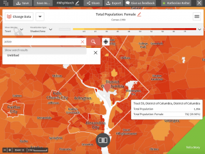
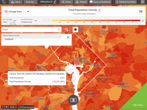
Washington D.C., 20500
1970
Washington, D.C.: (20500) Tract 58
Total Population: 1,156
Number of Females: 458 [39.619%]
1990
Washington, D.C.: (20500) Tract 58
Total Population: 1,956
Number of Females: 782 [39.98%]
2010
Washington, D.C.: (20500) Tract 58
Total Population: 2,675
Number of Females: 1,372 [51.29%]
The population in New York City, 10012, has grown since 2010 as did the percentage of females. The percentage increased from 49% to 52%. In Washington D.C., there is a much more significant increase in the female percentage of the population from 1970 to 2010. The percentage increases from 39% to 51%. Looking at these results, it is clear that most recently, the percentage of female to male in the population in New York City and Washing D.C. is about 50%. This is relevant to my research because I am studying a hashtag that is about the Women’s March, so the percentage of women in the area will effect how many people are in support of this hashtag. Especially in places like New York City and Washington D.C., where the Women’s March took place on a large scale, it is interesting to see how many women there are compared to men in each area.
Part VI
The first article I chose is about a 50-year anniversary of the Women’s March in South Africa. Though this has very little to do with the women’s march on January 21st in Washington D.C., I read it because I was interested to see what other women around the world marched for in history. This article was written in 2006. The author writes, “Many young women’s initiatives lack a strong analysis of gendered, rights-based discourses in their programming, and this is based on a weak women’s movement and lack of engagement with feminist ideology and practice” (p.143). The women in South Africa in the 1950’s were marching to keep alive the legacy of women for the younger generation, and to encourage young women to embrace their feminist identify and become gender activists. I found this article interesting because it is a very different time frame and location compared to the women’s march in Washington D.C. on January 21st, but it is very similar to what women are marching for in the present. This article highlights the importance of women activism and equality. The next article I read was about women protesting gang rape in Swaziland. This article was written in 2004. The authors quote one of the organizers of the Women’s Legal Rights Initiative, “We’re fed up. Enough is enough… The powers that be have realized that women are angry” (p.5). This article is relevant to my topic because it shows women in history who are passionate about issues pertaining to the women gender and are activists who fight against it.
Graham talks about software-sorted geographies as “automatically and continuously allocating social or geographical access to all sorts of critical goods, services, life chances or mobility opportunities to certain social groups or geographical areas” (p.134). This method is applicable to my data set because I am able to see where people are tweeting, what people are tweeting, and how many friends they have all in one map. I am able to see more tweets in cities with a higher population and a higher percentage of women, since #WhyIMarch pertains particularly to the Women’s March.
Boyd, Danah, and Kate Crawford. 2012. “Critical Questions for Big Data.” Information, Communication & Society 15 (2): 662–79.
Douglas, Anne Carol, and Gibbs, Palmer. “Women March to Protest Gang Rape” Off Our Backs: a women’s newsjournal. Vol. 34, No. 11/12 (November-December 2004), p. 5. http://www.jstor.org/stable/20838194.
Graham, Stephen D. N. 2005. “Software-Sorted Geographies.” In The People, Place and Space Reader, eds. Gieseking, Mangold, Katz, Low, Saegert, 133-138. New York: Routledge.
Legoabe, Lerato. “The Women’s March 50 Years Later… Challenges for Young Women”. Agenda: Empowering women for gender equality, No. 69, Nairobi + 21 (2006), pp. 143-151. http://www.jstor.org.ezproxy.trincoll.edu/stable/4066826.
Katherine, I thought that this was a very insightful post. One of the first things that stood out to me was the fact that only such a small percentage of your tweets (48 out of 10,154) were mappable. Everyone in our group seemed to have an extremely low percentage of mappable tweets, so we’re in the same boat as you. I thought that it was pretty interesting that a majority of your mappable tweets came from inside the United States, especially because there were marches and protests held all over the world. I agree that this under represents the people tweeting about this topic outside of the United States. After observing your first map in Part III, I noticed that there were tweets all over this country, showing how this topic is being talked about throughout the United States, not just in a particular region in this country. I only had a total of nine mappable tweets out of over 58,000 tweets, which was pretty disappointing, but the nine mappable tweets also had geolocations spread all over this country. I liked the topic you chose for your census maps and one thing that stood out to me was the huge rise in female population in Washington D.C. from 1990 to 2010, with an increase of 12%. Maybe another topic you can research can be percentage of different races of woman in both NYC and Washington D.C. in 1970, 1990, and 2010. I thought the articles you chose were great as they talk about the history of woman standing up for what they truly believe in and this makes me want to look into another possible health insurance crisis that may have happened earlier on in the history of this country and look into how people of different race, gender, and social class reacted to it. Good work!
Katherine, I found this post to be very interesting. The fact that you had so many mappable tweets is something that I found to be really cool. I think it is interesting to be able to see the locations of where are the tweets were coming from. I agree with you about the fact that the majority of the tweets would come from within the US especially because of the Women’s march. I think you are right about how this mapping data unrepresented who is tweeting about the issue; this is something I also found with my data. Another thing that was interesting was how wide reaching your tweets were. There were tweets from all over the country and some outside of it. This is cool because it shows that this is not just an issue affecting people in one place in America but that it has national and global attention. I had such a few number of mappable tweets from my data so I wish I had been able to see more geolocations like the ones you had. Looking at the maps in terms of gender was an interesting because women’s rights have changed so much over time is a central part to the #WhyIMarch. I think it would be interesting to look at the breakdown of race within gender in this hashtag. I am sure that there would be some interesting data. After having read your post, it made me think about how I could have looked at my data in terms of gender. I also think it would interesting to see which gender is tweeting more about this topic.