
I expect to see most of the tweets in my data set coming from the United States. Not only is #woke a term that Americans have created/adopted, but it is also centralized around American social and political issues. I expect to see most of the tweets from 0-90 degrees Latitude. This is essentially due to the language barriers, and I feel like the majority of the tweets will come from English speakers in the Northern Hemisphere. My home town is probably around 45 degrees N and 75 degrees W. I wouldn’t be surprised if there are some tweets with #woke in my hometown, but I would not expect a lot. Coming from a small, privileged, majority white town, I don’t expect a lot of tweets from people expressing opinions about social issues. Also, I know not many young people use Twitter in my town, and I feel like the older age demographic isn’t using this term so often.
My total number of tweets is 11,569 and the number of tweets with geolocations is 44, so the percentage of tweets that are mappable is .38%. Yau explains how the data we obtain creates the visual in itself. He affirms that we can draw conclusions from what visuals are showing us. I feel like my data allows us to make the conclusion that #woke is used by primarily English speakers, and does in fact travel internationally. I feel like non-English speakers could be mis-represented. Any tweet about social issues could honestly work well with #woke, so even if non-English speakers are in the same conversation as a tweeter using the hashtag, the map wouldn’t show it. The quadrant of the globe that appears to produce the most tweets is the North Western quadrant. The United States is in the quadrant, and I assumed the bulk of my data would be coming from that area. All mapped tweets are in English, except one in which language was labeled Japanese, which affirms my thinking that this hashtag is centralized in America. The data produced came from the US, UK, South Africa, and Canada. The only country that I thought would have been labeled is Australia.
Kate Crawford and Danah Boyd discuss big data in terms of its “capacity to search, aggregate, and cross-reference large data sets” (Boyd and Crawford 663). I would consider myself to have big data based on how it offers an opportunity to make social, economic, and legal claims. Numbers wise, I believe I have a sufficient amount of data for analysis and cross-referencing. Not only does the hashtag bring up so much information about a variety of topics, but it also links us to other hashtags and trends that, multiples the spectrum on which I can research.
Both of my teammates had larger total data sets than I did. Jordan, with #blacklivesmatter, received over 83,000 tweets; and Will, with #NoDAPL, received over 27,000 tweets. I believe my hashtag has less tweets because of how general it is. Yes, I get data regarding different topics, but I think specific current events like the Black Lives Matter movement and the fight against the Dakota Access Pipeline are able to produce such a larger data set. Most people tweeting about a certain issue will most likely use a hashtag directly relevant to the topic, rather than use a general term like “woke”.
. With the design of my map, I wanted to emphasize where the data is centralized. You can notice that the darker shades of orange highlight where bulks of data were recorded, and you see them around big cities in the Northeastern part of the United State, and in California as well. There is importance is showing the data from the UK, South Africa, and Canada because it shows the hashtag was primarily used in English-speaking areas. I think I am, in fact, hiding people in possibly the same conversations and in the same areas as these tweets that are shown.
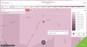
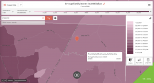
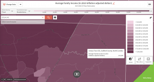
1st zip code: 27214 in tract 118, Guilford County, North Carolina
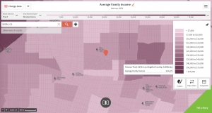
2nd zip code: 90036 in tract 2162, LA, California
Average Family Income: Census 1970
Guilford County, NC 27214: Tract 118
$9,163
Average Family Income: Census 1990
Guilford Country, NC 27214: Tract 151
$39,873
Average Family Income: Census 2010
Guilford County, NC 27214: Tract 151
$72,309
Average Family Income: Census 1970
Los Angeles, CA 90036: Tract 2141
$18,679
Average Family Income: Census 1990
Los Angeles, CA 90036: Tract 2141
$149,933
Average Family Income: Census 2010
Los Angeles, CA 90036: Tract 2141
$201,197
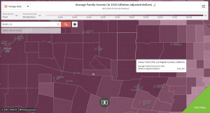
I chose to use these two locations because of the difference in the type of society each has. Los Angeles, as an urban area, has a much greater population density and more diverse individuals. Guilford County, North Carolina on the other hand is extremely rural, and much less diverse than LA. I chose to display average family income because I was interested in how income affects input on social issues. I have always had a general assumption that wealthier people tend to keep their mouths shut when it comes to expressing opinions, and people of lower financial class tend to speak up. I think these maps highlight the fact that #woke is a term that crosses class barriers, and is used by people of all financial backgrounds. This seems to be because the hashtag can be used in so many different ways, that different types of people can use it in different ways.
The first article that I found interesting was “Empirical Study of Social Awareness” by John L. Haer. Haer analyzed how people in different areas, Minneapolis and Tallahassee in one example, placed themselves in economic classes and their “perceptions of socio-economic status” (Haed 119). What I found interesting in this article was that Head claims people who believe they can be a part of different class memberships tend to have higher socio-economic statuses than people who feel like they are isolated. I find it interesting that people of higher classes are more likely to speak their minds on social issues than people in lower class, contrary to my assumption. There seems to be a connection between money and voice. The other article I found interesting was “Social Awareness in Monkeys” by Robert M. Seyfarth and Dorothy L. Cheney. The article explains experiments with monkeys, to see how their minds, without any context that humans get, interpret social interactions. The point I found interesting was that both baboon and vervet monkeys were able to “distinguish both their own and other individual’s close associates” (Cheney and Seyfarth 904). It helps me understand that even the simplest of minds instinctually see differences. I think it says a lot about why there are issues like racism and class-depreciation. Along with this, I think it shows that despite differences that people have, they are naturally similar and deep down feel equal needs to express themselves regarding social issues. I found this relevant to the fact that so many different people use #woke. I believe it is American Phenomenon because of this fact. It is applicable to all people on all social issues. Graham defines “software-sorting” as the way in which individual and collective life chances are shaped increasingly by their treatment within computer-controlled, customized, service domains. I don’t think his terms play out in my data that much, only because I have gained an understanding that location within the United States isn’t very relevant. I think the issues people are talking about are locational, but #woke isn’t specific to certain areas. I found tweets from people in high class and low classes, and urban and rural areas. I can use it to reflect American culture in the way that we use social media to connect to other people all over the country even if we don’t intend to. Finding similarities in different types of people is very insightful when understanding American culture.
Boyd, Danah, and Kate Crawford. 2012. “Critical Questions for Big Data.” Information, Communication & Society 15 (2): 662–79.
Cheney, Dorothy, and Robert M. Seyfarth. 2000. “Social Awareness in Monkeys”. American Zoologist. pp 904.
Haer, John L. 1957. “An Empirical Study of Social Class Awareness”. Social Forces. pp 117-121.
I’m somewhat surprised that a more ‘general’ hashtag such as your receives less attention than a specific one like Jordan’s or mine. It’s reasonable to expect that a hashtag like #woke would cross over into other movements, but, given the data you describe, I wonder if this is the case. I would like to see how often people combine #woke with other social justice hashtags, or how many people who use #woke also use other hashtags.
Looking at your SocialViewer maps, I think I may reconsider how I look at the spatial data. I assumed that a localized issue like the Dakota Access Pipeline would manifest itself in the area itself, but perhaps I shouldn’t limit my focus and investigate a wider region.
I agree with the following observation that you made: “I believe my hashtag has less tweets because of how general it is. Yes, I get data regarding different topics, but I think specific current events like the Black Lives Matter movement and the fight against the Dakota Access Pipeline are able to produce such a larger data set. Most people tweeting about a certain issue will most likely use a hashtag directly relevant to the topic, rather than use a general term like “woke””. I wonder also if #woke is used by people about other people satirically instead of in regards to a personal reflection. In this case, there may be fewer tweets overall, because there are more people supporting movements on Twitter than there are people who are mocking people who do not support movements.
I would suggest that you enlarge the images of the purple maps. The current size of the maps makes them more difficult to understand. I was able to enlarge the images by: clicking on the image, clicking on the pencil edit icon, and setting teh image size to its original size.
I am very interested in learning how you animated your first map so that it plots tweets across time. I would have liked to have been able to enable this function in my map.