
The group of tweets that I selected ranged from March 21 to March 22, and I selected a full 3,000 tweets. I chose this range because it is the most recent data that I have, and therefore it will allow me to analyze connections between the Twitter users more successfully. I say this because as the debate about transgender rights continues, the connections develop further and further.
I am not sure what type of results I will get from this extraction. There are a lot of repeated tweets in my dataset, and a lot of the same hashtags are found in multiple tweets. The connections between the Twitter users, however, is unknown. Although I started with 3000 tweets, I now have 3303 rows of data. I think that the reason for the right column to sometimes be blank is due to the lack of tagging other people in the tweets. If there is a name in that column, it means that the person who posted the tweet tagged someone else in it, thus making a connection between the two people.
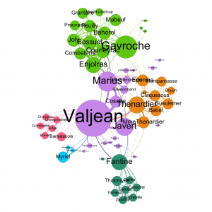
In the Les Miserables graph, I found 77 nodes and 254 edges. For my graph, I chose the undirected graph since directed was unable to be used at the time. Below is the chart that formed:
Valjean is Source 11 and Fantine is Source 23 – Valjean has 4 targets; 0, 2, 3, and 10. These correspond to Myriel, Mlle Baptistine, Mme Magloire, and Labarre. Fantine has 9 targets; 11, 12, 16, 17, 18, 19, 20, 21, and 22. These correspond to Valjean, Marguerite, Tholomyes, Listolier, Fameuil, Blancheville, Favourite, Dahlia, and Zephine.
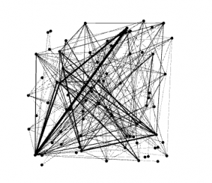
Above is the chart that formed when I changed the repulsion strength to 10,000. By increasing the strength so much, the characters that have less of an association with each other become farther apart, whereas the characters that interact more often get clustered closer together. A greater repulsion helps magnify the differences in the interactions.
When I changed the betweenness centrality to range between 10 and 200, some really large circles formed on my chart. Most of them are still pretty small, but one stands out in the middle and there are four medium sized circles surrounding it. I think these results indicate the importance of the characters, as in the amount of interactions each character has with the others. The main character, Valjean, takes up the majority of the book and interacts a lot with other characters, so therefore his circle is significantly larger than the others. The same goes for other main characters – their interactions are more frequent and substantial than the secondary characters.
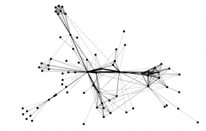
(I did not have access to the program to record the diameter and average path length, but these values were significantly larger than those for Les Mis.) These values indicate that there is a large distance between the majority of the Twitter users. Some do make references to each other, but many make posts about transgender rights independently from other users. Below is a full image of the chart and a zoomed in chart of the main data points:
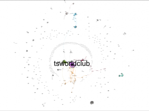
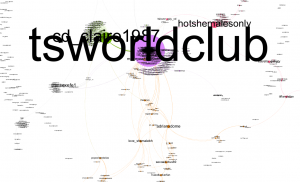
These charts indicate that there is a lot of isolation between many Twitter users. I decided to keep the singletons because it shows just how spread out everyone is, and how tsworldclub is really incredibly substantial in comparison to all of the other groups. I was told that cd_claire1987 is a porn site, which I had been warned about with transgender research. It is interesting that in my previous work with the transgender tweets, tsworldclub did not show up anywhere, and yet in this past week it seems that this Twitter account has been used significantly more. The only associated hashtag that I see in this chart is the #hotshemalesonly one, and it is the third largest word in the chart. Besides the connections between the tweets, these charts explain nothing about how Twitter users feel about transgender rights – in the previous lab, it was clear that there was a lot of criticism of transgender individuals, and here, we really only see the #hotshemalesonly tag, which still does not tell much about how people view transgender individuals.
I really thought it was smart of you to keep the singletons in your web analysis. I think that this was the only way to really capture your data set. I find it interesting that #transgender does not bring up a lot of large conversations, and I imagined it to be similar to mine in the sense that LGBT is very much so a community. TSworldclub seems to be running the conversation, what does this twitter handle stand for? I think a great thing to further analyze is the impact TSworldclub has on the transgender community, and what it is saying? Who runs it?
Your post makes me think differently about my post, because the transgender community is all talking about different things to different people, resulting in the different colors of the web, but my web analysis is a true web, where a lot of people are connected to each other and talking about the same things. I wonder what makes LGBT so different than transgender, seeing as transgender is a sub category of my own hashtag.
It is really interesting to look at your graph compared to the graph that Olivia generated. While Olivia’s data displayed a lot of connected users generating similar discussion, you had a lot of singletons present in your dataset. I believe in order to accurately depict your data it was essential that you kept these users within your graph. Like Olivia, I am very surprised that your data is so spread out. While I did not think that it would be as closely related as Olivia’s (which I was also surprised was so interconnected), I did not think the diversity of users would be so extreme.
What immediately points out to me when looking at your graph is the user “tsworldclub” and behind it “cd_claire1987”. I am extremely curious about these two users an why they are so essential in this community. I think it would be really interesting to look into these users in particular and note what they are saying and who they are. I wonder if these users are some type of important name in the transgender community or if they are engaging in key conversation.