
I decided to use the data that I had collected from the time period of Thursday March 23-Monday March 27(Today). Besides for the obvious factors that this data was both the most recent and spanned around the amount of tweets (2,000-3,500) that would be necessary for this lab, I also chose these specific days of the week due to my observations from previous weeks. When looking into my data scraping history, I have often found that there are most tweets generated on my hashtag during the end of the week/the weekend. Thus, I have decided to use my data that would be from Thursday-Monday.
When viewing my tweets it soon becomes apparent that there are some columns that are left blank. This would make sense when understanding the dataset in terms of source and the person mentioned. In this case that would mean that although there must always be a person who is generating the tweet, they do not necessarily always have to be mentioning another user.
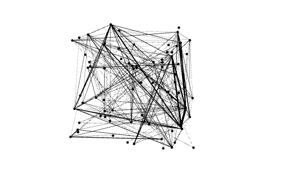
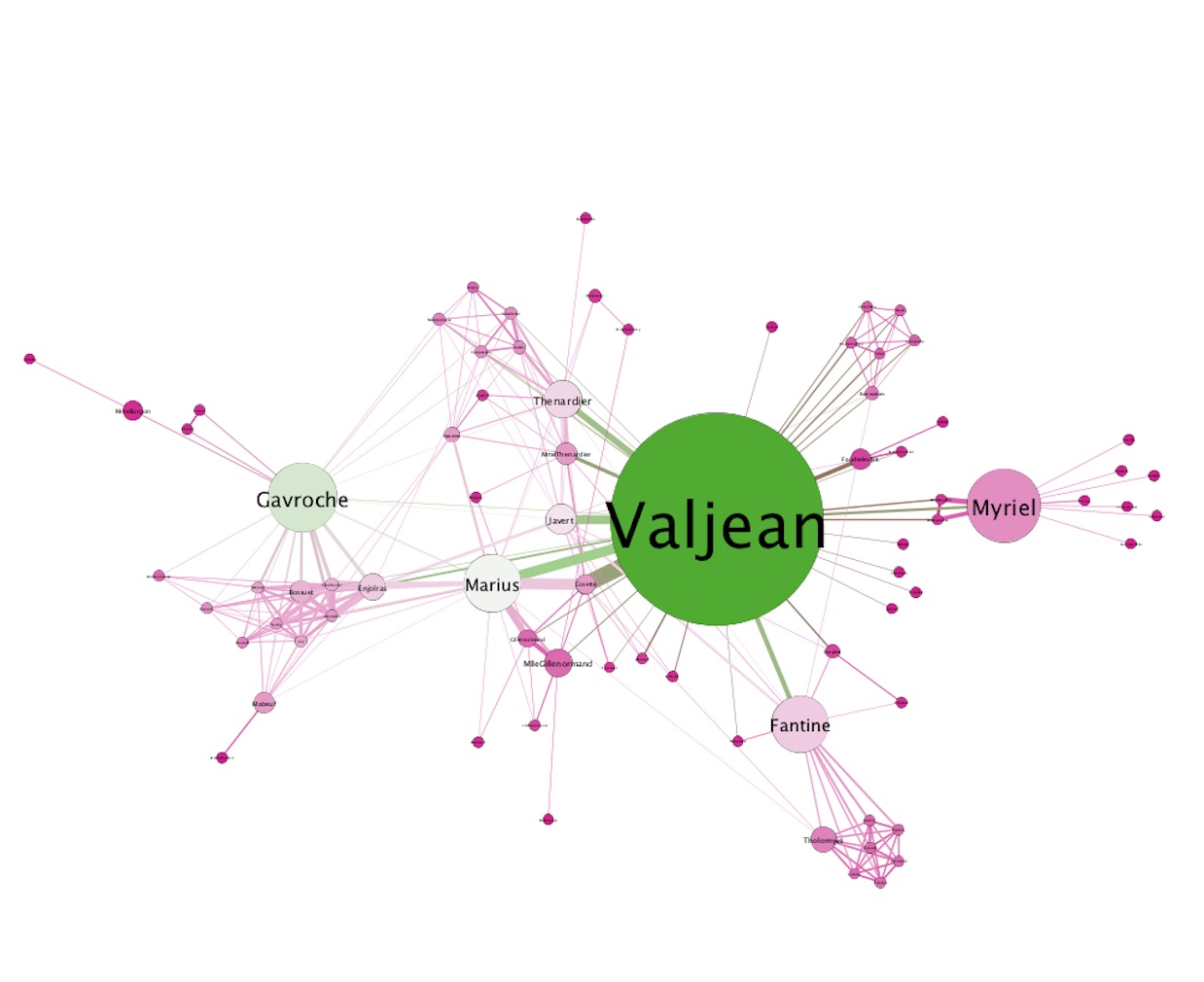
When opening this data in Gephi it displays an Undirected Graph of 77 Nodes and 254 Edges. This would be considered a undirected graph because there is no cause and effect at play. In this data we are observing mutual connections amongst the data. It is assumed that all the relationships within this data are mutual. Although there are some characters who display to have different social and economic standing within the novel, we are looking at interactions on a basic level, thus this should be viewed in an undirected graph. When viewing the data it soon becomes apparent that Valjean’s ID is 11 and Fantine’s ID is 23. Using their ID, Valjean talks to 4 different characters while Fantine talks to 9. I think this is interesting because Valjean is the main character, so I would expect that he would have more interactions than Fantine. Although he is the main character, this could be explained due to the fact that Fantine worked in a factory and then became a prostitute, so she would have more overall interactions. This also makes sense because Valjean was an prisoner/slave who had escaped, thus he spends the entire movie hiding- limiting his social interactions.
It becomes apparent that after changing the centrality settings the node size immediately changes. When doing this Valjean’s node becomes significantly larger due to his presence within the novel as the main character. Being the main character, Valjean interacts with the most individuals, causing his node size to increase. After running a statistical analysis it soon becomes clear that the APL is 2.64 and the diameter was 5.
For my personal data I chose to use a repulsion strength of 10,000. I chose this after playing around with many different numbers and seeing which would best represent the main user interactions while still displaying smaller nodes. My average path length was 3.614 and my CC number was 214. When considering the fact that Average Path Length is defined by “the average number of connections between people in this dataset”, this would show that the average number of connections between users tweeting using my hashtag is 3.614. This would make sense due to the fact that there are many individuals who are interacting with major users such as ppact, but when taking an average one must consider all of the users that have no mutual connections.
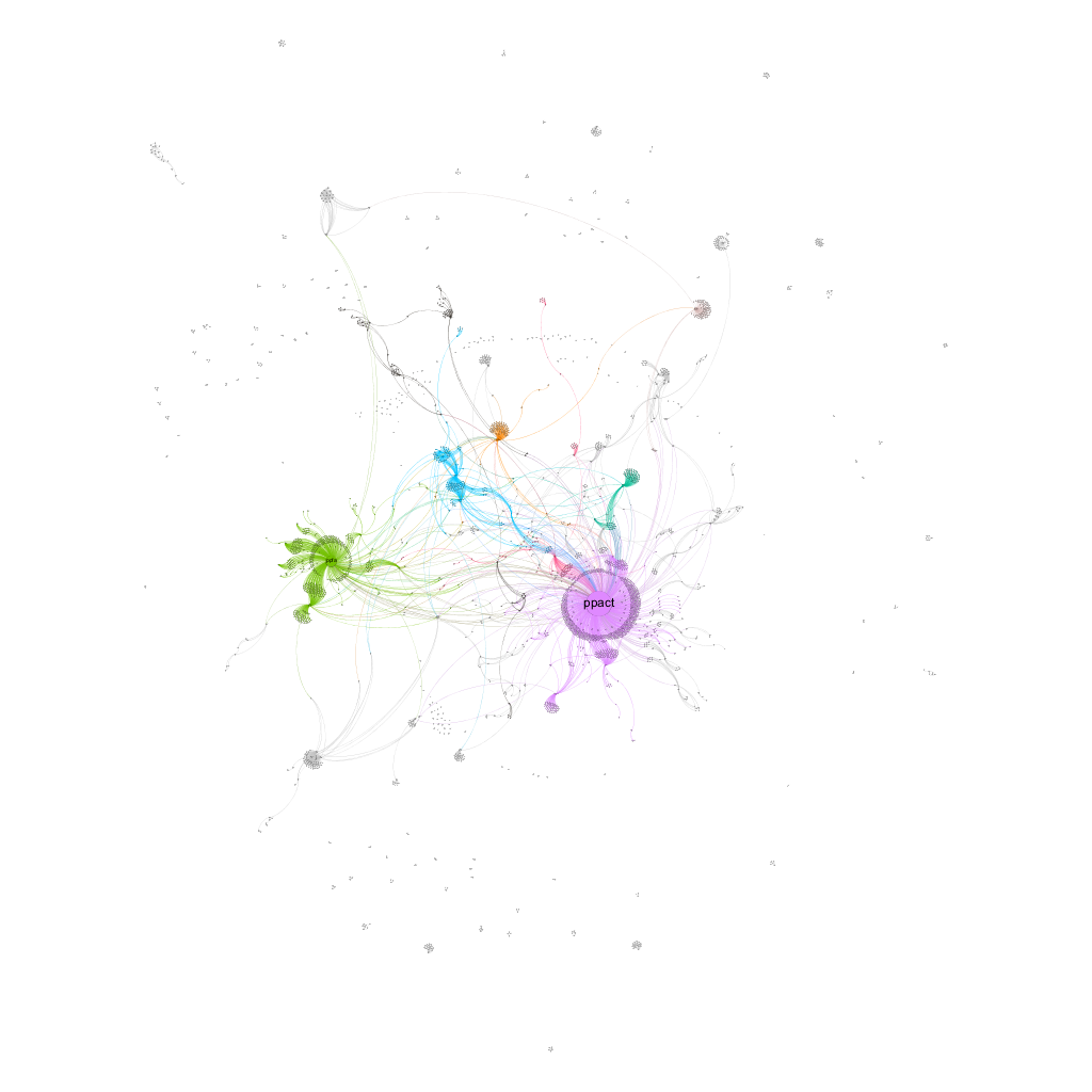
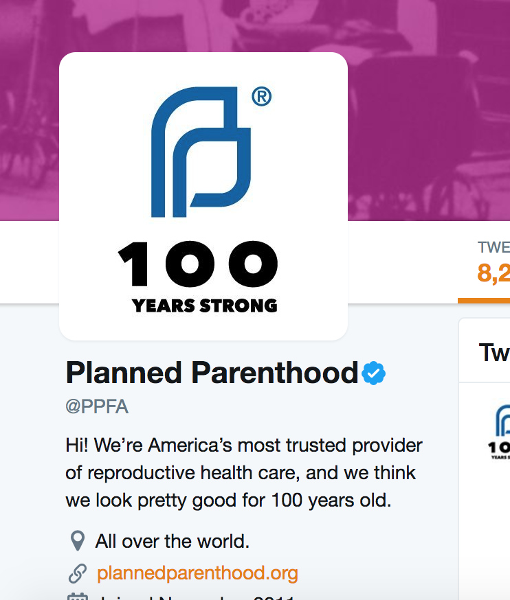
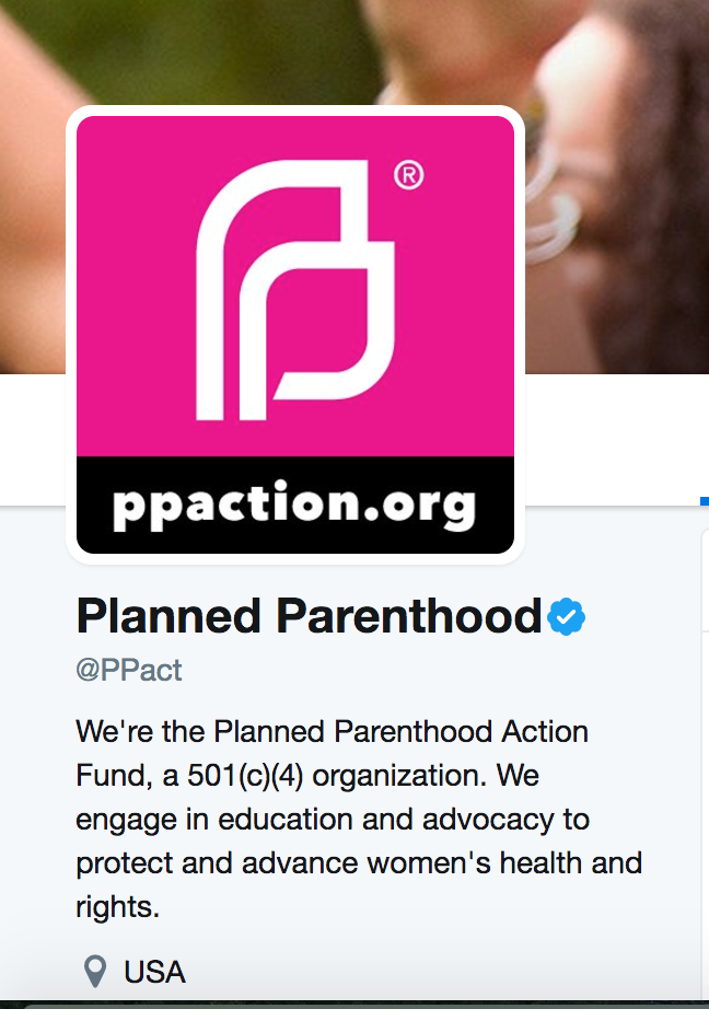
When looking at my graph overall it became apparent that the two main users that were being interacted with were ppact and ppfa. When looking up these users I found that PPFA stands for planned parenthood federation of america and PPACT stands for planned parenthood action fund. Below I have copied both of these twitter accounts. When viewing these two accounts on twitter it first becomes clear that they have the same symbol as their icon. After looking this symbol up I found that this is the official symbol of planned parenthood. The next thing that becomes apparent when looking at these two twitter users is the fact that they are both verified. This points at the fact that these are the official twitter accounts of planned parenthood. With this in mind, it now makes sense as to why these would generate the most interactions within the hashtag #StandwithPP, causing them to display the biggest note.
Although these are both the biggest nodes displayed on my graph, it is interesting to note the fact that ppact is almost double the size of the general planned parenthood federation of america account. While one would assume that the general planned parenthood account would be interacted with more, I believe this points at the nature of the tweets that are being composed using this hashtag. When understanding the hashtag #StandwithPP it is important to note that those who are tweeting using this hashtag are doing so to actively create change. In this they are writing with the intention of standing with planned parenthood during a time in which its position is at risk due to current political decisions being made. With this in mind, it would make sense that they are interacting more with the action fund. They are most likely trying to raise money for planned parenthood in hopes that it will aid in supporting it from being removed.
I thought that your post was very interesting, in the sense that the two main nodes were two verified accounts that work alongside Planned Parenthood. I also thought that your average path length of 3.6 was very interesting, this means that the people tweeting about planned parenthood are only three degrees of separation from each other, which probably makes for a great community and conversation. One thing that I think you should further consider is who is facilitating the conversation. I understand that a lot of people are in contact with the two verified accounts, but is it personal conversations? Or are these tweets more to just spread awareness and messages about updates with Planned Parenthood? I think that would be interesting to further research.
Your post makes me realize the involvement of verified accounts to facilitate conversations. In my twitter set, verified accounts about television shows involving the LGBT community were some of the main conversation starters. It also makes me realize how individuals can have the opportunity to talk to whoever they want, whether it be Donald Trump or their high school friend.
The fact that the PPACT hashtag was used more frequently than all the others does truly show that the people using this hashtag are supportive of Planned Parenthood and are dedicated to maintaining their funding and support by the country. It seems that Twitter users who use Planned Parenthood hashtags are trying to promote the fund and increase awareness about this issue, rather than talking about it privately with specific individuals. If I knew more about Twitter, it would probably be easier to develop an explanation for how this graph developed.
As it was last week, your graph shows a lot more respect and support for Planned Parenthood, whereas individuals who talk about transgender rights are a lot more critical and disrespectful, and our graphs show this distinction. It would be interesting to see how both of our hashtags were used a year ago, before Trump became president and threatened to defund PP and when transgender rights were not yet as publicly discussed as they are today – I have a feeling that the tweets were a lot less polarized at that time.