
Part 1:
For my dataset this week, I chose to use 3,000 tweets from March 16- March 21st. I chose to the maximum number of tweets because I thought it would allow me to see more connections within my data. March 21st is the day that I turned my Tags off and stopped collecting data so I chose that as my starting point of my 3,000 tweets and went from there. I chose to use this date because I wanted to have an analysis on my most current data. By using the extraction number 1, Python does not differentiate between tweets and retweets including singletons. I think that it is important to use this extraction because it allows you to see more connections within your data set. I expect that this will allow me to see who doing a lot of tweeting and the people who are retweeting and reacting to that. Looking at my data after running it through Python, I think that some of the spots on the right are empty because there was not another user name in the tweet.
Part II:
After having downloading the Les Miserables data into Gephi, I saw that there were 77 Nodes and 254 Edges. I chose to do an undirected graph because Les Miserables tells a story where there is a lot of overlap and connections between people so an undirected graph would allow me to see these connections.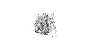
Valjean’s id number is 11 and Fantine’s is number 23. After looking at their connections, you can see that Valjean talks to 4 people while Fantine talks to 9. In my opinion I think that Valjean is the source of these connections and his 4 connections are Myriel, Napoleon, Mlle Basptistine, Labarre. I also think that Fantine is the source of the majority of her connections which are Valjean, Marguerite, Tholomyes, Listolier, Fameuil, Blacheville, Favourite , Dahlia, and Zephine.
By increasing the repulsion strength, I think that the nodes that had no connection moved really far apart which is why you are able to see the different interactions.
When adjusting the between centrality setting to minimum 10 and maximum 200, you are able to see how the node size changes. Valjean’s node becomes larger than the others. I think that this happened because he is one of the main characters in this story.
![Untitled[5]](http://commons.trincoll.edu/amst-data-driven/files/2017/03/Untitled5-300x300.png)
Part III:
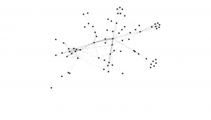
After I loaded my data set into Gephi, I put the repulsion strength at 10,000 because I thought it would make my data spread out more which would give me a fuller picture. My network diameter is 5 and my average path length was 1.115 which means that my data is only 1 degree of separation.
Looking at my graph, I was able to see the interconnections in my data. I found it interesting that I had many big circles. This is different from both Katherine and Danny’s graphs. I also found it interesting that with so many people connecting and interacting with one another, there is a group of people in the middle that have no connection at all. I am shocked that the realdonaldtrump or potus circle is not bigger because of all his controversial views on Muslims but this may have to do with days I choose to look at. I think that if I had used a different set of tweets I would have seen more tweets coming from Trump’s accounts.
I also decided to look up some of the accounts and tweets that were creating the biggest circles in my data and what I found was really interesting. Islamicfreedom, which is the dark blue circle, tweeted this
![Screen Shot 2017-03-29 at 10.41.59 AM[5]](http://commons.trincoll.edu/amst-data-driven/files/2017/03/Screen-Shot-2017-03-29-at-10.41.59-AM5-228x300.png)
along with the following photo.
![Screen Shot 2017-03-29 at 10.41.43 AM[5]](http://commons.trincoll.edu/amst-data-driven/files/2017/03/Screen-Shot-2017-03-29-at-10.41.43-AM5-265x300.png) i
i
I found it interesting that the people all connected to this account in my data are connected because they were retweeting this tweet rather than responding to it. This means that while these people are interacting with this specific tweet they are not talking to each other individually. I also looked at fiseebililah’s, the dark orange circle, tweet from my data set. This tweet contained a video about what people do when they see a Muslim on a plane with the words “Muslims on a plane #Islamophobia”
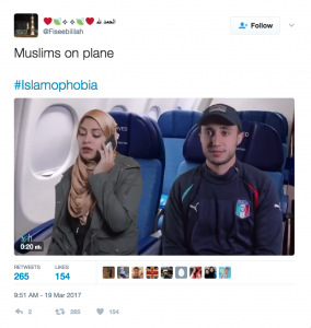
This tweet like the other tweet was more retweets than people talking about this tweet. I then looked at Kamalshaqui’s cicle, the light orange one. This was different than the other circle’s I had looked at. This person’s tweets in my data sheet were a mix of responses, retweets, and tweets of their own which made them connect many people which in my graph. I thought it was interesting that his circle and data was different than the others I had looked at. After having looked in the accounts of my graph, I feel like I have a better understanding of who is tweeting about Islamophobia.
I really appreciate the fact that you added pictures of the specific tweets in your graph to the lab. It makes it easier for the reader to understand the graph and makes the content much more powerful. I especially found the last tweet you spoke about very meaningful. You mention that a lot of people retweeted the picture of “Muslims on a plane” , but you did not elaborate on the content of the tweets. I am curious about how people react to this picture on Twitter, as it is a very racist photo. You may want to consider looking deeper into the content of the issues in some of the tweets, and add that in for a more comprehensible picture.
By comparing your graph to mine, it is interesting to see that your graph has many more similar sized large nodes, where as mine has a couple big ones that stand out. That must have to do with our different hashtags. Yours, #Islamophobia does not have one or two big hashtags that accompany it, but instead has a lot of related topics that have similar amounts of mutual RTs. As I stated in my lab, my graph looks more like planets revolving the sun, which is #WhyIMarch. However, your graph does not seem to have a node comparable to the sun in a galaxy. This makes me believe that my hashtag must be very different compared to yours, although they are both political matters, people use the two hashtags differently on Twitter.
Caroline, I thought that this was another great blog post. Like Katherine said, the pictures of the tweets you added to your post added a whole new perspective to your post. By doing this, you can see how people tweet about your topic differently and different perspectives people have on Islam. It is pretty crazy to see how people connect with each other on social media like Twitter, and how it happens without direct conversation. I think it would be very interesting to look at the different responses people have on either of these two pictures because this is where you will see people express their true opinions and own perspective on Islam. Every member of our group had very different graphs, but I thought it was very interesting how you had around six nodes that were pretty similar in size. I had one massive node in my graph, followed by four nodes that were of similar size. This is probably due to the fact that our hashtags are about completely different topics, but could be something that all three of us can look into. Good job!