
This data set is ranges from March 1st to Feb 28th. It will illustrate the aftermath of when Trump made statements to reverse the transgender bathrooms. It should be interesting to see who is tweeting with who.
I have 3,040 tweets once I cleaned up my data. Some of the tweets have empty slots because they must have just tweeted to tweet, not in conversation with another person. Or they could have just tweeted to start a conversation and no one replied.
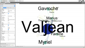
In the Le Mis graphic, there are 77 nodes and 254 edges. I think that a directed graph would show the power rankings within the movie, and also would show who directs the conversations between people. Not all conversations and relationships are mutual as there are slaves and other characters who would not have a mutual relationships. A directed map with arrows of showing communication flow would better illustrate the plot of the story.
Valjean is ID 11 Fantaine is ID 23.
If Valjean is looked at as a source, he only stems 4 relationships, if we view Valjean as a target of conversation then he has 26 new relationships and sources. This makes sense because he is the main character so he cultivates a lot of relationships though out the movie.
Source-Target (ID) Valjean–11-0 (13), 2 (12), 3 (11), 10 (10)
Source-Target (ID) Fantaine
If we look at Fantaine as a source, he stems 6 relationships, this makes sense as well due to their roles in Le Mis.
23-11 (47), 12 (46), 16 (39). 17 (40), 18 (41), 19 (42), 20 (43), 21 (44), 22 (45)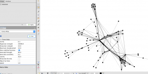
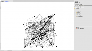
Because everyone is linked within this book regardless of other factors, the nodes can be connected in a wide variety of ways. I think that by making the repulsion strength larger is limits the qualities of the relationships so you can see who is really connected with each other within the book. People who communicate once or twice are less likely to have a strong line with a greater repulsion strength and strong relationships are clearly illustrated.
The average path length for this data is 2.64, this means that on average, the characters in Le Mis can be connected to each other through two mutual friends. They are on average 2.6 degrees of separation apart. the net work diameter is 5. This is small, the furthest two characters were from one another was through 5 connections.
Some of the circles are getting bigger than the others, I think that the larger circles are going to be the main characters of the book, as they are likely to have the most connections and conversations with people.
Here is the final product!
Part 3:
My repulsion rate for my own data was 10,000. I decided this because I really wanted to be able to see how far apart my web of communicators were, and I felt that the further the dots were from each other the easier it was for me to tell a story.
Average Path Length= 6.71 this means that it is a close community, and everyone is talking to one another. This means that there is on average 6.7 degrees of separation between tweeters.
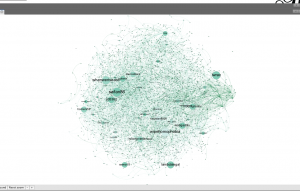
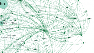
My graph is unlike any other’s in the class, it is all one color, which means that my users are tweeting about the same information. There are also few large bubbles that dictate conversation. My graph illustrates a large web of connections that facilitate their own conversations. When looking at the twitter handles of the users, it appears to be normal people, not celebrities or politicians. I noticed that none of my main tweeters are politicians, but instead TV shows such as We Rise the new show on ABC, and Moonlight the movie. The director and producer of We Rise, Dustin Lance Black, was one of the main people being tweeted at as well. I found this interesting as my previous twitter data has often involved the media and things like the Oscars, so I think that it makes sense a main person tweeting is the people who are in charge of the social media accounts for television.
Another one of the main bubbles was WipeHomophobia, which is a verified account that tweets out resources and links to aid people in the LGBT community who need help with suicide prevention. These types of accounts are interacting with individual people. I have found that this hashtag cultivates one on one relationships with people and might act as a way to discuss personal struggles the LGBT community faces. Another large twitter user I found was HRC, the Human Rights Campaign. These twitter conversations are filled with coping resources, campaigns, and a fight for justice, which perfectly reflects my previous research on this topic.
There are also a lot of one on one conversations between average users. This web graph shows how the LGBT people really provide a sense of community and friendship. Considering the average path length of 6.7, there are a lot of mutual friends. I believe that twitter is a place where members of the LGBT community go to to communicate with their peers. I also noticed that there are individual twitter users who connect to a lot of other bubbles. This means that individuals are very active and interactive with other accounts. One individual in particular @psychicfish has a strong community of twitter users. The image below is a screenshot of the outskirts of my web. This shows how connected users are. All of these people stay in communication with each other and have conversations as peers. Another interesting thing I noticed was how creative the usernames were. One of my personal favorites was glamKitty.
It’s amazing how much connection there is between the Twitter users in your graph. Mine had a good amount of connections but there still were a good amount of separate conversations going on, along with quite a few who weren’t conversing with anyone at all. The #LBGT hashtag seems to show the true family that the LGBT community has with one another. Another difference from my graph to yours is the types of other hashtags incorporated into it. Mine had a porn account and a bunch of derogatory terms for transgender individuals, similar to the results I found last week. Yours, however, shows support organizations such as WipeHomophobia. People who use the LGBT hashtag seem to be a part of the LGBT community, whereas people who use the transgender hashtag more commonly use it to rant and criticize transgender individuals for not being legitimate. It would have been interesting for me if I had kept the graph expanding even longer with the repulsion, as it could have possibly developed a more intricate map that yours did.
Something I found to be really interesting when looking into the gephi model of your data is the fact that it is all categorized under one single color (green). Like you noted in your write up, this is something that occurred only to you out of the entire class. The fact that it is all one color shows that all of your users seem to be tweeting about the same data, which is really abnormal. I personally am very surprised to see this as your topic is one that not only has a large global significance, but is one with numerous opinions. While my data also had a lot of connections there was still variety in terms of conversation. I really liked how Naty pointed out that this speaks to the LGBT community and the sense of family present. When first seeing your data it was difficult for me to understand how the conversation could be so interconnected, but Naty’s interpretation really helped.
Going off this, I was also surprised to see that you did not find any large celebrities or politicians engaging in your hashtag. While I would expect that there would be a lot of average users, I would expect that there would be major celebrities and or politicians also voicing their opinion online regarding the LGBT community. I would think it would be interesting to look deeper into why there aren’t as many big celebrities tweeting using this hashtag.