
After analyzing the data, I found that the majority of the tweets uploaded were posted in the US, with a few posts in Russian and French. Since social media is used in the highest density in cities, I’m expecting to see most tweets posted in cities like New York City and Los Angeles, with the locations 40N, 74W and 34N, 118W respectively. These two cities are known to have among the highest densities of people, and therefore are likely to be talking the most about gay rights. My hometown is close to Hartford, so I think my geographic location is around 40N, 70W. It’s highly unlikely I’ll find much, if any, tweets from my hometown area because it’s more of a suburban area, and people are not as passionate about progressive issues there.
There are 748 tweets that include #makeamericagayagain in this time frame. Only 9 had geolocations added, making 1.20% of the tweets. Yau describes in Data Points how it is possible to develop maps of where an individual travels based off of the geographic location from their phone. If the geographic location enabler was not always on, however, this map will not be accurate, as some points and trips do not get recorded. Of almost 750 tweets that could be from all over the world, the 9 tweets with a geolocation is too small of a group to be an accurate representation of all of the logged tweets. Most of my tweets are likely to be in the Northwestern quadrant, as they are probably all posted in the United States. Since the hashtag is #makeamericagayagain, it is primarily Americans who are concerned about this issue. People in other countries may be curious about it, but it is unlikely that they will be passionate enough about a different country’s gay rights to tweet about it. All of the geographically tagged tweets are in English except for one, which is in Spanish. This is expected, as English and Spanish are the most frequently used languages in the United States. This does not affect my thinking, as it is what I expected.
Based on Boyd’s and Crawford’s description of big data, I could consider my results to be big data. They indicate that big data is often a misleading term, as “big” could indicate “significant” rather than “large.” As explained in their article, “Big Data [is] a cultural, technological, and scholarly phenomenon that rests on the interplay of technology … analysis … [and] mythology.” They later say that big data “changes the definition of knowledge” and usually makes the most sense when used in context – if referencing big data out of context, it loses its meaning. My tweet results certainly can provide conclusive results that can be reinforced with further research. The results tell us that people talking about gay marriage in America on Twitter are primarily American, and though a small percentage of individuals use geotags, all of the results indicate that the tweets were posted in the United States. The results are not big, but they are significant.
Julia only had .01% of her hashtags geotagged – of about 21,000 hashtags, 16 were geotagged. Olivia has 2,000 total tweets, of which only one was geotagged. I was initially surprised that my hashtag had so few tweets in comparison to theirs, but after analysis it made sense – the current news focuses more on transgender rights rather than gay rights. #standwithPP and #LGBTrights would certainly be more relevant as of the past few months than #makeamericagayagain, because although gay rights is coming into question again with our new president, the country is more passionate about developing even more new rights rather than maintaining what we already have.
With this visualized data, I am able to analyze the #makeamericagayagain tweets much more easily. It makes sense that the few tweets I have area all located around major cities, such as Los Angeles, Boston, and New York City. It is unfortunate that there are so few data points, but with the data I have, it is likely that the posts that did not have a geotag were still mostly published near major cities. This graph tells me that major cities are generally liberal and do support gay rights.
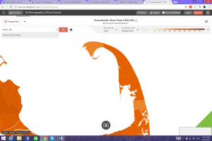
The two zip code areas that I chose to focus on are two locations where these tweets were posted; one is in lower Manhattan, with the zip code 10038, and the other is in the tip of Cape Cod, with the zip code 02657. For the Manhattan data, I decided to focus on the census tracts 15.01, 25, and 8, and studied the change between 2006, 2010, and 2015 of individuals in these regions that have incomes below $10,000.
Image 1: Individuals with an income below $10,000: 2006
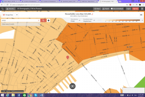
As we can see, in 2006, tracts 25 and 8 were combined into one, and both had a greater amount of individuals with an income below $10,000 than were in the tract now known as 15.01.
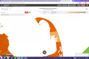
Image 2: Individuals with an income below $10,000: 2010
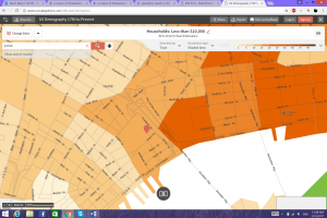
Now tracts 25 and 8 have been separated, and we see that tract 25 has the greatest amount of individuals with an income below $10,000, with 15.01 still having the lowest amount.
Image 3: Individuals with an income below $10,000: 2015
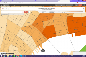
Not much has changed in the distinction between these census tracts between 2010 and 2015.
For the Cape Cod census, I focused on amount of households that had an income above $100,000 in 2006, 2010, and 2015.
Image 4: Individuals with an income above $100,000: 2006
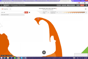
In this map, we see that the amount of households with an income above $100,000 in the cape is consistent throughout.
Image 5: Individuals with an income above $100,000: 2010
Here, we see that at the very tip of the cape and further south, there is a fewer amount of households with this high of an income.
Image 6: Individuals with an income above $100,000: 2015
At this point, there is a significant difference in the amount of households with this wealth in the middle of the extending cape.
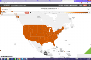
For the study of the entire country, I decided to focus on the amount of households with an income above $50,000 in each state across the country.
Image 7: Households with an income above $50,000: 1970
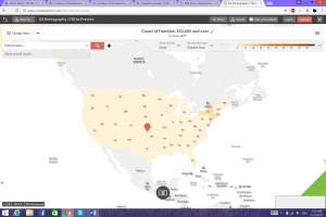
At this time, it was extremely rare to find individuals with this high of an income.
Image 8: Households with an income above $50,000: 1990
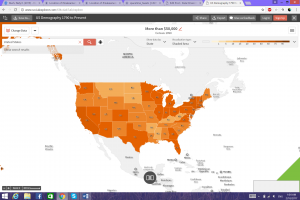
In just 20 years, we see a spike in the amount of households with this minimum income.
Image 9: Households with an income above $50,000: 2010
By 2010, the entire country was consistent with having a great percentage of households with this minimum income.
After analyzing this data, it has become clear to me just how extensively our available resources can supply us with data. We can either look at data regarding the entire country over decades, or we can look at data for specific districts in a city over individual years. The first two studies, of Manhattan and Cape Cod, indicate the fluctuations in populations over small periods of time. Although the number of households with these particular income ranges changes only slightly, we see that the changes do often remain and then affect how the populations will change in future years. The change in the entire US of wealth between 1970 and 2010 is substantial, but this data displays the necessity of having background knowledge when viewing charts and maps. The worth of the dollar dropped significantly between these two years, making it much easier for a family to have an income of $50,000 now than it was 40 years ago. We have many more millionaires than we had in 1970 as well, as the distribution and explosion of wealth has substantially increased in this time range.
In an article by Gary Gates titled “Marriage and Family: LGBT Individuals and Same Sex Couples,” Gates states that as many as 2 million individuals in the United States have an LGBT parent and 200,000 individuals have same-sex parents. Recent data reports that there are fewer individuals with same-sex parents now as there were in 2000, which is likely not due to there actually being fewer same-sex parents, but rather the stigma against the LGBT community discourages many people from admitting that they have gay parents. This information can relate to the data that I found – although gay rights is a heated topic that is still discussed, not many people use the tweet #makeamericagayagain, not because they have no use for it but perhaps they do not want the stigma attached with being associated with it. In addition, the few number of tweets that have a geotag location may be so low due to the same reason.
An article by Karma Chavez et al entitled “Equality, Sameness, Difference: Revisiting the Equal Rights Amendment” discusses the Equal Rights Amendment, which although it was established in the 1970s, it is still causing issues to this day. Although we are all supposedly equal, women reportedly have lower incomes than men with the same jobs, the LGBT community gets outcasted from social scenes and jobs. This information can explain why people may not be talking about #makeamericagay again as often as they used to – now that gay marriage has become legal throughout the country, although it is now under watch again, the society has more pressing social issues that it needs to overcome, such as transgender rights.
Graham coins the term “software-sorted geographies” to help explain the swiftness that software and computers can analyze the social world. People’s lives are changed based on how their interactions with the internet and computers are – both how the internet views them and their access to the internet. Both articles that I cited relate directly to this term, as the internet and the society view the LGBT community in a very particular manner, and people who post tweets and articles on the internet are extremely divided on the issue of LGBT rights and equality.
One thing that really struck me in your analysis was the article you read by Gary Gates. I was surprised to hear that since 2000 there are less individuals in the United States with same-sex parents. I was under the impression that there would actually be more same-sex couples since 2000, so I am very happy you included this in your analysis. I feel as though this article is really important when considering your hashtag and how it will develop over the semester and beyond. This stigma against the LGBT community is an essential consideration when looking into your topic and is extremely interesting to examine.
In your analysis you discuss possible reasonings behind the fact that your hashtag only generated 750 tweets and how little this is when putting it into comparison with Olivia and my hashtag. This was something that really surprised me when looking at the data the three of us collected as well. I thought it was interesting that you noted that although gay rights is a trending topic at the moment, our current news focuses more on LGBTrights due to the fact that our country could possibly be more passionate about developing more rights as opposed to simply maintaining the rights already in place. While I see how this could be true I still wonder how my hashtag plays a role in this interpretation. It would be interesting to look at why my tweet, which we would be considered a right we would be maintaining as opposed to expanding, was able to generate as many as Olivias.
Something that I found really interesting in your analysis of your data that differed from Olivia and mine was the way in which you interpreted big data and how you considered your data to be possibly “big data.” While I automatically looked at my data and thought it could not possibly be “big”- I found it interesting the way in which you pointed at the fact that in Boyd and Crawford’s article they point at the fact that big data is often a misleading term and many would expect that this only refers to the quantity of the data, when in reality it can refer to data that is significant in its ability to point towards conclusive results. While I still see my data to not be yet big, I understand the ways in which it can develop and how it has a lot of potential to be.
I thought the two zip codes you chose to further examine was very thoughtful. To look at the zip codes where the tweets were found is very smart. However; I did not see the correlation between income and the LGBT community. I think it would have been more interesting to look at marital status or something like that. However; I thought that it was so interesting that your tweets are often found at the tip of Cape Cod. Providence Town is self proclaimed as the gay capitol of the United States, so it makes perfect sense that people are so passionate about making America gay again. Knowing this, I think it would be really interesting if you further analyzed where typical gay communities are and if there is any correlation between those locations and the tweets you find. It could be also interesting looking at “anti-gay” communities to compare and contrast.
Like Julia, I also found it interesting that the Gary Gates article stated that there are less people with same-sex parents now than in the past. With the recency of the approval of same-sex marriage, I expected this number to leap drastically. This makes me think more about my hashtag, because I often view the LGBT community as ever-growing with people and support, as it becomes more and more accepting. I think that it is interesting that people are tweeting my hashtag #LGBT but I wonder what percent of those people are actually living and LGBT life where they have partners and are starting families. It makes me wonder about the age group of the people tweeting my hashtag.