
When scrolling through the different languages in my tweets I found a very wide range. In total, I found that there were 24 languages within my dataset. These languages included: Arabic, Bulgarian, French-Canadian, Danish, German, English, British English, English Australia, Spanish, French, Indonesian, Italian, Norwegian, Japanese, Korean, Netherlands, Norwegian, Polish, Portuguese, Russian, Swedish, TH, TR, VI, XX-IC, ZH-CN, ZH-TW.
The total amount of tweets in english 80992 of the 83967 tweets. This displays that 96.5% of these tweets are in english.
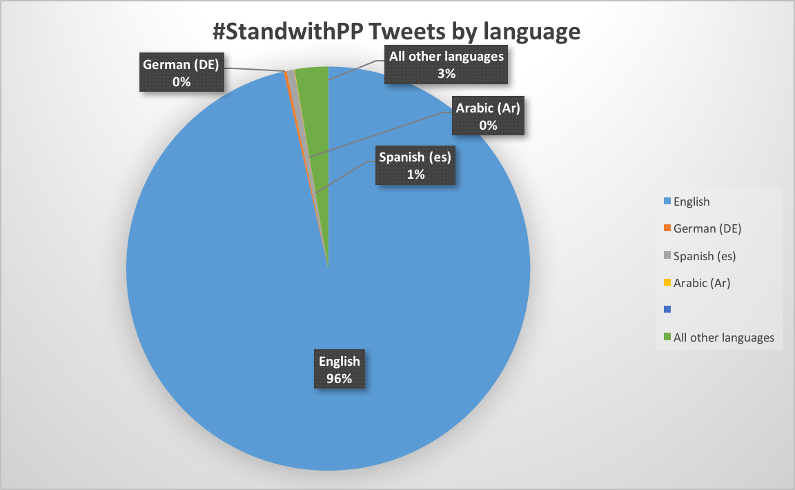
When viewing this information in a pie chart it becomes clear that English is the dominant language. Following english is Spanish, which is only 1 percent of the total language. Although I had a wide range of languages, each language does not have many users besides the english language. This is probably because of the amount of tweets I decided to incorporate in my dataset. By using such a large sum of tweets it became more likely that there would be such a variety of languages. Despite this, my data still showed that English was the main language, leading by a large amount. This could be due to the fact that most, if not all, of the discussion is being generated in the United States. This would also explain that Spanish would have the second largest presence.
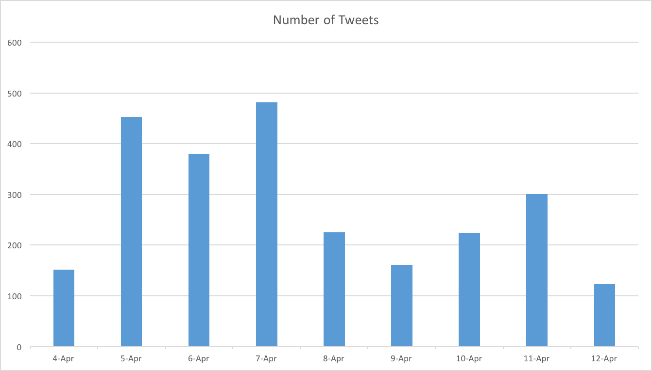
Due to the fact that my dataset was so large initially, the dates of my tweets spanned through a long period of time. Because of this I decided to take a smaller sample of my tweets, grabbing the top 2500 tweets out of my dataset. In this I was able to draw tweets from 9 different days. On April 4th there were 152 tweets, on April 5th 453 tweets, April 6 380 tweets, April 7 481 tweets, April 8 225 tweets, April 9 161, April 10 224, April 11 301, and April 12 123. This was useful in that I was able to see if there were specific days of the week that were generating more tweets than others. By using a smaller dataset I was able to look more into specific days and what was occurring in the news on those days. In my bar graph it becomes clear that April 7th generated the most amount of activity. Following this was April 5th. The least amount of tweets being generated was on April 12th. After looking into google news I noted that the Seattle Times posted an article “Planned Parenthood deserves support, not to defund it.” Although this is a more general article, its main objection is to stand with planned parenthood and against the defunding of it. This type of article supports action in support, which could motivate those who support and are tweeting to do so. When analyzing my data throughout the semester this has been a consistent trend. Due to the fact that my hashtag is one of support and actively standing for an issue, it is positive support that typically generates the most activity from the users tweeting with my hashtag. Also on April 11th it came out that “Republican lawmakers said Monday they want the state to foot the bill for a new family planning program that excludes funding for Planned Parenthood.” While April 11th did generate a lot of activity I am surprised that there was not more. Other than these articles there were not many that really stood out to me during this time span.
When evaluating my data I found my mean to be 277.78, my median per day to be 225, not to have a mode, my total data to be 2500, my max to be 481, my min to be 123 and my range to be 358. When looking at my mean, median, and mode in comparison to everyone elses I was surprised at how large of a range there was. My mean was on the smaller side and was a lot smaller than many of the other individials in my class. Although Danny and I used the same sample size of 2500, he was only able to get tweets from 2 different days within this sample as opposed to my 9. It would make sense that I did not have a mode due to the fact that there are only 9 different days and the probability of any of these nine days to generate the exact same amount of tweets is extremely slim. I found that when looking at everyone elses mode most did not have one either. My median was very similar to my mean. After taking statistics I know that when considering my 5 number summary, if I were to graph this information I would find that because the mean and median are pretty similar, I would have a pretty normal distribution. While my issue typically generates a lot of tweets, it is clear that there was not much occurring in the news during this 9 day period regarding Planned Parenthood. There are many different issues occurring in the news displayed by the different hashtags within my class which could have been gaining more attention during this time period.
When looking at the max, min, range, and count of my data in comparison to the rest of my class it seems as though my maximum is on the lower side. The maximum seems to correlate a lot with the mean, where the individuals who had a high mean also displayed a high maximum. Although my max was on the smaller side when compared to others, my minimum was not smaller than others. This would explain why my range was generally smaller than most others in my class. It seems as though because there was nothing that specifically occurred during these 9 days within my topic, I was generating more of a consistent amount of tweets each day than others in my class. I am able to note that there are people with a very high min and high max, causing them to have a large range. This could be explained if something major happened regarding their topic on one day, causing many people to start tweeting about it. Google news would confirm my hypothesis that nothing really huge happened on one particular day within this 9 day span, causing the amount of tweets to remain consistent.
Prior to this lab, I was seeing a lot of trends that displayed the type of news that generated activity with my tweet. Although in many cases it is acts against specific issues that cause talk, mine tends to generate activity when displaying acts of support. In the last lab I saw that there were more people who were following the twitter account for the funding of planned parenthood than there were the general planned parenthood account. This shows that many people are positively reinforcing planned parenthood and react better when asked to support planned parenthood as opposed to stand against those who want to get rid of it.
The huge majority of tweets published in English really does indicate that the issue of Planned Parenthood is exclusively an American one, and therefore few people would be tweeting about it in different languages. I wonder what the tweets in other languages besides English and Spanish are about – perhaps people from other countries are showing support for PP, or they have family members who work for the organization?
I find it interesting that you did not find any significant news to explain the peaks in #standwithPP tweet activity. April 9 had quite a small amount of tweets in comparison to the rest of the days in your time frame, but it seems this is simply due to natural fluctuation in people’s Twitter activity. I wonder if there were significant milestones (or setbacks, the more likely thing to occur) in Planned Parenthood recently that would have caused a peak in #standwithPP activity. For example, yesterday Trump signed an order to allow the withdrawal of Planned Parenthood funding within each state. This likely caused an explosion in social media discussion.
I think that all of your graphics for your post were very clear and made sense to look at. I thought that your analysis on your mean, median, range and mode made a lot of sense to the break down of your data in place of everyone else’s. I was surprised that 2,500 tweets covered a span of 9 days. I expected planned parenthood to be more talked about. One thing I would further consider is how your hashtag popularity comes in waves. It doesn’t seem that your data is consistent in the amount of tweets a day, and I think it would be cool to further analyze what makes your hashtag trend, is it based on politics? I would guess so.
I think that your data set compared to mine is very interesting. My Data spikes on topics that involve the media, just like how yours does, but mine is more based on pop culture; things like the Oscars and TV shows, while yours can be altered by a political statement by Trump. It is amazing to see the impact mass media has on individual’s tweets.