Injury Prevention Center Round Talk Map

Posted on

Final Greater-Hartford-2010-2014-Arrest Rates(2)

Final TroopPolygonShape

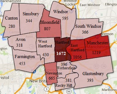
What is done: The first map is a clip of the Greater Hartford polygon map. The shaded polygon map represents the amount of arrests made from 2010-2014. Based on the shading, the darkest color represents the greatest arrest made versus the lighter shaded polygon which shows a lower range of arrest rates. Since this map was time sensitive and Garry just wanted a still picture of the map, I used Paint to label the town names and the rates of arrests made. The second and third map shows the troops of Connecticut and the arrest rates made from 2010-2014. There are police departments that cover multiple towns in Connecticut which is why there are Troop data. Troop data allows the audience to visualize the arrest rates in greater regions. The same color coding for the ranges apply.

What needs to be done:
Compile data to create entire state of Connecticut Map that is shaded just like Map 1
Currently working on Google Slides with Garry

Current Progress on Excel:
Interval Data:
https://www.google.com/fusiontables/DataSource?docid=1wBYD2HR4soYIS98UUoG-6pn-GKE2Vr_9Dl0ggOlJ

2010-2014 OCD Assault Rates:
https://www.google.com/fusiontables/DataSource?docid=1mkGpeGUjdsWO_0Ibw4ukuCPORwzQe4RU61xJMU2W

Hartford Food System

Posted on

Map

Our partner would like a map of food access in Hartford, including grocery stores, convenience stores, farmers markets and community gardens. They would like us to indicate all the places that are WIC certified, as well as bus routes. The map would serve two purposes: (1) to give Hartford residents an easy way to find healthy, affordable food in their neighborhood, and (2) to highlight the serious issue of food insecurity in the poorest areas of the city. Using polygons, we will demonstrate the income disparities of the different census tracts.

So far, we have mapped all of the grocery stores, convenience stores, and farmers markets as points. We still need to need to map the farmers markets and all of the places that are WIC certified. Then, we will need to add the CTTransit bus routes and the polygon data on median household income.

Assignment 8-KNOX demo

Posted on

link to map demo: http://doris0221.github.io/fusion-point-polygon/

My partner is expected to see an interactive map with two layers. On the first layer, it shows the all the community gardens with detailed profile information. The profile includes the address, the number of plots, photos of the garden, spot availability of the garden during the year and greenhouse availability(3). The second layer shows the Hartford neighborhood border, which divides gardens into different regions and also gives audience an easier way to visualize where their closet gardens are. Adding on to this border map, there is also a search tool, like the one in Google map, for audience to search by address. Audience can simply type in their own address in the toolbox. The map will then lead the audience into the closet garden according to the location. Moreover, there is another filter tool on the side of the map. The tool filters out by the information listed in the garden profile, such as the greenhouse and garden plot availability.

Steps completed:
Make point map
Make polygon map
Merge two maps into layer map
Create filter tool
Collect photos

Steps to be done:
Make photos appear in the profile–demo:https://support.google.com/fusiontables/answer/2527132?hl=en
Collect more photos
Fix filter tool
Edit code in github

Progress from Injury Prevention Center

Posted on

Intimate Partner Violence Arrests in Connecticut 2010

Intimate Partner Violence Arrests in Connecticut 2011


Intimate Partner Violence Arrests in Connecticut 2012

Intimate Partner Violence Arrests in Connecticut 2013

Intimate Partner Violence Arrests in Connecticut 2014

Intimate Partner Violence Arrests in the Greater Hartford Area for 2010-2014

Injury Prevention Center Vision: To have a shaded polygon map of Connecticut from 2010-2014 that contains the rate of arrests, children involved, and the average rates of arrest per year. On the map, the towns should be labeled and be able to hover over the towns for the information. In addition, there would be a table containing the same information as well as a bar/line graph.

Round Talk Vision on April 12th: Since this is the first priority, the vision is to clip the greater Hartford area to represent the interval shelter homes for victims of intimate partner violence. With this, there will be a shaded polygon map with town labels, the rate of arrests without the involvement of children for 2010-2014. Since this will be used in Garry’s Power Point, he would like the map to be a screenshot.

Steps Completed for Data Visual Vision:
Shaded polygon maps completed for all five years.

Steps to be done for Data Visual Vision:
Compile the five years of data into one polygon map, recalculate the data to factor in child involvement, use another tool to label the towns, create the table and bar/line graph.

Steps Completed for Round Talk:
Clipped the greater Hartford from mapshaper.org and exported it to Google Fusion. And is in the progress of compiling/cleaning data.

Steps to be done for Round Talk:
Compile/clean arrest data to import into Google Fusion, label the town names, color code polygon and have this ready for Garry before April 12th for revisions.

My Demo of the project

Posted on

Link to the demonstration:
Map tour demo

I have already embedded my story map into my partner’s website. There are only 3 pinpoints on the map now, and we wish to have 30 pinpoints for our final project. Each pinpoint will consist of introductory paragraph, quotes, and pictures. Some pinpoint will also show artifacts and 3D models. The final project will be a live story of Mr.McCook’s around-the-world journey. We wish the story map to be easily editable, and we will also produce a text-and-picture only paper form interpretation of the tour for further use and updates.

Steps I have completed:
0. All the scanning of McCook’s journal and sorting of files.
1. Create a storymap, and add contents to it.
2. Figure out how to embed 3D models without killing the application.
3. Write several intros to the pinpoints.
4. Figure out how to export data through the story map(which was once thought as impossible).
5. Create the website and embed my map to it.
6. Update the original data document corresponding to the map.

Steps yet to be done:
1. Finish all the readings of the journal and write intro to all of them(estimated time of completion: next week)
2. Add all contents to the storymap demo version(estimated time of completion: mid-April)
3. Figure out how to edit the style of the pointers on the map, b/c now the pointers are hardly visible(this can only be done through github code editing, so that I will have to have host server for the website, which make this seemingly-simple mission extremely hard. I will try to do that after I finished the demo version).
4. Follow-up with my partner frequently to update the data I have(Some necessary pictures still need to be added)
5. Introduce my partner to the ArcGis tool, and let her know how to update in the future.
6. Present the work before final.