
Part I
I chose the week of February 6-13th because that was the time period I used for the Text Analysis Lab and I would like to compare my data.I copied and pasted the link to python and now a new file popped up on the desktop. So now I expect that the Python code has been applied to my data. I am not sure what I will find.
I found that I have 4,336 rows of two columns. Some of the right columns are left blank because that means some people retweeted, but may not have mentioned other users. Jack and I agree that people might retweet something, but not have anyone in particular that they want to tell.
Part II
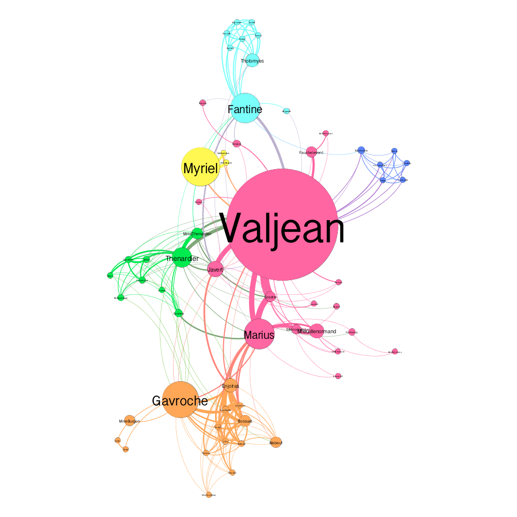
When I opened the file, I found that there are 77 nodes and 254 edges. We would choose an Undirected graph over a Directed graph for Les Miserables because we want to see the mutual relationships between all of the people even if they are not all talking directly to one another.
Valjean’s ID # is 11 and Fantine’s # is 23. We found that Valjean talk to 4 people and Fantine talks to 9. I have never seen Les Mis, therefore am not familiar with the main characters. However, I was told that Valjean is the main character so I am curious as to why he only talks to 4 people. I assumed he would have more interactions than Fantine. Julia acted this play out in high school, so she was telling me how Fantine worked in a factory and then became a prostitute, so this might explain her many interactions shown on the graph. Valjean was an escaped prisoner and did not want much social interaction, so this could explain his fewer points of contact shown on the graph.
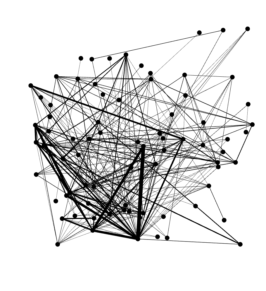
When I increased the repulsion strength from 200 to 10000, it seemed as if the dots grew farther apart, making it easier to interpret compared to the clump of dots that it was at 200.
Average Path Length: 2.6411483253588517
Diameter: 5
When I changed the min size to 10 and the max size to 200, the center dot became much bigger than the others. The dots closest to the center increased in size as well, but not as big as them middle. The ones on the outside stayed small. I think the biggest dot shows the main character, or the character with the most connections to the other characters, and the smallest represent the ones with the fewest connections.
Part III
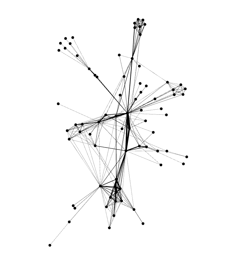
I chose 10,000 as repulsion strength.I chose 10,000 because it shows the best size relationship between the larger nodes and the smaller nodes. This graph shows the largest node without drawing all of the attention away from the smaller ones.
APL: 4.567
Modularity: .756
CC: 300
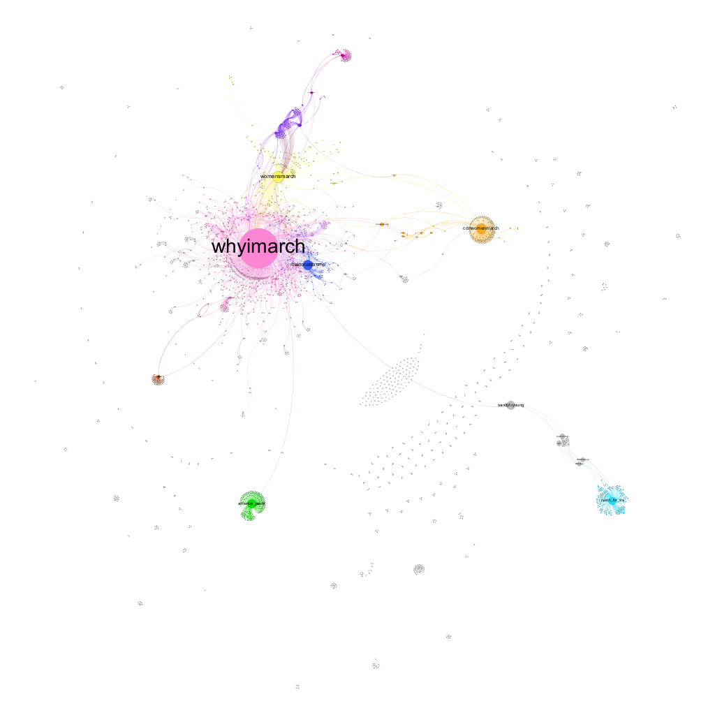
As expected, WhyIMarch is the largest node. I made the node pink, but now that I am looking back on it I probably should have made it yellow to depict the sun. That is what the nodes looks like to me. #WhyIMarch is the center of the node galaxy, and each of the other nodes revolve around it. The nodes closest to the sun are planets realdonaldtrump and womensmarch. It is interesting that I have realdonaldtrump on my Gephi graph because his anti-women theories are the reason people are marching. Realdonaldtrump would not be using the hashtag #whyImarch, which makes me think that users are tweeting @realdonaldtrump, arguing against his points, and pointing out that they march because of him. It makes sense that womesmarch is connected to whyImarch and they are right next to each other because they have the most “mutual connections”.
The next closest node to the sun is cdnwomenmarch. I had to look up cdnwomenmarch, because I was unsure as to what it stands for. I found out that it means Women’s Canada March! This makes sense that it is not connected to any of the American hashtags, because people in Canada might not have a strong connection to those in America The node is about the same size as realdonaldtrump, however it is off on its own with multiple users around it, who I assume are Canadian. There are only a few users who connect the stream to whyImarch. There is one singular line that connects one user, sandylcyoung, whose dot is bigger than everyone elses, over to March_for_life. I was wondering why sandylcyoung’s dot is much larger, and I think it might mean that the user has many followers on twitter. I went to her twitter page and she has 17K likes. She follows 1K and has just under 1K followers. The smaller nodes surrounding big ideas must mean they are users with very small amounts of followers. One line connects the main clump of nodes to America_partii which I had to research in lab #2 because I was unsure of what it meant. It is interesting to see it now showing up as one of the bigger nodes because it means they must tweet about the women’s march often.
The smallest of the large nodes is “susavestheworld”, which I also had to look up. Susan Adelman is a women activist who tweets very often about womens rights and anti-trump movements. Her tweet has been retweeted often in this set of data, “RT @susavestheworld: #WomensMarch A day without women A day without immigrants What will “those people” do? _™ê… a good mystery. #WhyIMarch #Š—_”. This is a very popular tweet, as it was tweeted over 100 times in the 3,000 tweets I collected in this data set.
I have a small node, ppact, which corresponds with Julia’s largest node, which means “Planned Parenthood Action Fund”. The farthest node away is aliciakeys. With a few followers around her. Maybe that means she is a large player in the women’s march. Her tweet, “RT @aliciakeys: Sisterhood _™‘™_™‘™ #WomensMarch #WhyIMarch #WomensRightsAreHumanRights” was retweeted often in this data set. I looked up the tweet and found that these pictures accompanied it.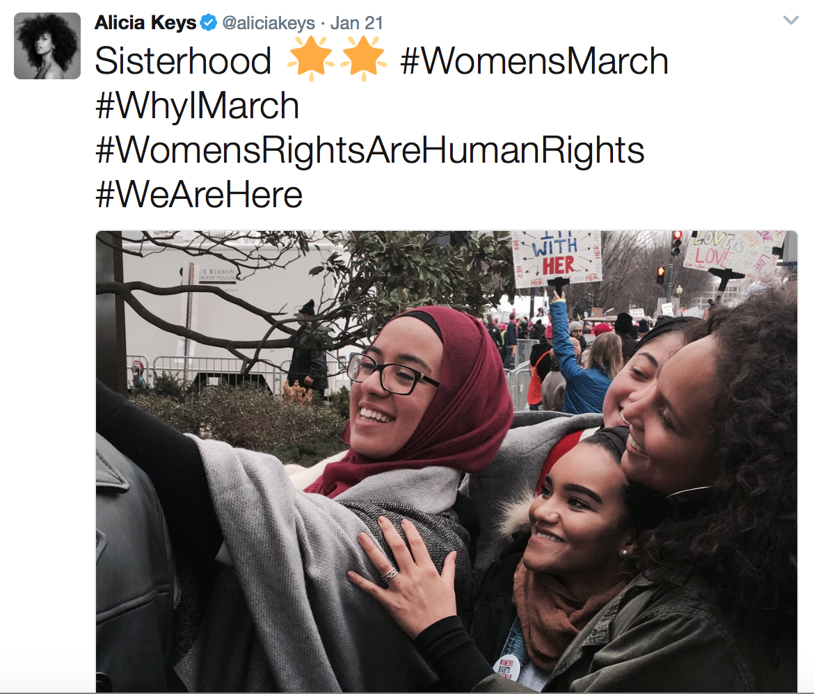
It is very powerful when celebrities post on Twitter about women’s rights because those tweets get a lot of views and therefore retweeted often. it is cool to see this on the graph and analyze it by looking at the excel sheet of how often users retweet.
Katherine, I thought that this was yet another insightful post. One thing I liked that you and Caroline did was include actual pictures of some tweets regarding your hashtag. I think that this really brings out the different perspectives people have on your hashtag and is a great way to see how people, who may not know each other, connect on social media. I probably should have included some tweets about Obamacare, and is definitely something I’m more curious to look into. I agree that celebrities have so much influence on social media as so many people look up to them as role models and they tend to have millions of followers so their tweets are bound to get reposted, like Alicia Keys’ picture above. Although all three of our graphs our different, my graph and your graph are a little more similar to each other than Caroline’s graph because we both have one large node that is surrounded by smaller sized ones, whereas Caroline just has a lot of similar sized nodes. It’s crazy to see how people are connected on social media, even if they don’t know each other in the real word. Good job!
Hi Katherine, I first want to say I think this may be your most insightful post yet. I really enjoyed the pictures of tweets you put in this post. It is something I also did and I feel like it adds depth to the data. I found it interesting how interconnected your graph was because although my graph was connected it looked different from yours. I also really enjoy you talking about the colors you chose for your nodes and the comparison of the #whyImarch to the sun. The idea of using yellow because of the sun would have been cool. I like how you looked at how many followers the Twitter accounts had. This is something I wish I had done. I like how you compared certain nodes were connected. I really enjoyed your post and seeing how your data connects.