
Part I:
The time period I chose is the most current 2,200 tweets the majority are from this weekend. #energy is a current event that produces changes and modern advances every day. I want to see the most up to date things that people are saying about #energy. I chose 2,200 for no particular reason it was just a good number to break up the data at. I chose from Wednesday March 22 – Sunday March 26.
I have no idea what to expect when my data comes about. I think that the “friendships” will be disconnected and scattered because #energy is a really broad hashtag.
Part II
77 nodes and 254 edges. Directed would be better because it indicates which way people are directing the conversations.
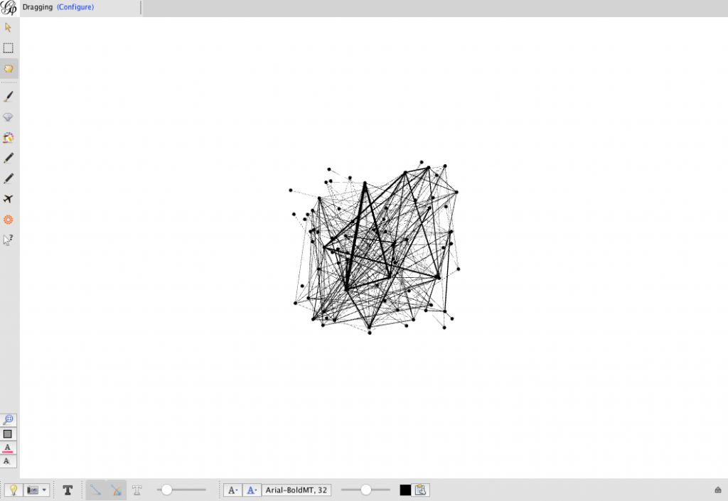
Original Graph: Untouched.
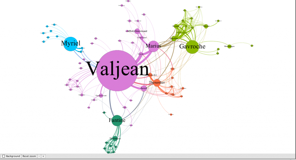
It explains who is talking and who is listening. Valjean’s ID number is 11.0, and Fantine is 23.0. Valjean is speaking to 4 targets 0.0 (Myriel) , 2.0 (Mlle Baptistine), 3.0 (Mme Magliore), 10.0 (Labarre) . Fantine is chatting up a storm! She is talking with 9 targets, 11.0 (Valjean), 12.0 (Marguerite), 16.0 (Tholomyes), 17.0 (Listolier), 18.0 (Fameuil), 19.0 (Blacheville), 20.0 (Favourite), 21.0 (Dahlia), 22.0 (Zephine).
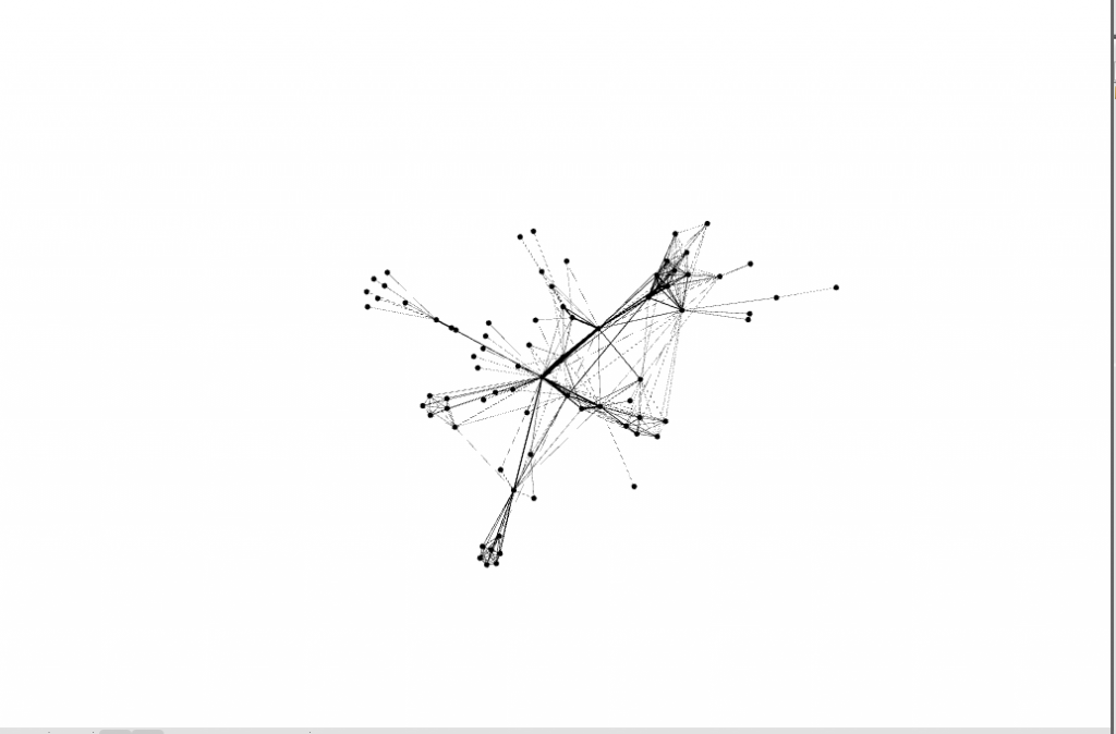
With a 10,000 repulsion rate I think it was able to scale the nodes and edges making them manageable and keeps them linked on a better mathematical scale. The average path length is 2.64 and the diameter is 5. When I changed the min to 10 and the max to 200 I think it enhanced the circles that were getting the most communication. It made those circles an individual color and and expanded them in size. I also think it shrunk the smaller circles, the ones with the least amount of communication.
Part III:
Chose 10,000 as my repulsion strength because my data is really spaced out and splotchy I felt that would be the best course of action for my graph. My data produced 2413 nodes and 1746 edges. My diameter is 4 and the average path length is 1.9. That tells me that not a lot of my dots are connected that they are really spaced out and not a whole lot of conversations are taking place between tweeters.
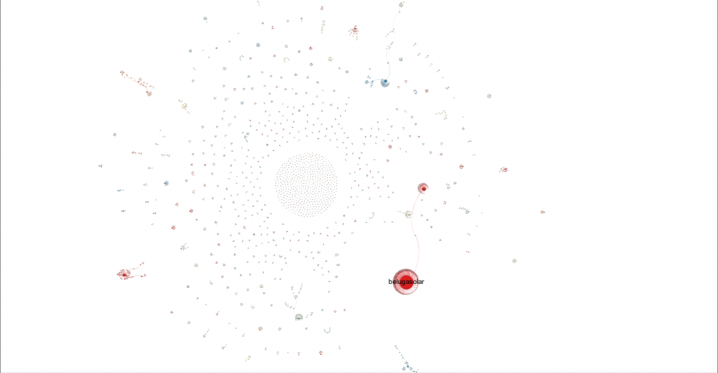
The making of this graph has been one of the most stressful experiences of my college career. From my data refusing to open, to not being able to figure out how make the circles smaller. But finally I am done with the graph and I can analyze it. My biggest tweeter about #energy is belugasolar. Beluga solar is a pool company that uses solar energy to heat your individual pool. They are my biggest tweeter and they have sparked a lot of discussion on the twitter verse. Very fascinating to see a consumer product that uses clean #energy and not propane to heat a residential pool. Beluga Pool Solutions is the name of the company. With #energy not everyone is talking to everyone, the lines are not all connected to each other. There is one really large circle (belugasolar) and a lot of smaller circles with branches off of them. The only thing that links all of the data is that their tweet had #energy at the end of the tweet. But the users are not talking to each other. #energy is so broad still that some conversations are about solar energy and others are about wind energy. There is also still a few tweets about “eating a banana! #energy.” My data will never be able to escape those tweets. Gephi is incredibly revealing for my data because it shows that there are a lot of different conversations going on. That not all #energy tweeters are talking about the same thing. It is not a topic like #keystoneXL, where it is a singular event that is having attention called to it. I imagine that Keystone has a condensed amount of conversations. My data is all over the place with hundreds of conversations with 2,200 tweets. No one is talking to each other as you can see above. There are maybe 6 lines connecting conversations. Everyone is having separate conversations about energy.
I think it is really cool to see that a large topic of #energy conversation is coming from Beluga Solar and how their goals of solar heating for pools has spiked a lot of responses on twitter about the usage of different energy sources. Its cool to see through this data how the conversation of energy is utilized modern day and the technological advances that are talked about in lieu of more traditional ones. I agree that its somewhat frustrating that your data isn’t more linked to each other to reveal something larger about a single topic, rather than multiple topics related to #energy. But I think that is what makes your data super interesting. Instead of analyzing something more narrow, you are crossing bridges to tons of different people on a more global scale about a topic that can mean many different things. This way you can predict where #energy may be leading in the future and what types of #energy consumers or general public need for development. I think it would be cool to see if any of your separate conversations using #energy overlap with #keystoneXL conversations, and how that speaks to where people want energy usage and development to be going towards.
Woah, this is so cool! Your data’s average path length is so short! Your topic is so broad, which is unfortunate because, as you said, your data will never be able to escape those tweets about eating bananas for energy and such. You’re right in that Gephi shows your data has so many independent conversations occurring. It is cool to see Beluga Solar as a consumer product that uses clean energy and not propane to heat pools having so much activity and your largest node.
It is so crazy to see how short your average path length is while also seeing how that could lead you to believing that there is a targeted, interconnected conversation about energy! However, it totally makes sense that you’re going to be getting tweets for #energy that haven’t anything to do with the definition of energy you are concerned with! Your banana findings were comical as well. I agree that your map shows the independent conversations occurring, but I wonder how that would change with the timeframe of data you used? It’s also empowering to see a clean energy consumer product drawing the most connections!