
Pie Graphin’
I count 16 different languages – da, de, en, en-GB (which is totally a different language if it’s cockney), es, fr, hu, id, it, ja, ko, nl, pl, ru, sv, tr. Using the countIf function, I identified 2389 english tweets. The percentage of English tweets from my February 22-24th dataset is 2389/2669 or 89.51% however, when I added the en-GB the percentage increased to 90.63%.
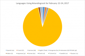
It certainly doesn’t surprise me that English accounted for over 90% of those tweeting #standingrock. However, I was very interested to see that #standingrock was referenced in 15 other languages. I do not see any meaningful trends in these other languages, but in thinking of my geolocation data, this lab actually revealed more geographical information that my geolocation did! I think it definitely makes sense that French speaking and Spanish speaking countries comprise larger percentages of the remaining 10% of tweets. These tweets might be coming from France or Spain – relatively liberal countries – or some areas of Spanish or French colonial influence who would certainly be supportive of indigenous rights. However, Hungarian, Italian, and German actually made up comparable or larger percentages than French or Spanish – a conclusion I would not have expected from my data. If I had to guess why the above languages were used to reference #standingrock, I think one of the few linking characteristics of these languages here would be their relation to western culture and thus western news. With the exception of Russia (who for all we know may have been trying to spread false claims in support of the DAPL), I feel as though the cultures of countries where tweets in these languages could reasonably be expected to be seen would be receptive to discourse regarding climate change. Even Korea and Japan pay media attention to turmoil in the United States, and especially with respect to Japan are countries whose culture would allow/promote the importance of civil discourse regarding climate change.
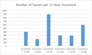
| Time | Number of Tweets |
| 2/22/2017 > 12:00 | 401 |
| 2/22/2017 < 12:00 | 193 |
| 2/23/2017 > 12:00 | 891 |
| 2/23/2017 < 12:00 | 297 |
| 2/24/2017 > 12:00 | 293 |
| 2/24/2017 < 12:00 | 594 |
I used a countif(range, “>12:00”) to calculate the number of tweets before and after noon for each of the three days I analyzed. Considering the events of 2/22/17 i.e. the forced removal of water protectors from the sacred stone camp, it actually makes a lot of sense to me that the number tweets on 2/22/17 would be smaller than on 2/23 or 2/24. This presents lag time between the actual removal and the twitter discussion of the events, which definitely aligns with a sad theme of solidarity in #standingrock: many supporters of the Sioux are much more inclined to do so from the safety of their computers or phones than by actually going to the Standing Rock reservation. On 2/23, tweets from #standingrock spiked – evidence that more people were talking about the events – and this can be accounted for by increased media coverage of this terrible development in the Standing Rock movement. Thus people noticed something new had happened, rather than actually being aware of different facets concerning the movement. For instance, when I search standing rock 2/22, the results are far less involved than those on 2/23. For 2/22/, the first link returned is a facebook post, the second a CBS story about protesters removed, and the subsequent links from various smaller news sources (except CNN – they had one further down the page). Meanwhile, for 2/23, the first result returned is this:
https://www.facebook.com/402298239798452/photos/a.422881167740159.110630.402298239798452/1551708291524102/?type=3 – a public statement from the Standing Rock Sioux. The next link was coverage of the removal from The Guardian, a British newspaper with a large international circulation. I imagine there were people who tweeted #standingrock on 2/23 and 2/24 internationally who read that article.
My mean tweets were 889, my median was 887, and mode was not available. My total tweets was 2699, while my max, min, and range were 1188, 594 , and 594. The fact that my min and range were equivalent is oddly troubling, however, I am going to hope I did everything correctly! I did not feel as though my data was an outlier from my peers. None of my descriptive statistics presented an extreme in the class data, and furthermore, I believe my data evidences that #standingrock is a day to day trending hashtag. In other words, it will spike when something new happens, but otherwise, it is not a constantly trending topic on twitter. Perhaps in relation to Gillespie, this points to Twitter’s calculated approach to creating the circles of discussion we mapped in the last lab. If twitter is keeping trends within certain groups, then it would make sense that I saw similar twitter handles in the last lab when mapping data on Feb 22-24. And if twitter is keeping trends within groups that are receptive to them, then no wonder my max, min, and range were so eerily similar. My descriptive statistics did not really tell me anything I didn’t already know. In fact, I found this to be the least revealing analysis of my data thus far. I would expect this too! I am just using simple functions to analyze my data, when in reality, my data requires much more complex functions to properly and adequately analyze.
It’s cool that you included all the languages in your pie chart. I also think it’s really interesting how you examined the tweets by time (by noon) over a few days. What was the new revelation on February 23? I am also curious to see what your data (particularly the range) would be if you had more days in your dataset. Would the range even out, or are there really these huge variations like 594 tweets? I like how you did some digging (no pun intended) and found that Facebook article. I know we are looking at Twitter and not Facebook, but I wonder if you could include the fact that 2.3k people did the angry face, and 1.1k people did the crying face, compared to only 105 people who hearted the post.
I also thought it was really interesting how you delved into the background of the different languages used for tweets related to #standingrock. Additionally, it was cool how you chunked up your data to assess the events that were happening within those time frames. I think it would be interesting to see the text or gephi analysis from these specific time frames that resulted in spikes and dips, in order to understand better what people are talking about and to whom, in relation to the current events. I find it interesting to see how your data has overlapped with mine over the semester, and I find it really cool to see how the large spikes and dips that affect your data set are factored into the patterns I find within my own.
Its crazy that you had fewer tweets than my #energy results. You also had about 10 less languages than me. Probably because #energy is global issue and standing rock is more of a limited national issue, not as international. I agree that I think it would be really interested to look at the text analysis from that time Frame to see what tweets were really saying.