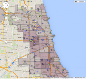
Below is the revised version of my wizard layer map. While I am still currently using Jack’s information for my point map, it is very relevant to what my data will hopefully look like in the future, once I am finished compiling it and finalize it with my organization partner. One aspect I could not figure out is how to change the color of the dots in order to distinguish the types of early child care providers. However, I included a screenshot below which is similar to what I expect my final layer map to look like, a searchable, filterable map. I got this from Veronica at http://chicagobuildings.org/
My partner and I also discussed using more than just two layers, however without more data I was unable to try it, but will definitely be working on that in the future.
*Update on March 10 from Jack: Katie also is having difficulty with web hosting via Google Drive, as her interactive currently is visible only with Safari. I have pasted a static image below. Looks like web hosting via GitHub is a better solution.


Katie, I think your map looks great, but unfortunately I am unable to see it/use it. I can only see an image file embedded in your post, but looking at your previous maps, I can see what you are trying to do. I like how you have a lot of information on each data point, for instance the school data, age range and etc. For your polygon map, maybe include data that shows total population of students or something around those lines. Also it would be nice to include a legend. When you have different colored points, having a legend is always good to distinguish which color represents what.
One thing I would also suggest is adding graphs. From the data in your previous post, I can see you making something like a bar graph to compare how many preschools there are vs. home care. It could also be a pie chart as well. Here is an example of how you can do it. https://developers.google.com/chart/interactive/docs/gallery/barchart
I have also had issues with posting visualization on the website, but I was able to figure it out. Hopefully everything works out for you!