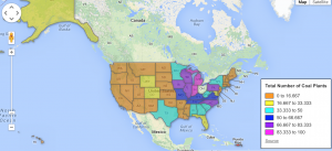
This is a Google Fusion Table that shows the approximate number of coal plants in each state. As you can see, the states that are pink have the largest number of coal plants and the states that are orange have the fewest number of coal plants. A chart such as this would only be effective if the person wanting the data visualization wanted to represent ranges of numbers. For instance, if someone wanted a data visualization to show where outbreaks took place, rather than the approximate number of outbreaks per state.
**Note: I was unable to embed the Google Fusion Table in this post, so the map featured in this post is a picture of the Google Fusion Table I created.

Dear skb — Creating a Google Fusion Table is a good first step, but as you recognize in your text, the goal of assignment 4 is to embed an interactive version in your post. See instructions near the end of this tutorial http://epress.trincoll.edu/dataviz/chapter/create-thematic-polygon-map/
Also, think about the story you wish to tell with your visualization. Is the raw number of coal plants per state the most important factor? Or would it be more meaningful to show us coal plants per capita? To do that, insert another data column to show us coal plants divided by state population.
Finally, for future assignments, it would be best to work on visualizations related to your original topic. I was impressed by the amount of publicly available data you found in January and encourage you to craft it into meaningful interactive charts and maps.