Last week, the Connecticut Open Data portal opened with a handful of files to demonstrate the state’s initiative in sharing public data. Check out the data that’s currently available on the Socrata platform at https://data.ct.gov
Also, I was curious to find out what types of interactive data visualizations could be easily created with Tableau Public (free download, but Windows only, requires free account for web services). This application competes with Google Fusion Tables, a free cross-platform data visualization tool, which I’ve been teaching to my Trinity students.
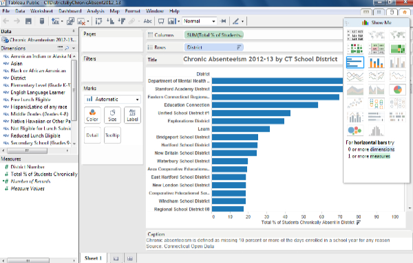
Tableau Public has limitations, and users are encouraged to upgrade to Tableau Desktop (free trial, but full retail price is $999, with education/non-profit discount; Windows only). One limitation of Tableau Public is the lack of a direct link to the CT Open Data/Socrata web platform, which means that I could not display “live” data. Therefore, I had to export a sample data file into Excel, and upload into Tableau Public, where the dashboard allowed me to construct an interactive chart with “static” data. The interface seemed relatively straightforward to me, but I’ve used dozens of data tools over the years. The chart-design mode below seemed similar to the Microsoft Excel pivot table feature, if you’ve ever used that one.
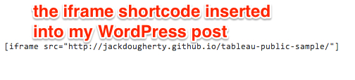
Next, I created a free Tableau Public web services account to save my work online, and it generated a results screen with a long HTML embed code. To display the interactive visualization on your own site, users need to host this code on another live website, and in my case, I simply pushed it into a GitHub Pages repository, as I’ve taught my students to do in our DataViz book-in-progress. To embed that live site on this WordPress.org post, I embedded an iframe with the URL source into the text/code view.
The live data visualization appears below — be sure to explore its interactive features.
Overall, Tableau Public — when used in combination with a web hosting platform — looks like a relatively easy way for non-profit organizations to create interactive data visualizations and embed them on their websites. At first glance, Tableau Public appears to have a wider range of out-of-the-box visualization designs than Google Fusion Tables. So why did I decide NOT to teach Tableau Public to my Trinity students in spring 2014? The major roadblock is that the application is currently Windows-only, and most of my students use Macs. While I have Windows virtualization (e.g. Parallels) installed on my Mac, that’s not a luxury that’s available to most of my students. Still, Tableau recently announced that it will release a Mac version in the second quarter of 2014, though it’s unclear to me whether this means the free Tableau Public and/or the not-so-free Tableau Desktop. Wait and see.