At the Injury Prevention Center, I have been looking at and analyzing data from a database of pediatric trauma patients from 2007 to 2012. Having received this massive dataset, there was a lot of different routes in which we could have approached this. For the beginning of the semester, I have been organizing data into formats that represented the data shown in an earlier pediatric trauma registry paper. For instance, I would group the patients by year, age, ethnicity, etc. Although I am still in the process of formatting some of the data, such as organizing the data based off of time, I have made progress in creating graphs and visualizations that represented the paper. Moreover, I have played around with other visualization to see whether they are effective in displaying that data, such as the motion graph.
Now that most of the data organization has been completed, my next step is to continue making visualizations based off of my data. After Alvin Chang’s presentation, I started to think about how each of my visualization could tell a story, what audience I wanted to show, and how effectively I could portray this data to them. After completing the preliminary visualizations, I will start to delve into the data and look at any trends or anything of significance that I could potentially visualize. I have sketched a few ideas on what I want to do and hopefully within the next few weeks I will bring them to light. Moreover, within the next week or couple of days, I will start compiling a list of questions that I could ask patients, doctors, and families. Similar to what Alvin did, I would like to be able to embed a story behind the data to make it more powerful. By the end, we hope that we will have a collection of visualization to choose from, and tell impactful stories that promote the cause of injury prevention.
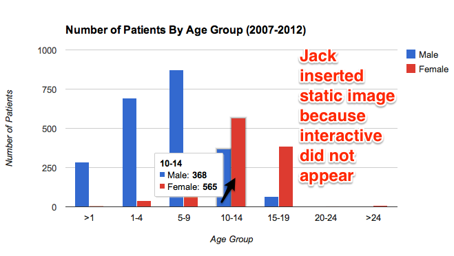
Below are some examples of what I have done so far:
In this graph I compared the number of patients by age group. From this graph we can see that males ages 0-9 usually are the ones who get injured the most. However, this changes the older the children get. It would be interesting to find out why this trend exists.
Update by Jack, March 18th: the interactive image below did not consistently appear in your post, most likely due to Google Drive hosting issues. But I was able to paste the underlying URL into another browser to capture this static image, which I have pasted in. Therefore, both the static and interactive versions may appear in some browsers. See my comment below about hosting code on GitHub instead.
The interactive version:
In the next two graphs, I show the percentages of patients by ethnicity. Each graph represents either male or female patients. Hopefully for future graphs I can mix both male and female so that all the data could be contained in just one graph.
For this graph, I made a times series of female patients based off of ethnicity. I will include the males once I am able to. Here we can see the the number of patients throughout each year. Whites mostly make up most of the injuries, but there was a significant decrease in 2010. I could possibly research why there was such a big drop to see if it was just a coincidence or not.
Note from Jack, March 18th: The Google Motion Chart below appears in some browsers, but not others, which also may be a Google Drive hosting issue. Please try hosting with GitHub to see if that resolves the issue.
Below is a Google Fusion Map that I made which compiles the total number of patients in each city/town from 2007-2012. Around the Hartford area is where the most injuries take place. I would however like to use the Leaflet application instead of the Google Fusion.
Ray – Thanks for your progress memo, which demonstrates a wide variety of your work over the past few weeks. Here are my comments to help you move on to the next steps.
First, I encourage you to keep working on visualizations where web interaction adds value, by allowing users to click on and explore underlying data. As we’ve discussed, the pie charts do not benefit much from web interaction, because users can already see all of the data without clicking. By contrast, the interactive charts and maps require a web platform, and the online features add value.
Also, your reflections on Alvin Chang’s presentation highlight the goal of designing visualizations to tell a story. Continue to work on this objective, and decide what titles and text should accompany your charts and maps above. Sometimes the combination of textual and visual is better than either one alone.
For example, what is the story you wish to tell with your motion chart, and how can you make it clearer to users by enhancing the design and adding a title and/or more text? As far as I understand it, the story makes more sense when unique colors are selected to represent different ethnicities. Is there a way to pre-select this? Make sure that you’re following the required data format for Motion Charts at https://support.google.com/drive/answer/1047434?hl=en&ref_topic=30240
At the bottom of your post, the interactive map clearly shows patterns about injury data, but I encourage you to think more clearly about the “story” it tells. If we look solely at the raw number of injuries per town, it would not surprise me that darker green appears around the Hartford region, because that’s where most people live. Instead, consider adding a data column to your spreadsheet to show the number of injuries divided by town population. (One of your classmates learned how to download 2010 census data from http://socialexplorer.com, and she or I can show you, too.)
Also, you mention an interest in creating the map in Leaflet rather than Google Fusion Tables. You’re welcome to try — see Leaflet tutorial page at http://leafletjs.com/examples.html. But Leaflet requires learning more code on your own (there is no graphical user interface), and you would still need to host your data spreadsheet somewhere online. So I recommend sticking with GFT unless there’s a compelling reason.
Finally, as we’ve learned in seminar, hosting on Google Drive is problematic, since the visualizations do not consistently appear in our posts. (Believe me, I wish that I knew this before teaching it to your class this semester!) Instead, see my tutorial for hosting code on GitHub at http://epress.trincoll.edu/dataviz/chapter/host-html-github/ Ask me or Veronica if you need help.