Author: Emily Heneghan
Assignment 4: Google Fusion Tables
The map below displays an estimate that the growing minority population will continue to be concentrated in urban areas, which will reinforce current levels of segregation in Connecticut. I used the Connecticut town boundaries, Census 2010 from MAGIC UConn Libraries and then I obtained the Increase in Minority Population (2010-2030) from the Analysis of Impediments to Fair Housing Report that Erin Kemple had given to me. In this report there is a static map impeded onto a PDF, which had been made using ArcGIS. I have not yet received the ArcGIS maps and shapefiles for these maps so for this assignment I had to manually add the increase in minority data manually by adding another column in Google Fusion Tables through looking at the pre-made map in the report. So for the map below, if you click on a certain town you will not get the exact data, since I have not received it yet. I also am unsure of how to get rid of the red shading at the bottom of the map.
Assignment 3
After meeting with Erin Kemple last week we decided at our first plan would be that I read through the Connecticut Analysis of Impediments to Fair Housing Choice, which is a report hat is still in the process of being completed. This document is over 200 pages and includes a lot of information so while going through it I made a list of data that I think we should make available using visualizations. Erin Kemple is also going to go make her own list so that at our next meeting we can compare and decide together what information we think is significant to use and then we will have a better idea about how exactly to display he selected data. Although there is still much to be decided on, I have come up with some ideas for design choices, with some guidance from Erin about where I can look for some inspiration.
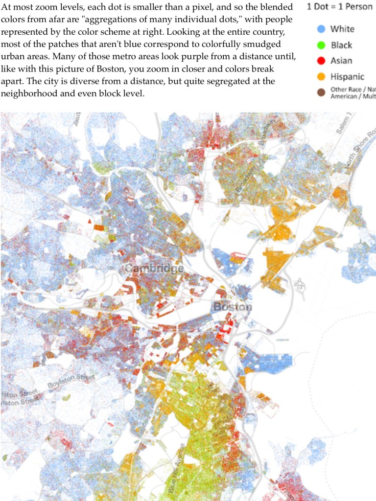
Since a significant portion of the report addresses racial segregation statewide in Connecticut, I have been thinking about and researching different ways racial segregation has already been shown using maps. The Atlantic Magazine has a very interesting map of racial segregation throughout the United States that uses individual dots to display population density by race in different parts of the country, as soon below.
A map similar to this would be useful for Connecticut Fair Housing, but only if other variables can be added that are related to impediments to housing opportunities that would allow viewers to have a better understanding of what groups of people are being affected by certain housing practices and policies, mostly focusing on people of color, people with lawful sources of income other than employment, people with disabilities, single-parent households and LGBT people.
I also came up with another idea that I thought of by looking at a Comprehensive Opportunity map on the Al Jazeera America website as well as a map displayed in the Impediments to Fair Housing Choices report of how two programs, the federal Housing Choice Section 8 Voucher program (HCV) and the State Rental Assistance Payment program (RAP) have statewide patterns of that their participants are living in areas that are disproportionately low income and have a significant population of people of color. This means that these programs are handing out vouchers to their participants (who are disproportionality made up of people of color, those with disabilities, single-parent households) in low income areas, which most likely means that there are little opportunities in these areas. The map of the Comprehensive Opportunity Index for the Baltimore Region shows different sections of various levels of opportunity in terms of jobs, safe neighborhoods, and good schools. While I do not know if it is possible to obtain this information about opportunity index scores throughout Connecticut, it could be significant if I am able to get data about something such as where good schools are located and created a map that compares this data with where housing voucher participants are living.
Exercise 2B
For my Data Visualization internship I am working with Erin Kemple from Connecticut Fair Housing. This center is a statewide nonprofit organization focused on identifying impediments to fair housing in order to eliminate such barriers and advocate for change. Connecticut Fair Housing tries to find the forces at work in the market that are preventing people from getting housing. This includes whether or not various groups of people are treated differently as well as what are the differential affects of certain policies that are not necessarily discriminatory practices but result in unfair housing opportunities.
Through talking with Erin Kemple, I found out that the main Data Visualization goal is to create charts and maps to put on the web that display such impediments to fair housing so that policy makers as well as the general public become aware of such forces. An important aspect that Erin Kemple is interested in is mapping data points for zoning and racial makeup. Along we that she believes it will be very helpful to create interactive maps with filters to display various data and how-to tutorials so that website viewers have the opportunity to plug in whatever information they are interested in.