Category: 3 design choices
Plans for Pediatric Trauma Registry
Over the past two weeks, I have been going to the Injury Prevention Center quite frequently and working with Garry on the data that he gave me. He has given me a published paper on how the IPV has categorized and analyzed the data; therefore I have been using this paper as a guide. The data that has been given to me contains 5 years (2007-2012) of all pediatric traumas that have occurred. The information is extensive and contains information such as age, gender, ethnicity, time, place, injury type, and etc. Because this data base is owned by Connecticut Children’s Medical Center, the data itself is private and cannot go out into the public unless it is shown as a visualization.
The first priority is to organize the data as shown in Using Trauma Registry Data to Guide Injury Prevention Program Activities. By grouping information together such as age and injury severity, we can better see the correlation between different age groups and the result of the injury. By the time I am finished I will hope to have the trauma patients’ demographics, the cause of injury by mean age, temporal characteristics, injury severity, injury location, injury intent and mechanism, and injury location.
Next, as we move along in the class, I will then start making charts that will showcase the information that is interactive but also easy for the public to understand. For instance, I would group together injury types and display which types of injuries are more prevalent, and add other information such as age groups most affected. Here is an example of an interactive chart that could be helpful: Health Chart
As well as injury information, creating maps would also be helpful in looking at cities and locations where injuries often occur. The authors of the Trauma paper, used ArcGIS to map cities in Connecticut, but it would also be beneficial for the map to be interactive as well. Here would be an example: Health Map
Data Viz Agenda for Achieve Hartford
After meeting with Rob from Achieve Hartford this week, we’ve determined an initial agenda to work with in the upcoming weeks. For now, most of the data I will be working with is achievement related, usually test scores from the state tests. The first task involves building on the interactive map I created last week, but this time including achievement data. More specifically, the map will show the distribution of schools based on the percentage of students at each school at the proficient level on the CMT (Connecticut Mastery Test) and CAPT (Connecticut Academic Performance Test). This will allow viewers to easily visualize graphically where the better performing schools are located.
Eventually, it would be good to incorporate several years worth of this data, and then create a visual progression over time, to determine if the higher performing schools are consistent across years, or if there are any dramatic changes within schools across years. This interactive school finder is more detailed than the map I made in my previous post, as it lets individuals search for specific schools in the Cleveland Metropolitan School District, meaning individuals can type in their own address and see what schools are in their immediate vicinity. Additionally, I’m hoping to add an outline of the boundaries of Hartford and possibly the boundaries of the four school zones located within the city. BatchGeo seems to be limited in this respect.
The second priority is to create an interactive chart of each schools achievement progression overtime through CMT scores. The primary interactive feature would be the ability for the viewer to select the characteristics they are interested in, such as the specific school names or types of schools (magnet or district) he or she is interested in rather than viewing a massive chart of the 30+ schools in the HPS system. A second chart would be designed in a similar manner, but would look at the achievement progression of cohorts of students.
Something along the lines of this interactive visualization in the following link: Interactive Chart Example
Assignment 3: Prioritizing Park Watershed Data Viz Goals
After meeting and working with Mary Pelletier this week, I learned how to prioritize some data visualization with the Park River Watershed Organization’s goals. This is where our current thinking is at, in terms of potential examples:
It would be good to learn WordPress and Zeemaps together. Not only will I use WordPress for Data Viz blogging, but The Park River Watershed website also uses this same forum. Although others have set up the ‘framework’ for the website, and the Zee map (Dr. Jon Gourley), Mary Pelletier has added and changed the content. We are especially interested in:
Learning how to set filters that can be turned on/off the zee map so that there can be different types of point data on the map, such as
- Schools
- Community maps (“Blue-Green” map walks)
- Water quality (data can be obtained from Dr. Jon Gourley)
Learning how to add links into the Park Watershed home page, especially RSS feeds from
- US EPA Urban Waters
- Forest Service Urban Wildlife Refuges
- American Rivers
Here are a few topics, which could benefit from data visualization:
- location of all the schools in the watershed (all municipalities) that can be searched by school type, (Elementary, MS or HS and public or private) [very similar to what we did in BatchGeo with the schools in Hartford information provided by Jack Dougherty]
- these locations searchable by relationship to a watercourse, water body or wetland (At the moment, the data file for all the schools in the whole watershed has not been found yet, but we can begin to work with the data on schools provided by Jack, to figure out map location, and filter types)
- trace contamination of water through West Hartford from MDC drinking water reservoirs (western headwaters that are filled with potable water) through to severe impairment, which flows into Hartford City limits via the North and South Branches of the Park River. This idea is highly likely and probable to carry out since it will be a nice project to work on throughout the semester and view water quality changes within the watershed and through data visualization. It also relates a lot to my interest of Environmental Science and Human Rights.
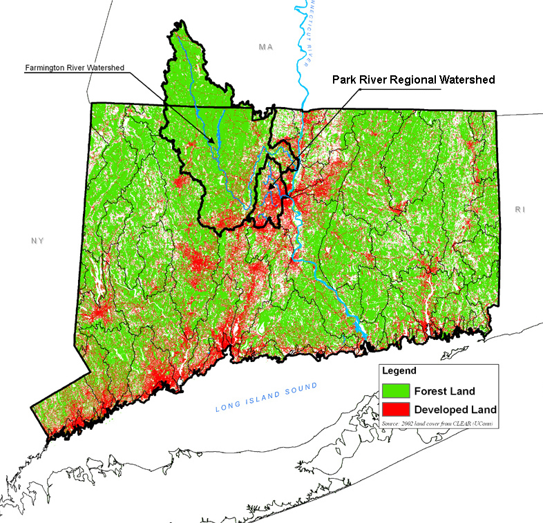
***Note: Mary spoke to Jon Gourley about this briefly. We think that the water quality data will be a bit of a mish-mash, yet it would be good to “visualize” that there is no consistent data set that can help us pin-point where impairments begin, and locations where water quality is able to recover (due to sufficient landscape buffers).
Connections with “Tree House” could develop a walking tour of drainage (and “green”) features on Trinity’s Campus, downstream to the South Branch of the Park River. These points with links could be loaded onto the existing Zee map. This might be a good short exercise that could be presented around to the TREEHouse club in ~April.
Possible New Idea? – Develop a system to track new membership with respect to their sub-watershed. It might be too revealing to show an exact address, yet perhaps there is a way to visualize the number of members per watershed. To do this, there will be a need to develop a way for “members” or constituents to join and become participants.

There were many, MANY, ideas that we both came up with between our meetings and the emails we sent to each other. But a myriad of the ones listed above are ideas that interest me and are an importance to my organization director. Mary also gave me a couple links to view for possible website/map ideas.
Connecticut Fund For the Environment
Farmington River Water Association
Connecticut River Watershed Council
We discussed which map types would be the most useful for the projects we’d like to work on. These interactive data would most likely be satellite images of the watershed in order for the public to understand its locality between other river systems and especially the city of Hartford.