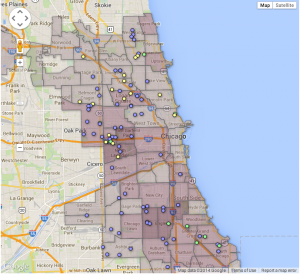
Update to Alternative Schools Map- Assignment #6

Posted on

I have updated my data visualization of alternative schools to include a search bar.  This will allow people who are interested in finding an alternative school be able to view a specific school’s information by simply selecting their name.

The next step I would like to take with this visualization is to create an option search bar where someone can select the different qualities they would like in an alternative school and then the data visualization would isolate the schools that met the request.  The way I imagine it is almost like having boxes to check that would filter the schools that appear on the map.  I feel that this will be helpful, because if someone is looking for a school for a middle school aged child, it would be easier if they didn’t have to sift through the high schools.

You can view my data visualization at this link: http://sarahbates.github.io/DataViz

Assignment 6: Updates on A5 Schools in Park Watershed

Posted on

This week I wanted to be able to combine the point layer of only the school points in the watershed, with the Park River Watershed outline, as well as boundaries of the municipalities. However, this task proved to be more difficult than I thought as I had some difficulties with Google Drive and Google Wizard Fusion. There wasn’t a problem so much with the codes of my data. But there were some issues with the tools and applications I used, which were not cooperating very well. Below is the map of the my school points and the watershed boundary. The schools each have a type:

1 = interdistrict

2 = district

3 = more PreK centers

I would like to create a choropleth interactive map that shows the three different types of schools in the watershed. There are no private schools included. It would be very beneficial for schools to have the information available to them, in order for science programs and environmental clubs to seek out a student networks.

*March 10th update from Jack: As Shaina reported, she is having difficulty with web hosting on Google Drive. Her interactive map below is only visible to me on Safari, so I have inserted a static image. The best way to fix this may be to shift to web hosting on GitHub.*

static version
static version


Update Assignment 6b

Posted on

From last week, I have compiled and organized my data so that I was able to create visualizations. So far I have managed to incorporate, age and ethnicity. From these graphs we can see that the majority of injuries occur for males up until they are around age 5-9, however, females are more likely to get injured after 10 years old.

*March 10th update from Jack: Ray is having difficulty with web hosting on Google Drive, as I can only view some of his iframes below in Safari. So I have pasted a static image of two of his interactive charts: a bar chart and a time-motion chart. Looks like hosting on GitHub pages will be a better solution.*

static image
static image

In this graph I compiled a list of patients based on their ethnicity. From the data, whites and males make up most of the injury patients.

Here I created a time series graph that shows the number of patients each year by ethnicity.

I will also be making maps. Although this is a incomplete map, it is a sample that of what I will make when I get the data. For each city, I will include the total population as well as the number of patients in that area from 2007-2012.

Assignment 6- Updated A4/5 Google wizard layer

Posted on

Below is the revised version of my wizard layer map. While I am still currently using Jack’s information for my point map, it is very relevant to what my data will hopefully look like in the future, once I am finished compiling it and finalize it with my organization partner. One aspect I could not figure out is how to change the color of the dots in order to distinguish the types of early child care providers. However, I included a screenshot below which is similar to what I expect my final layer map to look like, a searchable, filterable map. I got this from Veronica at http://chicagobuildings.org/

My partner and I also discussed using more than just two layers, however without more data I was unable to try it, but will definitely be working on that in the future.

*Update on March 10 from Jack: Katie also is having difficulty with web hosting via Google Drive, as her interactive currently is visible only with Safari. I have pasted a static image below. Looks like web hosting via GitHub is a better solution.

static version
static version

Screen Shot 2014-03-06 at 8.56.07 PM

Updated Map: Part 2

Posted on

In building on the map I created last week, I was able to use HTML code to include a legend to the map I created through the Layer Wizard. I still want to add several features, but it is definitely an improvement from the very first map I made. Eventually I would like a drop down menu so viewers can switch through the years. Right now, the map displays data from 2013, but if you click on one of the school’s, you can see the percentage of students who are proficient from 2007-2013. Switching between years would allow viewers to see how each school has progressed over time.