Thus far, I believe I have made a tremendous amount of progress in attaining the necessary skills to become a skilled Data Visualizer. I have currently produced 3 relevant and unique Data Visualizations, and seeing as I’m now more acquainted with the various dataviz tools, I feel I will be able to produce them far more productively in these final 6 weeks. I hope to create visualizations that will be usable in educational studies classes, and am currently working on one showing the long term achievement gap with NAEP data.
This week Mary and I met to review the Schools in the Park Watershed excel sheet. From there we added columns with color and text ID. This shows the types of schools are which. We created categories that are relevant to nature or watershed research. In Google Fusion tables we were then able to change the point markers and colors to show differences among the schools of the area.
Next step will be to add the polygon layer of the watershed as well as the municipal boundary lines. There needs to be a little clean up done on the pop up boxes (URL links, taking out unnecessary data, etc.). I would like to add a legend as well to distinguish what each color means. Are the colors and markers seen in Google Fusion the only ones we can use? Are there any other ways to change the styles of these markers? Need an explanation on how the map works for the general public.
We were also wondering if there was an excel sheet of the private schools. Mary knows of some popular Environmental programs/schools that are private that would be nice to filter on the map as well.
We would like to integrate this map and its framework into the Park River Watershed website.
Move UP wants to get involved in data visualization because they believe that it will be an effective way to enhance adult literacy programs in the Hartford Area. Their goal is essentially to help visualize how the demographics pair up with the information about the individuals from the programs in order to see how you can most effectively enhance and promote the programs.
Using the one set of data that I have been given I have been able to experiment with several different types of visualizations and learned how to use multiple different sources in order to assist me in creating the visualizations I want. Most of the visualizations that I have created so far this semester have been maps, or are going to become maps, but I have also made a pie graph (shown below). Depending on what future data comes my way, I could potentially look into making more visualizations beyond just the maps. In terms of the mapping, I have been able to get some basic maps, both layered and not (layered shown below). I am currently working on more layered maps that get the demographics involved, which is getting us much closer to our final goals.
Now that I am halfway through the semester, I am still working to fulfill the initial data visualization priorities we determined in the beginning of the semester. Our first priority was to create a map displaying the distribution of HPS-run schools and include achievement data. Thus far, I have been able to produce a two-layered map with data points of schools that are color-coded based on the CMT proficiency of that school. There are also outlines of the four school zones, so viewers can easily visualize which schools are in which zones. Now that I have figured out how to create the legend, I can move forward with making a map for the CAPT proficiency for HPS-run high schools. In mapping the high schools, I have run across the issue of multiple high school’s at the same address, so when you click on the data point, you only see one school (ex. Engineering, Law & Gov, and Nursing are all coded with the same address). Once this issue is resolved, the map should be fairly easy to complete. Finally, since we now have a workable template for a searchable feature from Derek Eder, I should be able to now include this.
Update by Jack on March 18th: To illustrate what Marissa wrote above, I have pasted the embed code from her post last week
After listening to Alvin Chang discuss his methods of data visualization, I found his suggestion of making sure you understand what your question is very helpful. When I initially began creating the map, I understood what it showed, but I wasn’t entirely clear on the particular story we wanted to show. After speaking with Rob about this, we determined that the main question for the maps is whether one zone has better choice options than another. I feel more confident moving forward now that I have this question in mind.
The second priority involves interactive line charts that display achievement data over the span of five or six years, enabling viewers to see each school’s progression. The first priority for charts is to create one for cohorts. At the moment, Achieve Hartford has static line graphs that shows cohort progression for each school, but with the help of interactive visualization tools, Rob and I would like to have one line chart to compare different schools. Since one line chart with the 30+ schools on it would be way to cluttered, we determined it would be better to have a checkbox feature that enables the viewer to select specific school’s, or two drop down boxes for viewers to select two specific schools. I would like to have the Hartford average permanent on all graphs, so viewers could compare two schools, but also specific schools to Hartford overall. Once I am able to create this chart, it should be relatively easy to create a second interactive chart that better displays the achievement data across time from the maps.
At the Injury Prevention Center, I have been looking at and analyzing data from a database of pediatric trauma patients from 2007 to 2012. Having received this massive dataset, there was a lot of different routes in which we could have approached this. For the beginning of the semester, I have been organizing data into formats that represented the data shown in an earlier pediatric trauma registry paper. For instance, I would group the patients by year, age, ethnicity, etc. Although I am still in the process of formatting some of the data, such as organizing the data based off of time, I have made progress in creating graphs and visualizations that represented the paper. Moreover, I have played around with other visualization to see whether they are effective in displaying that data, such as the motion graph. Now that most of the data organization has been completed, my next step is to continue making visualizations based off of my data. After Alvin Chang’s presentation, I started to think about how each of my visualization could tell a story, what audience I wanted to show, and how effectively I could portray this data to them. After completing the preliminary visualizations, I will start to delve into the data and look at any trends or anything of significance that I could potentially visualize. I have sketched a few ideas on what I want to do and hopefully within the next few weeks I will bring them to light. Moreover, within the next week or couple of days, I will start compiling a list of questions that I could ask patients, doctors, and families. Similar to what Alvin did, I would like to be able to embed a story behind the data to make it more powerful. By the end, we hope that we will have a collection of visualization to choose from, and tell impactful stories that promote the cause of injury prevention.
Below are some examples of what I have done so far:
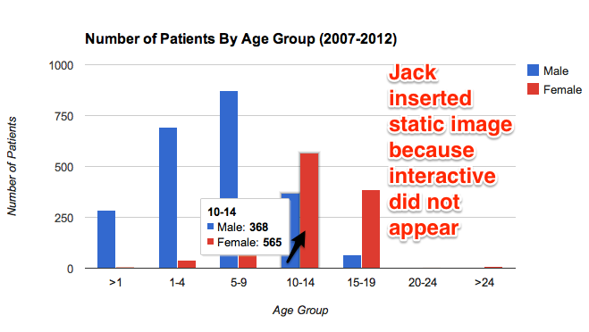
In this graph I compared the number of patients by age group. From this graph we can see that males ages 0-9 usually are the ones who get injured the most. However, this changes the older the children get. It would be interesting to find out why this trend exists.
Update by Jack, March 18th: the interactive image below did not consistently appear in your post, most likely due to Google Drive hosting issues. But I was able to paste the underlying URL into another browser to capture this static image, which I have pasted in. Therefore, both the static and interactive versions may appear in some browsers. See my comment below about hosting code on GitHub instead.
static view of interactive chart
The interactive version:
In the next two graphs, I show the percentages of patients by ethnicity. Each graph represents either male or female patients. Hopefully for future graphs I can mix both male and female so that all the data could be contained in just one graph.
For this graph, I made a times series of female patients based off of ethnicity. I will include the males once I am able to. Here we can see the the number of patients throughout each year. Whites mostly make up most of the injuries, but there was a significant decrease in 2010. I could possibly research why there was such a big drop to see if it was just a coincidence or not.
Note from Jack, March 18th: The Google Motion Chart below appears in some browsers, but not others, which also may be a Google Drive hosting issue. Please try hosting with GitHub to see if that resolves the issue.
Below is a Google Fusion Map that I made which compiles the total number of patients in each city/town from 2007-2012. Around the Hartford area is where the most injuries take place. I would however like to use the Leaflet application instead of the Google Fusion.