Assignment 4: Schools in the Park Watershed

Posted on

As we move forward with our projects, I have honed down on two specific ideas I would like to work on for this semester. One idea we would like to expand on is the Water Quality Story. Many streams and tributaries begin in the smaller areas outside Hartford and the more suburban towns, such as West Hard Hartford. As of right now, I am still in the process of searching for data on the water quality measurements, whether that be water sediment or levels of pH, etc. We would like to observe how affected the streams become as they begin flowing from the cleaner suburban regions to more urban environments. By depicting this data to the public, we can learn where pollutions are being dumped into the streams through point and non-point sources. Hopefully, with adequate data, we can be efficient in discovering how our neighborhoods and towns can work together to create a cleaner stream system.
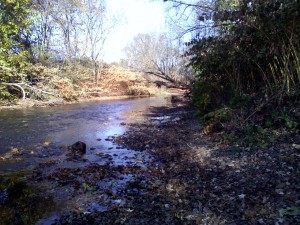
Img_131029143854
Here is an image of the Park River near Flatbush Ave., Hartford, CT.

The second idea includes working with public data about the different types of schools (public, private, etc.) and levels of education (primary/elementary education, high school) that reside in the Park River Watershed. Specifically, we would like to examine school systems that were built along the main rivers in the watershed. This knowledge will allow schools to build a greater and stronger network within their science programs as well as with each other. With a better support system, students will be able to foster their environmental interests further, and school officials and teachers will have an easier time implementing interactive science into the education system.

With school information around the Hartford area that Professor Jack Dougherty has given me, I was able to upload the data onto Google Fusion Tables to create a Point Map. Utilizing this tool for these points of schools is a great way to portray what my partner organization and I would like present. Below, the red dots on the interactive map show the different types of schools in and around the city of Hartford.


I have also found a shapefile layer of the Park River Watershed, which can be converted into a .kml file and can easily be uploaded to Google Fusion Tables as well. In the map below, the watershed can be seen outlines in red.

I would really like to be able to merge the the point map and the polygon layer of the watershed into one map. The polygon layer would need to be somewhat transparent in order to show the points. I believe this type of dataviz created does fit my partner’s needs  in terms of illustrating a map that shows school points over the Park Watershed. Once I learn how to combine points with a polygon layer, this map will look more like what I have envisioned.

Here’s a couple examples of how I would like my merged map to look like.

Chicago TIF Projects

2011 IL Senate Redistricting Plan

Vacant and Abandoned Building Finder

Experimenting with Google Fusion Tables

Posted on

The data visualization below incorporates two sets of data: the geographical location of the schools operated by the Hartford Public School system and the achievement characteristics of each school, that is the percentage of students who met the proficient level on state tests in each school. As the legend suggests, red schools are the worst performing while green schools are the highest performing. The schools are divided based on data from 2013, but by clicking on the school, the viewer can observe the percentage of students at proficient from 2007-2013. This map easily lets viewers identify the locations of high performing schools and if participating in the Open Choice program, parents can gauge the distance from their home to their preferred school choice. Of course, this use will further be enhanced once I am able to include a searchable feature, which I provided a link for in my last post.

However, data can be misleading, and as Jack commented in my previous post, achievement data is not directly linked to the students which reside in that area because of the Open Choice program, which allows students to apply to attend any one of the HPS-run schools. Furthermore, the map does not fully highlight the progress from 2007-2013, and so one could assume that low-performing schools have always been low-performing schools, without clicking on each data point. For example, in 2007 36.4% of students at ML King met proficient. The school has steadily improved, and in 2013 57.2% of students met proficient. If this progress was more easily visible, a viewer might conclude that ML King has found a successful method to improve achievement, and further improvement is likely. To highlight progress, an interactive chart might best complement the map, or even a time slide feature in which viewers can select the year, and the achievement data will adjust accordingly.


This second map is very similar to the one above, but shows CAPT scores, which is the state test taken by students in Grade 10. As a result, the markers only represent high schools.


Assignment 4

Posted on

The polygon map above shows Connecticut Unified School Districts organized by median household income. The visualization is interactive as clicking on one of the separated locations allows the user to see the name of the district, the percent of 8th graders who passed the Connecticut Mastery Test on average, and the exact median household income. This graph would be very useful for both of my Data Visualization partners as it shows the relationship between geography and household income in this specified area of Connecticut, and since my first data visualization establishes a correlation between median household income and test scores, this can be used as a point of comparison as well. For this specific project, I believe all my desired features were available. My first visualization is below.