DataViz Final

Posted on

Presentation

Which files need to be transferred? How are they labeled? Who owns or has access to them?
The bond data file was in excel format and it was found on the State of Connecticut Library public record online. It was labelled based on the type of bonds, race, date, and amount. The data is owned by the State of Connecticut Judicial branch and everyone can have access to them.

What info and training does the partner need to maintain or update the dataviz? Spell out the steps in your post, and refer to DataVizForAll if needed.

My partner is already an expert in Data Visualization. However, if he wants to manipulate the data and change it. He can go to my github.

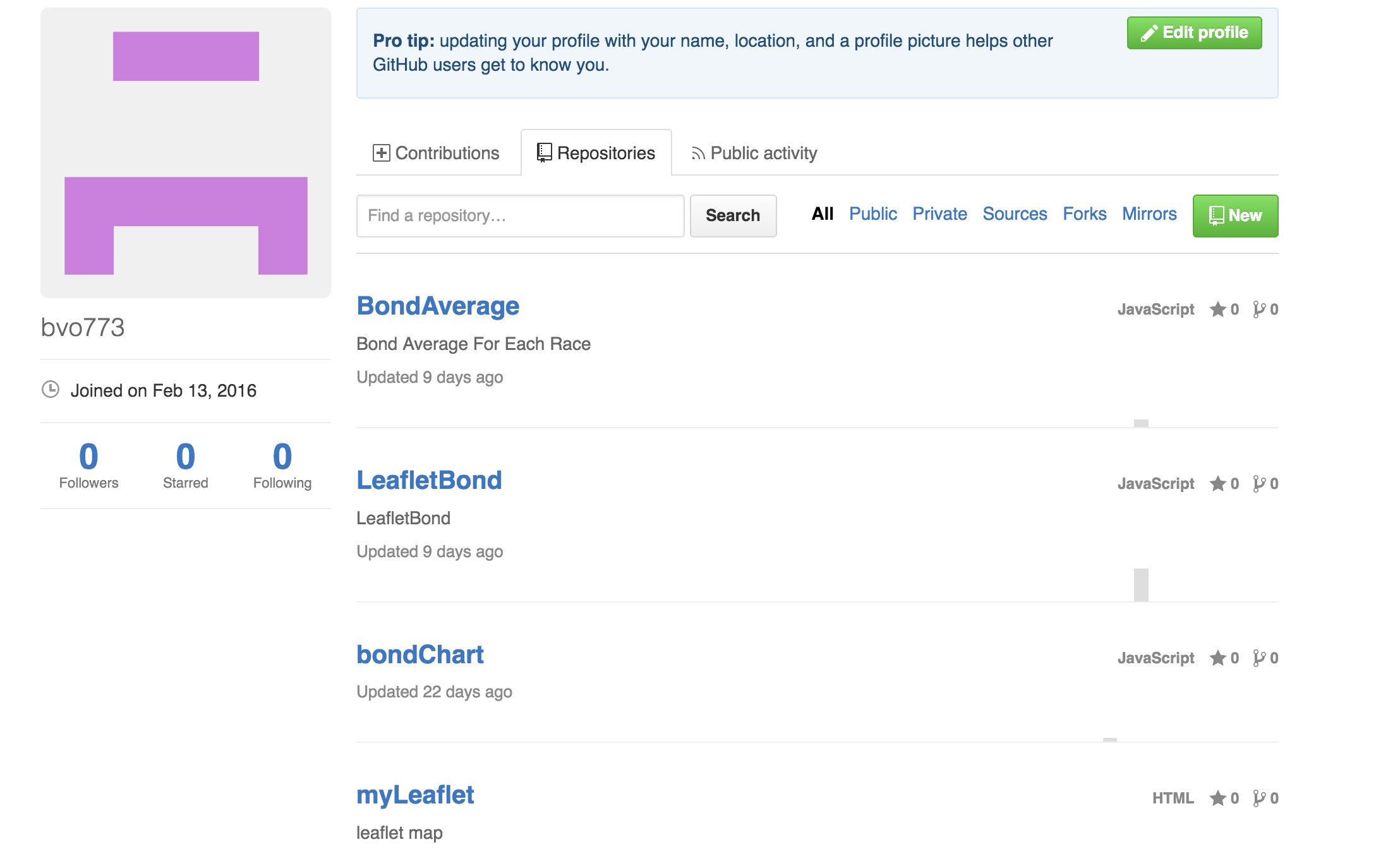
1) Go to my github: link
2) Choose a repository on which visualization they want to edit
repository_
3) Go to the main.js file and edit the code in the function
test

Binh’s demo-in-progress

Posted on

Repository
Do minorities have a higher bond? (1998-2014)

Repository
Arrest rate per capita (1998-2014)

For this project, my partner would like to create various data visualization based on the bond data in Connecticut. He wants to see how race plays a factor or how many bonds are there for each town in Connecticut. There are many different data visualization you can create with many different variable.

*Updated both leaflet and chart

Steps I’ve completed:
Using a pivot table to arrange my data
Using a leaflet as a data visualization
Using a highChart as a data visualization
Added markers
Adjusted arrest rate per capita

Steps to be done:
Use different ranges of color based on the density
Create more Visualizations with different templates
Manipulate other variables
In progress of making a linkchart

Modify Code Templates

Posted on


In this data visualization, I’m showing the statistics of the US unemployment Rate and CT unemployment Rate from 1982-2014. If you look at it, the US unemployment rate tends to be higher than the CT unemployment Rate. However by 2009, the recession began and many states were affected. Connecticut was one of the states that was impacted by it the most and its rate was slightly higher than the national average.

Lying with Maps

Posted on

MAP 1

MAP 2

In these 2 maps, I show how the median household income in Connecticut. If you look at map 1, which is the lying map, you can be easily be tricked to think Connecticut has a very high median household income and this shows there isn’t a lot of poverty in Connecticut. Why is this? Because there is a majority of blue in the map that represents this high median household income. This color range from 60,000 to 300,000 dollars percent of the median household income, which put the majority of the population that between the 60,000 to 300,000 dollars. However, in the 2nd map, the range is more accurate and reasonable which shows there are areas that have a very low median income and a variety of other different incomes.

Comparison of 3 mapping tools

Posted on

Schools in Connecticut

Are you hungry?

Places you can visit in Connecticut

All 3 mapping tools have their pros and cons. However, the easiest tool to make a map is definitely BatchGo- you basically copy your data and paste it and it literally convert the data into map for you. The second easiest mapping tool in my opinion is MapMe. MapMe is very user friendly due to its interactive font and easy instructions. Also, there is someone from their website that would chat with you to guide you on how to use it. The hardest one for me is Google Fusion Table. Google Fusion can be really useful if you know how to make use of their features, but it is very confusing because it has a lot of features. It’s not like you can hover your mouse over to the features and the instructions would pop up. You have to google if you are stuck.

In my opinion, MapMe is my favorite because it is very user friendly. It has a good amount of features to create the map you need it. One of my favorite features is that you can customize your location with different colors easily. Another feature that is very cool is that you can give a short description for each location. Unlike Google fusion and BatchGo, their maps look plain. However, I prefer Google Fusion if I have a lot of data and it can be easily sorted if it’s used correctly. I would use BatchMe if I just want a quick and basic map.