Training and Transfer of Ownership to the Hartford Food System

Posted on

Transferring the Visualization’s Ownership:

For this project, Kaitlyn and I have used Google Fusion Tables and GitHub to manipulate the data into a Visualization. Transferring the ownership of the visualization should be easy since Google Fusion Tables can be shared and edited by the Hartford Food System through email. Google Fusion Tables creates the map part of the online visualization, and editing these tables change the points and polygons. With the power to edit the Google Fusion Tables, the Hartford Food System will be able to add new data and upkeep old data while simultaneously updating the online map. In case the Hartford Food System change other parts of the visualization like the legend or the position of the maps, Kaitlyn and I will share the code via GitHub. This code can be ‘forked’ from our project’s repository and then edited if necessary.

Adding and Updating the Visualization’s Data:

Data about food establishments in Hartford can be found on the city’s open data site. For example, the data that we used for our food establishment types here. The city of Hartford also updates this data on a regular basis. Current data can also be edited by double clicking on the table’s cells or selecting the ‘edit’ button that appears next to the cell.

Screen Shot 2016-04-07 at 8.18.33 PM

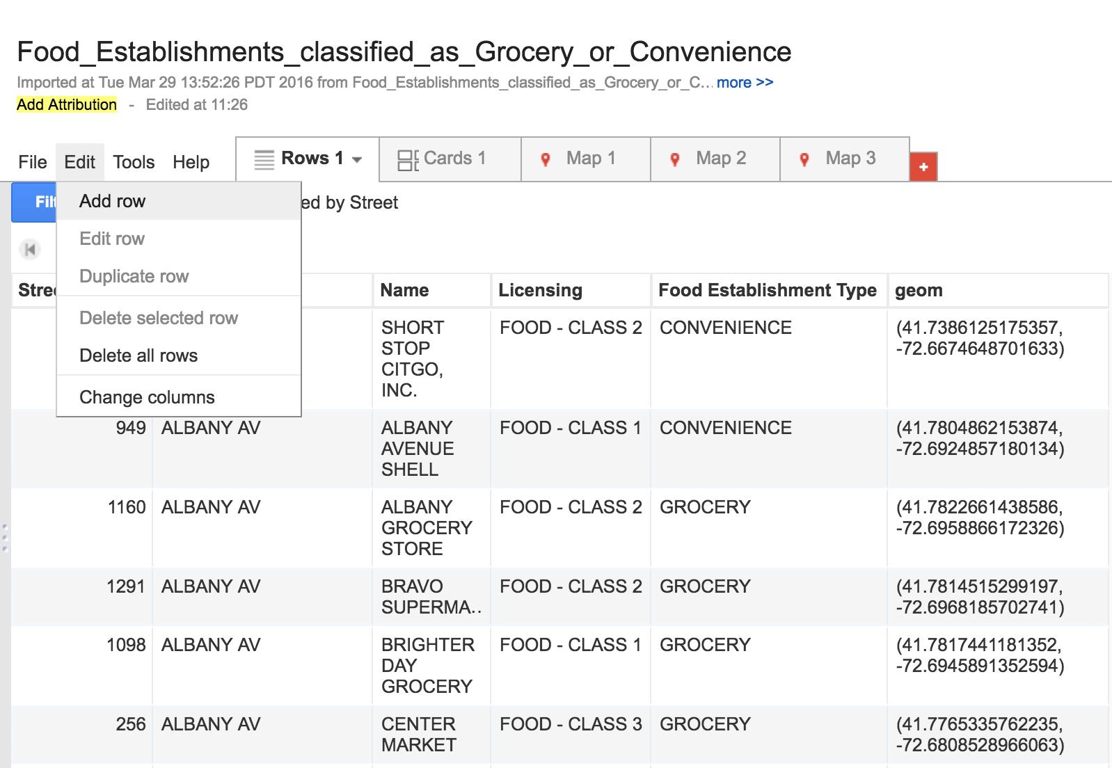
New data can be singularly added by selecting ‘edit’ on the toolbar and then ‘Add Row’, while new data sets can be uploaded as excel and KML format by creating a new Google Fusion Table document.

Screen Shot 2016-04-07 at 8.11.30 PMScreen Shot 2016-04-07 at 8.09.38 PM

The polygon’s map information can also be altered and updated. Currently, we are using the 2014 ACS 1-year estimates for the data in the Polygon. This information can be updated annually. To do this, new American Community Survey data sets should be uploaded to a new Google Fusion Table and ‘merged’ with the Hartford Census tract KML file. Both spreadsheets must share the same information in at least one column, like the names of food establishments. More information and the step-by-step instruction on how to merge spreadsheets on Google Fusion Tables can be found here.

Changing the Visualization’s Characteristics:

The ability to change the colors and information displayed by the polygons can be done in Google Fusion Tables. To do this, the Hartford Food System can select the ‘Map 1’ tab and then ‘change feature styles’ or ‘change info window” button on left side of the screen.

Screen Shot 2016-04-08 at 10.18.46 AM

However, if the Hartford Food System decides to change the data point colors or the legend’s characteristics they will have to modify code in GitHub. In his data visualization book, Jack Dougherty explains step by step the process how to extract, or ‘fork’, a visualization’s code to another GitHub account. Kaitlyn and I will share the link to our GitHub repository so the Hartford Food System can extract the visualization’s code.

Data Sources:

Food Establishment Types and Classes

American Fact Finder ACS download tool

Hartford Food System

Posted on

Map

Our partner would like a map of food access in Hartford, including grocery stores, convenience stores, farmers markets and community gardens. They would like us to indicate all the places that are WIC certified, as well as bus routes. The map would serve two purposes: (1) to give Hartford residents an easy way to find healthy, affordable food in their neighborhood, and (2) to highlight the serious issue of food insecurity in the poorest areas of the city. Using polygons, we will demonstrate the income disparities of the different census tracts.

So far, we have mapped all of the grocery stores, convenience stores, and farmers markets as points. We still need to need to map the farmers markets and all of the places that are WIC certified. Then, we will need to add the CTTransit bus routes and the polygon data on median household income.

Maps that Lie

Posted on

Map #1

Map #2

These two maps display the population of each town and city in Connecticut. In map one I chose to make categories that evenly split the difference between the highest and lowest population into thirds. This displayed most towns in Connecticut in the lowest category (blue) because they all fall below 49,000 people. Highly populated areas like Hartford, Stamford, and other cities were the only areas represented in the other two categories (green and yellow). For the second map, I divided the first category in map one into three separate categories. This shows a variation of categories for smaller towns and portrays a disparity of population across the state.

Comparing Three Mapping Tools

Posted on

Google Fusion

BatchGeo

Mapme

Overall, I thought that Mapme was the most detailed Point Map system to use. It gives you the option to manually add each ‘pin’ or import a spreadsheet and automatically track it. It also gives the user much more control over the information that is shown on each pin. Pins can be customized by color and logo, while photos, and websites can be added to the description.

On the other hand, BatchGeo was the least customizable interface to use. There is no way to change the starting map location, nor the pin color or size. However it was the fastest and easiest map system to use. All the user has to do is copy and paste their spreadsheet to a text box on BatchGeo’s website, and BatchGeo does the rest of the mapping.

Google Fusion Tables is somewhere in between. Excel and Google Sheets can be imported and edited in Fusion Tables, the pin size and color can be customized, and the starting map location can also be set. Fusion Tables is not as fast as BatchGeo, nor as customizable as Mapme, but it does have a hybrid advantages from each interface. It also does offer a ‘heat map’ where a user can show the distance between different restaurant locations. This could be used in my project to show food deserts in between grocery stores in Hartford.