Injury Prevention Center Round Talk Map

Posted on

Final Greater-Hartford-2010-2014-Arrest Rates(2)

Final TroopPolygonShape

What is done: The first map is a clip of the Greater Hartford polygon map. The shaded polygon map represents the amount of arrests made from 2010-2014. Based on the shading, the darkest color represents the greatest arrest made versus the lighter shaded polygon which shows a lower range of arrest rates. Since this map was time sensitive and Garry just wanted a still picture of the map, I used Paint to label the town names and the rates of arrests made. The second and third map shows the troops of Connecticut and the arrest rates made from 2010-2014. There are police departments that cover multiple towns in Connecticut which is why there are Troop data. Troop data allows the audience to visualize the arrest rates in greater regions. The same color coding for the ranges apply.

What needs to be done:
Compile data to create entire state of Connecticut Map that is shaded just like Map 1
Currently working on Google Slides with Garry

Current Progress on Excel:
Interval Data:
https://www.google.com/fusiontables/DataSource?docid=1wBYD2HR4soYIS98UUoG-6pn-GKE2Vr_9Dl0ggOlJ

2010-2014 OCD Assault Rates:
https://www.google.com/fusiontables/DataSource?docid=1mkGpeGUjdsWO_0Ibw4ukuCPORwzQe4RU61xJMU2W

Training and Transfer of Ownership to the Hartford Food System

Posted on

Transferring the Visualization’s Ownership:

For this project, Kaitlyn and I have used Google Fusion Tables and GitHub to manipulate the data into a Visualization. Transferring the ownership of the visualization should be easy since Google Fusion Tables can be shared and edited by the Hartford Food System through email. Google Fusion Tables creates the map part of the online visualization, and editing these tables change the points and polygons. With the power to edit the Google Fusion Tables, the Hartford Food System will be able to add new data and upkeep old data while simultaneously updating the online map. In case the Hartford Food System change other parts of the visualization like the legend or the position of the maps, Kaitlyn and I will share the code via GitHub. This code can be ‘forked’ from our project’s repository and then edited if necessary.

Adding and Updating the Visualization’s Data:

Data about food establishments in Hartford can be found on the city’s open data site. For example, the data that we used for our food establishment types here. The city of Hartford also updates this data on a regular basis. Current data can also be edited by double clicking on the table’s cells or selecting the ‘edit’ button that appears next to the cell.

Screen Shot 2016-04-07 at 8.18.33 PM

New data can be singularly added by selecting ‘edit’ on the toolbar and then ‘Add Row’, while new data sets can be uploaded as excel and KML format by creating a new Google Fusion Table document.

Screen Shot 2016-04-07 at 8.11.30 PMScreen Shot 2016-04-07 at 8.09.38 PM

The polygon’s map information can also be altered and updated. Currently, we are using the 2014 ACS 1-year estimates for the data in the Polygon. This information can be updated annually. To do this, new American Community Survey data sets should be uploaded to a new Google Fusion Table and ‘merged’ with the Hartford Census tract KML file. Both spreadsheets must share the same information in at least one column, like the names of food establishments. More information and the step-by-step instruction on how to merge spreadsheets on Google Fusion Tables can be found here.

Changing the Visualization’s Characteristics:

The ability to change the colors and information displayed by the polygons can be done in Google Fusion Tables. To do this, the Hartford Food System can select the ‘Map 1’ tab and then ‘change feature styles’ or ‘change info window” button on left side of the screen.

Screen Shot 2016-04-08 at 10.18.46 AM

However, if the Hartford Food System decides to change the data point colors or the legend’s characteristics they will have to modify code in GitHub. In his data visualization book, Jack Dougherty explains step by step the process how to extract, or ‘fork’, a visualization’s code to another GitHub account. Kaitlyn and I will share the link to our GitHub repository so the Hartford Food System can extract the visualization’s code.

Data Sources:

Food Establishment Types and Classes

American Fact Finder ACS download tool

Girl Scout Partner Potential Map Ownership Transfer

Posted on

Transferring Ownership 

Because we decided to use Google fusion tables transferring ownership is simple. I will add you as the main owner of the fusion table, right now the owner is Linda, which will allow you to access the map  through your Gmail and will also give you full editing privileges. For the map to be reachable for other people within Girl Scouts by using a Google fusion template I will be able to create an interactive web page were the Map can be viewed but not edited. And this page can be easily reached with a simple URL you can distribute to anyone who wants to view and use the map.

Spreadsheet Update: 

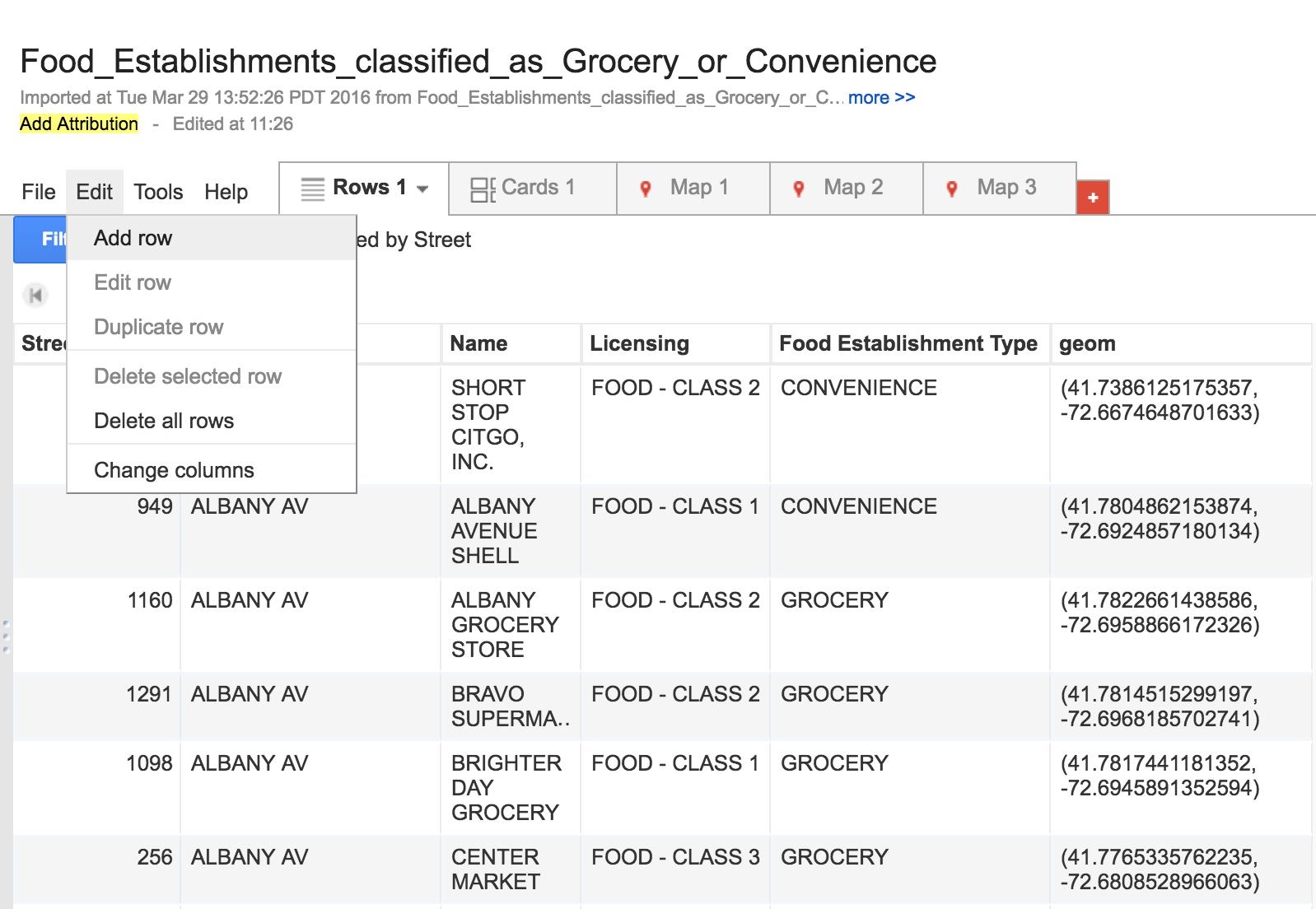
1)When new Girl Scout data is updated you will need to pull Girl data from iMIS using the LB Data Viz Query (girl)

2)When you data is now imputed into a new excel sheet before you begin organizing your town data you will need to convert the smaller wrong town names to the correct ones using VLOOK up. VLOOK up instructions can be found here. You will need to use this excel page to convert your town names: VLOOK up town data.

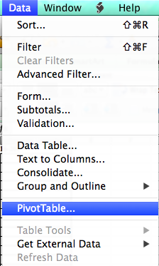
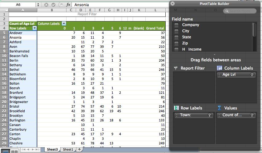
3) When new data on Girl Scout participation is available in order to convert this into a usable spreadsheet for Google fusion you first step is to create a pivot table showing the number of Girl Scouts in each town by age group. To create a pivot table you will need to highlight the entire spreadsheet then go into Data and then click pivot table.

Screen Shot 2016-05-17 at 11.51.11 AM

You will then need to organize you data into these groups at shown in the picture below.

Screen Shot 2016-04-07 at 3.03.26 PM

4) Once your Girl Scout population by town data is organized your next step is to create a spreadsheet with both census population data and Girl Scout participation data. You can use the same population template spreadsheet each time the only thing that will need updating is the percentage of Girl Scouts compared to residences.

Screen Shot 2016-04-07 at 3.07.57 PM

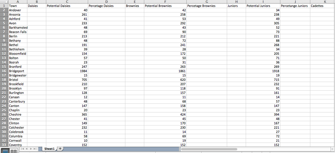
Your spreadsheet should be set up in a format like this. Your Columns for each age group should be labeled as such: Town, Daisies (number of Daisies in town), Potential Daisies (population in town), and percentage (actual Daisies over potential Daisies) Once you input the new Girl Scouts data you need to find the percentage of Girl Scouts over Census data.

Google Fusion Map Update:

1) Once your spreadsheet is organize you will need to input your new spread sheet into a google fusion table. You will then need to merge it will the MAGIC town borders of Connecticut. Under file in your google fusion table you will need to click merge and it will give you an option to merge your fusion table with a table on your desk top (town borders). You can access the Magic town borders here. For more help on merging data look to the Data Viz For All Booklet.

2) You will then need to copy the color codes and percentage ranges from you old maps. You will need to create 7 maps using google fusion tables exactly like the ones I initially created using the new data. For help using Google fusion tables look to Data Viz For All Booklet. Once you tables are finalized you will be able to update the GitHub code to update the template.

GitHub Update:

1) Updating GitHub is simple once your maps are updated and finalized you will want to go into file on your google fusioon map and then to about this table. You will then see

Screen Shot 2016-05-04 at 1.03.45 PM

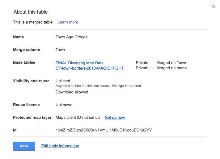
You will then need to do a hard copy of the ID at the bottom of the list. This ID is different for every map within this google fusion table so when importing these IDs into the GitHub code it will be different for each map.

2) You will then need to go into your fusion-girl-scouts repository making sure you are editing within your gh-pages. You will need to go into your  Screen Shot 2016-05-04 at 1.14.57 PM file and then into your Screen Shot 2016-05-04 at 1.15.06 PM file. This is where you will be updating your map and points within the template. Once in your maps_libs.js file you will then need to scroll down to line 26 Screen Shot 2016-05-04 at 1.16.44 PM

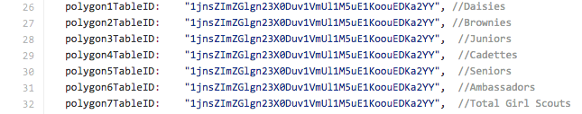
Within this code is where you will import your new polygon IDs that you copied from your google fusion table. Each ID is labeled with each age group.

3)Once your IDs are updated you will want to check that your map updated correctly by scrolling down on your main repository page and click on the demo link. It may take a while for the maps to update but before you do a pull request to update your master branch you want to make sure the maps are inserted correctly.

4)*This step is not necessary until you have made changes to your gh-pages that are perfect and finalized. To make a pull request to your master branch to have your repository completely updated you will need to click on the Screen Shot 2016-05-04 at 2.36.41 PM new pull request page. It will then ask you to check which GitHub profile to pull from and you will want to click on Screen Shot 2016-05-04 at 2.38.31 PM 
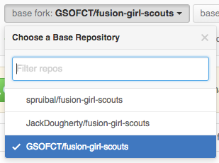
GSOFCT. Once you are have clicked on your own repository you need to create a pull request to you master from your gh-pages which will look like this Screen Shot 2016-05-04 at 2.40.25 PM
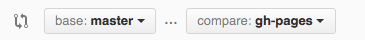
. You can then create your pull request.

5)Depending on how much your data has changed you may need to edit the range of percentages the map is basing its data off of for each individual age group. You can find this on your google fusion table under change feature style in fill color. You will also need to update the percentages under the color legend on the template map within GitHub. You can access this in your Screen Shot 2016-05-04 at 1.14.57 PM file and then in your Screen Shot 2016-05-04 at 1.15.06 PMfile. You will then need to scroll down to line 170. Screen Shot 2016-05-04 at 2.25.31 PM

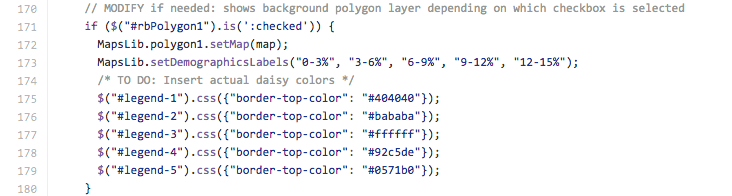
There is separate code for each age group and within this code you can edit the color codes for the legend as well as the percentages under each color. Each code is labeled under each age group.

Population Data: 

1) Once new population data for CT is released you will need to update the population data as well. The best source for specific age break downs is from the Department of Public Health for Connecticut. You will have to download their data called Connecticut Town Population by Age Sex Race and Hispanic Ethnicity for the next census. The data surrounding race is not important for the data needed for your partner potential map so you will have to extract the specific data you need for this large data set.


Hartford Food System

Posted on

Map

Our partner would like a map of food access in Hartford, including grocery stores, convenience stores, farmers markets and community gardens. They would like us to indicate all the places that are WIC certified, as well as bus routes. The map would serve two purposes: (1) to give Hartford residents an easy way to find healthy, affordable food in their neighborhood, and (2) to highlight the serious issue of food insecurity in the poorest areas of the city. Using polygons, we will demonstrate the income disparities of the different census tracts.

So far, we have mapped all of the grocery stores, convenience stores, and farmers markets as points. We still need to need to map the farmers markets and all of the places that are WIC certified. Then, we will need to add the CTTransit bus routes and the polygon data on median household income.

Assignment 8-KNOX demo

Posted on

link to map demo: http://doris0221.github.io/fusion-point-polygon/

My partner is expected to see an interactive map with two layers. On the first layer, it shows the all the community gardens with detailed profile information. The profile includes the address, the number of plots, photos of the garden, spot availability of the garden during the year and greenhouse availability(3). The second layer shows the Hartford neighborhood border, which divides gardens into different regions and also gives audience an easier way to visualize where their closet gardens are. Adding on to this border map, there is also a search tool, like the one in Google map, for audience to search by address. Audience can simply type in their own address in the toolbox. The map will then lead the audience into the closet garden according to the location. Moreover, there is another filter tool on the side of the map. The tool filters out by the information listed in the garden profile, such as the greenhouse and garden plot availability.

Steps completed:
Make point map
Make polygon map
Merge two maps into layer map
Create filter tool
Collect photos

Steps to be done:
Make photos appear in the profile–demo:https://support.google.com/fusiontables/answer/2527132?hl=en
Collect more photos
Fix filter tool
Edit code in github