Injury Prevention Center Presentation – Data Visualization Final

Posted on

Files that need to be transferred:

  • Excel Files: 
    • The population of children in each town and the total population from Social Explorer. I own the file and it is also located in Google Fusion. It is labeled as: 2010-2014-ACS-Children Population-Data.xlsl
    • The calculations of police arrest rates of the Greater Hartford Area. Within the excel file, there are multiple spreadsheets that also contain the calculations of total population without child involvement for five years. I own the file and plan to input individual spreadsheets into Google Fusion. It is labeled as: greaterhartford-arrest-rate.xlsl
    • List of 169 towns with the troop label. I own this file and this is also located in Google Fusion. This is labeled as: CT-towns-troops.xlsl
    • The calculations of police arrest rates of Connecticut. I own this file and this is also located in Google Fusion. This file is labeled as: CT-arrest-polygon.xlsl
    • The calculation of 2010-2014 total police arrests. I own this file and is labeled: 2010-2014-total-arrest-rate.xlsl
  • Google Fusion:
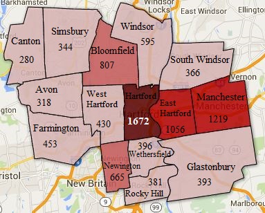
    • Greater Hartford polygon map is labeled as: Greater-Hartford-Police-Arrest-Rates-2010-2014 and will be shared with Garry.
    • Connecticut Troop polygon map is labeled as:  CT-Troops-Arrest-Data and will be shared with Garry.
    • Connecticut Police Arrest polygon map is labeled as: CT-Polygon-Shape-Map and will be shared with Garry.
    • All of the excel files will also be uploaded on Google Fusion and will be shared with Garry and make him the owner
  • Shape Map Files: 
    • Connecticut map shape file of 169 towns. I own this geojson file and is is labeled as: CT-towns-polygon-shape.geojson
    • Connecticut troop map shape file. I own this kml file and is labeled as: CT-troops.kml

Step By Step Instruction on Updating/Maintaining Maps

Part A:  Google Fusion

  1. In order to create a thematic polygon map, there are two types of files that need to be merged:
    • Data Table: the numerical values for each polygon and is your normal excel or csv file.
    • Geographic borders: series of points that draws each polygon. This can be shape files can be found from open source data such as MAGIC UConn Libraries or refer to the DataVizForAll book for direct links to the shape files.
  2. How to Upload data tables:
    • In Google Drive, click New > Google Fusion Tables. Import each sample file, one at a time, by selecting “From this computer” and navigating to the file. Click Next to confirm the data upload. google fusion upload
    • Then, a columns and rows of data will appear, just like the excel sheet.
  3. Merge Data and Border Files: This step is important in creating the choropleth map.
    • In order to merge the data table and geographic borders, the two files must share a common column. For instance, a town name
    • google fusion merge
    • Then, go to File –> Merge –> and select the geographic borders. Note: your geographic borders file will not show up unless you upload it into Google Fusion.
    • Select the matching column types to merge. The goal is to match the correct column type, even if the town names do not appear in the same order. google fusion match merge
    • Afterwards, a new link will pop up to direct you to the new Google Fusion table where the data table and geographic borders are merged.
  4. Creating Thematic Map
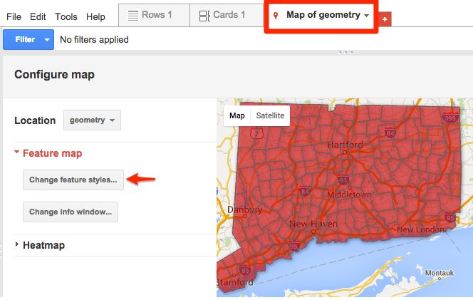
    • Click on the Tab labeled Map of Geometry. Make sure the Location is Geometry to get the thematic map. Next, click on change feature styles under Feature Map.
    • google fusion thematic map
    • This will allow you to change the color scheme, the appropriate ranges, and the overall appearance of the map. Try to play with the buckets and gradient tab that is located in Polygons –> Fill Color. Note: If you want to have your range in quartiles, Google Fusion calculates the range for you. However, make sure the starting range is less than the lowest number and the highest number is higher than the highest range. If you do not change the range, then the polygon map will not change color.  google fusion change feature style
    • Legend: To make the legend appear on the map, click on Automatic legend which is located under the Legend Header. Afterwards, click on “show polygon fill legend”. Then, you can customize the title and position of the legend
    • Customize Window Data/Information: When you hover over the map, a window of information will pop up. To customize the type of information you want shown, click on “Change info window’ which is located under Feature Map. Then, a window will pop up where you’ll be able to click on information that you want to include. google fusion info window
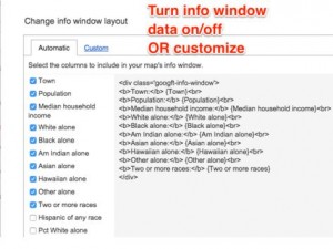
    • Hover over a polygon to visually see the information included in the window.
  5. The thematic map is now complete! To share this map, make sure you change the settings to anyone who has a link can access the map.

References/Pictures: DataVizForAll by Jack Dougherty

Injury Prevention Center Round Talk Map

Posted on

Final Greater-Hartford-2010-2014-Arrest Rates(2)

Final TroopPolygonShape

What is done: The first map is a clip of the Greater Hartford polygon map. The shaded polygon map represents the amount of arrests made from 2010-2014. Based on the shading, the darkest color represents the greatest arrest made versus the lighter shaded polygon which shows a lower range of arrest rates. Since this map was time sensitive and Garry just wanted a still picture of the map, I used Paint to label the town names and the rates of arrests made. The second and third map shows the troops of Connecticut and the arrest rates made from 2010-2014. There are police departments that cover multiple towns in Connecticut which is why there are Troop data. Troop data allows the audience to visualize the arrest rates in greater regions. The same color coding for the ranges apply.

What needs to be done:
Compile data to create entire state of Connecticut Map that is shaded just like Map 1
Currently working on Google Slides with Garry

Current Progress on Excel:
Interval Data:
https://www.google.com/fusiontables/DataSource?docid=1wBYD2HR4soYIS98UUoG-6pn-GKE2Vr_9Dl0ggOlJ

2010-2014 OCD Assault Rates:
https://www.google.com/fusiontables/DataSource?docid=1mkGpeGUjdsWO_0Ibw4ukuCPORwzQe4RU61xJMU2W

Progress from Injury Prevention Center

Posted on

Intimate Partner Violence Arrests in Connecticut 2010

Intimate Partner Violence Arrests in Connecticut 2011


Intimate Partner Violence Arrests in Connecticut 2012

Intimate Partner Violence Arrests in Connecticut 2013

Intimate Partner Violence Arrests in Connecticut 2014

Intimate Partner Violence Arrests in the Greater Hartford Area for 2010-2014

Injury Prevention Center Vision: To have a shaded polygon map of Connecticut from 2010-2014 that contains the rate of arrests, children involved, and the average rates of arrest per year. On the map, the towns should be labeled and be able to hover over the towns for the information. In addition, there would be a table containing the same information as well as a bar/line graph.

Round Talk Vision on April 12th: Since this is the first priority, the vision is to clip the greater Hartford area to represent the interval shelter homes for victims of intimate partner violence. With this, there will be a shaded polygon map with town labels, the rate of arrests without the involvement of children for 2010-2014. Since this will be used in Garry’s Power Point, he would like the map to be a screenshot.

Steps Completed for Data Visual Vision:
Shaded polygon maps completed for all five years.

Steps to be done for Data Visual Vision:
Compile the five years of data into one polygon map, recalculate the data to factor in child involvement, use another tool to label the towns, create the table and bar/line graph.

Steps Completed for Round Talk:
Clipped the greater Hartford from mapshaper.org and exported it to Google Fusion. And is in the progress of compiling/cleaning data.

Steps to be done for Round Talk:
Compile/clean arrest data to import into Google Fusion, label the town names, color code polygon and have this ready for Garry before April 12th for revisions.

Modifying Leaflet Choropleth Map

Posted on


For this data visualization, the interactive choropleth map represents the US Population Density. What makes this map unique is that the user can hover over any state and get additional information, unlike Google Fusion where the user needs to click on the state to get information. From GitHub, I have modified the leaflet code by manipulating the height & width of the map, changing the color of the border outline to black when the user hovers over the state, and the width of the border boundaries. An interactive choropleth map is a useful visualization for Police Data and this allows me to be one step closer to creating a data visualization that tells a story of intimate partner violence.

How to Lie with Maps using Police Data

Posted on

The Rate of Police Arrests in 2014 in Connecticut (Inequality)

The Rate of Police Arrests in 2014 in Connecticut (Equality)

Above are two shaded polygon maps that contain the same data about the rate of police arrests in 2014; yet, the information portrayed is different. From the shaded red polygon, the person reading that map would interpret disparity in the number of assault arrests in Connecticut. For instance, the Hartford area shows consistency in arresting 50-1,601 people for assault (light pink) while there are less than fifty arrests (dark red) that are spread across Connecticut. On the other hand, the blue shaded polygon contains the same data, but why can it be interpreted differently? Well, the person reading the blue polygon map would see a consistency of equal assault arrests in Connecticut. This is how you can lie with Maps. If you look closely at the two polygon maps, the red shaded polygon represents the TOTAL OFFENSE ARREST while the blue shaded polygon represents only ASSAULT OFFENSES. I have learned not to be fooled by maps easily by learning how to lie with maps. The reason why the person who created the map would show different interpretations with the same data is to emphasize their main point. For instance, if I wanted to target an audience about the importance of reducing the total amount of offense arrests, I would show the red polygon. However, if I want to emphasize the equality of arrests to show that the arrest rates are not increasing, I would show the blue polygon map. I have learned to carefully assess the map by using the legend as a guide as well as pay attention to details to better understand the purpose of the map.
(Note: The polygon is not filled because the police departments do not have the data for those towns in Connecticut)