Posts

DataViz Final – CWP Project

Posted on

Files to be transferred:

  • The geojson file for the 37 towns. Label: cwp-37-towns-v8.geojson. This file contains the data provided by the Capital Workforce Partners. The organization owns and has access to the file.
  • The csv file for 37 towns. Label: cwp-37-towns-v8.csv. This file contains the data in the geojson file but in the excel format.

Part 1: Maintain the website

  1. Sign up for a free GitHub account.
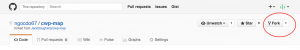
  2. Go to https://github.com/ngocdo67/cwp-map. This is the repository for the Leaflet map. Click on “Fork” to make your own copy of the map.Screen Shot 2016-04-21 at 11.09.00 AM
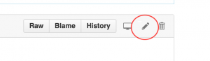
  3. Go to the README file. Click on the edit icon. In the demo link http://ngocdo67.github.io/cwp-map/index.html change “ngocdo67” to your github username. Click on the green button Commit changes.Screen Shot 2016-04-21 at 11.33.08 AM
  4. Go to the branches tab. Delete all branches, except for the master branch. Go back to the repository main page. Click on Branch: master. On the Find or create a branch, type in gh-pages to create your own gh-pages branch. The code in here would be the one that goes live on the link you have on the README file.Screen Shot 2016-04-21 at 11.35.08 AM
  5. Replace the current link on your account with your own demo link.

How to do a pull request

  1. On the main page of the repository, click on the green button New Pull Request

Make sure the base fork is your username, NOT “ngocdo67”.  Use the drop-down menus to CAREFULLY select the direction of the merge in this TO-FROM format. In this example, it is TO master branch FROM gh-pages branchScreen Shot 2016-04-21 at 11.38.31 AM

  1. Follow these steps to finish the pull request, which merges all content TO the master branch FROM gh-pages branch:
  • Create the pull request (select green button)
  • Give it a title (such as “updated index and ReadMe”)
  • Send pull request (green button)
  • Merge pull request (another green button)
  • Confirm merge (and another green button!)
  • Always double-check your repository branch names to do editing and live web testing in the gh-pages branch, then make sync a copy to public share in the master branch.

Part 2: Update the Information

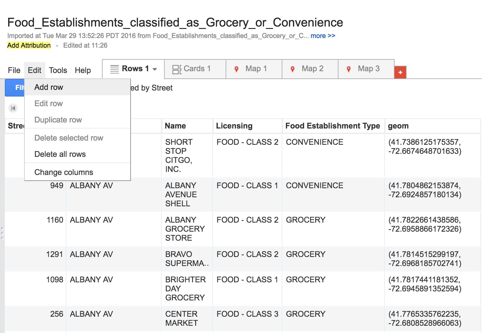
  1. On the main page of the repository, download the zip file. Open the compressed file.
  2. Open the cwp-37-towns.csv file in the zip. The column number corresponds to the tab number. For example, number 2 means Median age. Change the data and save it as a new csv file

Solution 1: Mapshaper

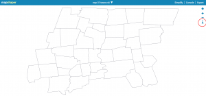
  1. Import the geojson file to mapshaper.org by dragging the file to the site’s browser window. Click on the i icon and hover over (NOT clicking on) the map to check if the field that contains towns’ names is named “name”.                       Screen Shot 2016-04-30 at 2.16.45 PM
  2. Import the new csv file to mapshaper by dragging the file to the site’s browser window. When a window pops up, select the Import button to add the csv file as a second layer. This table layer will appear as a rectangular cells, because it does not contain geographic information.mapshaper-join-select-map-layer
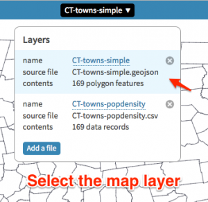
  3. Click the drop-down menu and select the map to display it as the active layer
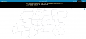
  4. Click the Console button, type this command( -join your-new-csv-file-name.csv keys=name,name) and press return Screen Shot 2016-04-21 at 11.46.15 AM
  5. Click the Export button, select the GeoJSON option to download your new GeoJSON file.

Solution 2: geojson.io: If the merge fail in mapshaper, you can go to the page geojson.io to fix the data manually

  1. Go to the website geojson.io. If there already exists a file on the website, click New. Click Open and select File to upload your geojson file.
  2. On the right side of the website, select the Table tab. In here you could directly change the data in that table.Click Save and select GeoJSON to download the new geojson file to your computer.
  1. Click on the New pull request to see if the master branch and gh-pages branch are similar or not.
  2. If there is any difference, then do a pull request from gh-pages to master branch.
  3. Upload the GeoJSON file to the master branch by clicking the Upload button on the main repository page. After dragging the new GeoJSON file to the browser, click the green button Commit changes.
  4. Do a pull request from master to gh-pages branch
  5. Go to script.js in the gh-pages branch. Find the line  $.getJSON(“cwp-37-towns-v4.geojson”, function (data) and change “cwp-37-towns-v4.geojson” to the name of the new geojson file. Click the Commmit Changes button.
  6. Go back the the main page of the repository. Do a pull request from gh-pages to master branch.

Delete a Repository

Screen Shot 2016-04-27 at 10.30.11 PM

  1. On the main page of the repository, go to Settings.
  2. Click on Delete this Repository
  3. Type in the name of your repository to confirm that you want to delete it.

Reference: Data Visualization for All – Jack Dougherty


CT Landmarks project final slides and transferring of ownership

Posted on

Laura will edit the first and last slides later this week to add her presentation part to it.

Assignment 10B: Write a transfer and training plan to migrate your dataviz and ALL source files to your partner.

  • Which files need to be transferred? How are they labeled? Who owns or has access to them?

The journal files scanned(in PDF format) were all in Community Partner’s local hard drive and their official Google Drive, labeled in their labelling format. The pictures of artifacts I took were not in their system yet, and I will transfer all the pictures to our shared Google Drive(owned by CT Landmarks) before finals.

  • What info and training does the partner need to maintain or update the dataviz? Spell out the steps in your post, and refer to DataVizForAll if needed.
  1. Go to http://storymaps.arcgis.com/en/  , and log in.
  2. Click “My stories” in the upper panel, and go to the current story.
  3. Add Point to the map:
    1. Screen Shot 2016-04-19 at 21.50.40Select the map in use, click on “Edit map”.
    2. In the new window, search for the location in the search panel on upper right corner, Then in the small frame popped up, click on “Add to Map Notes”. Then a pinpoint will be created
    3. If you need to add any additional informationAfter added to map notes, click on the pin again, then click “edit” in the pop-up window.
    4. Click “Save”, and go back to the original story map page.
  4. Delete point on the map:
    1. Click on the pinpoints, and click “edit”, then in the new menu, click “Delete”.
  5. Edit Any part of the Story:
    1. Click on “Edit story” in the storymap dashboard(The pic shown above)
    2. Scroll down to the part you wish to edit, and then click the small pencil icon associated with it.
    3. Main-stage (The background) SetupScreen Shot 2016-04-19 at 21.58.54
    4. Side Panel content editScreen Shot 2016-04-19 at 22.06.37
  6. Create a new point for a story
    1. Click the “+” sign at the bottom of the side panel, and follow the procedures for editing the story(Step 4)
  7. Organize the orders of the pinpoints:
    1. Click the “Organize” sign at the bottom of the side panel, and drag-and-drop pinpoints in designated order

Laura and I will meet in person in the next following weeks to do all the trainings for ArcGIS.

Injury Prevention Center Round Talk Map

Posted on

Final Greater-Hartford-2010-2014-Arrest Rates(2)

Final TroopPolygonShape

What is done: The first map is a clip of the Greater Hartford polygon map. The shaded polygon map represents the amount of arrests made from 2010-2014. Based on the shading, the darkest color represents the greatest arrest made versus the lighter shaded polygon which shows a lower range of arrest rates. Since this map was time sensitive and Garry just wanted a still picture of the map, I used Paint to label the town names and the rates of arrests made. The second and third map shows the troops of Connecticut and the arrest rates made from 2010-2014. There are police departments that cover multiple towns in Connecticut which is why there are Troop data. Troop data allows the audience to visualize the arrest rates in greater regions. The same color coding for the ranges apply.

What needs to be done:
Compile data to create entire state of Connecticut Map that is shaded just like Map 1
Currently working on Google Slides with Garry

Current Progress on Excel:
Interval Data:
https://www.google.com/fusiontables/DataSource?docid=1wBYD2HR4soYIS98UUoG-6pn-GKE2Vr_9Dl0ggOlJ

2010-2014 OCD Assault Rates:
https://www.google.com/fusiontables/DataSource?docid=1mkGpeGUjdsWO_0Ibw4ukuCPORwzQe4RU61xJMU2W

Sample presentation: CT Educational Redlining Map

Posted on

Reminder: Share your Google Slides, then File > Publish > Embed > Medium iframe

Reminder to insert this:  Direct link to Google Slides

Reminder to practice how to turn on the presentation mode, and to go back and forth to browser mode to view any tabs you open

Text of your transfer and transition plan goes here. . . 

Training and Transfer of Ownership to the Hartford Food System

Posted on

Transferring the Visualization’s Ownership:

For this project, Kaitlyn and I have used Google Fusion Tables and GitHub to manipulate the data into a Visualization. Transferring the ownership of the visualization should be easy since Google Fusion Tables can be shared and edited by the Hartford Food System through email. Google Fusion Tables creates the map part of the online visualization, and editing these tables change the points and polygons. With the power to edit the Google Fusion Tables, the Hartford Food System will be able to add new data and upkeep old data while simultaneously updating the online map. In case the Hartford Food System change other parts of the visualization like the legend or the position of the maps, Kaitlyn and I will share the code via GitHub. This code can be ‘forked’ from our project’s repository and then edited if necessary.

Adding and Updating the Visualization’s Data:

Data about food establishments in Hartford can be found on the city’s open data site. For example, the data that we used for our food establishment types here. The city of Hartford also updates this data on a regular basis. Current data can also be edited by double clicking on the table’s cells or selecting the ‘edit’ button that appears next to the cell.

Screen Shot 2016-04-07 at 8.18.33 PM

New data can be singularly added by selecting ‘edit’ on the toolbar and then ‘Add Row’, while new data sets can be uploaded as excel and KML format by creating a new Google Fusion Table document.

Screen Shot 2016-04-07 at 8.11.30 PMScreen Shot 2016-04-07 at 8.09.38 PM

The polygon’s map information can also be altered and updated. Currently, we are using the 2014 ACS 1-year estimates for the data in the Polygon. This information can be updated annually. To do this, new American Community Survey data sets should be uploaded to a new Google Fusion Table and ‘merged’ with the Hartford Census tract KML file. Both spreadsheets must share the same information in at least one column, like the names of food establishments. More information and the step-by-step instruction on how to merge spreadsheets on Google Fusion Tables can be found here.

Changing the Visualization’s Characteristics:

The ability to change the colors and information displayed by the polygons can be done in Google Fusion Tables. To do this, the Hartford Food System can select the ‘Map 1’ tab and then ‘change feature styles’ or ‘change info window” button on left side of the screen.

Screen Shot 2016-04-08 at 10.18.46 AM

However, if the Hartford Food System decides to change the data point colors or the legend’s characteristics they will have to modify code in GitHub. In his data visualization book, Jack Dougherty explains step by step the process how to extract, or ‘fork’, a visualization’s code to another GitHub account. Kaitlyn and I will share the link to our GitHub repository so the Hartford Food System can extract the visualization’s code.

Data Sources:

Food Establishment Types and Classes

American Fact Finder ACS download tool