Both of the following maps are based on the same data of employment rates across all census tracts in Connecticut. However, due to the number of intervals that the data is divided into in each map, the two maps look very different from each other. In the first map, the data is divided into only 2 buckets, showing a clear distinction between the census tracts with high employment rates (64.9% – 79.6%) and the ones with low employment rates (less than 64.9%). Highly contrasted colors are also used to emphasize the difference between the 2 baskets.
On the other hand, the data is divided into 8 buckets in the second map. Colors of the same hue and slightly different shades are used in symbolizing the baskets. It seems like the employment rates across the census tracts in Connecticut are quite even, with only a few census tracts having slightly higher rates of employment than the others.
The above maps have demonstrated how mapmakers can lie with maps and give totally opposite impressions to viewers, just by changing some of their decisions on map elements in making maps.
This sample map shows the percentage of minorities in the school districts. Using many gradients, I was able to create ranges that are very similar in color. Therefore, I was able to show that in the small area of CT, the percentage of minorities was similar throughout the towns/cities. If I wanted to show extreme differences, I would have used less gradients and ranges and had colors that contracted each other. In this map, There was a big range, but the colors representing each gradient was a similar color. In the second map, I used data from IPC. I calculated the total number of injuries in CT and also added in population statistics. Using those stats, I was able to calculate the injuries per capita. Most cities/towns had a relatively low level of injuries. However, to make the map show an extreme difference, I used many gradients, but also chose different colors to represent each. For instance I used blue, orange, and red to show a greater contract between colors. The third map shows the same data, but using the same color. Because the ratios are so low and similar, it looks like as if there is no difference in ratio of injuries in each town/city. However, this is not the case since the Hartford area as well as Cromwell, have the highest ratio, but it is not shown in the third map
The two data visualizations below present the same date in very different ways. Both aim to give a geographical visualization of individuals over the age of 25 in given Connecticut Counties who reported never graduated High School. The first shows a more narrow spectrum of the data by only separating the various percentages of those not graduating high school into two different categories, while the second visualization shows three different categories in color all of which are similar. The first would suggest these counties are very different and divided, while the second would suggest they are very alike. One has to be a lie, so this would suggest that we’ve accomplished our goal in lying with maps.
Last week, the Connecticut Open Data portal opened with a handful of files to demonstrate the state’s initiative in sharing public data. Check out the data that’s currently available on the Socrata platform at https://data.ct.gov
Also, I was curious to find out what types of interactive data visualizations could be easily created with Tableau Public (free download, but Windows only, requires free account for web services). This application competes with Google Fusion Tables, a free cross-platform data visualization tool, which I’ve been teaching to my Trinity students.
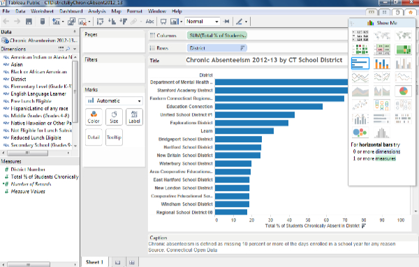
Tableau Public has limitations, and users are encouraged to upgrade to Tableau Desktop (free trial, but full retail price is $999, with education/non-profit discount; Windows only). One limitation of Tableau Public is the lack of a direct link to the CT Open Data/Socrata web platform, which means that I could not display “live” data. Therefore, I had to export a sample data file into Excel, and upload into Tableau Public, where the dashboard allowed me to construct an interactive chart with “static” data. The interface seemed relatively straightforward to me, but I’ve used dozens of data tools over the years. The chart-design mode below seemed similar to the Microsoft Excel pivot table feature, if you’ve ever used that one.
Dashboard view of Tableau Public
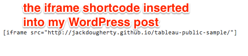
Next, I created a free Tableau Public web services account to save my work online, and it generated a results screen with a long HTML embed code. To display the interactive visualization on your own site, users need to host this code on another live website, and in my case, I simply pushed it into a GitHub Pages repository, as I’ve taught my students to do in our DataViz book-in-progress. To embed that live site on this WordPress.org post, I embedded an iframe with the URL source into the text/code view.
The live data visualization appears below — be sure to explore its interactive features.
Overall, Tableau Public — when used in combination with a web hosting platform — looks like a relatively easy way for non-profit organizations to create interactive data visualizations and embed them on their websites. At first glance, Tableau Public appears to have a wider range of out-of-the-box visualization designs than Google Fusion Tables. So why did I decide NOT to teach Tableau Public to my Trinity students in spring 2014? The major roadblock is that the application is currently Windows-only, and most of my students use Macs. While I have Windows virtualization (e.g. Parallels) installed on my Mac, that’s not a luxury that’s available to most of my students. Still, Tableau recently announced that it will release a Mac version in the second quarter of 2014, though it’s unclear to me whether this means the free Tableau Public and/or the not-so-free Tableau Desktop. Wait and see.