 Members of the DataViz seminar learn how to design interactive, online data visualizations while working with Hartford-area community partners on a public data project for 8 hours/week.
In Spring 2014, the Data Visualization for Social Policy internship seminar is listed under Formal Organizations (FORG 210, section 4) for 1.0 credit, and requires an approved internship contract. Beginners with a strong desire to learn are welcome, and no prior experience is required. All students must bring a laptop to each seminar (Mac or Windows or Chromebook; ask instructors if you need help).
 Time & Location:
Mondays 12-1:10pm in Gallows Hill room 105, Trinity College (see Google Maps or building #19 on campus map). Walk through the common area to our room in back. Feel free to bring your lunch. Guests are welcome. Members of the Trinity community and Hartford-area non-profit organizations are especially welcome to drop-in for any portion of our weekly seminar, or follow our work on the web.
Instructors:
Associate Professor Jack Dougherty: email and website and appointment calendar
Teaching Assistant: Veronica Armendariz will help with homework assignments on Thursdays and Fridays 3-4pm in Gallows Hill common area or email to make an appointment
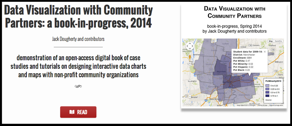
Our primary text, Data Visualization with Community Partners, is an open-access web book that the instructor and students will create online as the seminar progresses. Follow our work online at http://epress.trincoll.edu/dataviz
Schedule (subject to change; important revisions marked in red; *=more to come)
Mon Jan 27 – Introduction
- What are data visualizations? Why do they matter for our community partners?
- Syllabus schedule, assignments, and public work/student privacy policy
- Self-introductions by seminar members: What do you hope to learn and why
- Exercise: Let’s make a simple placemark map with sample data and BatchGeo tool
- Share your To-Do doc and Worklog spreadsheet on our GoogleDrive organizer
- Assign #1: Listen to partner and prioritize dataviz needs & sources on ToDo by Feb 2
- To come: online form to collect contact info for password-protected Moodle*
Mon Feb 3 – Publishing to the Web with GoogleDrive, WordPress, and iFrames
- How can we easily create content for the public web — or make it more private?
- Read “Introduction” about criteria for using dataviz tools in book-in-progress
- Read public-private policy for partner organizations (discuss with yours) and students
- Tutorial: Upload sample data to Google Drive and change sharing settings
- Tutorial: Publish a WordPress post (categories = practice AND your name); add links and media; change visibility to password-protected; for help, see related screencast
- Tutorial: Embed an interactive dataviz (such as BatchGeo) on a website using iFrame
- Teaching assistant Veronica’s drop-in hours or email for appointment (see above)
- Feedback on Assign #1 (To-Do lists) and opportunity to get back on track by Fri Feb 7
- All: discuss partner priorities, data sources, and public status of works-in-progress
- Assign #2a: Write a 2-3 sentence bio about yourself (recommended: Insert>Image to add photo), with a link to your organization, in this editable GoogleDoc by Sat Feb 8th for instructors to edit and publish to the DataViz website
- Assign #2b: Write a WordPress post of at least 2 paragraphs of at least 1-2 paragraphs that describes your partner organization, a public description of their dataviz goals (ask partner if any details should be private), and your initial thoughts about what types of dataviz tools or methods you will need to learn to accomplish these goals. Embed a relevant dataviz (such as a BatchGeo map related to your partner org) as an iframe in your post, even if it’s simply to demonstrate one tool that you’ve learned. Remember to select post categories (Assign 2b AND your name) and make it public. Due by Sat Feb 8th.
- My update for community partners on goals and public work
- Free productivity tools: Evernote for collecting web links and organizing notes; Skitch for creating and editing screenshots
- Update your To-Do list and Worklog spreadsheet
Mon Feb 10 – Choosing Different Charts, Maps, and Tools
- Before class, optional photos & quick survey questions using Google Forms tool
- How do we work with partner organizations on making dataviz design choices?
- Read draft decision-tree in the Introduction to DataViz book-in-progress
- Each intern discusses last week’s Assign 2 posts and how your thinking is evolving
- Assign #3: Describe your partner organization’s dataviz priorities and source data, illustrate your current thinking with potential examples, and explain why some types of charts/maps may be more appropriate than others. At least 300 words on WordPress (category = Assign 3 design choices) due by Sat Feb 15th. To illustrate, you may:
- insert photos of your color hand drawings
- insert screenshots of examples from the web (with credit in caption)
- insert links to examples from the web (with credit in the text)
- embed iframes to examples from the web (with credit in the text)
- ideally, create your own dataviz rough drafts using tools you’ve learned
- Update your To-Do list and Worklog spreadsheet
Wed Feb 12
 Recommended: TrinTalks Series (a local spinoff of TED Talks), 5-7pm at Vernon Social Center, with an interactive presentation followed by food, beverages, and discussion. Topic: “Visualizing Data with Hartford Community Partners.” Building on the open data movement and the recent growth of user-friendly digital tools, Professor Jack Dougherty and Trinity students are working with Hartford community organizations to create interactive data visualizations and maps for the public web. Will broader access to more information promote social change?

Mon Feb 17 – Point & Polygon Maps, with Custom Displays and Controls
- How can Google Fusion Tables & templates move us beyond basic point maps? See my post comparing BatchGeo versus Google Fusion Tables with template
- Working collaboratively with data
- Merge tables to map different layers of points and/or polygon data
- Custom displays (marker colors, legends) and controls (search & filter)
- Read differences between Google Spreadsheets versus Google Fusion Tables, and when to use one versus the other
- Limitation: Currently, Google Spreadsheets do not automatically update into Google Fusion Tables (but see progress on issue 126; and Chris Keller script with example)
- Tutorial: How to geocode locations and create Point Map with Google Fusion Tables
- Tutorial: How to create thematic Polygon Data Maps with Google Fusion Tables
- Tutorial: How to Create a Searchable/Filterable Map with Google Fusion Tables template by Derek Eder, with Jack’s example (*full tutorial to come)
- Tutorial: How to host and edit web pages on Google Drive (*tutorial to come)
- Assign #4: Using Google Fusion Tables, create any type of dataviz from the options above, and embed it in a WordPress post (category = Assign 4 GFT). Feel free to use your partner’s ACTUAL source data, or SIMULATED data that resembles what it will look like, and mark it accordingly. In your post, describe how the TYPE of dataviz you created does (and does not) fit your partner’s needs, and be specific about desired features not yet achieved (ideally, with links to examples elsewhere). Meeting with TA or instructor is highly recommended for this assignment. Due by Sat Feb 22nd.
- Update your To-Do list and Worklog spreadsheet
Mon Feb 24 – Web Hosting, Combining Layers, and Editing Templates
- How do we move beyond limits of basic tools?
- Reorganized DataViz book Introduction and Start pages
- Host HTML web pages with Google Drive tutorial in DataViz book Share section
- Create Layered Maps with Google Fusion Tables Layer Wizard
- Assign #5: Update last week’s post with new ideas learned this week, by expanding/revising and selecting both categories (Assign #4 and Assign #5), to be evaluated as worth two assignments, due by end of Saturday March 1st.
- Update your To-Do list and Worklog spreadsheet
Mon March 3 – Web Hosting and Collaboration with GitHub; Geocoding II
- Host HTML (and more) and collaborate with GitHub in DataViz book Share section
- Tips for creating better charts/legends in Google Spreadsheet and Fusion Tables
- Demo of how to sync and upload many files from desktop with GitHub for Mac or Win
- Create a Search-and-Filter Map with Google Fusion Tables template by Derek Eder by forking to your GitHub repository and modifying
- More Geocoding tutorials: Format & combine address terms, and Extract geocoded latitude/longitude coordinates with Open Refine in DataViz book Map section
 Assign #6A: Update your best work so far (either revise existing post or create new one with category = Assign #6 update; also category=your name) by Thurs March 6th. Be sure to explain what you are trying to create, then show your best efforts so far.
- Assign #6B: Write peer review comments on posts of 2 designated peers to identify what is working, and what could be improved. Comments should be about 2 paragraphs and include links to relevant examples, and are due by Sat March 8th.
- Ray and Emily exchange comments with Shaina and Katie
- Marissa and Sara B exchange comments with Sarah K and Minh
- Ben and Minh Anh exchange comments, and also comment on one other post
- Update your To-Do list and Worklog spreadsheet
Mon March 10 – Data Journalism and Design
 Guest presentation: “Storytelling with Data Visualization” by Alvin Chang, Data Editor at The Connecticut Mirror. Previously, he was a data visualization developer at the Boston Globe, and also spent time writing about the NHL for ESPN Insider. He holds a master’s degree from NYU’s Interactive Telecommunications Program. Learn more about his work. Sponsored by the Community Learning Initiative.
- Before the presentation, read: Alvin Chang, “Connecticut Plans to Launch Open Data Portal,” CT Mirror, January 13, 2014, http://ctmirror.org/connecticut-plans-launch-open-data-portal/; and at least one additional dataviz and/or story by Chang on CT Mirror or his personal site above.
- Assign #7: Write a progress memo to your field supervisor that identifies their organization’s data visualization goals, and illustrates what you have accomplished so far, and the work that remains to be done. Post on WordPress (category = 7 progress) and email the link to your field supervisor by the end of Friday March 14th.
- First evaluation by community partner (internship field supervisor) – instructor will email online form on Fri March 14th, to be completed by supervisor during break.
- Updated: To create a Google Fusion Table point map with a textual legend (A, B, C) instead of a numeric legend (1-100), see updated instructions to modify template at see https://github.com/JackDougherty/FusionTable-Map-Checkboxes
- New: Create a search-and-filter map with 2 layers (points and polygons) with Google Fusion Tables – template available (thanks to Derek Eder), more instructions to come
- Updated: How to host HTML code and collaborate with GitHub Pages
- Update your To-Do list and Worklog spreadsheet

Mon March 17 – No Class – Trinity Spring Break
Mon March 24 – Getting back on track with GitHub hosting and other support
- Updates on your progress reports, community partner feedback, April 21 & 23 events
- Tell the seminar what support you need to help meet your project goals
- Catching up on the new-and-easier hosting code on GitHub tutorial
- Downloading census data with Social Explorer (requires Trinity network or VPN)
- Update your To-Do list and Worklog spreadsheet
Mon March 31 – How to Lie with Data Visualizations
- News: Launch of CT Open Data platform, and my test of Tableau Public tool
- Also: I updated Embed iframe with WordPress plugin tutorial to illustrate how to nest your GitHub Pages hosted dataviz on a secondary website.
- How can data visualization designers mislead viewers with charts and maps? Learn “how to lie” to become more aware of the problem and make ethical decisions.
- Read Mark Monmonier, How to Lie with Maps, 2nd ed. (University of Chicago Press, 1996), excerpt pp. 39-42.
- In class: Make a copy of Missing the Goal Sheff report 2007 data, and adjust the default settings to portray the data at two extremes: high progress vs. low progress.
- Assign #8: How to Lie with Maps. Create a WordPress post (category = 8-how to lie with maps) that displays two different portrayals of the same map data, to illustrate opposite extremes, such as “very similar” versus “highly unequal.” Add 1-2 paragraphs to explain how you created these divergent views of the same map data. Follow the Google Fusion Tables polygon map tutorial as a guide. To receive FULL credit, provide your own data and/or boundary file. For example, you may download this CT Census Tracts 2010 boundary file (.kml format), from MAGIC UConn Libraries, boundary data page. Also, you can download census tract spreadsheet data to merge with it from Census.gov or SocialExplorer.com (export in CSV format, and multiply 6-digit tract number by 0.01 to add decimals to match). Worth 5 points, due by end of Saturday April 5th.
- Update your To-Do list and Worklog spreadsheet
Mon April 7 – Writing about Data and Storytelling
- How do we tell truthful and meaningful stories about data visualizations?
- Read: Jacqueline Rabe Thomas and Alvin Chang, “By the Numbers: Integrating Schools in CT,” CT Mirror, January 15, 2014, http://ctmirror.org/by-the-numbers-integrating-schools-in-ct/.
- Read: Jack Dougherty, “CT Mirror Gets It Right — Then Wrong — with Trinity Students’ Sheff Data Visualizations,” The CT Mirror, January 21, 2014, http://ctmirror.org/ct-mirror-gets-it-right-then-wrong-with-trinity-students-sheff-data-visualizations/.
- Assign #9: Write a rich interpretation or story to accompany your dataviz, and embed your best version in the same post (category = 9 writing about data). Due by end of Saturday April 12th.
- Update your To-Do list and Worklog spreadsheet
Mon April 14 – Preparing Presentations; Ownership and Sustainability
- In-class paired reviews of Writing about Data posts
- Assignment #10: Revise and update your best data visualizations and writing into a post suitable for public presentation. Due by end of Friday April 18th (category = 10 presentation, worth 10 points).
- Who “owns” the data and how can we make visualizations sustainable by partners?
- Dataviz transition checklist:
- Underlying data: Who “owns” it? Where is it located? How is it labeled and what source(s) are credit? Who has access to update data in the future if desired?
- Visualization: Who “owns” it? Where is it located? How is it labeled and how are contributors credited? Who has access to update the visualization in the future if desired? What skills would be needed?
- Assign #11: Write a post-internship data visualization transition plan, with links and language that your partner organization will understand, that addresses topics above. Due by end of Sunday April 20th (category = 11 transition plan, worth 5 points).
- Update your To-Do list and Worklog spreadsheet
Mon April 21 – Daytime public presentation
- Student presentations for partner organizations in Gallows 105, 12-1pm
- Presentation format (no more than 5 minutes each)
- What was your partner organization’s need, and how did you design your data visualization to address it?
- What work remains to be done & how are you preparing to transition ownership?
- Respond to questions and comments
- Katie Hawkins, data viz intern with GreatBy8
- Shaina Lo, data viz intern with Park Watershed
- Marissa Block, data viz intern with Achieve Hartford
- Raymond Li, data viz intern with Injury Prevention Center
- Benjamin Peterson, data viz ind study with Ed Studies Program
- Sarah Keane, data viz intern with Move Up literacy program
- Minh Nguyen and Minh Anh Nguyen, data viz interns with CT Mirror
- Based on feedback, make revisions to Assignment 10 and 11 by end of Wed Apr 23rd.
- Bonus point opportunity: Read and insert a thoughtful comment on my team’s Housing Mobility Tool Google Doc for the CT Mirror April 29th Inequality Hackathon, due before Mon April 28th seminar. (Use Google login or insert initials to receive 1 point bonus.)
Wed Apr 23 – Evening public presentation
- Community Learning Initiative partner appreciation event, Social Science Center, Williams Memorial, begins at 5:30pm, with our 10-minute presentation around 6pm
- Brief overview of Data Visualization internship seminar by Jack Dougherty
- Student presentations: How did you design an interactive data visualization to address your partner organization’s needs? How did your learning benefit from working with a community partner?
- Veronica Armendariz (TA), scatter chart with CT Voices
- Shaina Lo (presented by Veronica), interactive map with Park Watershed
- Marissa Block, interactive line charts and maps with Achieve Hartford
- We invite audience members to talk with us about possible future collaborations
Mon Apr 28 – Information and Social Change; Seminar wrap-up
- Does broader access to richer information actually promote social change?
- Read: Home page and “Submit a Challenge,” Hack for Western Mass, http://hackforwesternmass.org/.
- Read: CT Mirror Inequality Hackathon, http://www.ctbigdebate.org/hackathon.html.
- Finalize checklist of dataviz transition for sustainable use by community partner:
- data files: who owns it? who can edit/view? who knows how to update it?
- visualization: who owns it? who can edit/view? who knows how to update it?
- embedding: have you shown partner how to embed iframes into their website?
- Second evaluation by community partner (field internship supervisor)
- Peer evaluation of overall contribution to the seminar – download Excel to fill out & email to Jack by end of Thursday May 1st, who will anonymize results
- Finalize your To-Do list and Worklog spreadsheet
- Assignment 12 (worth 10 points): If the instructor were to redesign this course for a future semester, what advice would you offer and why? Discuss the pros and cons of different curricular models below, and offer your personal recommendation. Due by end of Thursday May 1st (category = 12 redesign seminar).
- 1) Reduce and insert data viz as a 3-week module into a topical seminar, similar to how I taught an abbreviated version during Ed 308 Cities Suburbs Schools seminar in Fall 2013 — see Oct 16th to Nov 3rd.
- 2) Keep as-is with current 0.5 credit seminar combined with 0.5 credit internship.
- 3) Expand into a larger 1-credit course, with more data viz content and coding instruction during the first half, and pairs of students working on community partner projects during the second half. Also, may count toward Numerical & Symbolic reasoning requirement.
- Also, feel free to describe how to rethink relationships with community partners. For example, what might they need to do BEFORE working with a Trinity student on a dataviz project.
How your work will be evaluated:
Students can access their individual grades on the password-protected Moodle site. Most seminar sessions conclude with a short homework assignment that is due by the end of the week, with a general expectation to write approximately 4,000 words (or 15 double-spaced pages) across the entire semester.
- Assignments 1-9 and 11 are worth 5 points each = 50 points
- Assignments 10 and 12 are worth 10 points each = 20 points
For this internship seminar, each student is expected to maintain their To-Do list and Worklog on a shared GoogleDrive, and document at least 8 hours per week (or equivalent) on tasks related to learning about data visualizations and the broader work of the organization. The community partner (aka field internship supervisor) will be asked to complete two evaluations (the first at mid-semester, and the second at the end) to evaluate your contribution to their organization and accomplishment of goals. Finally, each participant (including instructors) will evaluate your overall contribution to the seminar with an anonymous comment and score, which will be averaged together.
- First evaluation by community partner = 10 points
- Second evaluation by community partner = 10 points
- Overall contribution to the seminar (avg) = 10 points
- Total possible score = 100 points (with 1-point bonus opportunities TBA)
In this course, unsatisfactory work (below 70%) earns a D or F, adequate work (70-79%) is in the C range, good work (80-89%) is in the B range, and outstanding work (90 to 100%) is in the A range. Each range is divided into equal thirds for letter grades with minus (-), regular, and plus (+).
Late work will result in a 20 percent reduction for every 12 hours overdue, with exceptions granted only for verified health or family emergencies.
Students are expected to engage in academic honesty in all forms of work for this course. Discussion and collaboration, both inside and outside of class, is highly encouraged, but all assignments are expected to be completed independently, except for those clearly labeled as work for partners or groups. If these guidelines are unclear, it is your responsibility to ask for clarification.
Please notify the instructor during the first week of the course if you require any special accommodations (such as religious observances, learning disabilities, etc.).
Additional topics intended but not covered in Spring 2014 seminar
- Tutorial on linking Google Forms data collection to a Google dataviz*
- Tutorial on adding/editing data on OpenStreetMap*
- Tutorial on embedding Google Analytics code to measure web traffic*
- Write case study on if/how your dataviz changed communication