This semester, I’m working with an organization located in Hartford called Center for Children’s Advocacy. This organization is a group of attorneys and other advocates who work to make sure that all children in Connecticut are given legal rights. The center mainly works with abused and neglected children, but also has a large focus on improving the educational success of Connecticut’s teens by preventing truancy and collaborating with the juvenile justice system. The main part of the work the center does is through legislature, by fighting for laws that ensure the well being of all children.
My main involvement with Center for Children’s Advocacy is by helping them pass new legislature on Alternative Schools in Connecticut. Currently, Alternative Schools are not held to the same standards as government public schools, which has allowed them to get away with offered a sub-par education. The goals that Center for Children’s Advocacy and I have are to create an interactive map that enables parents to see their options for alternative schooling, while also making the public aware of the glaring differences between alternative and public schools in the quality of education. The hope is for these maps to show where alternative schools are, where they’re needed, and facts about the education they offer, which in turn will force these schools to be held accountable to at least the public, if not the legislature.
Below is a sample of a 2D representation of what a data visualization for Center for Children’s Advocacy might look like. Note: This is not actual data.
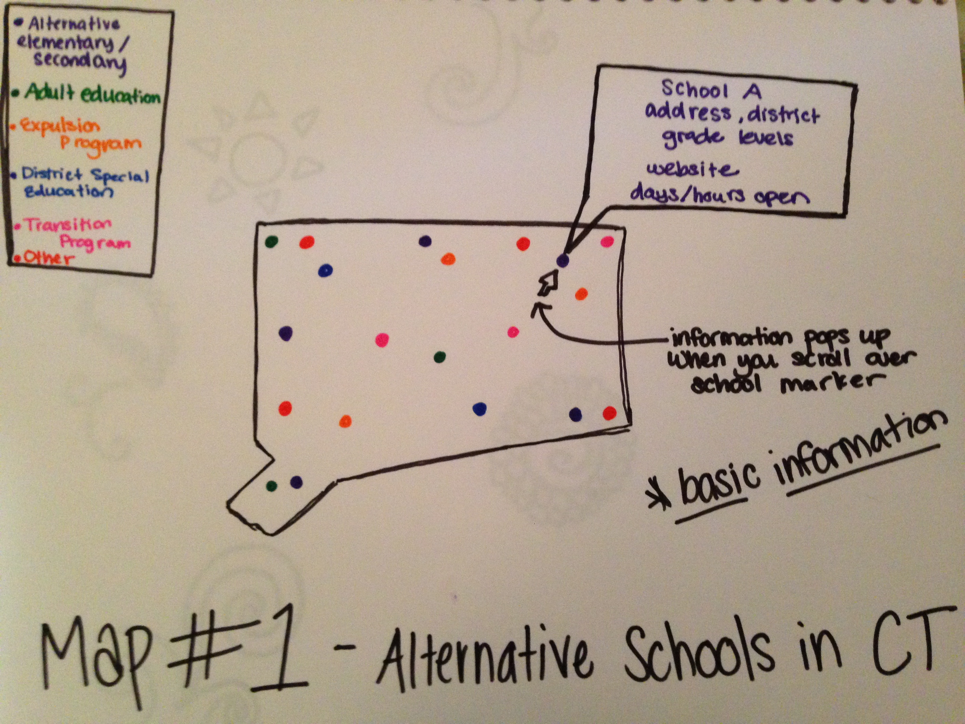
Your data visualization design is a good start. The point layer with distinctive colors is an effective way of showing different type of programs that Alternative Schools in Connecticut offer. Moreover, the information pop up window also helps the viewers to know about each different school better.
This map achieves the goal of displaying the facts about the education that Alternative School offers, but it has not yet shown where the schools are. Even though the information pop up window provides the address, and map displays a rough idea of their location, I suggest adding the polygon of town boundary to the existing map. Sometimes, parents’ decision making on the alternative schools depends on the relative distance from their home to their preferred school. Moreover, a search tool may also be helpful for viewers who know the names of specific schools. Instead of hovering the mouse over all points, they can just type the name on searching box and that school will be highlighted.
Since Marrisa is also doing a project about school choice, her map with searching box is a great example. Here is the link:
http://marissablock23.github.io/AchHart/
I think that what you have is a good basis to start from, but that a lot can be built upon from this. Having a polygon layer in addition to your points would, probably, be helpful for the viewer. With the polygons you can compare the schools to local demographics, which I think would be interesting in your case. What you have right now looks good, and is definitely looking like it would make a good searchable map for if somebody was looking for a particular school, etc.
I believe that it would also be beneficial, since you are comparing alternative schools to public school, to have a visualization that shows a compare/contrast between the two types of schools. If the viewer had a visualization that helped them understand why alternative schools aren’t being held to the same standard, I think that could lead to a compelling argument. You could show average GPA upon graduation for both public and alternative schools, for example. You could portray this data in the form of a line graph like so https://developers.google.com/chart/interactive/docs/gallery/linechart