Working with Center for Children’s Advocacy

Posted on

This semester, I’m working with an organization located in Hartford called Center for Children’s Advocacy.  This organization is a group of attorneys and other advocates who work to make sure that all children in Connecticut are given legal rights.  The center mainly works with abused and neglected children, but also has a large focus on improving the educational success of Connecticut’s teens by preventing truancy and collaborating with the juvenile justice system. The main part of the work the center does is through legislature, by fighting for laws that ensure the well being of all children.

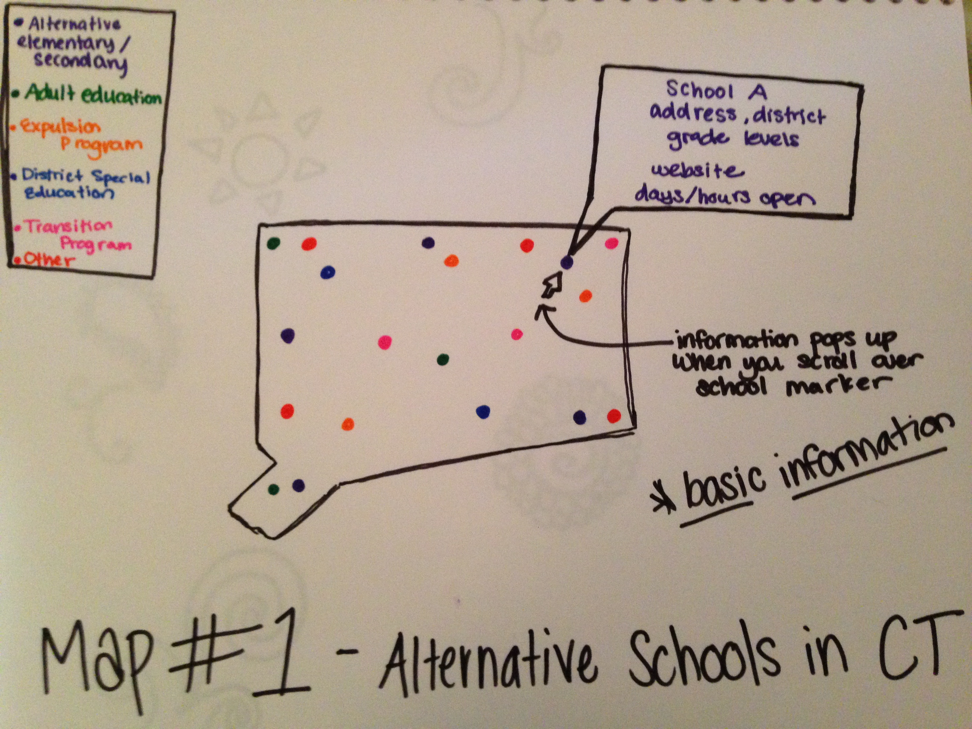
My main involvement with Center for Children’s Advocacy is by helping them pass new legislature on Alternative Schools in Connecticut.  Currently, Alternative Schools are not held to the same standards as government public schools, which has allowed them to get away with offered a sub-par education.  The goals that Center for Children’s Advocacy and I have are to create an interactive map that enables parents to see their options for alternative schooling, while also making the public aware of the glaring differences between alternative and public schools in the quality of education.  The hope is for these maps to show where alternative schools are, where they’re needed, and facts about the education they offer, which in turn will force these schools to be held accountable to at least the public, if not the legislature.

Below is a sample of a 2D representation of what a data visualization for Center for Children’s Advocacy might look like.  Note: This is not actual data.

Data Viz Example

Assignment 2b: Description of Park Watershed Organization

Posted on

This semester I will be partnering up with The Park River Watershed in Hartford, Connecticut. Mary Pelletier who runs the non-profit organization describes this program as a “start up” willing to explore many and any environmental issues related to the watershed. Their goals include involving the greater community to participate in a growing a network that includes teachers, artists students, etc. They want many of the citizens to be involved with their initiatives as it involves a whole community to create a positive resource for all.

I have not yet decided what specific data I would like to use for this project as Mary and I are still working out logistics as to what is more important to show and produce for the public. We would like to use data that the general public. Right now, I just placed sample data into my Batch Geo. Hopefully, when I get real data my map will look a bit more interesting and interactive.

View Sample map in a full screen map

Assignment 2b Great by 8

Posted on

For the beginning of this semester I will be working with West Hartford Great by 8.
Great by 8 is an early childhood education and health community organization that focuses on bridging the gap between those that have access to preschool programs and those who do not have the opportunity. Great by 8 aims to address two priorities: 1. Eager and Ready to Learn in order to provide access to preschools and 2. Physically and Emotionally Health to improve children’s overall health and wellbeing.

I have not been able to meet with my partner and thus do not know exactly what their main data visualization goal is. However, I created a map in class and so will embed it here in place of what my organization will want later as I have a meeting set up on Monday 10th.

View Sample bad map in a full screen map

Exercise 2B

Posted on

For my Data Visualization internship I am working with Erin Kemple from Connecticut Fair Housing. This center is a statewide nonprofit organization focused on identifying impediments to fair housing in order to eliminate such barriers and advocate for change. Connecticut Fair Housing tries to find the forces at work in the market that are preventing people from getting housing. This includes whether or not various groups of people are treated differently as well as what are the differential affects of certain policies that are not necessarily discriminatory practices but result in unfair housing opportunities.

Through talking with Erin Kemple, I found out that the main Data Visualization goal is to create charts and maps to put on the web that display such impediments to fair housing so that policy makers as well as the general public become aware of such forces. An important aspect that Erin Kemple is interested in is mapping data points for zoning and racial makeup. Along we that she believes it will be very helpful to create interactive maps with filters to display various data and how-to tutorials so that website viewers have the opportunity to plug in whatever information they are interested in.

Partnering with Achieve Hartford

Posted on

Throughout the course of the semester, I will be partnering with the organization Achieve Hartford, a nonprofit education advocacy group. Fortunately, I had some exposure to this organization last semester through the Community Learning Initiative, in which I co-authored a study on the characteristics of students in the Hartford Public School (HPS) system. This past experience helped fuel my interest to work more closely with Achieve Hartford, and learn the art of data visualization in the process.

Through research, publications, and community forums, Achieve Hartford raises awareness about the state of education reform in Hartford and hopes to facilitate the engagement of parents, businesses, and community and school leaders in the process. For my role, the research and publications will be the most relevant aspect of their work. Their research is conducted in an independent and credible manner, in order to raise awareness about facts and issues affecting the HPS system. Achieve Hartford’s primary goal in terms of data visualization is to optimize their presentation of the most interesting and meaningful data by highlighting its worth through visualizations and thus making it more accessible to parents, rather than reading through an entire report.

Though I am still in the very early stages of expanding my knowledge of data visualization tools, I am certain that interactive charts  and tables will be beneficial in helping to consolidate data from several reports, possibly with achievement data of test scores. Additionally, geographical visualizations of relevant indicators will also be useful to identify any possible trends. Something as simple as an interactive map that shows the spatial distribution of Hartford schools across the four school zones in Hartford might help parents make more informed decisions about school choice.

I look forward to working with Achieve Hartford this semester and I hope to create data visualizations that will positively complement their work.


View Distribution of School Types in HPS in a full screen map

]