Redesign Seminar

Posted on

My recommendations for this course in a future semester would be similar to the third option. I think the semester the way it was this semester was great, keeping in my this semester was the first and thus a trial and error semester, but I the data viz and coding instruction definitely could seem appealing in the future.

Although there won’t be able to have as much of an internship experience, i think that even just working with a partnership outside of the college is very interesting and a great opportunity while also learning how to create these visualizations with a more in depth learning of the coding aspect.

The community partners are definitely a necessity for a course like this and they seemed to be extremely willing and helpful throughout the semester, but I know in my case, joining so last minute and being only .5 credit, it was hard for my partner and I to really create and maintain a structure for our semester project and partnership. Nevertheless I really enjoyed working with her and very much appreciated her allowing me to do so such last minute.

Transition Plan

Posted on

The data I used to create my visualization was simply found on the internet. These useful locations and points in West Hartford can be changed and others can be added or removed. The goal and intention was simply to find useful resources for children 8 and under. This visualization show’s these location in the West Hartford boundary.

I imagine a map such as mine can be used or maps that are specifically used for solely one of the types of locations. Such as a map of only day cares or dental care.

I first used google fusion tables that can be located through this link.

Polygon data

Point data

And finally I used github to create the two layer map, that can be found here.

Greatby8: The easy way to find early childhood resources

Posted on

Throughout my semester of data visualization I worked with the partnership named Great by 8. Great by 8 “is a community collaborative focused on improving access to high quality services in the areas of early childhood education and health. Great by 8 is a combined Graustein Discovery Community Board and the Town of West Hartford’s School Readiness Council. [They] have a formal board comprised of parents, teachers, public school administrators, private program directors and other community members to ensure that all West Hartford children are Great by age 8.”

In my data visualization I used a polygon outline of West Hartford and found useful locations to place on the polygon layer. The useful locations are there in order to make finding resources, such as health care units, dental care, recreational facilities, day cares, clothing stores etc. for children 8 years and under, easy to find and more widely known.

Click here to access my data visualization.

Assignment 6- Updated A4/5 Google wizard layer

Posted on

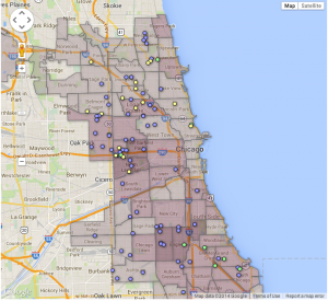
Below is the revised version of my wizard layer map. While I am still currently using Jack’s information for my point map, it is very relevant to what my data will hopefully look like in the future, once I am finished compiling it and finalize it with my organization partner. One aspect I could not figure out is how to change the color of the dots in order to distinguish the types of early child care providers. However, I included a screenshot below which is similar to what I expect my final layer map to look like, a searchable, filterable map. I got this from Veronica at http://chicagobuildings.org/

My partner and I also discussed using more than just two layers, however without more data I was unable to try it, but will definitely be working on that in the future.

*Update on March 10 from Jack: Katie also is having difficulty with web hosting via Google Drive, as her interactive currently is visible only with Safari. I have pasted a static image below. Looks like web hosting via GitHub is a better solution.

static version
static version

Screen Shot 2014-03-06 at 8.56.07 PM