As part of my data visualization work with Achieve Hartford this summer, I explored ways to make educational data more accessible and useful to the public. The Hartford Public Schools (HPS) compiles information on thousands of individual students, and while raw data files cannot be directly released due to privacy laws, the City’s brand-new Hartford Data initiative created a better way to request and work with this type of data in public formats. Their staff encouraged me to submit a data request on their new website (http://data.hartford.gov) to aggregate student-level data into larger units, which can be publicly shared without violating confidentiality, because batches of students are grouped together without individual identities. I submitted my request for HPS student data (over 20,000 files) to be aggregated into the 17 city neighborhood units. Back in 2008, HPS stopped assigning students to schools by neighborhood residence, and began an “all-choice” initiative where students can apply to attend any HPS district school (or the growing number of interdistrict magnet and charter schools), regardless of residence. Since students do not necessarily attend what we used to call their “neighborhood school,” there has been no easy way to obtain neighborhood-based data on HPS students. But this is changing.
 Today, the Hartford Data staff publicly released the first installment of my data request as the first entries in their Education/Youth/Family category. The HPS neighborhood data is divided into two files (2007-10 and 2010-12) due to a federally-mandated change in how student race/ethnicity is reported. Behind the scenes, the Hartford Data staff obtained HPS student-level files with street addresses, geocoded each point on a digital map, then grouped them according to neighborhood boundaries. My understanding is that they successfully geocoded over 97 percent of the student addresses, which is pretty good in light of the many spelling errors and PO Box numbers that pop up during the process. This first batch includes student enrollment data by gender, grade, and race/ethnicity, but does not yet include other data, such as the HPS schools attended (inside or outside of the neighborhood area), or other data points such as average student achievement levels. I also have another request to aggregate HPS student data by census tracts, which are smaller units than the official neighborhoods. In fact, I was so eager to use the new Hartford Data platform that they talked me into serving as a member of its advisory board. Be careful what you wish for.
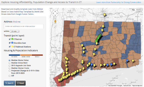
 When the data finally appeared online, the question that immediately came to mind was: how much have HPS student enrollments risen or fallen across neighborhoods from 2007-12? First, I blended together the total numbers of students in the two files and calculated the percent change. Next, to visualize this data on a map, I uploaded the spreadsheet into a Google Fusion Table and merged it with the neighborhood boundary map that I also downloaded from the geographic data section of the Hartford Data site. The result is the interactive thematic polygon map embedded at the top of this web post, and you can learn how to create your own (for free) by following my Google Fusion Tables tutorial, which I presented to several groups this month at our Open Data Visualization workshops. Some nice features of Google Fusion Table maps are that users may click on any region to view its data, or click on a link in the legend to see all of the data in the underlying spreadsheet. It’s not a perfect map: I still can’t figure out how to easily display percentages rather than decimals in the legend. But if you’re a non-profit organization or neighborhood group that doesn’t have a big technology budget, the free Google Fusion Tables tool and a free online tutorial or workshop may be a good solution for you.
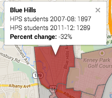
Overall, I was surprised to see such sharp declines in HPS student enrollments, shown in dark red in the city’s northwestern area (Blue Hills -32%, Upper Albany -26%) and also the South West neighborhood (-20%). Together, these three residential neighborhoods experienced a loss of nearly 1,300 HPS students over five years. Although dark green areas of growth appear in Downtown and South Meadows, the raw numbers of students living in these neighborhoods are very small, and the combined gain is only 30 students.
Why are these changes happening? I don’t yet have all of the data to fully interpret it, and welcome informed input from readers. As I always tell my students, think about what maps do not show us. First, today’s new data comes from HPS, which means that it includes only students enrolled in HPS-run schools (both district and magnet), and not residents of Hartford neighborhoods who attend non-HPS magnet schools, charter schools, the suburban Open Choice program, and non-public schools. We know that public school choice programs have grown over the past several years, and Several researchers involved with the Cities Suburbs and Schools project at Trinity College and I are seeking more data from the Connecticut Department of Education and public school choice providers to help fill in this part of the puzzle. Second, there also may be population shifts affecting selected Hartford neighborhoods, which we may be able to nail down with American Community Survey data from the US Census. More work to be done.
Explore your own questions by checking out Hartford Data (http://data.hartford.gov) and the related CT Open Data site (http://data.ct.gov), browse their growing collections, post your own data requests, and share your results on the public web.